CoFo Cinema1909: From Historic City Lettering to a Custom Typeface and Retail Release
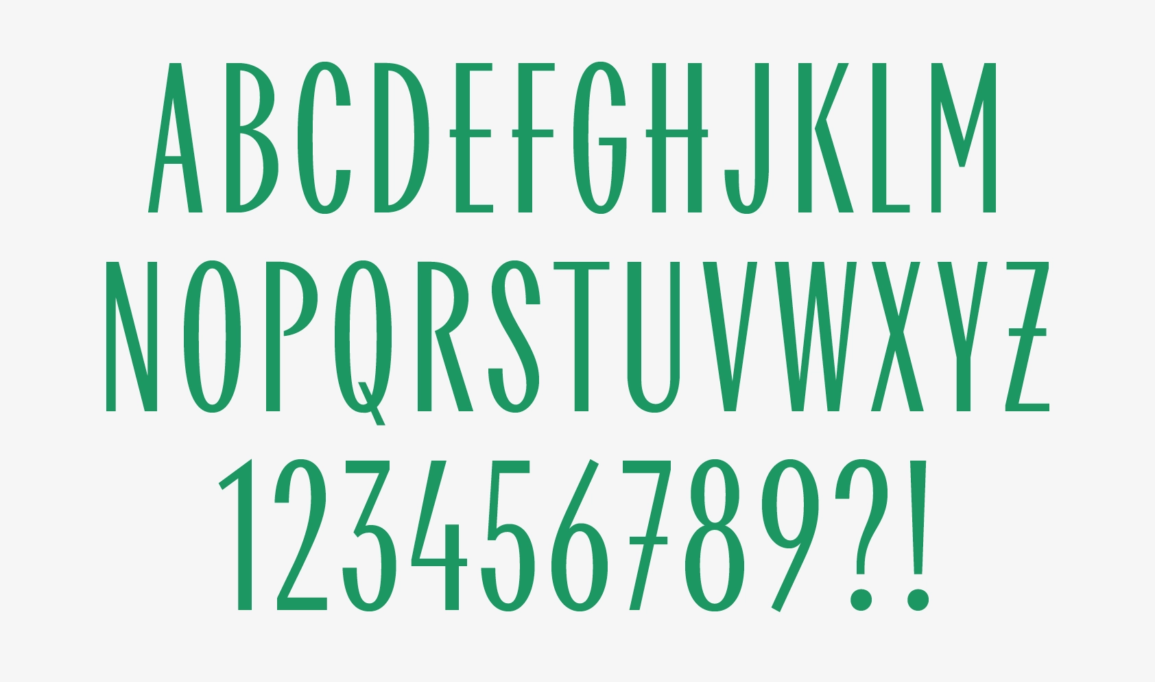
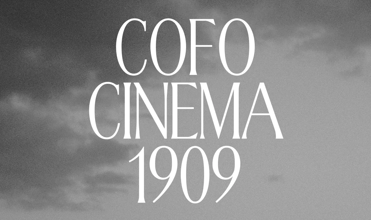
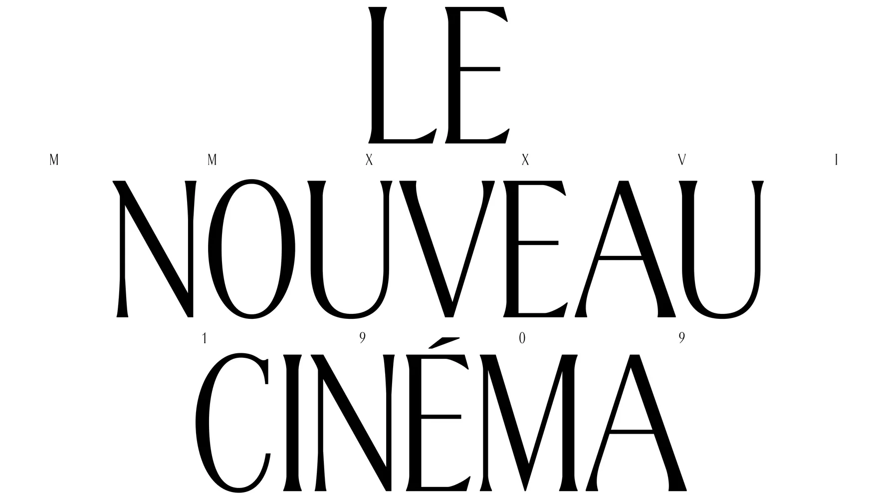
Cinema1909 is a stylish display typeface informed by a mix of Art Nouveau and Cyrillic Art Deco. Cinema1909 was inspired by Moscow Metro stations and first created for the city’s oldest cinema. It was later expanded for public release. Today, it’s a versatile typeface with a rich history.
The Story of Cinema1909
The story of Cinema1909 gives a good glimpse into one of the ways that a retail typeface comes about. Now that we’re publishing the second major update since its first release in 2022, we wanted to retrace the steps we took to get here.
Act I: A moment of inspiration
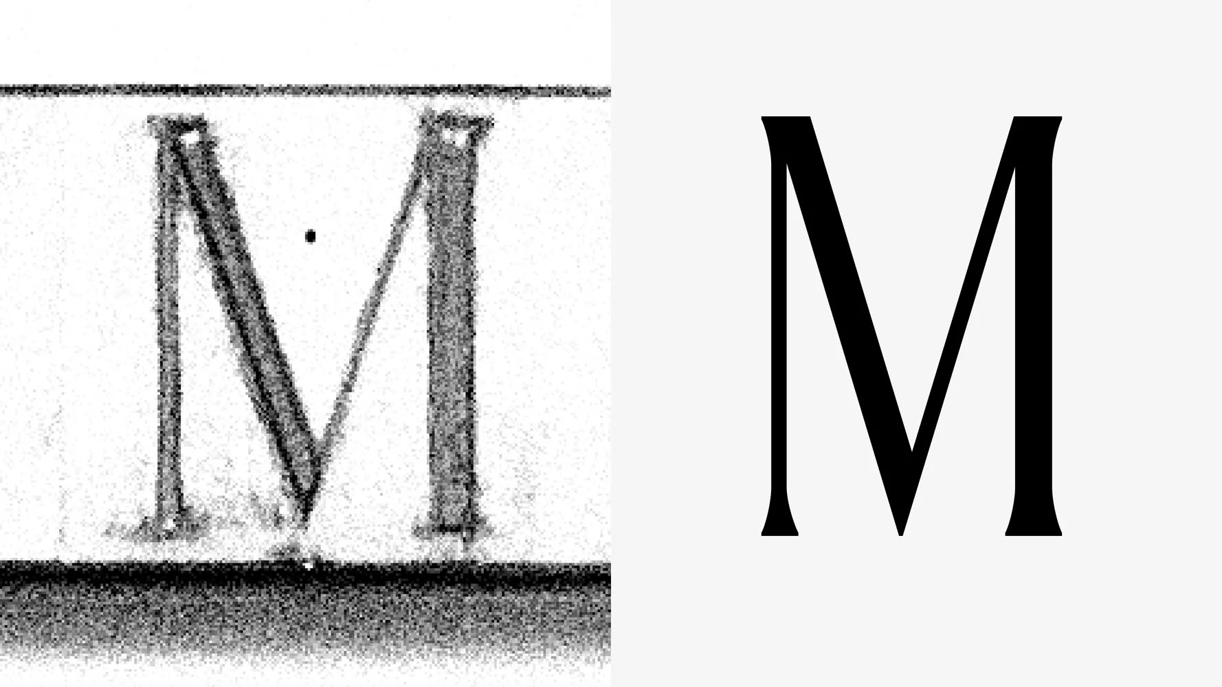
In 2017, our designer and creative director, Liza Rasskazova, was getting ready to lead a type walk during our summer Type Design Workshop. We take our students on these walks to help them find inspiration for typefaces. That year, we chose the lettering in the Moscow Metro. Ahead of time, Liza scouted dozens of stations, and in doing so, she came across a serif sign in the Komsomolskaya station of the Sokolnicheskaya line.

Most historic station signs in the Moscow Metro are set in sans serifs, so a serif was a striking difference. And it wasn’t just rare—its unusual proportions and distinctive elegance made it truly unique.
In the same way we hope our students find inspiration, Liza herself was inspired. Between other major studio projects, she started working on a typeface of her own.
Act II: A custom typeface for The Khudozhestvenny’s identity
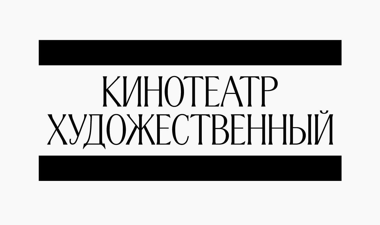
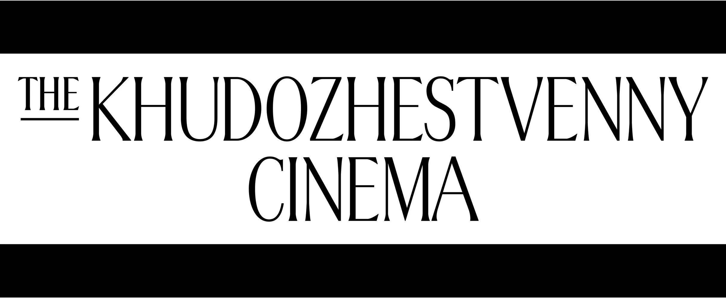
Two years later, in December 2019, we were commissioned by Anna Kulachek from the Strelka Institute of Art and Design to create a logo for the Khudozhestvenny Cinema. Founded in 1909, it is the oldest cinema in Moscow and one of the oldest in the world.
Given the length of the name [Кинотеатр «Художественный»], we focused on condensed letterforms.
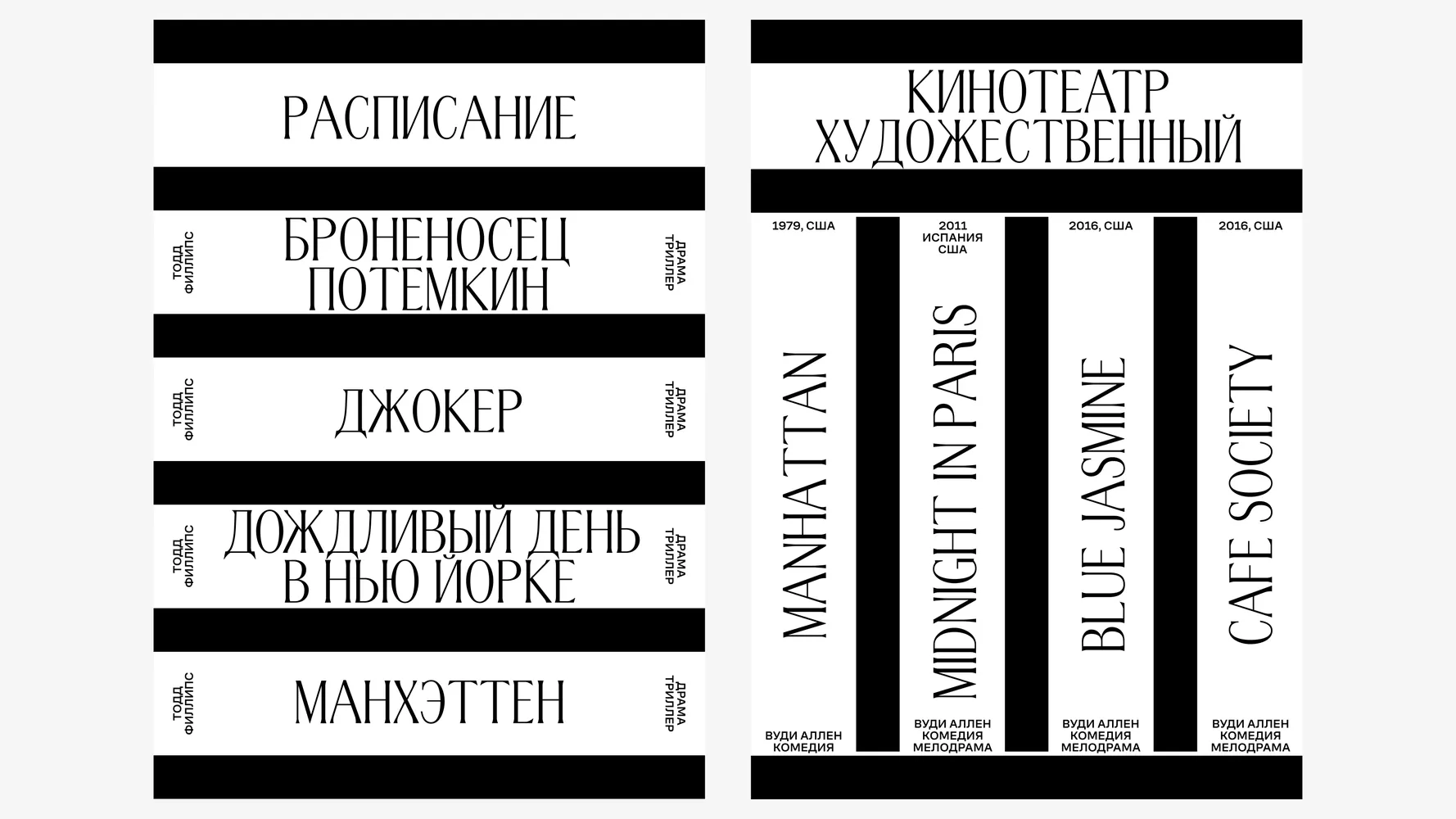
Anna Kulachek’s identity concept for The Khudozhestvenny Cinema
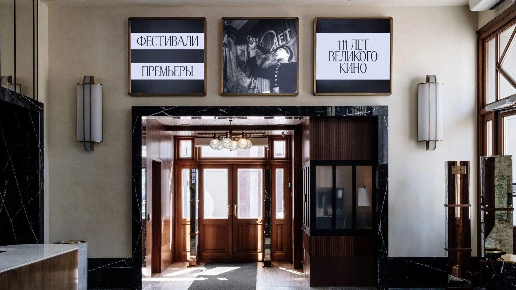
As we explored, we realized that Liza’s in-progress metro-station-inspired typeface might be a perfect fit, so we pitched it. It was such a successful stylistic match that Anna asked us to develop it into a full typeface for the project. Referencing historical models, we designed a complete set of uppercase basic Latin and Cyrillic characters. Khudozhestvenny Cinema was given exclusive rights to use the typeface for two years.
Act III: The public release
In 2021, we asked the client if they wanted to extend their exclusive rights. They decided not to, which meant we could finally release CoFo Cinema1909 in our store. We had already been working on extending and refining the character set, so the typeface was ready for the release.
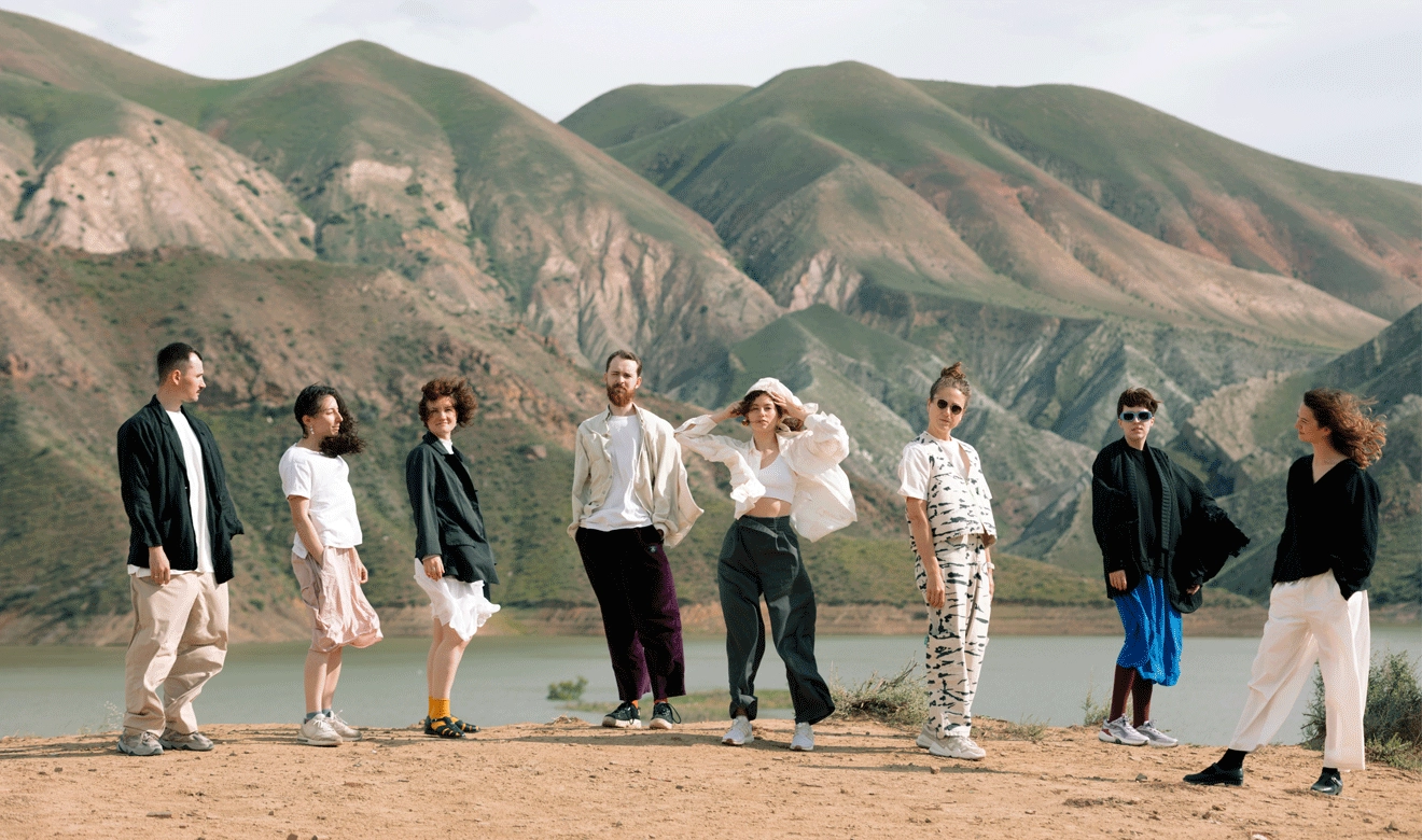
For the launch, Liza shot a promo video in Armenia, where she’d just recently moved.
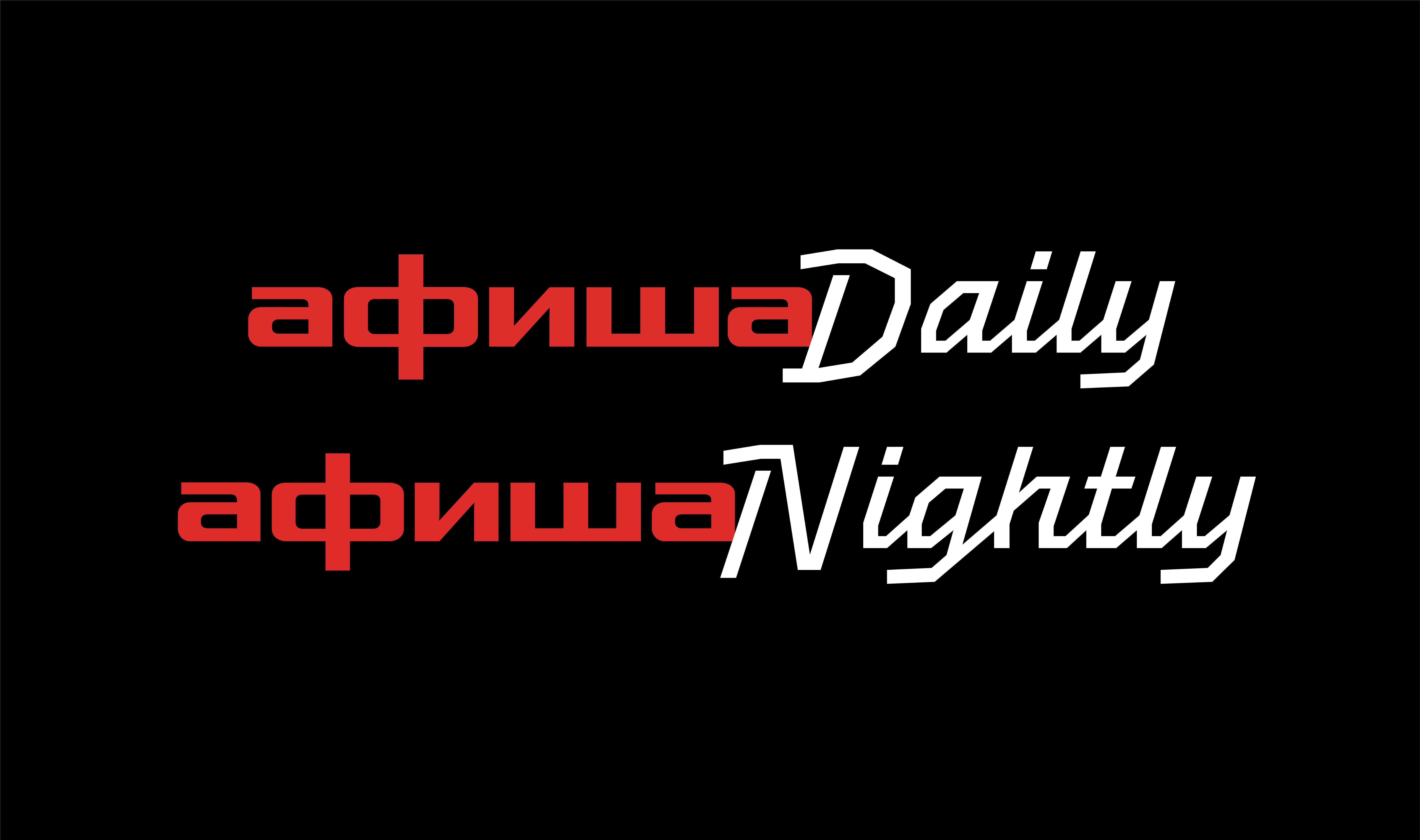
CoFo Cinema1909 went on to become a bestseller. It was our first display typeface to become a breakout hit, finding its way into all kinds of serious, high-profile, and elegant projects.
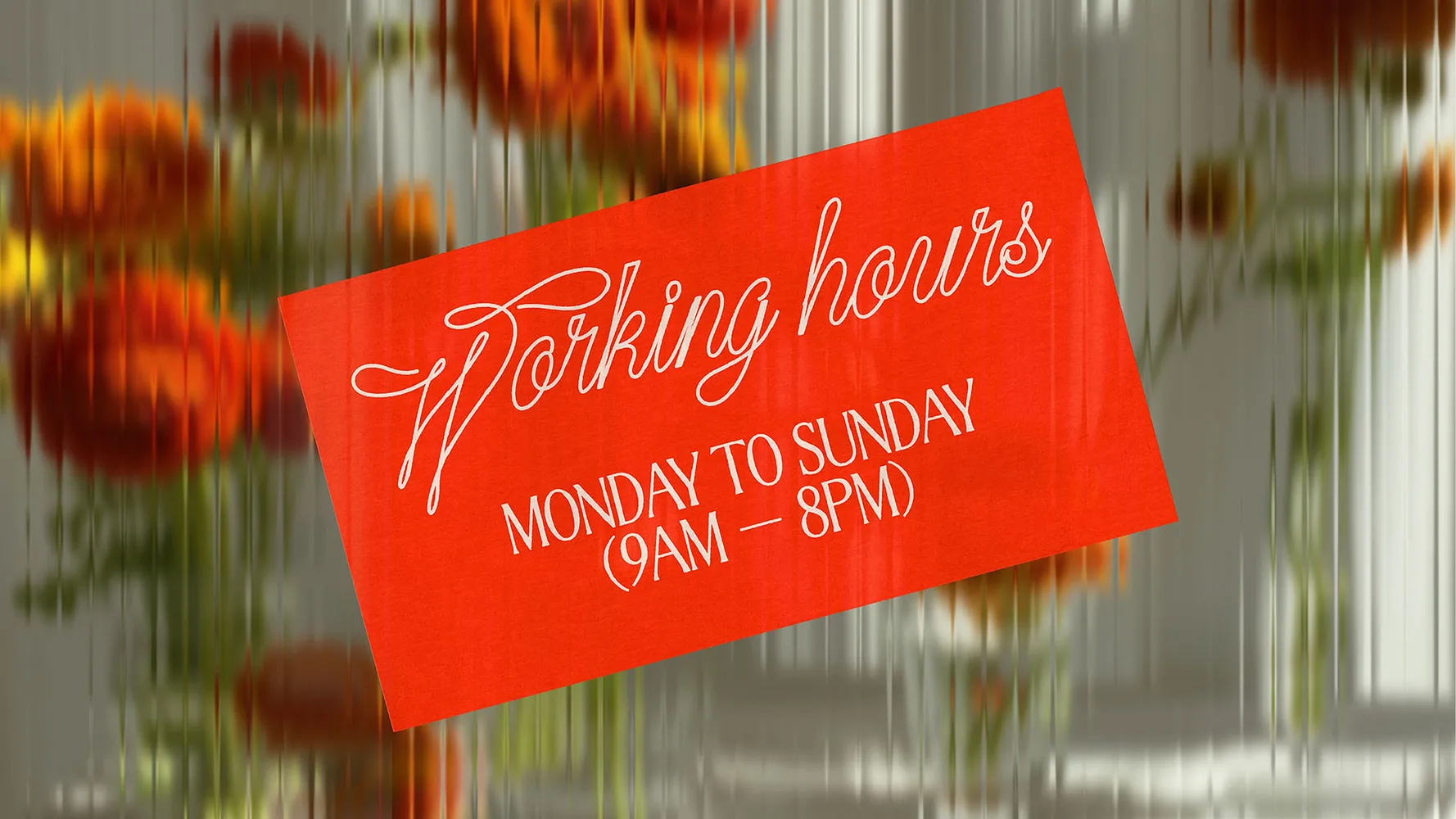
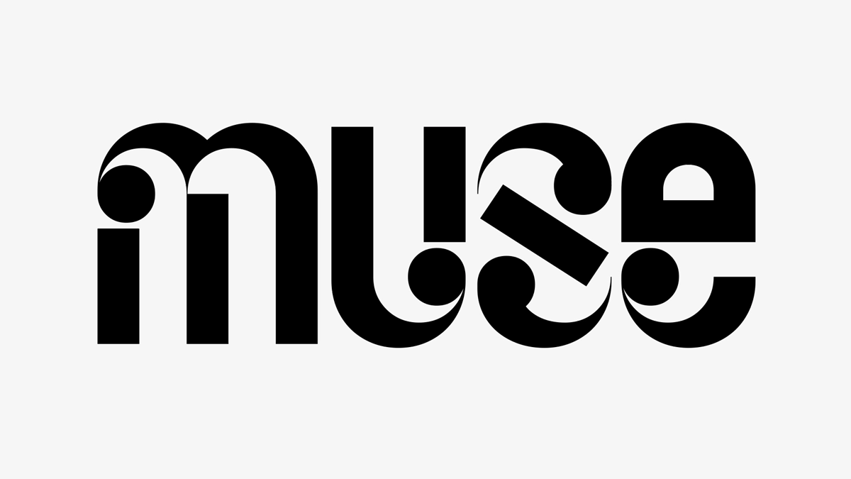
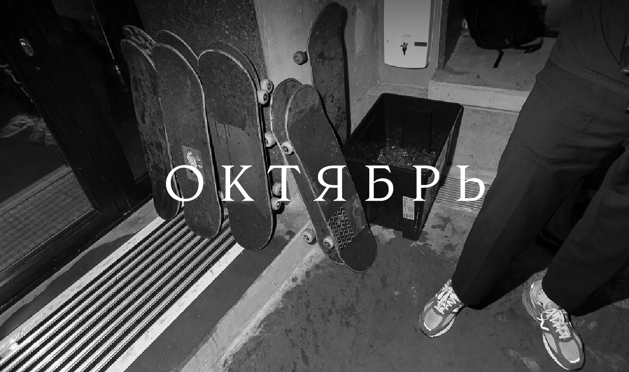
MeNow identity by Orchidea Agency
The Sequel: Lowercase
If this were a movie, the public release of Cinema1909 would be the end of the story. Famously, though, typefaces are never finished: you just decide that it is time to release them. But the ideas of what else you can do are always running in the back of your mind.
We’ve always wanted to come back to Cinema1909, add more weights, and design a lowercase. But projects like this often need an extra push.
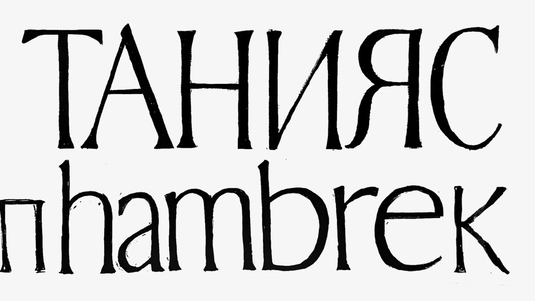
That push came in 2024, when Manau Quellec joined us as a summer intern from Ésad Amiens. Thinking about a possible project to give him, we decided on Cinema. Expanding the character set on a single-style typeface would be the right scope for a few months.
We tasked Manau with designing the lowercase, which we’d only explored in hand-drawn sketches. The original metro lettering had no lowercase, so we would have to design them from scratch together.
[Manau Quellec went on to design the Newz family, which won the 2025 Gerard Unger Scholarship and is currently under development for future release at TypeTogether.]
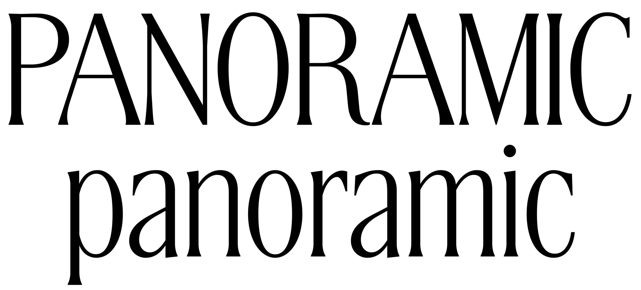
There were a few key details we wanted to carry through or reference from the uppercase:
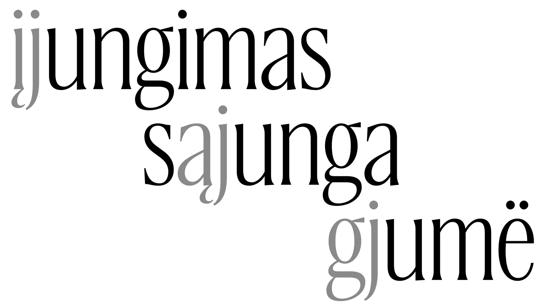
Letterspacing & proportions. The uppercase is characterized by tight letterspacing and unevenness in proportions. Bringing these qualities into the lowercase was straightforward for some letters and tricky in others. We made sure the tight spacing did not compromise combinations like įj gj ąj which are often overlooked.
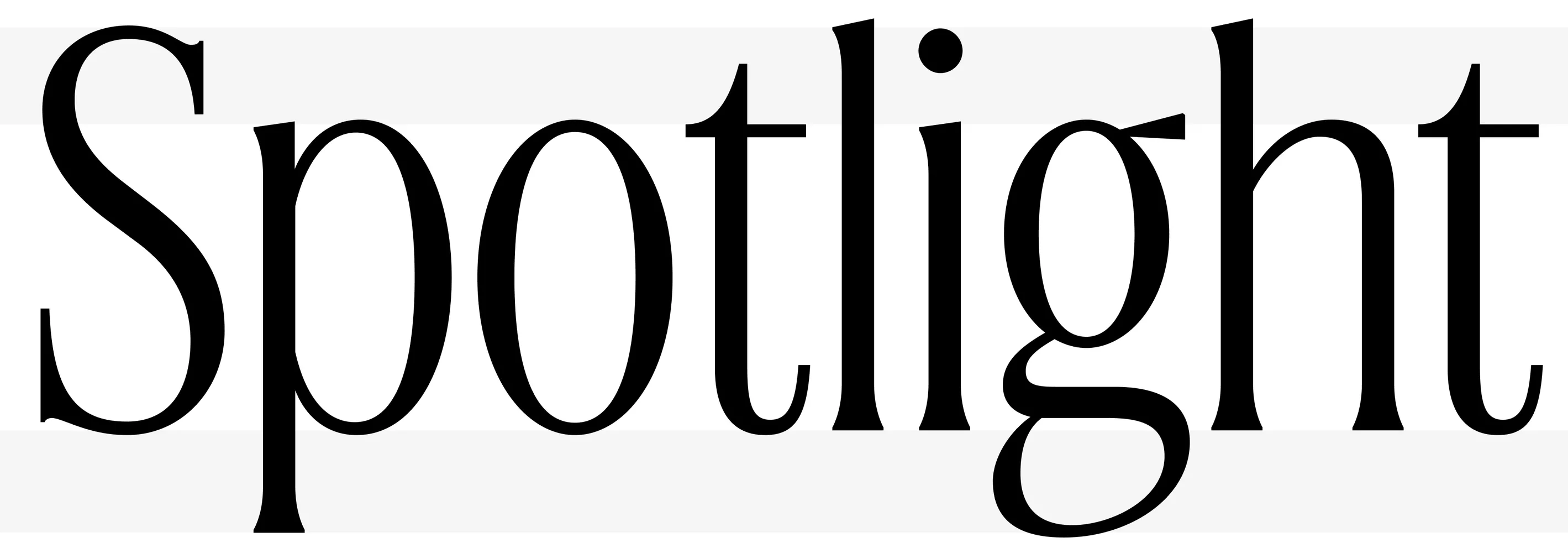
Line spacing. Compact line spacing was a key feature of the uppercase. We explored whether we could maintain a low descender depth, and if using a high x-height could keep a similar compact appearance of tight line spacing.
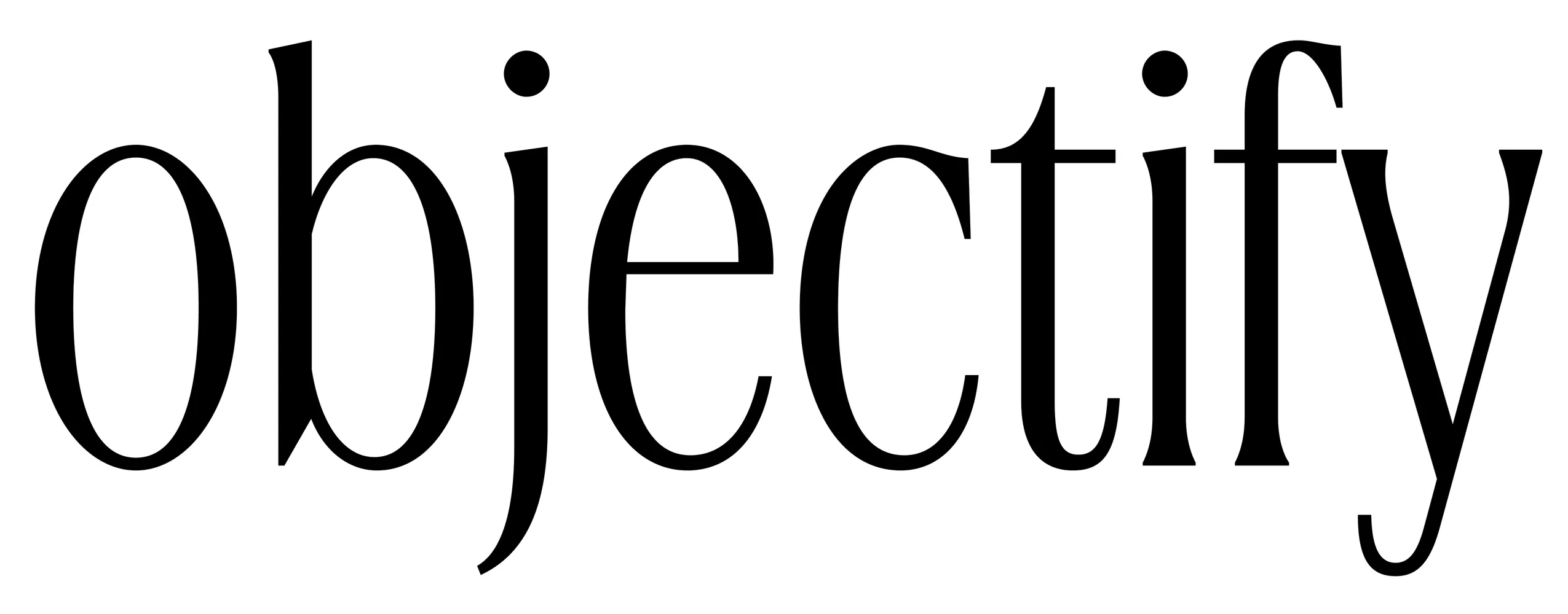
Atypical details. We wanted to see if there was a way to mirror the simplified terminals of the J and У. The y f and j went through some of the biggest changes—we wanted their terminals to echo the uppercase, while keeping them simple and compact enough to work in tricky letter combinations.
By the time Manau’s internship ended in 2024, he’d helped us make great progress on Cinema1909. But it took another two years to finish it. Liza was busy finishing CoFo Robert Sans, which we released in 2026. As soon as it was published, she returned to Cinema1909.
CoFo Cinema1909’s Special Features
Along with the new lowercase letters, this version of Cinema1909 includes:
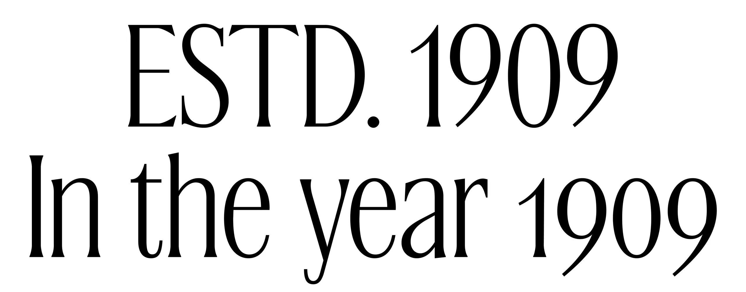
Two sets of figures (lining and oldstyle) come with matching currency symbols, giving you options for all-caps and mixed-case titles.
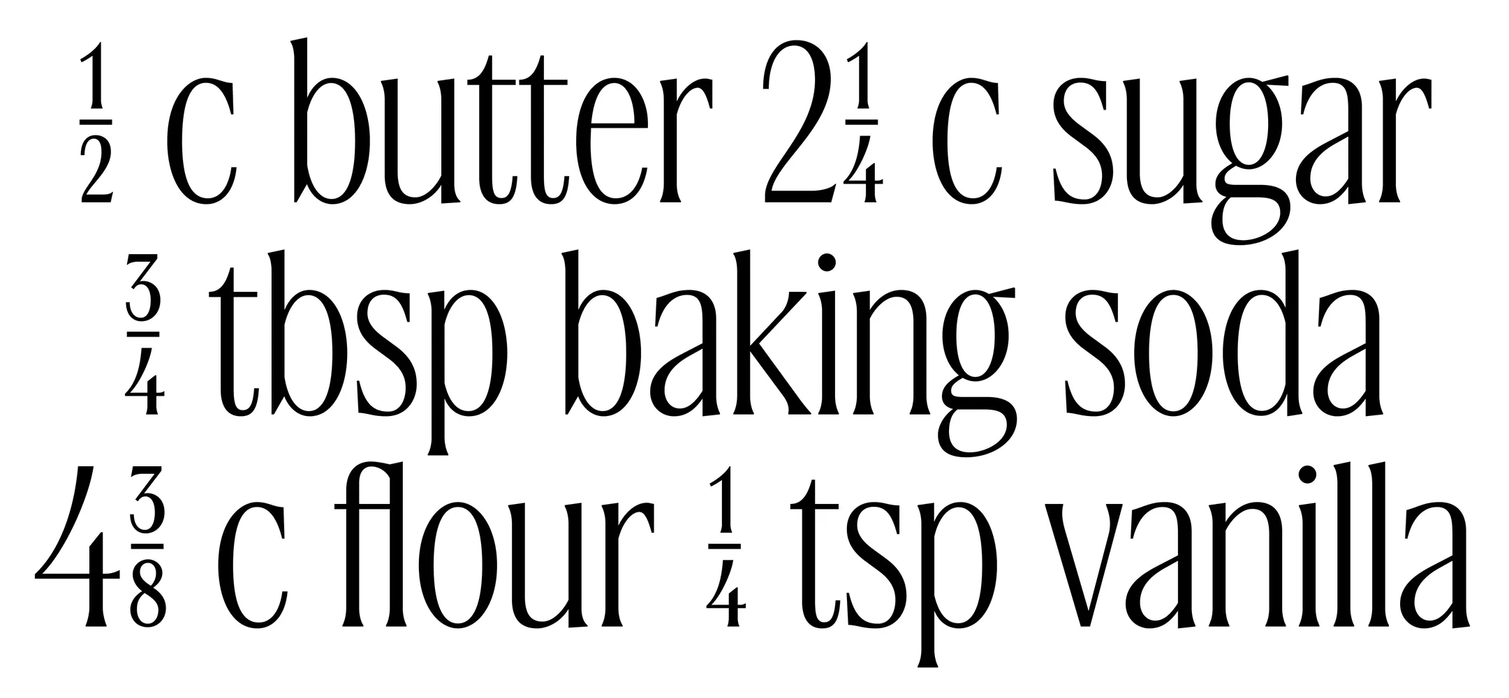
Fractions, both standard and compact, cover everything from recipes and money to shares and other divisive topics.
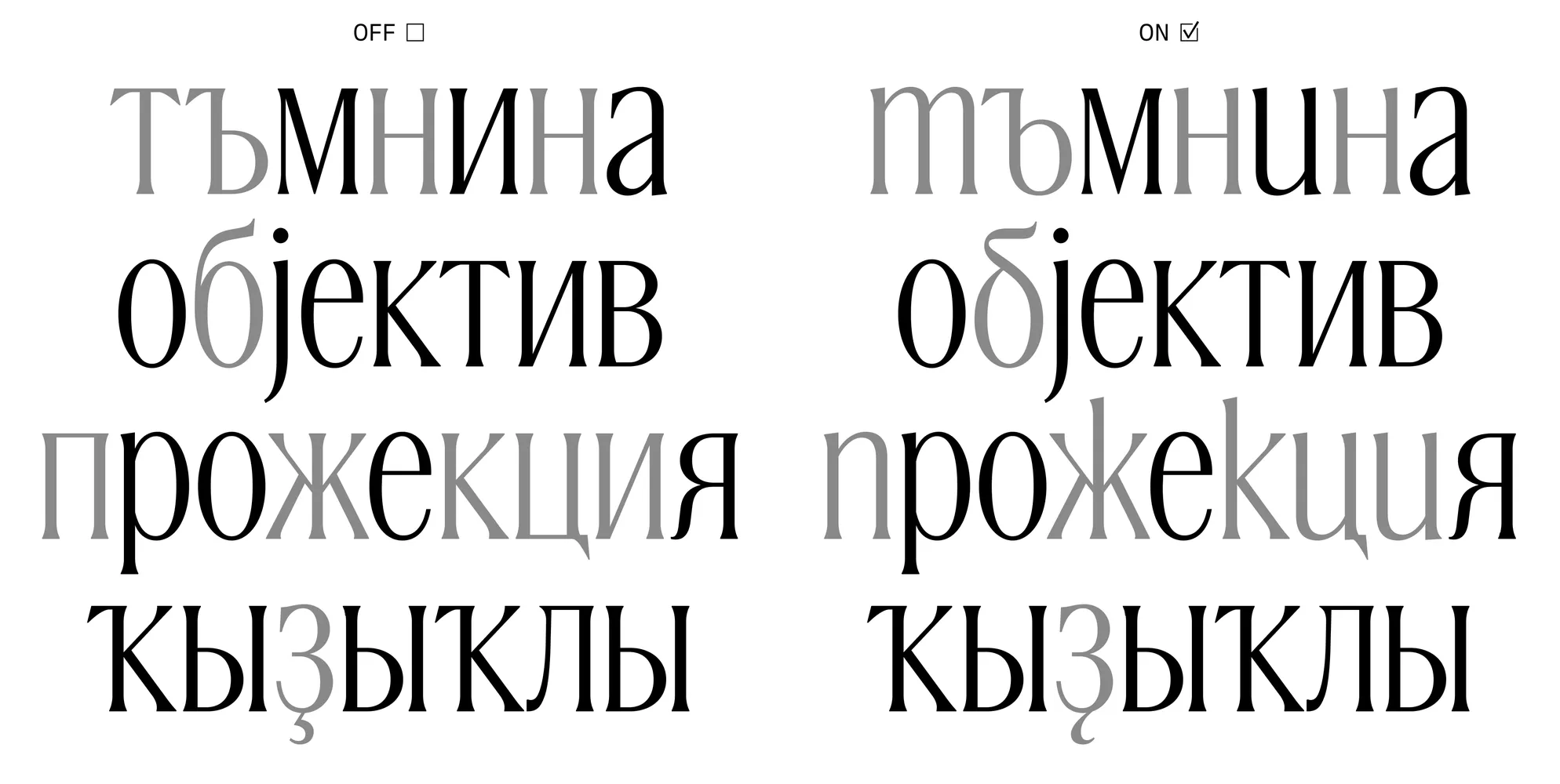
Bulgarian, Serbian, and Bashkir alternates are accessible through stylistic sets, allowing for proper regional variations.

Compact accents let you create stylish headlines, with tighter line spacing and cleaner spacing between lines.
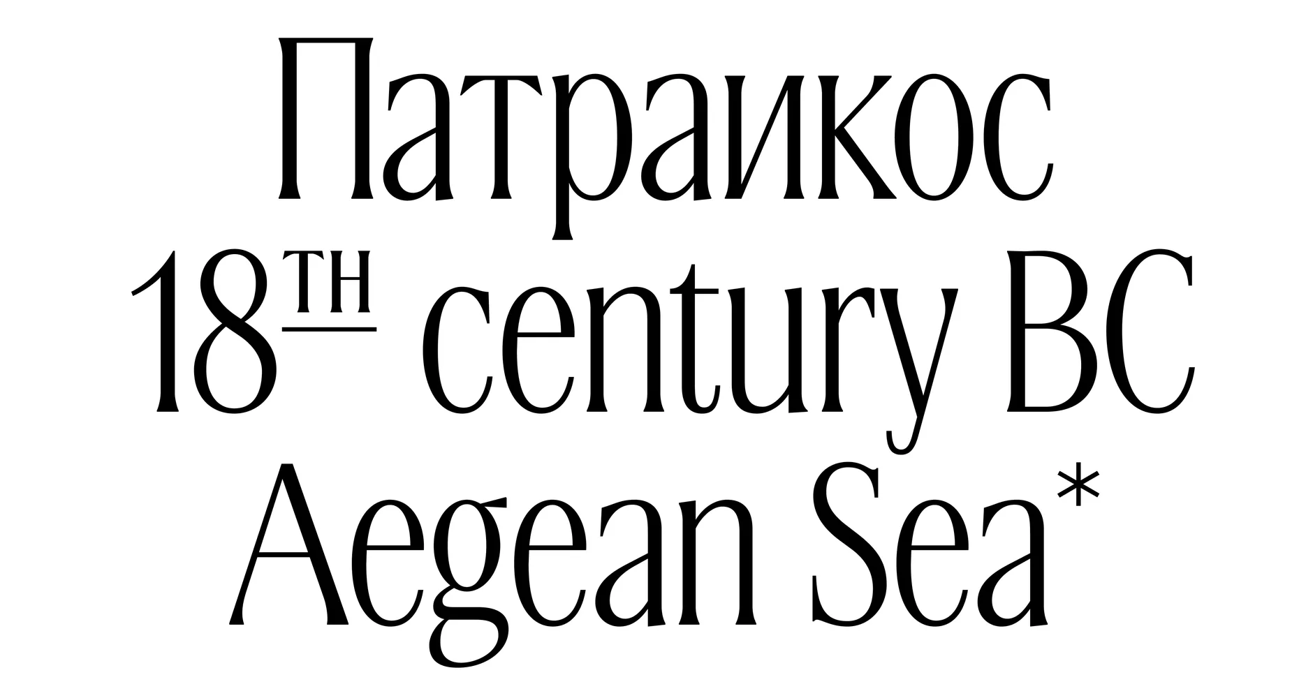
Ordinals save space—and we support the full character set they require.
Epilogue
CoFo Cinema1909 combines elegance and decorative details with a refined feel. It works well in tight, compact headlines, both in all caps and mixed case. With ordinals and broad language support, it offers plenty of ways to tell your story.
Ready to try it out? CoFo Cinema1909 is available for purchase and free trials. See the typeface in action on the CoFo Cinema1909 page.
Written by Iván Ruiz-Knott & Maria Doreuli
Editor: Ekaterina Barannikova
Type designer: Liza Rasskazova
Type design intern: Manau Quellec
Graphics: Iván Ruiz-Knott, Maria Doreuli, Maria Kosheleva, Polina Baydin