CoFo Raffiné: a typeface that evokes elegance
Raffiné [adjective]: very polite; well-mannered; elegant.
CoFo Raffiné [typeface]: very demure; very polite; straight to the point; refined.
Designed by Olga Kovalenko, a talented graphic designer, lettering artist and calligrapher.
The origins of the typeface
CoFo Raffiné was born from Olga’s fascination with the 1919 silent film Wagon Tracks, a Hollywood’s classic Western. For Olga, the film’s titles by Irvin J. Martin were the true stars.
“At that time, cinema was silent, and titles didn’t just convey information—they carried emotional weight,” Olga explains. The experimental rhythm and proportions of those hand-drawn letterforms inspired her to reimagine their essence in a contemporary typeface.
The project began during the Type Design Workshop Pro in 2022 and took an additional two and a half years to refine, resulting in a fully developed type family.
Mixed proportions
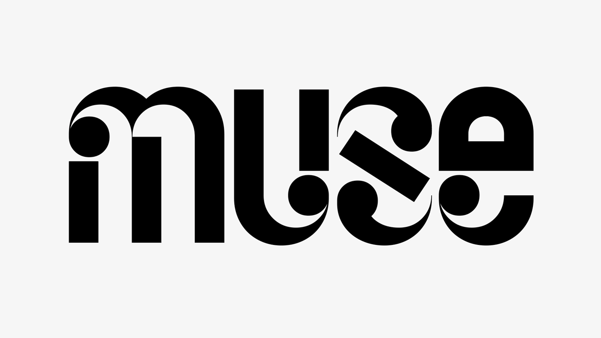
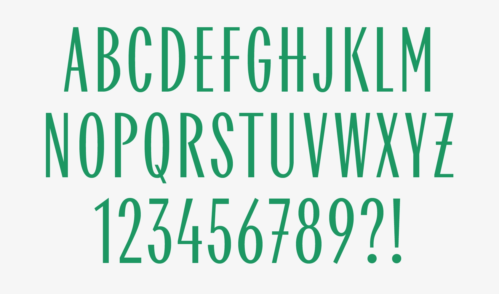
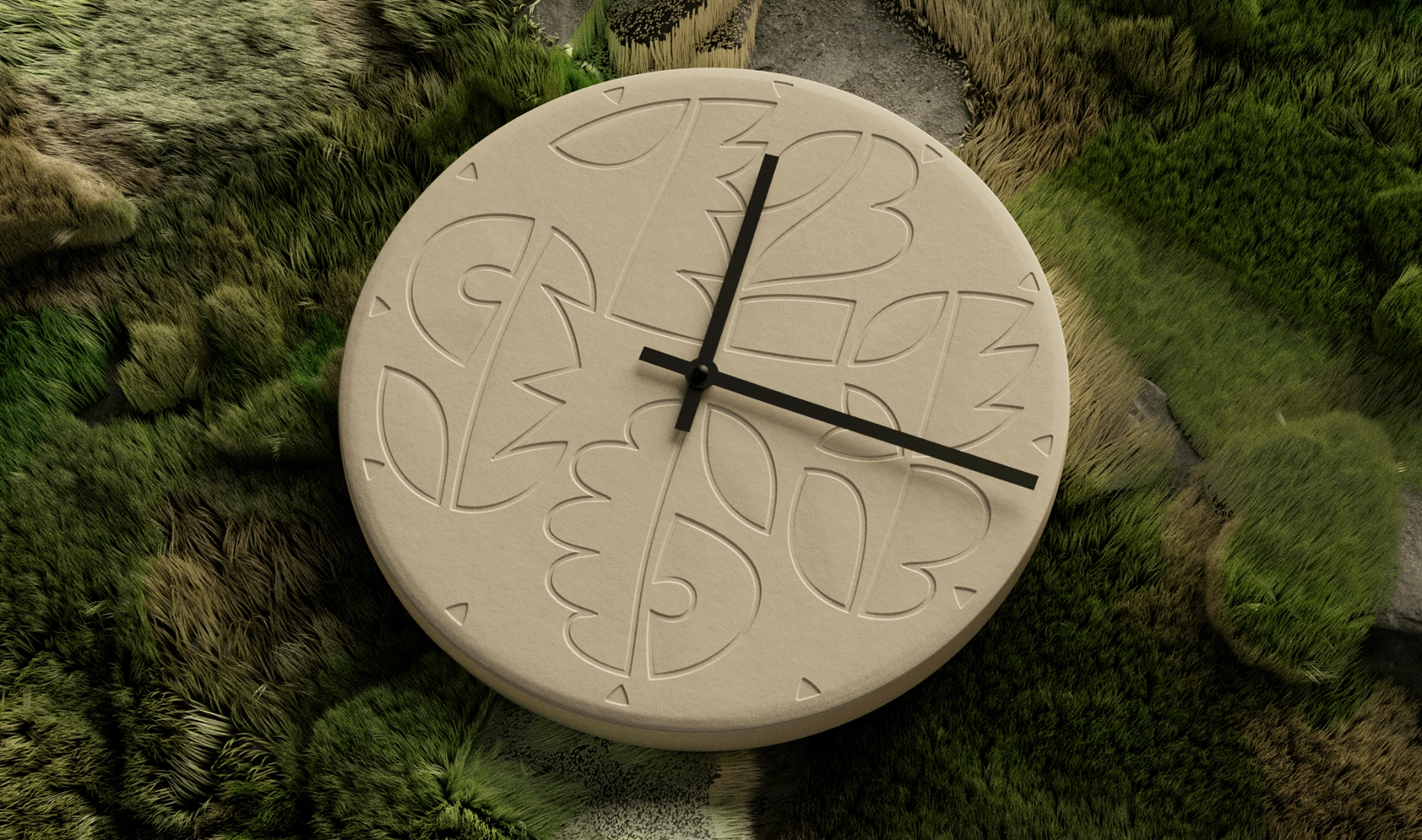
CoFo Raffiné challenges vintage proportions of Roman capitals or foundational hand calligraphy. Narrow and wide letters coexist, creating a unique visual rhythm. This approach is responsible for the typeface’s easily recognizable stylish character.
A range of weights
From its initial ornamental sketches to its final release, CoFo Raffiné has evolved into a versatile type system with five weights ranging from Thin to Bold, plus a variable font. Each weight brings its own distinct style:
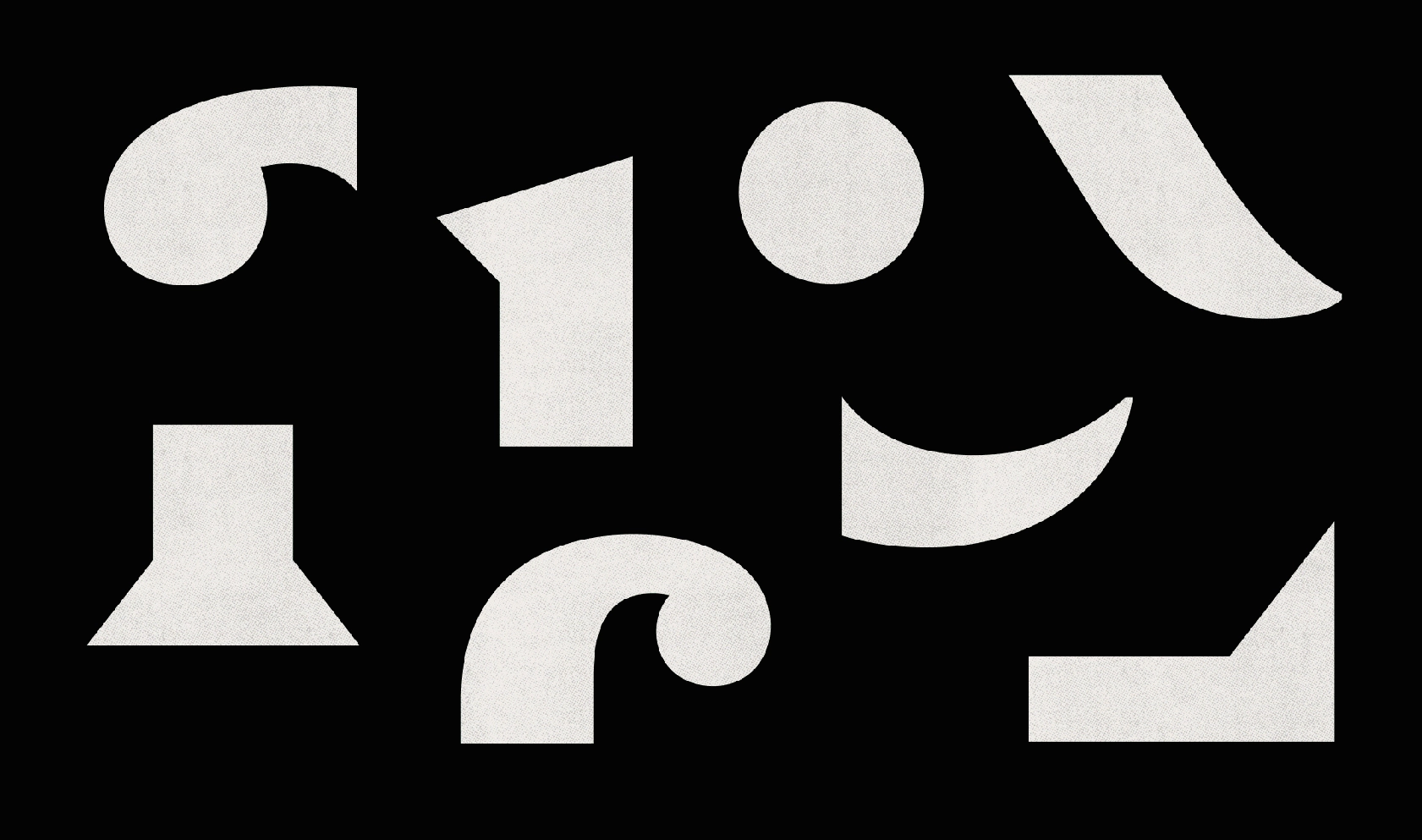
• Thin weight: Elegant and refined, with dramatic accents created by vertical stems and ball terminals.
• Medium and bold weights: Powerful yet balanced, ensuring clarity and elegance even at heavier weights.
• Regular: Widens the typography palette, making Raffiné functional in both large and medium sizes.
CoFo Raffine’s special features
Display design: Suited for bold expressive headlines and titles that grab attention.
Ligatures and alternative forms: To solve challenges with spacing and intricate shapes, Olga developed a set of carefully designed ligatures available through OpenType features, ensuring smooth connections and polished spacing.
Swashes and titling capitals: Offer extra flair and a more refined look.
Expressive numerals: Bold yet graceful digits that maintain the lively rhythm of the typeface.
Optional decor: Discretionary ligatures for uppercase letters, as well as ornamental strokes on select capitals like K, R, and Q.
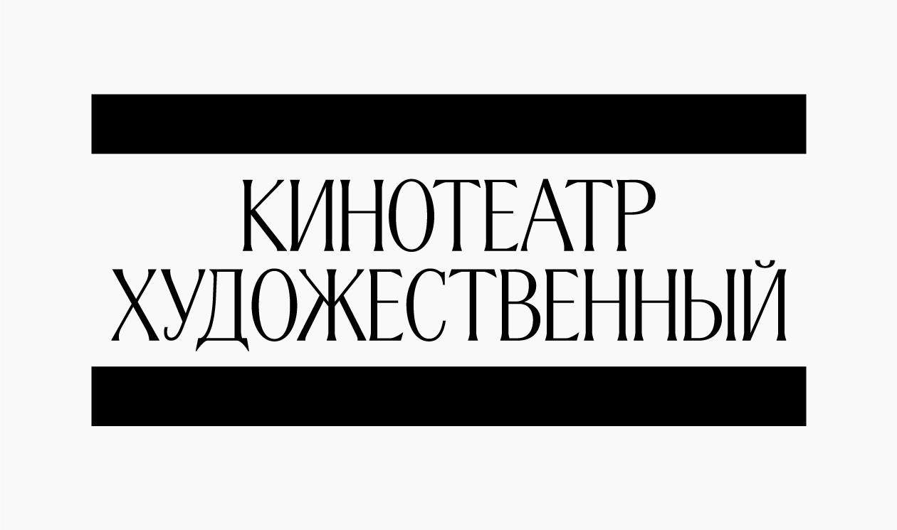
Diacritics and multilingual support: CoFo Raffiné currently supports more than 350 languages, including Latin and Cyrillic scripts. Special attention was given to Cyrillic’s unique structural characteristics, resulting in text that feels lively and engaging.
German umlaut set: Alternative set of Ö and Ü with lowered dieresis available for our Germanic friends.
CoFo Raffiné is more than a nod to the old-fashioned fonts of the past; it’s a versatile, modern typeface ideal for various design applications. Its expressiveness and practicality make it perfect for book covers, packaging, posters, editorial layouts, and more.
At Contrast Foundry, we’re proud to bring Olga’s typeface to life. CoFo Raffiné is a celebration of storytelling through typography—a reminder that type can inspire emotion, create atmosphere, and make design unforgettable.
Editor: Ekaterina Barannikova
Promo Video: Anna Volkova
Music: monochrome rainbow


