CoFo Cinema 1909—old-fashioned elegance in modern times
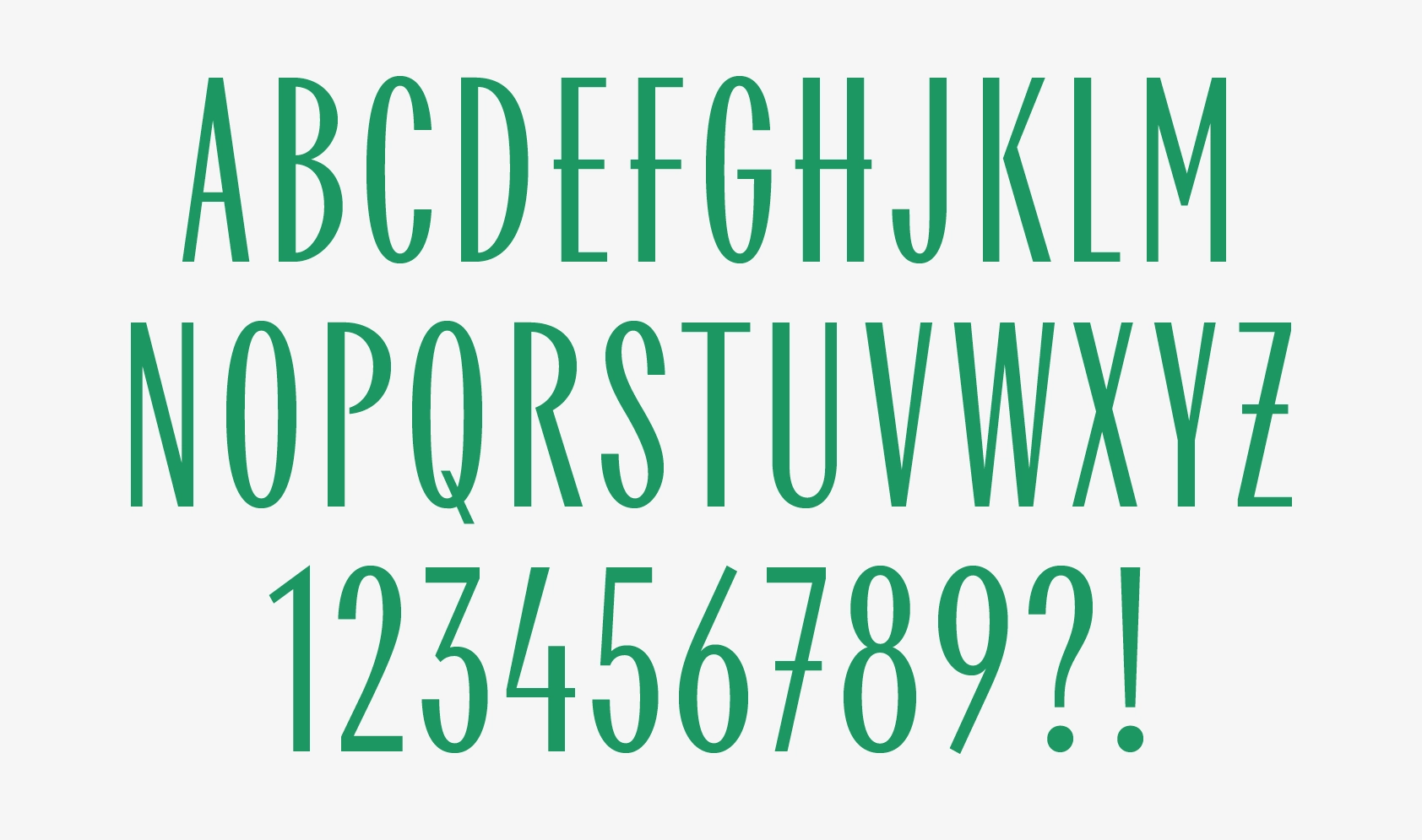
This is the tale of how the influences of Art Nouveau and Cyrillic Art Deco inspired us to create the cinematographic CoFo Cinema1909 typeface, which has proven to be our most elegant font for headlines.
Author: Liza Rasskazova
December 8th, 2020
The history of art deco on the territory of the former Soviet Union has always reminded me of a mysterious detective story. Before the revolution, art nouveau and historicism were widespread, then they got replaced by constructivism, and afterward, with the advent of the Soviet dictatorship in the 1930s, neoclassicism took the reign. The shades of art deco began to emerge exactly in that moment—when another interruption of tradition and collapse of the avant-garde took place. This style failed to evolve significantly in the USSR, but today its echoes can be found in post-constructivist buildings, Stalin’s Seven Sisters in Moscow, and architectural lettering. And I always loved looking for grains of this nonexistent aesthetics with a broken history in the city space.
In 2017, as I was getting ready for our traditional summer Type Design Workshop, I traveled around almost all stations of the first and second stages and the circle line of the Moscow Metro to prepare a short excursion. We choose the inspiration source for the final students’ work beforehand every year, and that year we opted for the fonts of the Moscow Metro.
During these trips, I was especially attracted by the sign at the Komsomolskaya station of the Sokolnicheskaya line, the style of which was strikingly different from most of the other plates. If you look at the archive photos and preserved plaques of the stations that didn’t end up being renamed—Smolenskaya, Arbatskaya, Ploshchad Revolyutsii—you’ll notice that square sans and sans serifs were mainly used to write the route names of the stations of the first and second stages, whether on Komsomolskaya station we see a serif typeface.
I vividly remembered not even the main sign, but the letters above the colonnade in the eastern part of the station’s entrance hall. I was inspired by the elegant letter Я, reminiscent of the R in the New Yorker logo, and the unusual proportions—a very narrow M, a wide A—the widths of the letters tend to unify. That’s when I had the idea to try and make a font based on that lettering and the elusive Soviet art deco. And I started to work on it in between the big studio projects.
In December 2019, Anna Kulachek, art director of the Strelka Institute, involved in the reconstruction of The Khudozhestvenny Cinema venue, commissioned us to develop a wordmark for this Moscow landmark. The restoration of the architectural monument took off in 2014 and was scheduled for completion by the fall of 2020. Within this period of time, it was possible not only to eliminate the emergency state of the building but also to restore the appearance of the facade, designed by the architect Fyodor Schechtel in 1909 and partially lost in the Soviet period: in the 50s, elements of neoclassical decor and bas-relief chariots were knocked off.
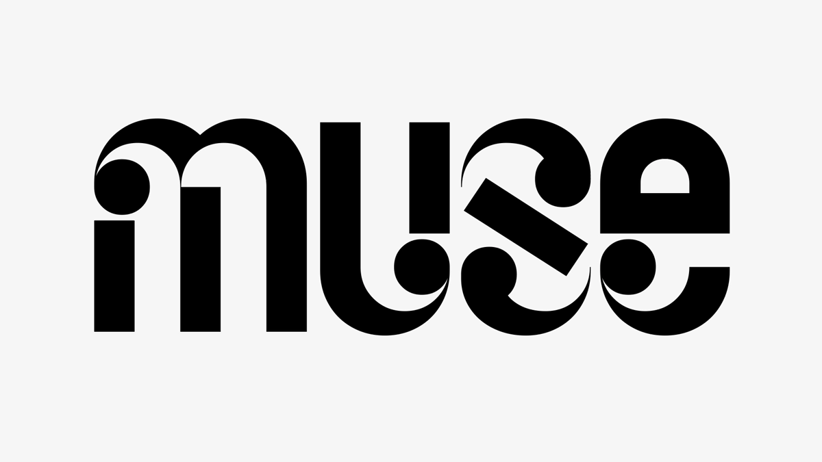
Working on the first sketches of the logo, we focused on redefining the historical sign on the cinema building’s façade with a whimsical У as one of the main features (together with the impressive length of the venue’s title). In addition, Anna suggested combining sans and serif in the logo. So in our first sketches (options ①②③ below) we concentrated on the search for the graphic rhyme of letters in words ‘Cinema’ (in Russian, ‘Kinoteatr’) and ‘Khudozhestvenny’ and the overall composition of the wordmark.
Concurrently, having looked at the developments of the identity, we noted how it aligned with art deco and immediately thought back to the font I had started. It seemed somewhat symbolic to use a font based on Moscow’s artifact for the logo of one of the capital’s landmark attractions.
We suggested it as one of the options for the logo (option ④), and a month later the client got back to us saying that they were willing to get the typeface and use it not just in the logo, but in the whole identity of the brand. Its character set at that time was very truncated, and there was still much work to be done. So I rolled up my sleeves and got down to work.
Initially, we decided to go for a very tight spacing, which is particularly unusual for Cyrillic. We liked the rhythm they created and the way the typeface worked in headlines—compactly, densely, and brightly. And the layouts showed clearly that the idea proved itself just as we expected. I really wanted to keep the odd proportion, and for a very narrow M, I had to find pairs in the alphabet. I quickly came up with a rhyming W in the Latin alphabet, whether with the Cyrillic one the solution didn’t turn up as easily.
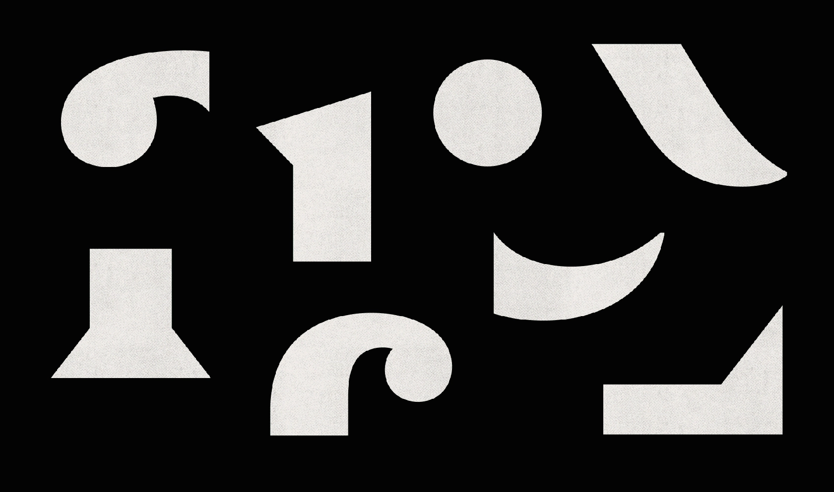
Then I took a radical decision to make constructions of the letters К and Ж different. Usually, designers try to deliberately avoid this kind of Ж with intersecting diagonals and choose for it a simpler form, as opposed to a complex K. I went with a more complex structure, and this, on one hand, became kind of a reference to the early Soviet tradition of architectural lettering, and on the other hand—helped me solve the rhythmic problem. Graphically, I didn’t want to retreat into historicism completely, and I tried to keep the project on the verge of old and modern, which affected the details—thin endings of the terminals У, C, Э, J, S, as well as in the numbers.
In addition to the standard set of characters in the typeface we decided to add a set of ordinals, a tradition that is widely spread in the Latin alphabet, but not in the Cyrillic one. That is even despite the fact that, judging by the plates of the 19th-mid-20th centuries, this typographic feature was widespread in the Cyrillic no less than in the Latin alphabet. And today it’s almost forgotten. So this is why I wanted to restore and support this tradition in the font.
Client: Khudozhestvenny Cinema
Typeface: Liza Rasskazova
Identity: Anna Kulachek
Editor: Susanna Agabayan


