Hamburgerfonts—a mix-and-match type specimen for better font pairings
Type specimens often fall into two camps: the traditional and the avant-garde. The traditional ones do little to inspire designers, while the avant-garde can become so focused on concepts that they forget to showcase the actual typefaces.
We asked our creative partners—The Office of Ordinary Things—to come up with something different. The goal was to break the mold with a concept that both elevates and emphasizes the typefaces in our catalog, and excites designers to use them in their own projects.
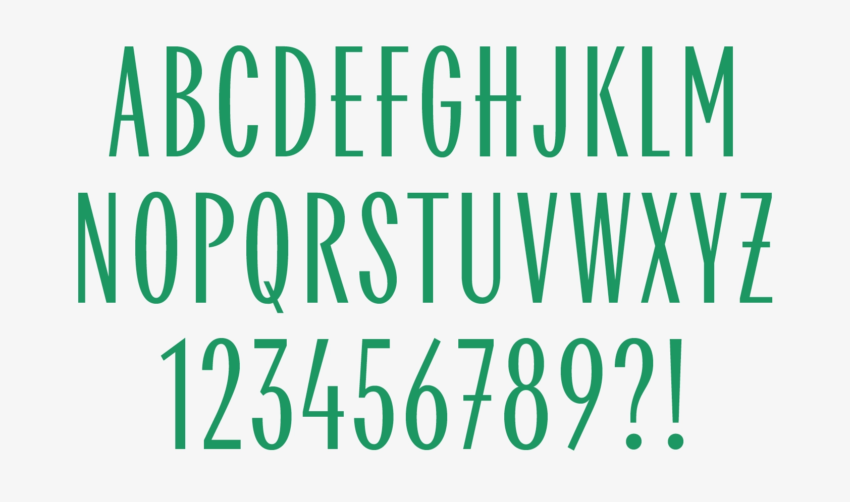
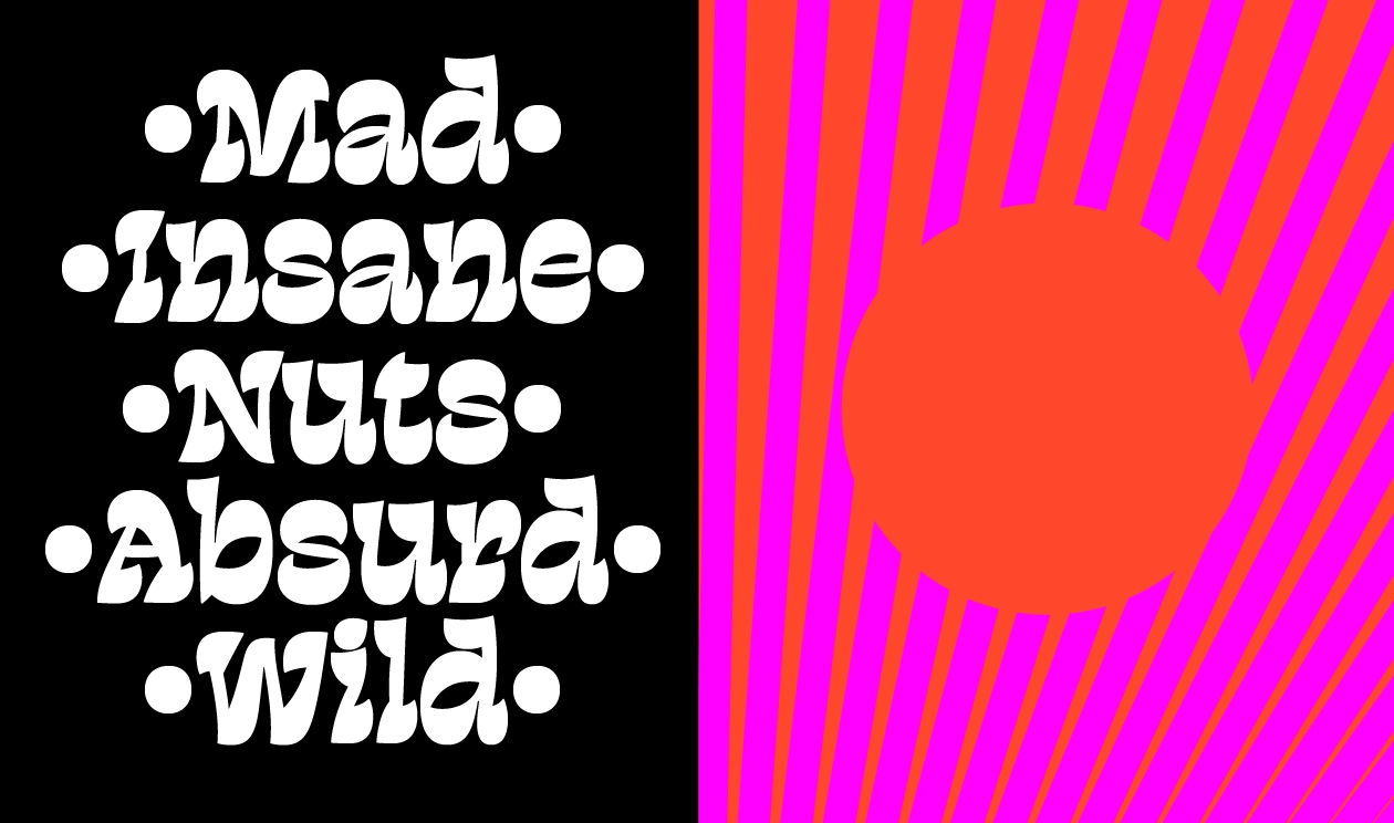
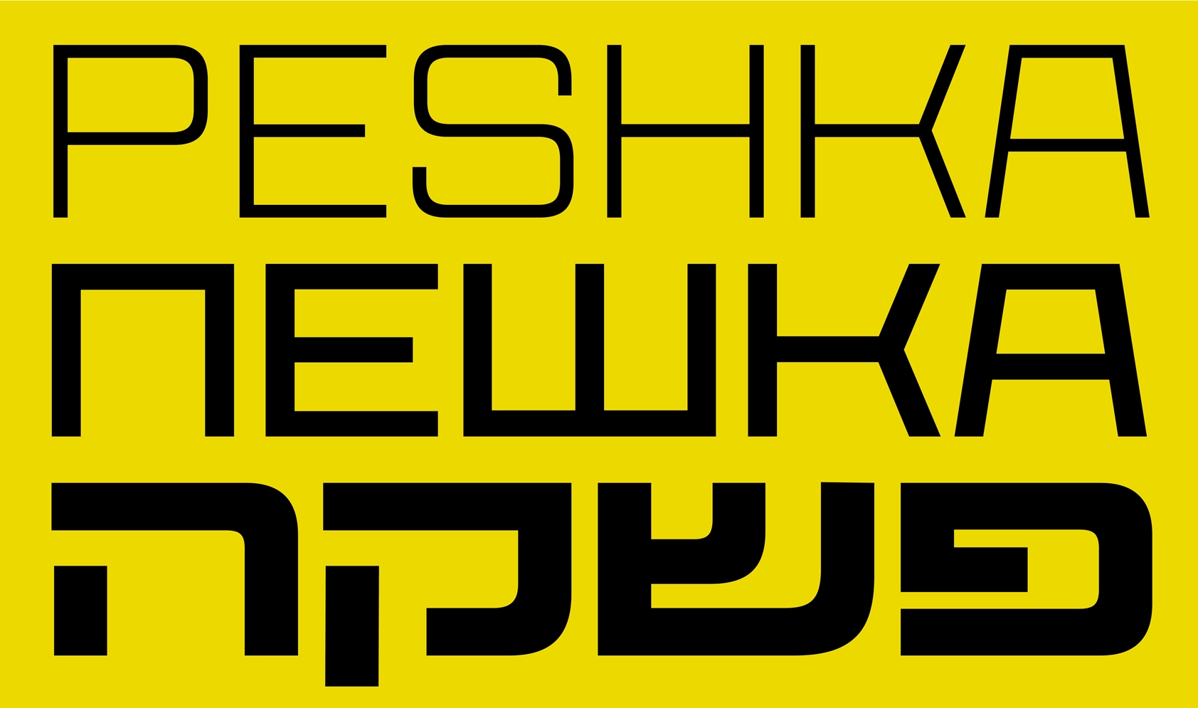
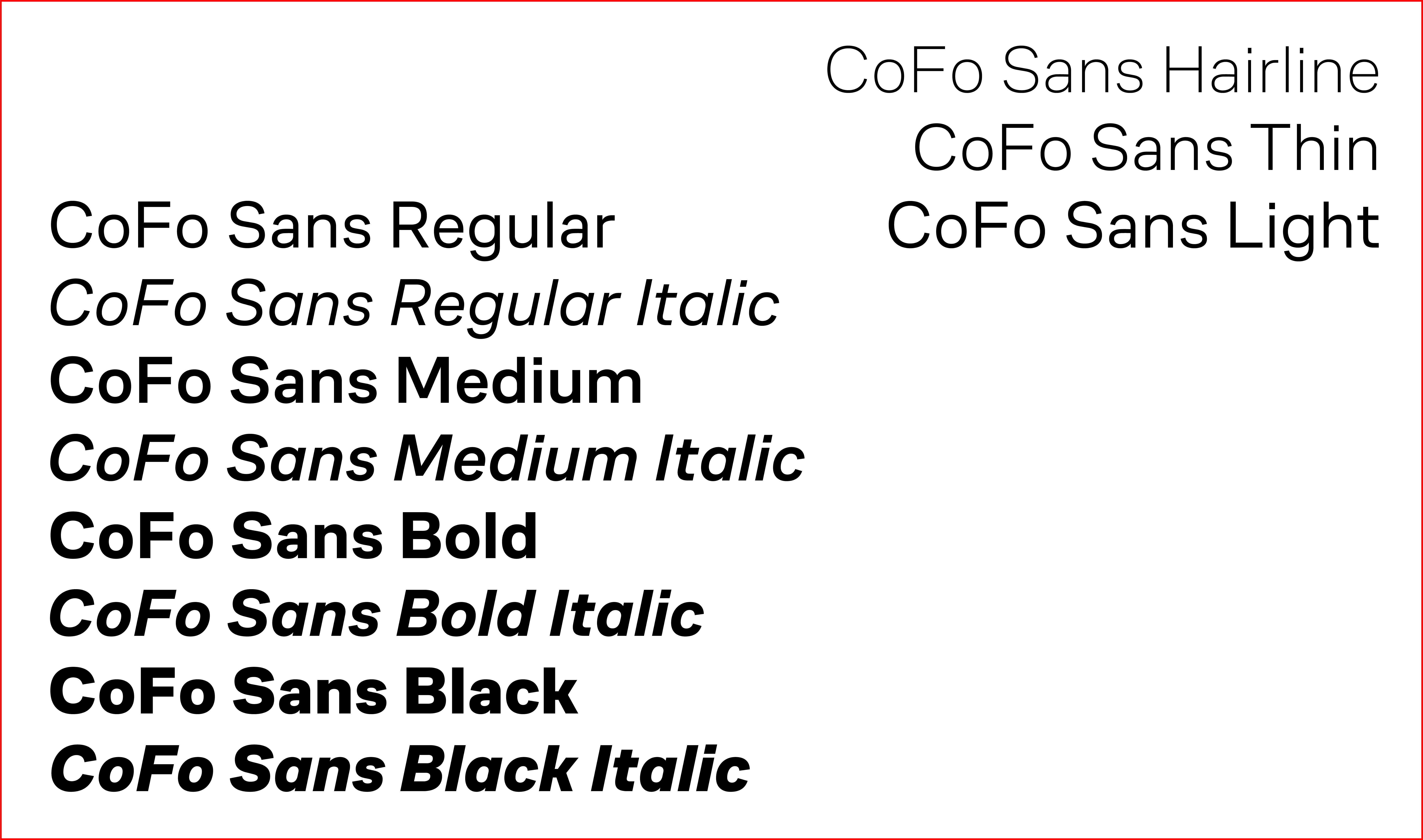
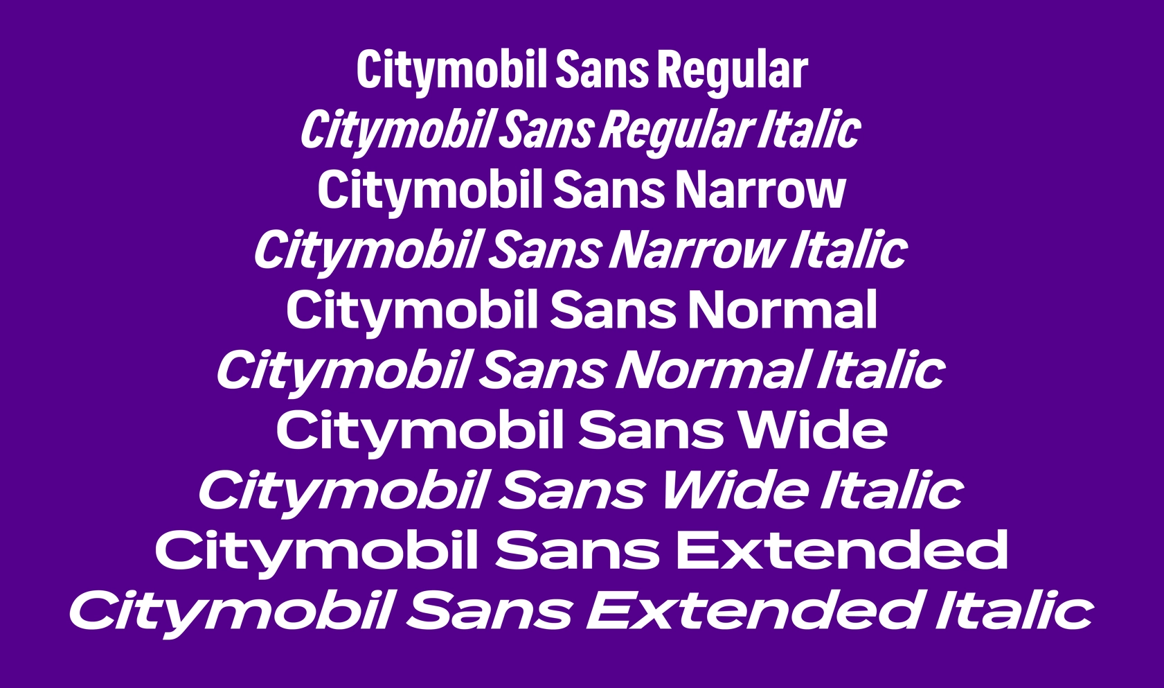
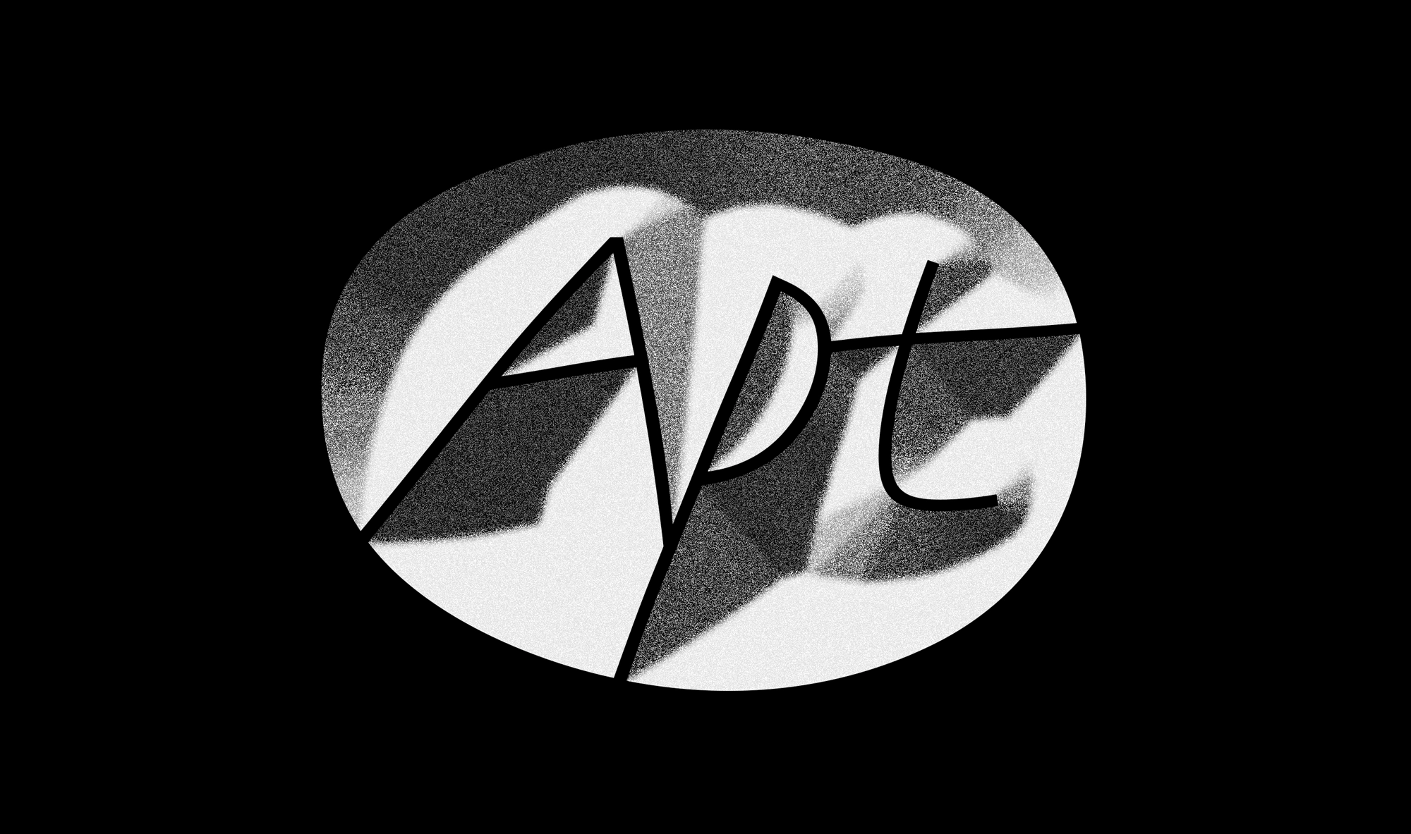
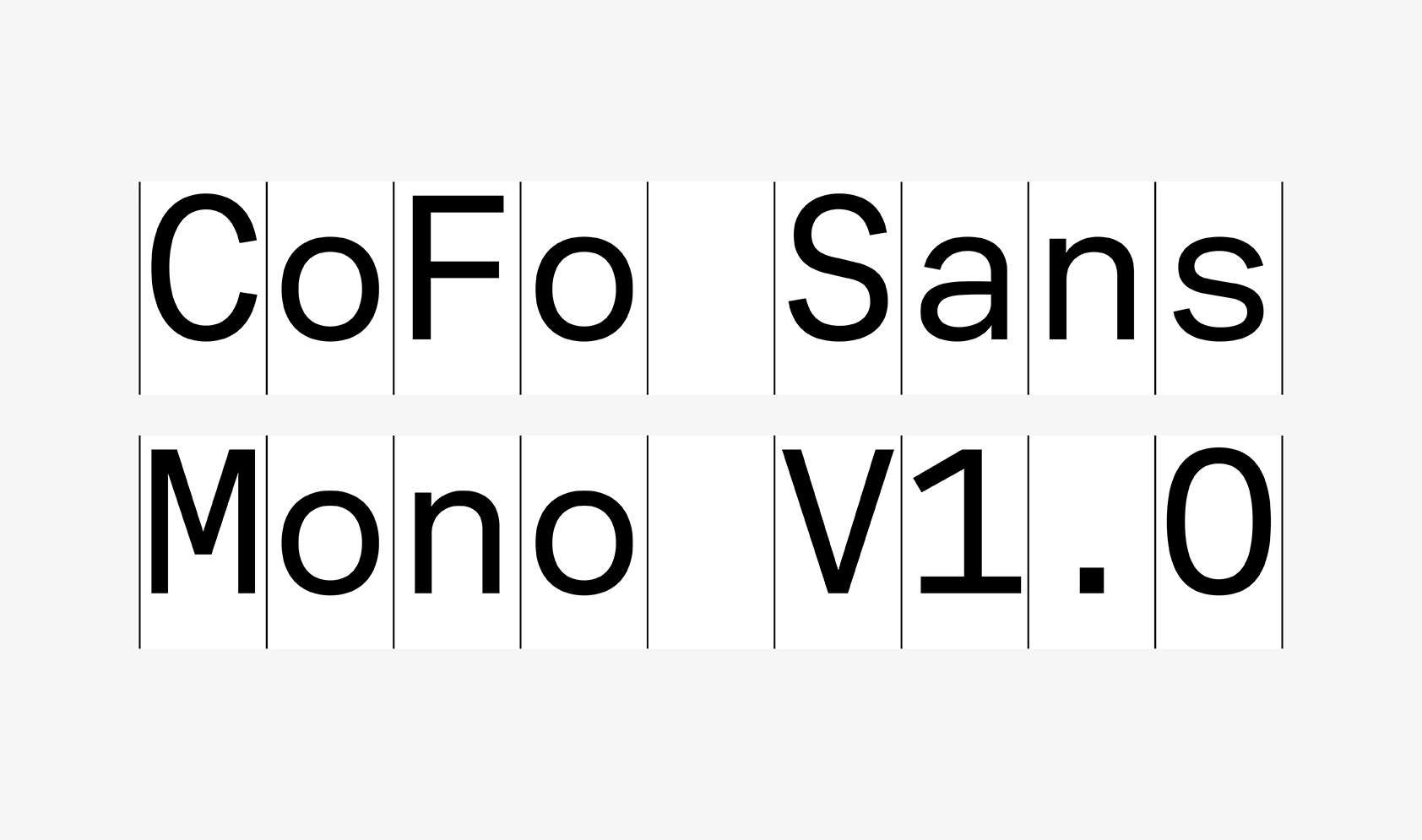
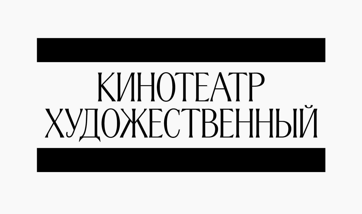
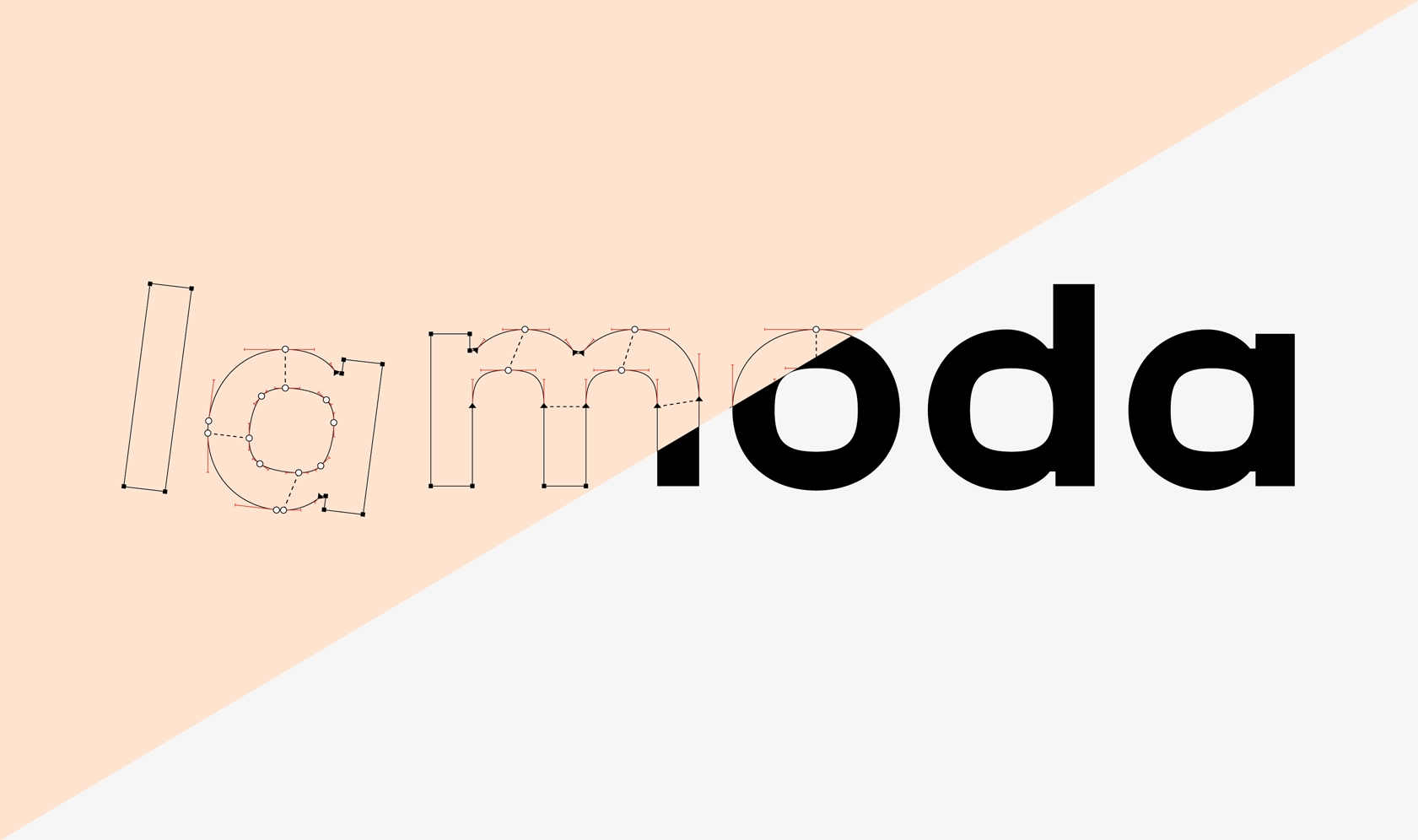
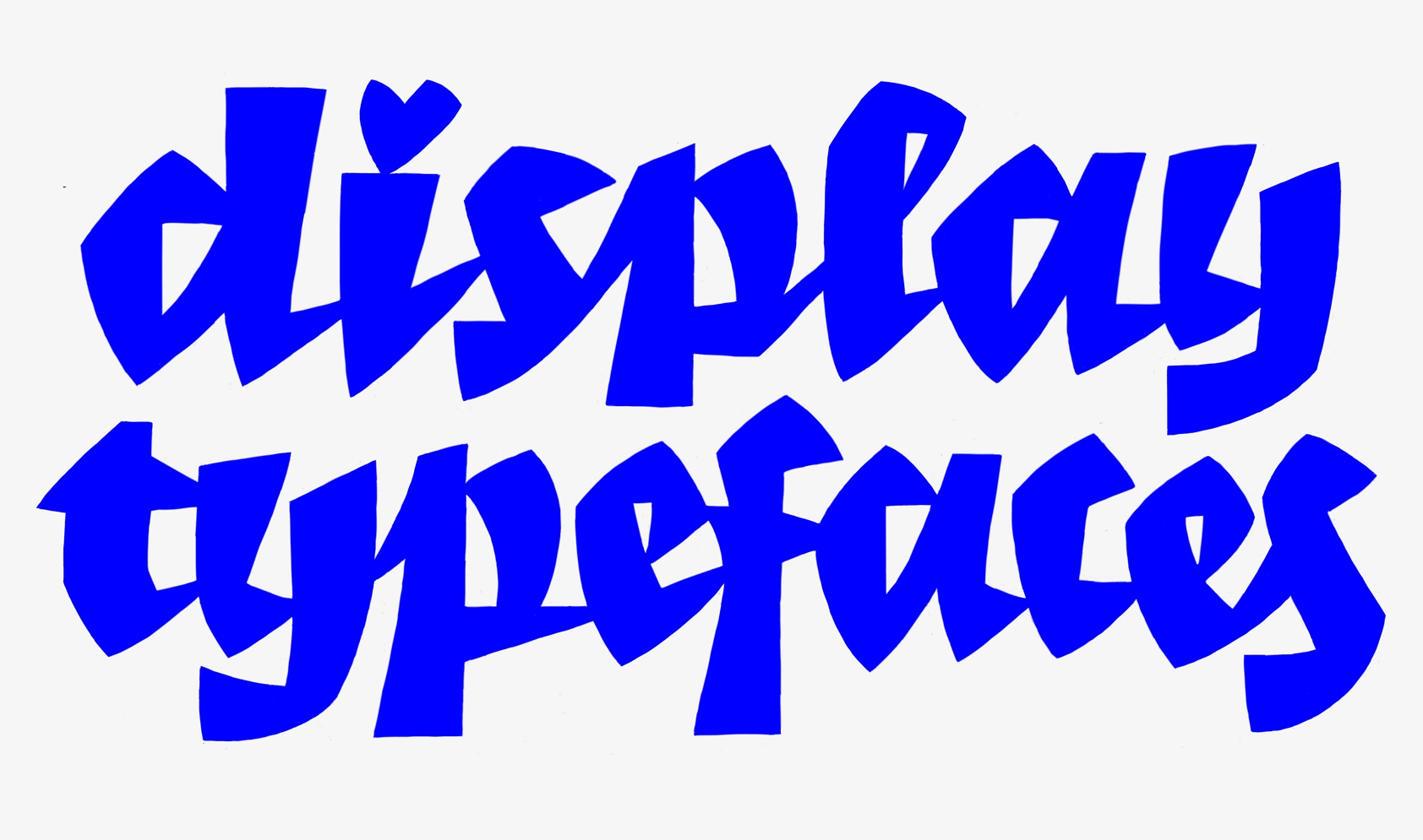
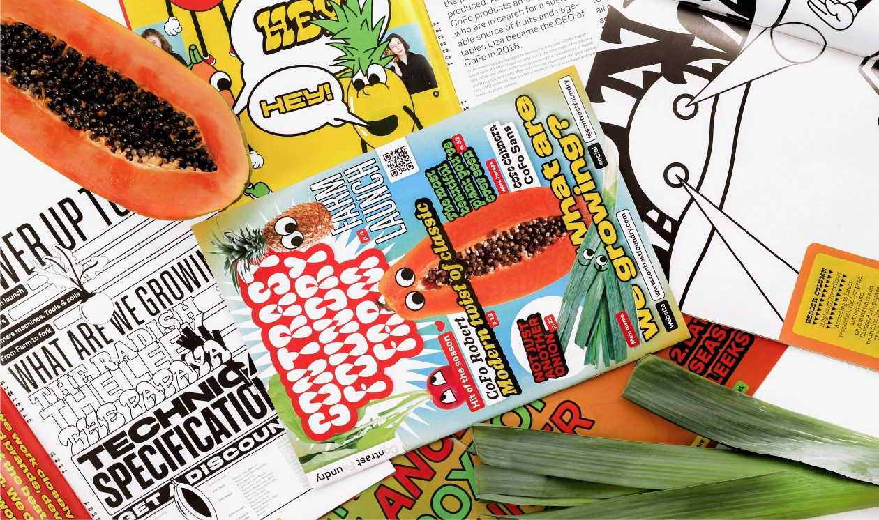
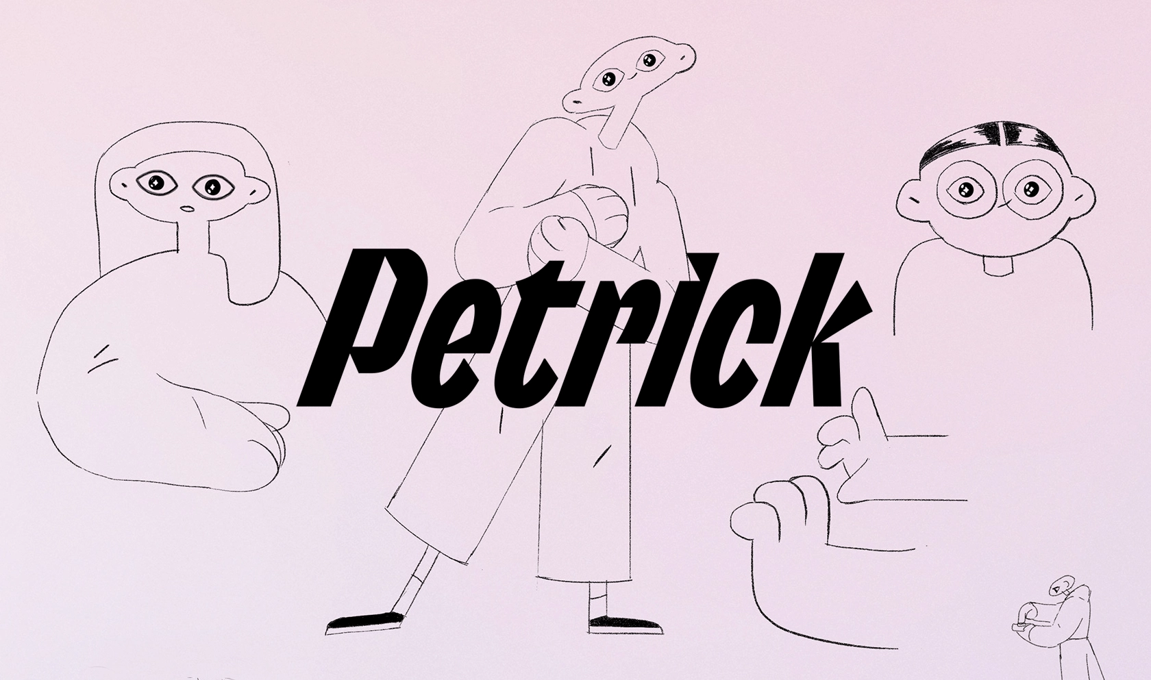
Inspired by its infamous namesake, Hamburgerfonts is a typeface specimen book cooked up (*ba dum tss* … sorry) to showcase the wide array of retail typefaces by Contrast Foundry (aka CoFo) and help designers create the best font pairings. The specimen highlights each font in the CoFo library, dividing the typefaces into three categories: Protein (Display Type), Veggies (Body Type), and Condiments (Supportive Type).
Utilizing the format of a mix-and-match children’s book, the unique structure allows readers to create their own delicious typographic creations by combining various typefaces/ingredients—leaving them hungry for more (*ba dum tss*… wow, truly sorry).
Order Hamburgerfonts:
https://contrastfoundry.com/store
CREDITS
Design & Concept
The Office of Ordinary Things
(Jonny Black, Giorgia Sage, Camille Gwise)
Illustrations
The Office of Ordinary Things
(Jonny Black, Giorgia Sage, Camille Gwise)
Contrast Foundry
(Egor Golovyrin, Nikita Sapozhkov)
Printing
MCRL Overseas Group


