Developing a typeface with COLLINS for Muse Group
Contrast Foundry had the rare and exciting opportunity to collaborate with COLLINS on a project supported by their co-founder, Brian Collins. We’re honored to open with his words:
“Muse Group is one of the quiet giants of the digital age—four hundred million people learning, tinkering and making music with its beloved products, including Ultimate Guitar, MuseScore, Audacity, MuseClass and Muse Hub. Yet for all that reach, it was a brand without a face. When the team at COLLINS was invited in, they didn’t just set out to polish its identity. They worked to transform and signal what the company really meant. Their rallying cry became “creative fluency”—the elusive moment when skill and instinct merge, when a musician stops thinking and simply plays. Around that insight, COLLINS built a new identity and operating system, every element designed to carry that sense of movement, rhythm, and possibility, including typography.
At the center of the typographic transformation stood Contrast Foundry. CoFo was asked to turn an idea—created by COLLINS design leaders Indgila Samad Ali, Rebeka Arce and Nick Ace—into something tactile, something that could sing on a screen and a billboard. Indgila had designed a typeface that could hold the pulse of the brand, something human yet exacting, lyrical but never soft. Contrast Foundry took that design and engineered it into a complete typeface. CoFo turned her work into visual music—Muse Display, a four-style family that feels alive in motion, complemented by custom versions of CoFo Sans and CoFo Sans Mono to carry the new identity through every corner of Muse Group’s universe.
Original concept sketches from COLLINS
The challenge Muse faced wasn’t unlike what so many creators confront: the yawning space between imagination and execution. They called it “the gap,” that place where inspiration stalls, where nine out of ten beginners quit before finding their stride. Muse’s ambition—and COLLINS’s north star—was to close that gap, to make music-making feel fluid and natural again. The rebrand was less about technology and more about compassion: helping people reach a state of creative fluency, where the act of creation itself becomes as natural as breathing.
Now, the new Muse identity hums across every surface the company touches—apps, interfaces, campaigns, instruments of expression. It has reorganized not just the look of the company but its soul. What began as a suite of disparate tools now moves like an orchestra, tuned to one purpose: to help anyone, anywhere, find their sound and follow it. And threaded through that harmony is the quiet precision of Contrast Foundry’s work—a reminder that even in a digital age, it’s still the hands of craftsmen that give ideas their tone and timbre. And hands like Indgila’s, shaping the rhythm at the heart of it all.
”
Brian Collins, co-founder of COLLINS
This project presented one of our favorite technical challenges: to bring to life an idea that at first seemed impossible to execute. How the concept of the typeface was born, how it evolved, the difficulties we encountered, and how we solved them—all of this is shared in the story of its creation.
The concept behind Muse Display
Musical staff, modules, and styles for different products
The original concept from COLLINS envisioned the display styles as being composed of several strictly defined modules, with each style having its own set. This gave the typeface a resemblance to sheet music, composed of stems, dots, and tails.
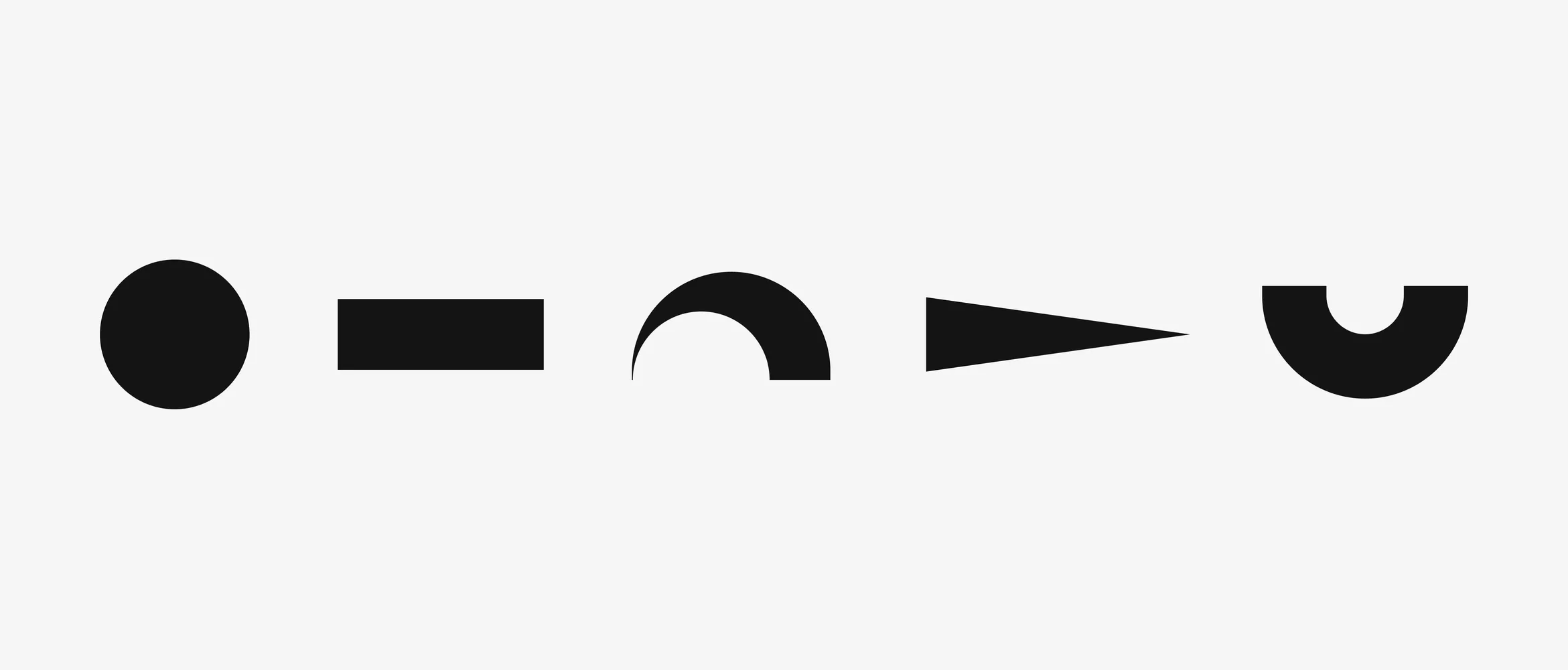
A modern musical staff consists of five horizontal lines, which became the guides for the modular styles of Muse Display. Uppercase letters reached the height of four lines, while lowercase letters occupied three. Just like with low notes, for the descenders, we allowed ourselves to add a sixth guide.
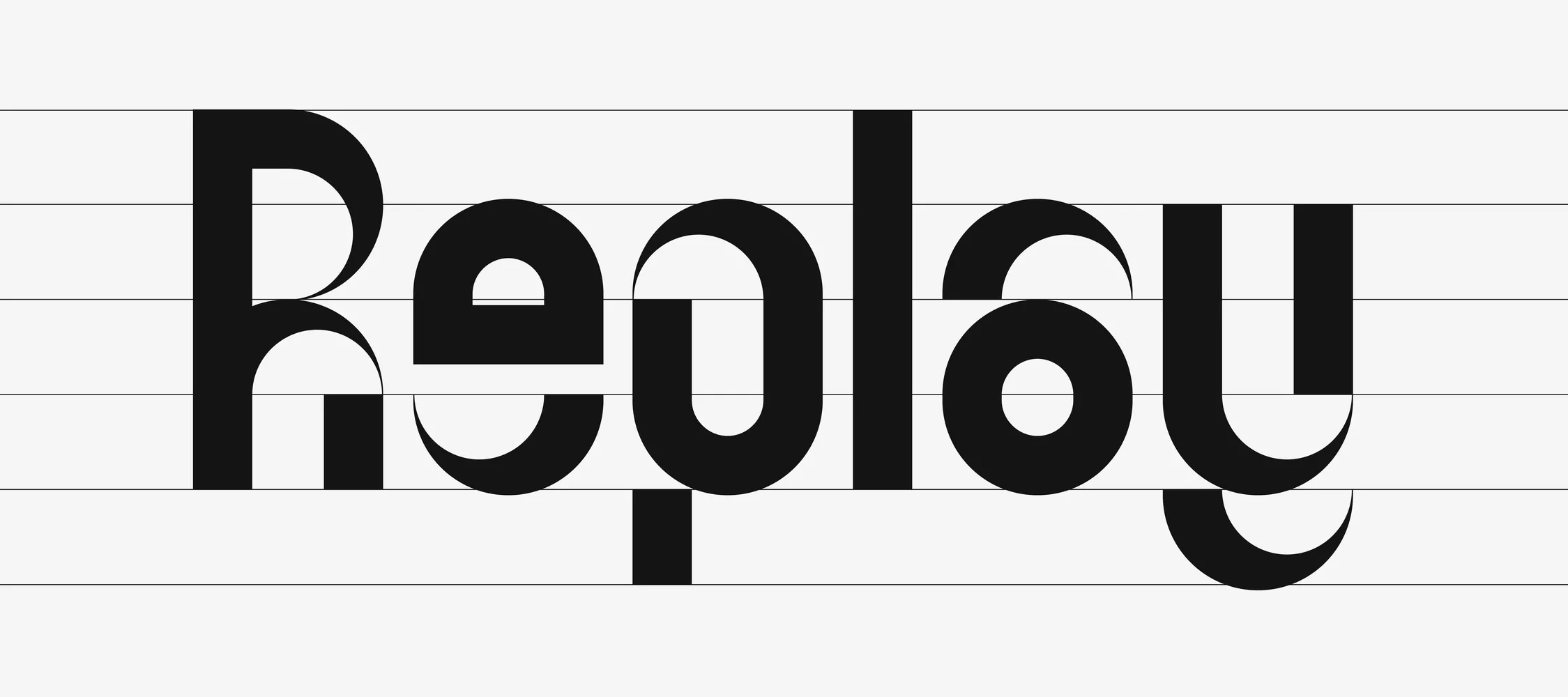

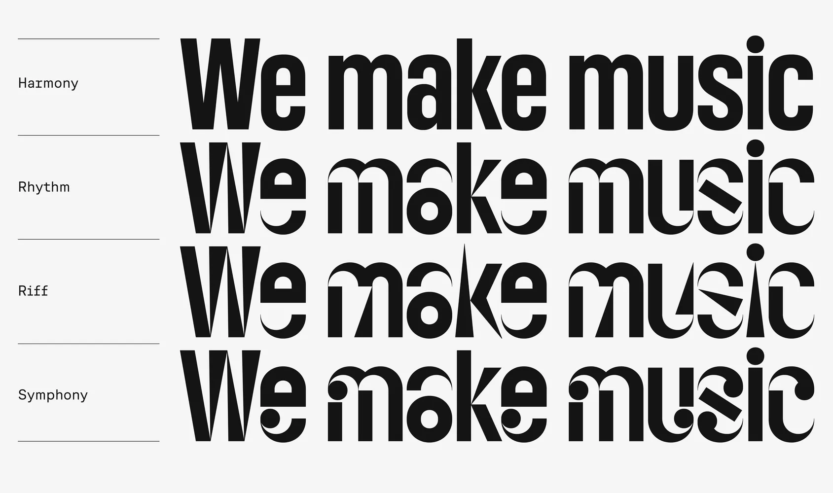
Thus, the idea of the three modular styles of Muse Display—Rhythm, Riff, and Symphony—was born.
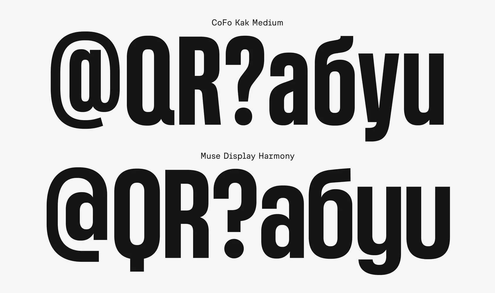
Alongside them, something equally bold and condensed, but more neutral was needed. Indgila tested numerous typefaces, but ultimately settled on CoFo Kak Medium from our collection. The appropriate weight, proportions, tall lowercase letters, compact descenders, round dots, and overall softness influenced the decision. However, we made some noticeable changes to CoFo Kak Medium to align with COLLINS’ concept, and it became Muse Display Harmony (read more below). In the Muse Display typographical system, Harmony serves as the primary typeface for headlines.
The first challenges and deviations from the system
One of the main technical challenges in translating COLLINS’ concept was finding the right balance between following the modular system and allowing for optical adjustments where needed. Despite all the modularity, sometimes deviating from the rules helps crystallize the idea and understand what is an essential part and what is secondary and can be adjusted.
The primary task was to unify the proportions of the lowercase, uppercase, and descender elements across all four styles without breaking the system.
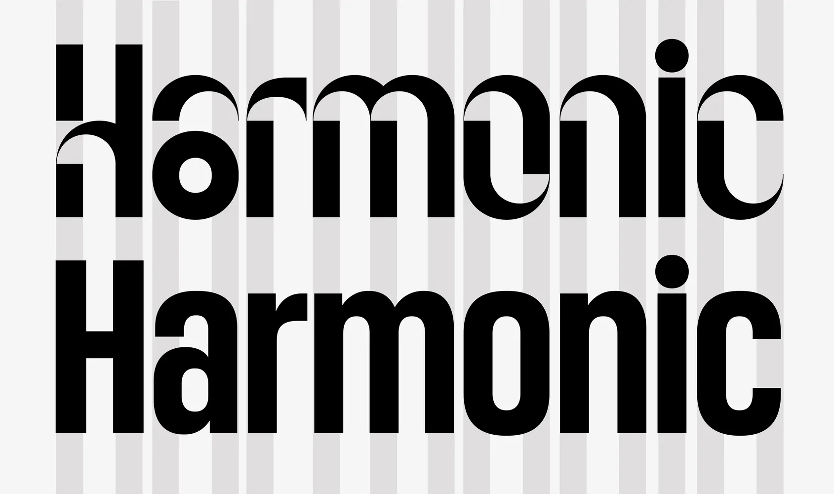
One of the first exceptions was increasing the height of the lowercase letters. While musical lines were the foundation, we had to ask—how important are they if the typeface is less legible and doesn’t work well in headlines?
Initially, lowercase letters in the modular styles were three-quarters the height of the uppercase letters. However, in the first tests, we realized that the lowercase were too small, so we decided to deviate from the structure of five musical lines and aligned them to CoFo Kak.
This wasn’t our first experience working with a modular typeface; our collection includes the industrial CoFo Kabeltouw, so we weren’t afraid to expand the module set and occasionally break the strict logic.
The same, but not the same
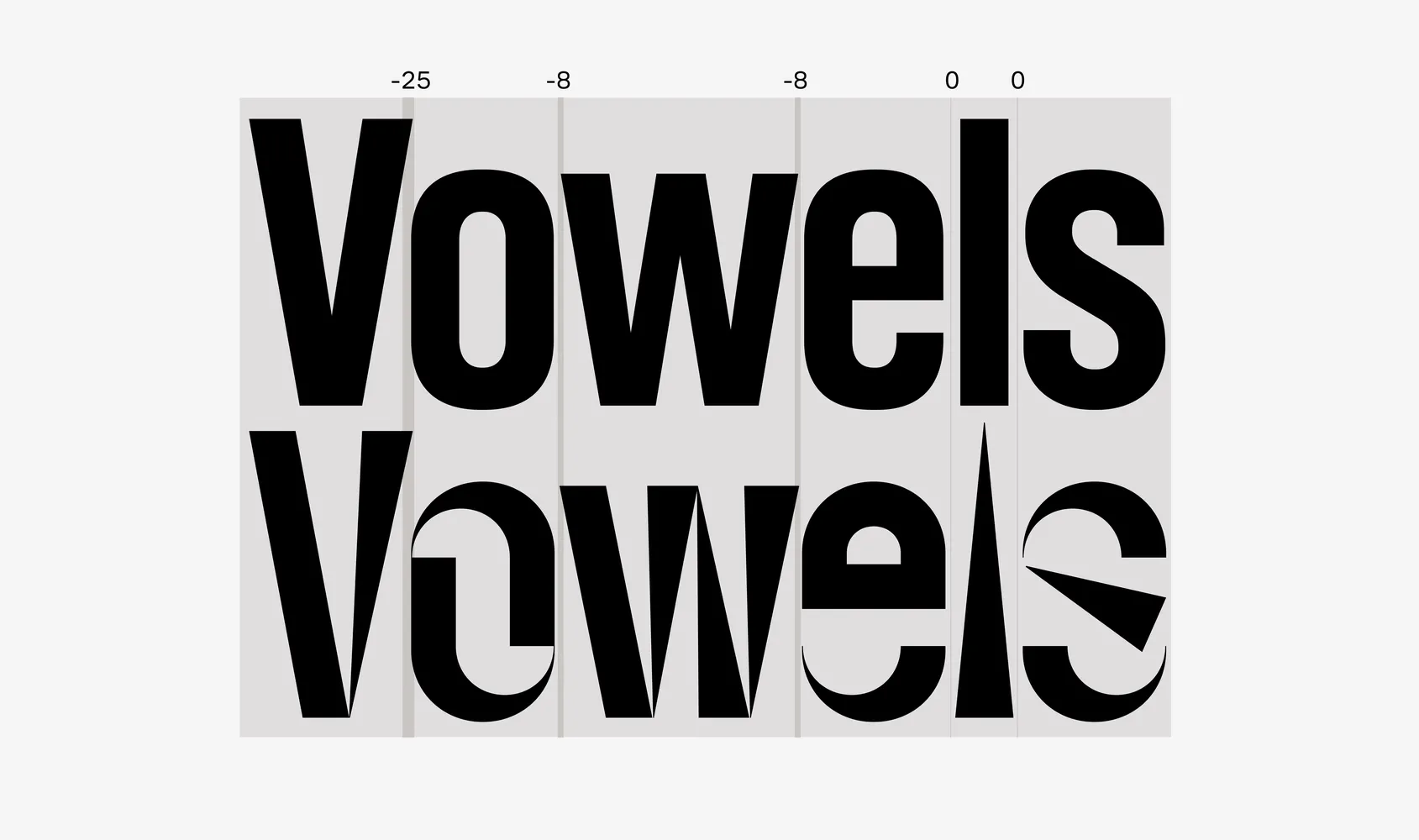
The most important thing for us was ensuring that the text set in multiple styles looked consistent in terms of weight. So, we adjusted the stems in the display styles and Muse Display Harmony with different widths! In Harmony, the uppercase stems are slightly thicker than the lowercase, but in the display styles, both upper and lowercase have equal stem widths.
Moving away from a mathematical circle
The rounded forms in the modular styles were initially built on a mathematical circle. In CoFo Kak, on the other hand, the ovals did not try to mimic a circle. We needed to reconcile the shapes—CoFo Kak became slightly wider and rounder, and we optically adjusted the geometric radii of the display styles to make them look more natural.
We also altered the constructions of many CoFo Kak glyphs: Q R Я a g u y б @ and ? This helped to embrace the roundness even more.
Ah, the duplex!
Animation and interpolation
One key feature of the Muse Display family is the duplex nature of the styles. This means that the same letter in different styles retains the same width, so when switching between styles, the overall width of the text remains unchanged.
Duplexing presented a challenge—balancing the “normal” Harmony style with traditional proportions and the three modular styles, where letters are constructed based on their logic and can’t benefit from optical compensation and precise proportion balancing.
Stiffness, rhythm, and exceptions to the rules
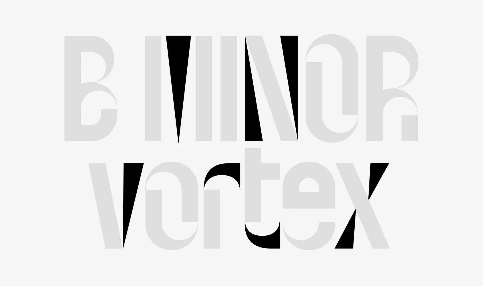
We aimed for a compromise between adhering to the rigidity and logic of Rhythm, Riff, and Symphony on one hand, and the naturalness and familiarity to the eye of Harmony on the other. The constructions of the letters did not compromise. The most challenging were the narrow J j f t r and triangular letters Vv W w Xx Yy M N. The narrow glyphs in the modular styles turned out disproportionately wide, and the triangular ones were either too wide or did not match the construction of the Harmony style. We solved this problem by adding new modules based on the existing ones.
Perfect kerning
We understood that the more consistent the shapes, the easier it would be to replace letters from different styles without affecting kerning. This was crucial for maintaining duplex consistency.
Note: Kerning between styles is technically impossible. If a letter from one style is replaced with one from another, it won’t kern with its neighboring letters. Therefore, designers may have to manually adjust kerning in specific cases.
Additional glyphs and numbers. Alternatives
Typically, we prefer not to design many alternative glyphs, but Muse Display broke all the rules from the start, so we decided to go along with it.
Muse Display offers a variety of alternatives to further enhance its personality. These include a musical set for letters like b d p q h, and k, and a minimalist j.
Designing the numerals, historically different from letters, wasn’t straightforward. The first set of numerals we created from the existing modules looked unnatural even in such a bold and rebellious typeface. So, we added a few unique modules and vibrant alternatives.
These stylistic sets provide a range of creative possibilities for your typography, allowing you to customize Muse Display to meet your design needs.
Muse Icons
In addition to the typefaces, we supported COLLINS in refining the product icon designs. Originally the icons were strictly modular, referencing the modular styles of Muse Display. In the process of refinements we stepped off the grid where it was necessary for the visual balance. We used the base plasticity of the typeface’s modules: the geometric round elements, sharpness, and massiveness of details, while focusing on optical adjustments and small-scale screen performance. For instance, we proposed an adjustment to the thin stroke in the initial sketch of the Audacity symbol—such an element didn’t appear in Muse Display and didn’t work at a small scale.
COLLINS: Muse Group (Copyright © COLLINS, 2025)
In conclusion
How strict of a system you can build with the least amount of modules? This project definitely challenged our skepticism about modularity in typeface design. But there was no Cyrillic in Muse Display! So we convinced ourselves that everything is possible when you just need to design for the English language!
In the end we believe that together with our partners at COLLINS we succeeded in creating a typographical system that reflects the dynamic and uncompromising character of the Muse Group brand. From logos and icons to the meticulously crafted styles of Muse Display—the entire system works in harmony like a well-tuned orchestra.
Credits
CONTRAST FOUNDRY
Maria Doreuli
Egor Golovyrin
Liza Rasskazova
Mastering: Tasya Petelina
Motion: Anna Volkova
COLLINS
Rebeka Arce
Indgila Samad Ali
Nicole Cousins
Beth Johnson
Mariah Bush
Cas Malo
Madeleine Carrucan
Tomas Markevicius
John Choi
Taylor Zahrt
Nick Ace
Taamrat Amaize
Michael Di Leo
Gianluca Alla
Alex Athanasiou
MUSE GROUP
Yury Vetrov
Vitaly Rynsky
Valentin Ladyagin
Lena Kireeva
Jack Sutton
Sophie Browness
Muse Group Product & Creative Teams
Photography & Videography
Jared Ryder
Styling
Liz Borger
Music & Sound Design
Rohan Rege