CoFo Friend: Is it the curves, or are we just getting along?
Article by Maria Doreuli
Date: November 18th, 2026
What makes a typeface a good friend? Is it the curves, the proportions, its versatility, or simply the way everything comes together?
CoFo Friend is my neo-grotesque, designed to feel contemporary, approachable, and confident. It shares some of its DNA with CoFo Sans, yet takes a different direction. The shapes are more rounded, the proportions more relaxed, and the overall character is less rigid. The family runs from Hairline to Extra Black, 7 styles in all, with a set of interface icons to match. It’s a typeface that knows how to blend into a design without losing its own personality.
But the story behind CoFo Friend is not about finding the perfect formula for friendliness. It’s about revisiting familiar design decisions, questioning old habits, and trying something new.
A Friend of CoFo Sans?
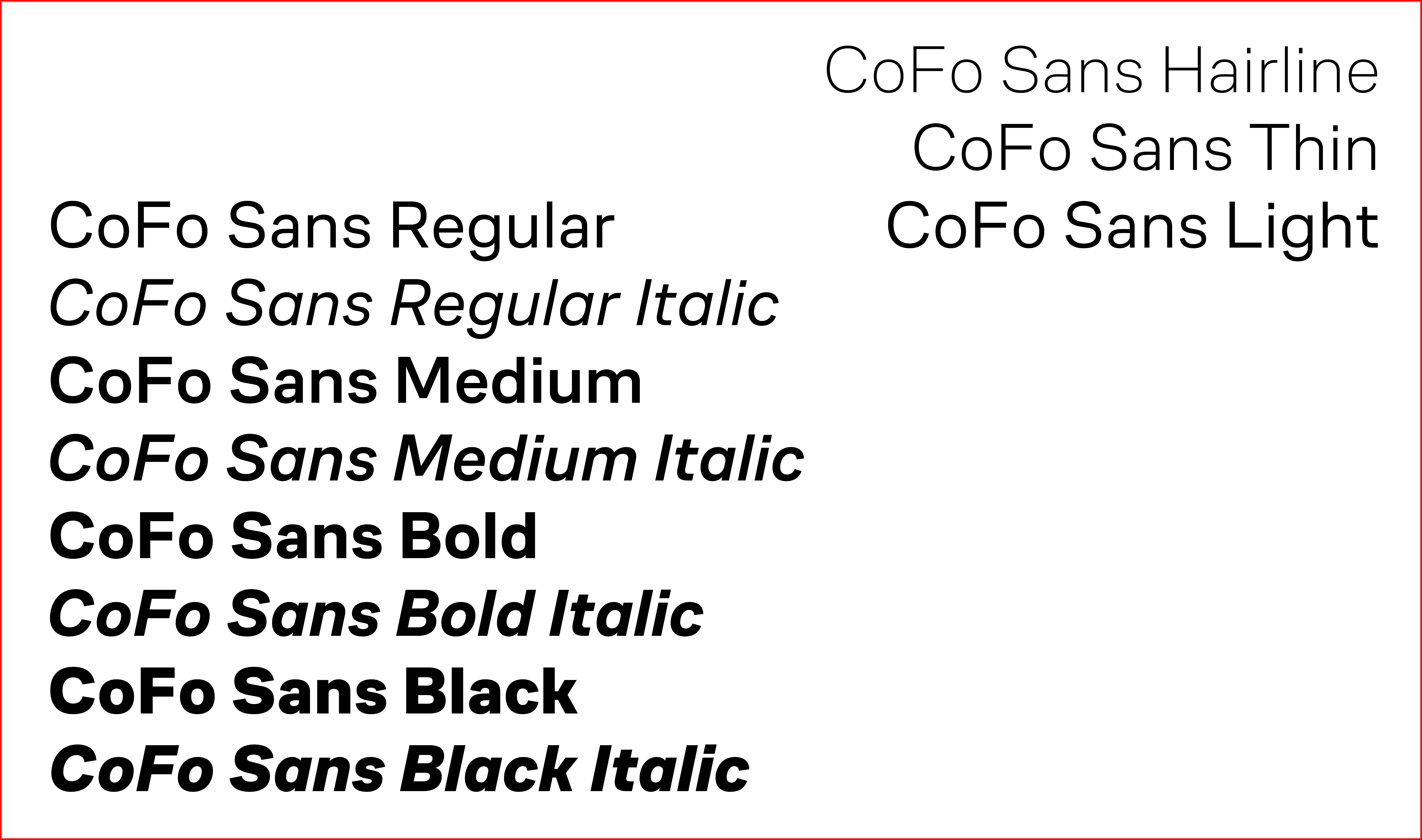
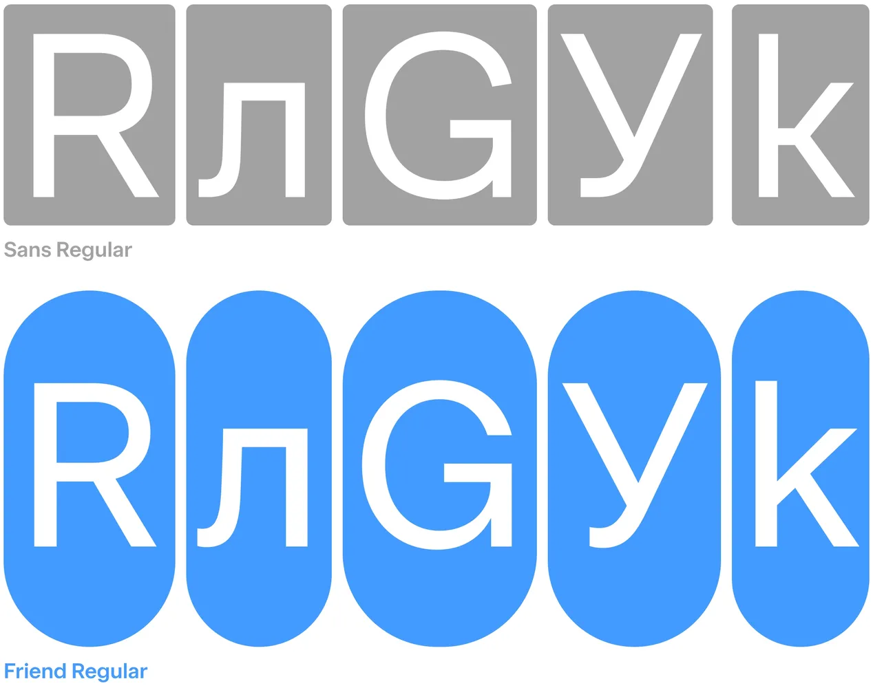
I like to think of my typefaces as an ongoing evolution. Each new design is an opportunity to come back to previous decisions and explore different solutions. CoFo Friend is no exception. In fact, you could call it something of an antagonist to CoFo Sans.
One of the defining characteristics of CoFo Sans is its slightly squarish construction. This was not simply an aesthetic decision. Latin contains many rounded forms, while Cyrillic has a greater number of square letters. Balancing the internal and external spaces between the two scripts can be challenging in geometric sans serifs. The squarish ovals of CoFo Sans were one way I addressed this.
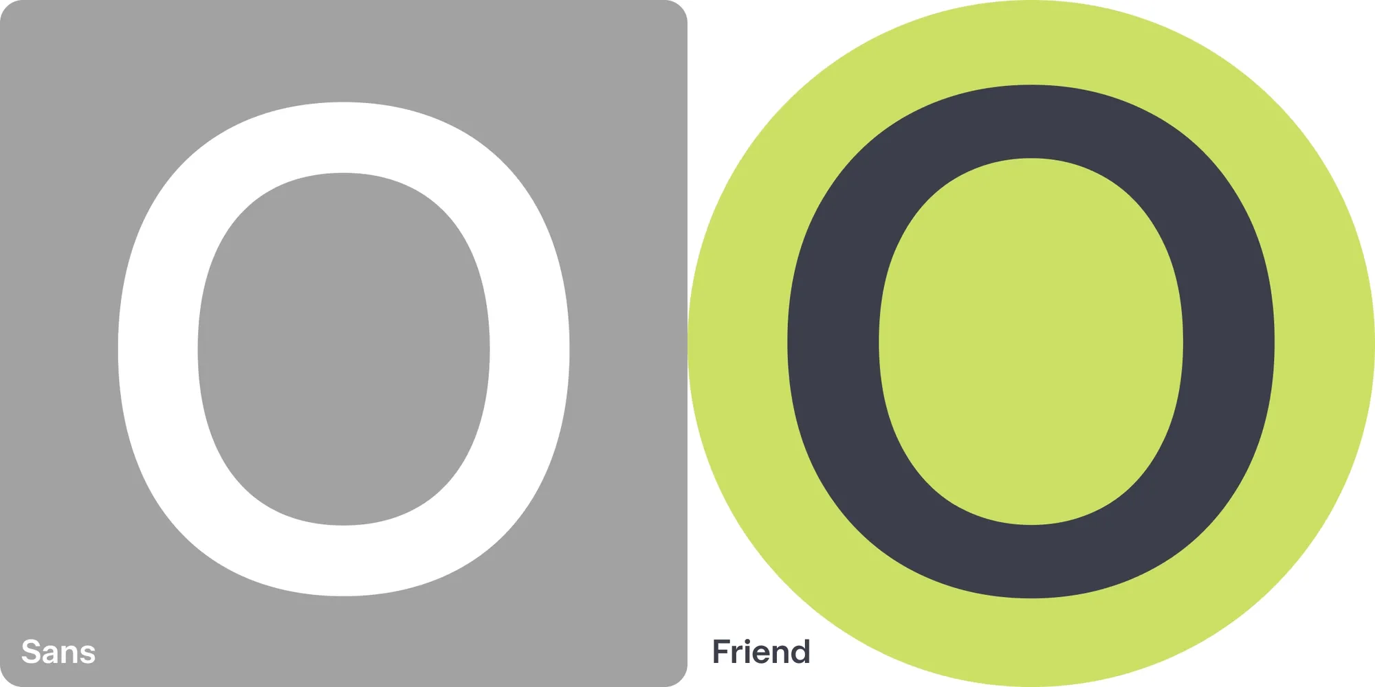
With CoFo Friend, I wanted to try solving this in the opposite way. The ovals are rounder, but not strictly geometric. Their curves flow smoothly, giving the design a sleeker, more approachable appearance without making it feel overly playful or technological.
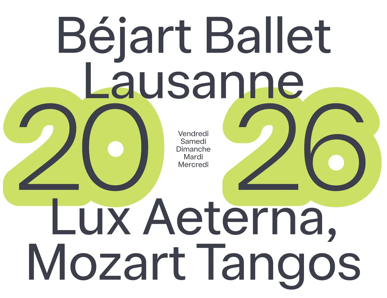
The idea was to create a typeface that could work across a wide variety of projects, particularly those where typography needs to play a solid supporting role without dominating the overall design. Like a true friend.
I imagine CoFo Friend being used for projects where typography can stay in the background and let other things shine—color, composition, illustration, anything.
CoFo Friend didn’t begin with a particular historical reference or an extensive research project. Instead, I relied on experience, intuition, and my understanding of how letterforms work together. Not every typeface needs an elaborate list of references behind it. Sometimes a design decision simply comes from knowing what feels right.
It’s All in the Curves (and the Dots)
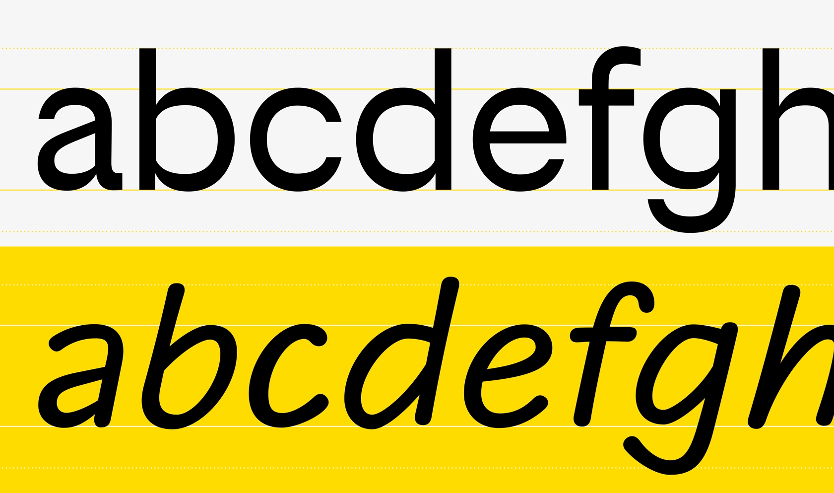
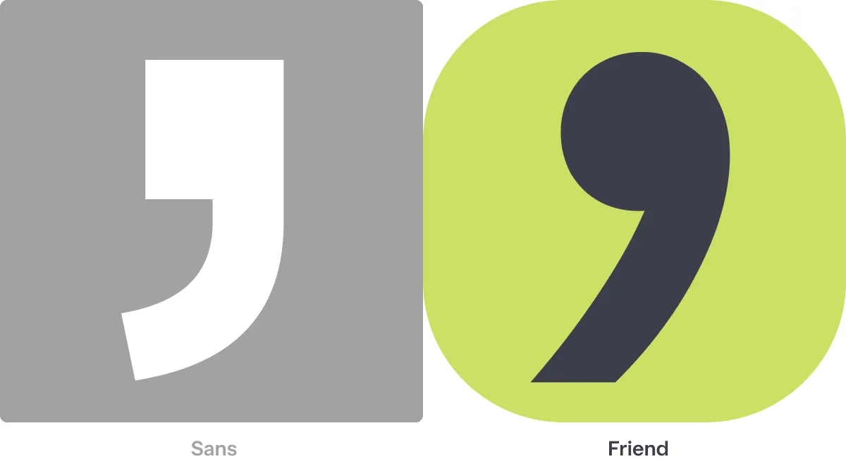
Some of the most recognizable differences between CoFo Friend and CoFo Sans are in the smallest details. Take the dots on the i and j. In CoFo Sans, they are square. In CoFo Friend, they are round. A seemingly minor decision, but one that changes the overall tone of the design.
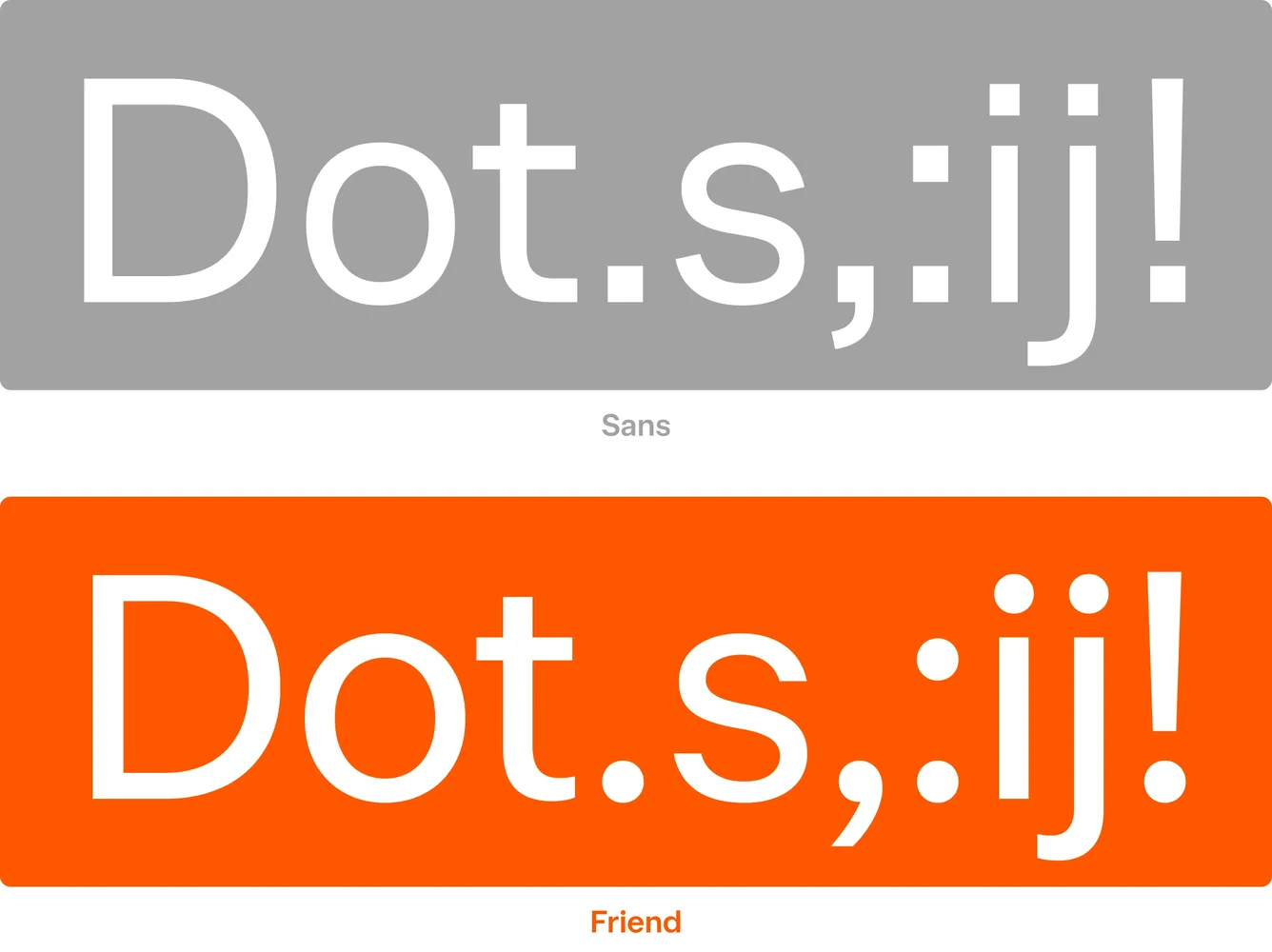
I was just as determined to use round dots in CoFo Friend as I had been to use square ones in CoFo Sans. Of course, after numerous requests, we introduced a stylistic set with rounded dots in CoFo Sans Pro earlier this year. Apparently, people have strong feelings about their dots. I do too!
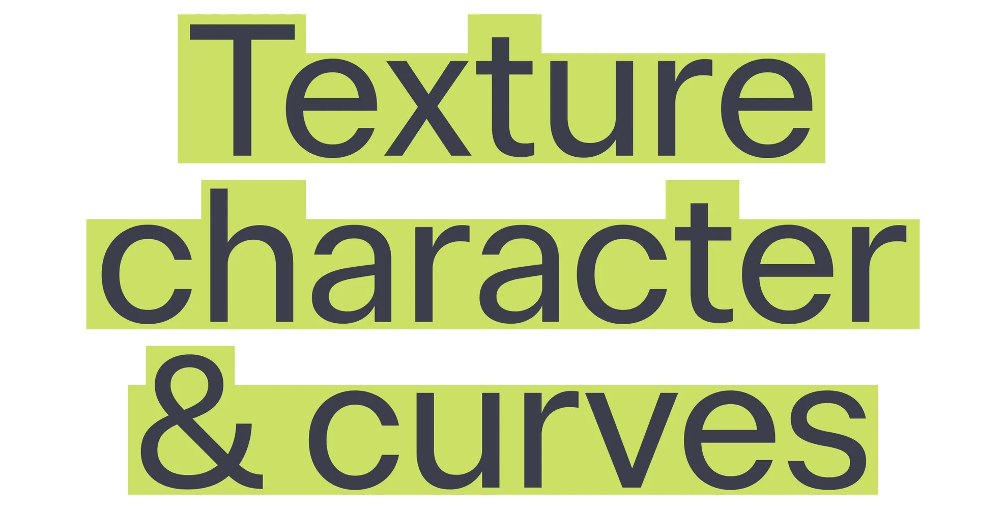
Another defining characteristic is the particularly high x-height. I pushed it as far as possible while maintaining comfortable proportions and legibility. This gives lowercase letters a stronger presence, allowing the typeface to feel bigger even at smaller point sizes.
The ascenders and descenders are compact for similar reasons, allowing tighter line spacing in headlines, banners, and social media graphics. Together, these decisions give CoFo Friend a dense yet comfortable texture, with smooth curves and an inviting character.
When Less Personality Gives More Opportunity: Numerals for Interfaces and Mobile Apps
Both CoFo Sans and CoFo Friend were designed with digital environments in mind. Over the years, we’ve worked with many product designers at Contrast Foundry, and I’ve learned that a good interface typeface needs to do more than look attractive in a specimen. Like all good fonts for apps, it needs to work with numbers, currencies, icons, buttons, menus, and all the other elements that make up a digital product.
For CoFo Friend, I paid particular attention to numerals and currency symbols. The figures are designed around a monospaced tabular width of 600 units, creating a consistent foundation for number-heavy typography. Their construction is deliberately straightforward, avoiding unnecessary details that might distract from the information.
Numbers are an interesting part of type design. They belong to the same visual system as the letters, yet have their own requirements. Here, I wanted them to be as useful and unobtrusive as possible.
Sometimes the best design decision is knowing where not to add character.
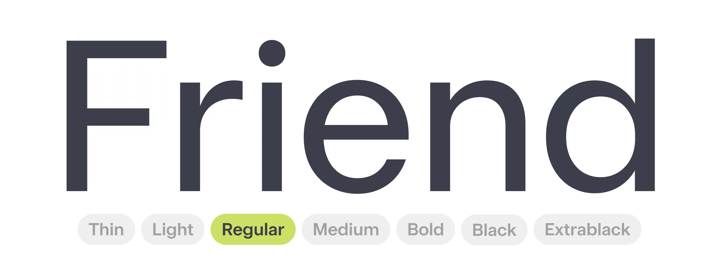
Reimagining the Design Space: Using a Different Master Structure
I also tried something different in the construction of the family. Instead of the more familiar Regular and Black masters, I built CoFo Friend using Hairline, Semi-Bold, and Extra Black.
The decision to draw a Semi-Bold master helped me maintain the typeface’s low contrast further into the weight range, rather than letting the strokes develop noticeable contrast too early.
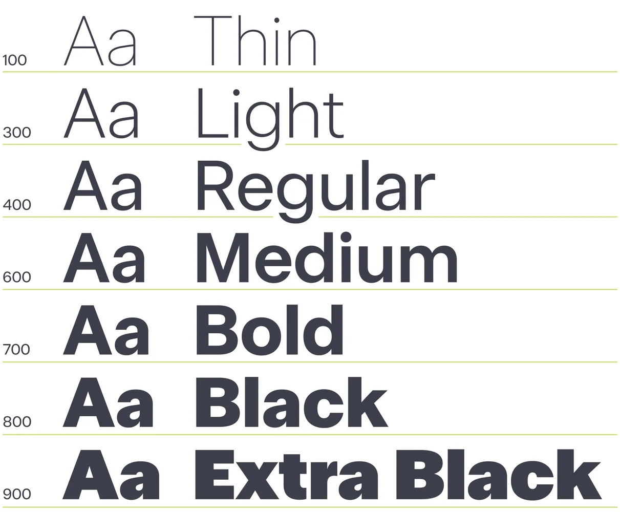
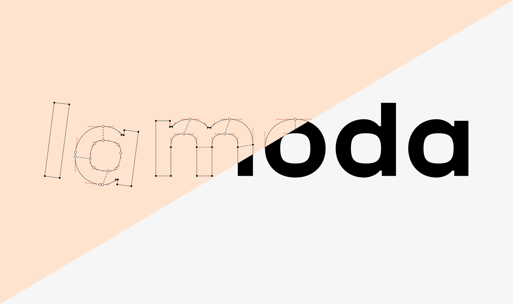
I also worked on a finer 2000 units-per-em grid, allowing more precise adjustments to the outlines and smoother interpolation between weights.
Will anyone notice these decisions when using the typeface? Perhaps not. But experimenting with the process is part of what makes designing a new family interesting.

A Friend with Benefits: Interface Icons
To make CoFo Friend even more useful in digital environments, we collaborated with type and icon designer Tolya Doodko on a dedicated collection of interface icons.
The set includes familiar elements such as checkmarks, checkboxes, information symbols, search, account, download, and sharing icons, as well as an extensive selection of arrows. The symbols adapt to the different weights of the typeface, allowing them to sit naturally alongside text in interfaces and layouts.
And if you think an essential interface icon is missing, let us know. We’re always happy to hear suggestions.
A Friend That Goes the Extra Mile
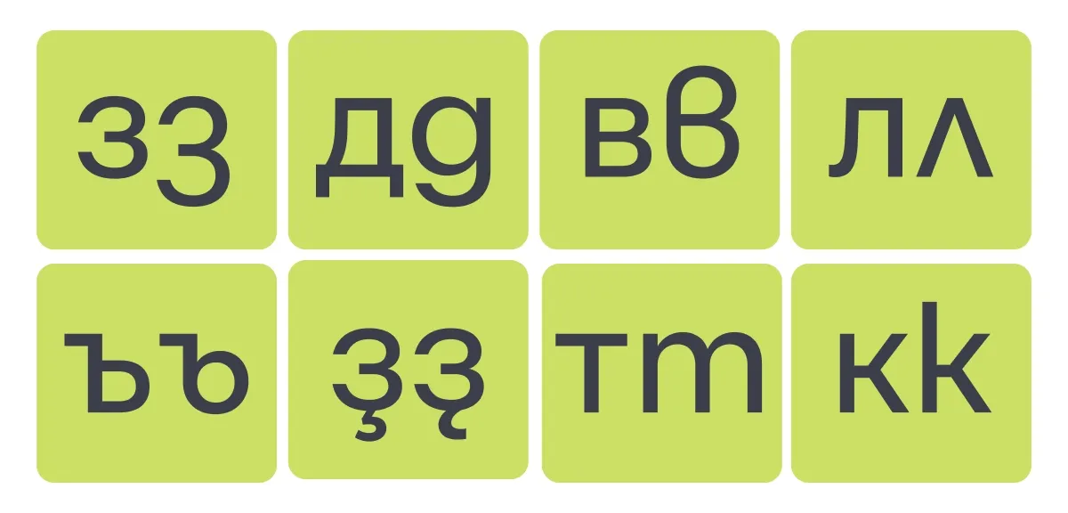
CoFo Friend also includes our usual collection of typographic extras: fractions, superiors and inferiors, indexes, and localized Cyrillic forms for Bulgarian, Serbian, and Bashkir.
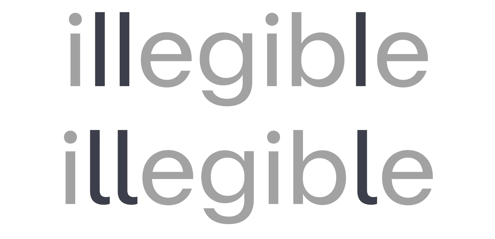
There’s also an alternative lowercase l for situations where it needs to be clearly distinguished from an uppercase I. Anyone who has ever tried to read Illinois in the wrong typeface will understand why.

Already Making Friends: First Use in help.world
Even before its official release, CoFo Friend found its way into a real design project. Creative director Indgila Samad Ali came across an early version of the typeface while working on the identity for help.world. She liked its character and decided to use it in the project.
It’s always exciting for me to see a typeface leave the controlled environment of my specimens and become part of someone else’s design. For CoFo Friend, a typeface intended to support rather than overpower other visual elements, this felt like a particularly fitting first use.
More Friends on the Way
CoFo Friend is designed to grow.
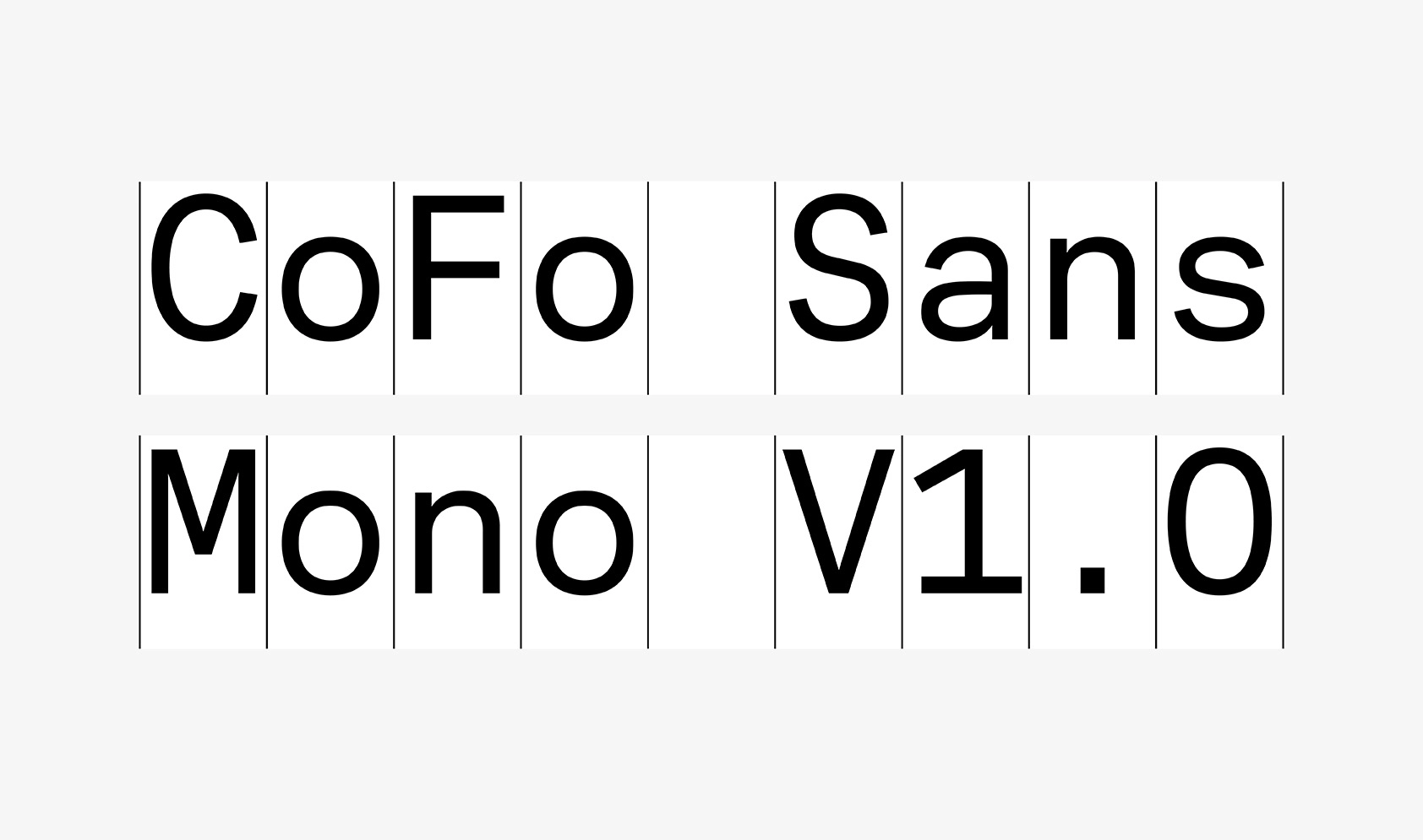
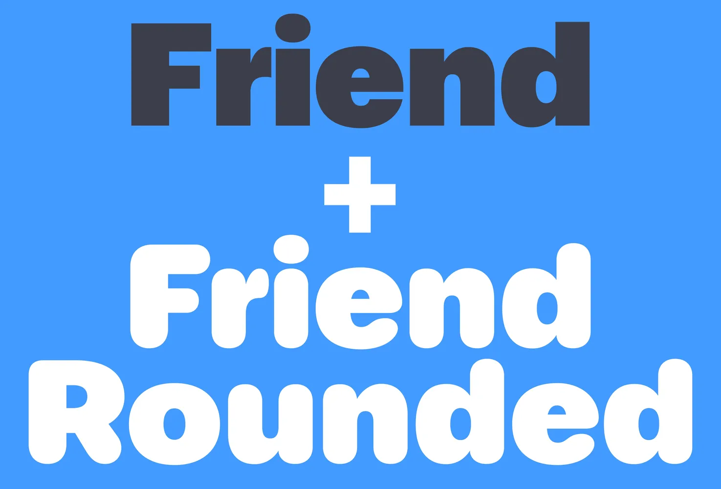
From the beginning, I imagined a more rounded version of the typeface. A softer, chubbier counterpart is already part of the plan, alongside italics and CoFo Friend Mono. We’re also looking ahead to expanding the family into more writing systems, including Armenian, Georgian, Arabic, and Vietnamese.
For now, CoFo Friend arrives with a wide range of weights, from Hairline to Extra Black, and plenty of room to explore.
It may not demand to be the center of attention, and that’s exactly the point. Sometimes you need a typeface that gives everything else a little more space to shine. And who knows? With time, CoFo Friend might become the one you keep coming back to.
Written by Maria Doreuli
Editor: Krista Radoeva
Type designer: Maria Doreuli
Team: Maria Kosheleva
Graphics: Maria Doreuli, Maria Kosheleva, Polina Baydin, Tatiana Egoshina
CoFo Friend at a Glance
Designer: Maria Doreuli; Foundry: Contrast Foundry; Release: November 2026
Classification: sans serif, low contrast, neo-grotesque, minimalist
Styles: Hairline to Extra Black, 7 styles, variable font
Scripts: Latin, Cyrillic; localized forms for Bulgarian, Serbian, Bashkir
Features: high x-height, alternative l, tabular figures, currency symbols, fractions, superiors, inferiors
Extras: interface icons as a variable font (arrows, checkmarks, checkboxes, search, account, download, share)
Best for: interfaces, digital products, branding, social media graphics, banners
First use: help.world identity by Indgila Samad Ali
Coming next: italics, CoFo Friend Rounded, CoFo Friend Mono, Arabic, Armenian, Georgian, Vietnamese
CoFo Friend FAQ
1. What is CoFo Friend?
CoFo Friend is a neo-grotesque sans serif designed by Maria Doreuli and released by Contrast Foundry in November 2026. It comes in 7 weights, supports Latin and Cyrillic, and includes a set of interface icons that match every weight. It is made for text, interfaces, and branding.
2. What is the difference between CoFo Friend and CoFo Sans?
Both typefaces share a similar design philosophy, but CoFo Friend takes a more relaxed approach. Compared to the slightly squarish, structured forms of CoFo Sans, CoFo Friend has a softer look, rounder ovals, round dots, a higher x-height, and a more approachable character.
3. Does CoFo Friend support Cyrillic?
Yes, CoFo Friend supports both Latin and Cyrillic scripts, making it suitable for multilingual typography. It also includes localized Cyrillic forms for Bulgarian, Serbian, and Bashkir, ensuring the appropriate letterforms are used for each language.
4. Is CoFo Friend a good font for UI design?
Yes, CoFo Friend was designed with digital interfaces in mind. Its high x-height, compact proportions, and balanced spacing ensure clarity at different sizes, while carefully designed numerals, currency symbols, and weight-matched interface icons make it a versatile choice for UI design.
5. Does CoFo Friend include interface icons?
Yes, CoFo Friend includes a dedicated collection of interface icons. The set features commonly used symbols such as arrows, checkmarks, search, account, and download icons, all designed to match the different weights of the typeface.
6. Will there be a rounded, italic, or mono version of CoFo Friend?
Yes, we’re planning to expand CoFo Friend with a more rounded version, matching italics, and CoFo Friend Mono. These additions are part of the family’s ongoing development.