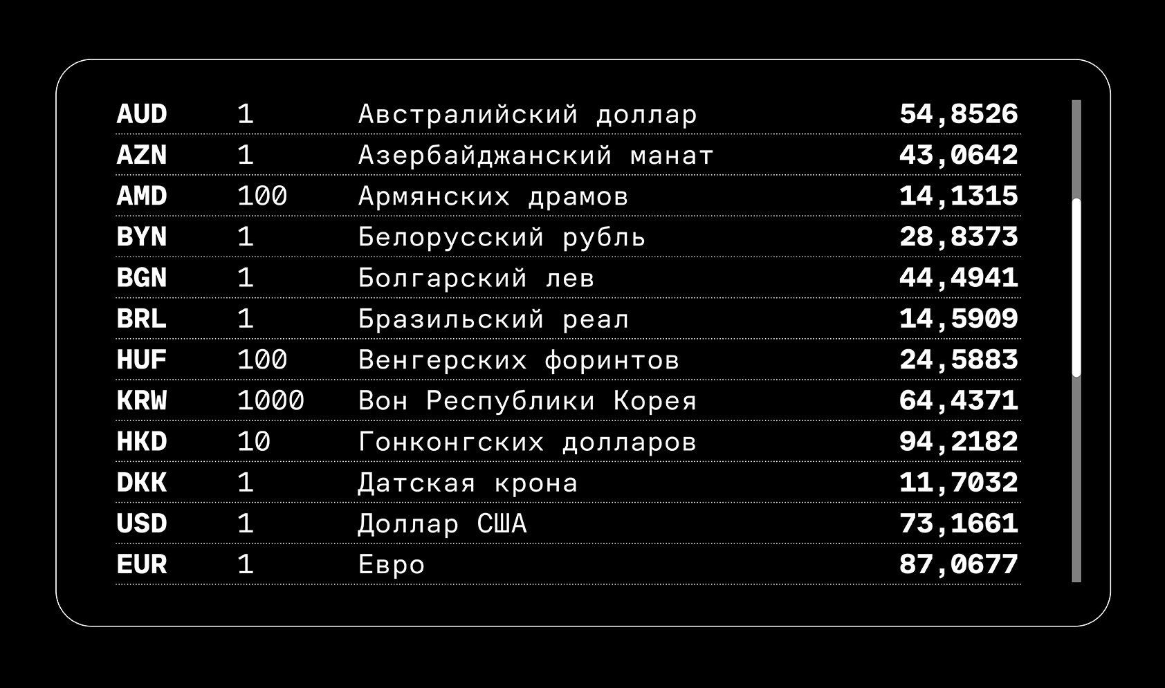
CoFo Sans Mono—the monospaced version of CoFo Sans with brutalist aesthetic, clean forms and industrial feel
Author: Krista Radoeva
Editor and translator: Susanna Agababyan
August 23rd, 2021
CoFo Sans Mono is the latest addition to our CoFo Sans Family. It comes in 4 weights—Regular to Black,—which all share the same width. CoFo Sans Mono retains many of the key characteristics of CoFo Sans, but they’ve all been adapted to fit the demands of a monospaced typeface.
What is a monospaced typeface?
A monospaced typeface (also known as fixed-pitch, fixed-width) has one essential characteristic: all its characters occupy the same width. Consider that each character inside a font consists not only of the letterform itself, but of the letterform plus the space around it, and together they form a bounding box that determines its distance from other letters.
In a standard proportional typeface, the size of these bounding boxes vary, depending on the letterform. In a monospaced font however, all bounding boxes are exactly the same, so the letterforms have to be adjusted to fit inside them.
Where do monospaced typefaces come from?
The first Latin and Cyrillic monospaced typefaces were created for typewriters: to fit their technical limitations and make the work of the typists easier. But typewriter and monospaced typefaces aren’t necessarily the same. While originally all historical typewriter typefaces were monospaced, not all monospaced typefaces were designed for typewriters.
The monospaced fonts that we’re more used to seeing—clean and simple sans serifs—actually come from early computers which had very limited graphical capabilities. These fonts also had to fit within a grid of equal bounding boxes and their design was focused on character differentiation and recognition.
Even though nowadays computer screens have practically no limits to the fonts they can show or the quality of the graphics, monospaced fonts still have an important function, especially in software text editors for writing code, and for typesetting documents that are rich with numbers and calculations.
Not that easy: the design challenges in creating CoFo Sans Mono
You may think that making a monospaced version of an existing typeface is an easy task: just set all the bounding boxes, adjust some proportions, remove the kerning and voila! You’re done! But not quite.
Most monospaced fonts share a common width, which makes them easily interchangeable. But when designing CoFo Sans Mono, we initially had to work with a wider bounding box, because we had to fit the Black weight into the monospaced width. Usually you don’t see as many monospaced fonts that include Black weights, for the reason that the heavier the weight is, the harder it is to get a balanced texture. But we don’t shy away from such challenges. After some testing of the proportions and spacing between the Regular and the Black style, we returned to the traditional width and were determined to make it work across all weights.
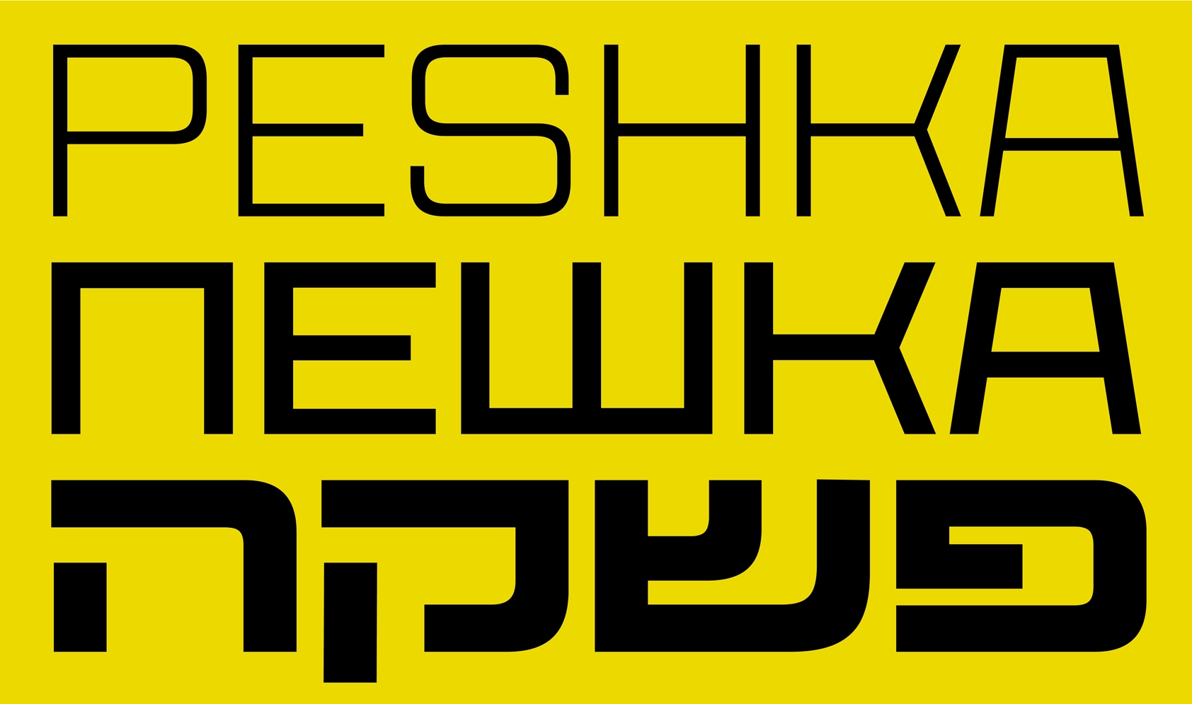
When you make monospaced fonts for Latin, you might have issues with a few letters that are generally wide and a bit difficult to fit in a small space, such as M W Æ Œ m w æ œ. But in Cyrillic you have a lot more of such shapes: Ж Ф Ш Щ Ю Ы Љ Њ ж ф ш щ ы љ њ. Since at Contrast Foundry Cyrillic isn’t an afterthought, but a priority, we started testing these letterforms straight away to find the best possible solution and balance between width, weight and space.
That led us to making careful optical adjustments, and we’re not shy to say that CoFo Sans Mono turned out to be one of the finest examples of a Cyrillic monospaced font—something that we were aiming for, when embarking on this project.
CoFo Sans Mono—a strong individual and a team-player
CoFo Sans was designed with simplicity in mind and the monospaced version with its rationality, clean forms, industrial feel, rich character set that includes Latin, Cyrillic, an extensive set of figures and carefully crafted fractions and symbols is no different. If you read the article this far, you know that we had to adjust all the proportions and spacing to make sure we have a fully functional monospaced font. And CoFo Sans Mono can be used on its own, but it’s also a great addition to CoFo Sans, which is slowly growing into a big family with a diverse set of possible uses. Combined with the full family, CoFo Sans Mono can become a powerful system for complex typesetting.
Ways to use? Find your own way
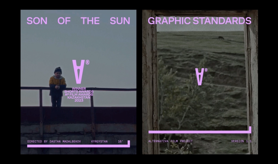
Monospaced fonts these days are used in a lot more ways than just for coding and setting receipts. They’re often used on the web and in apps—for the interfaces, buttons, small text and captions—because of their modularity and clean look. Not to mention all the creative ways graphic designers can use monospaced fonts to achieve a contemporary, brutalist, edgy aesthetic. CoFo Sans Mono has been optimized for all these occasions, and so many more like branding for digital and tech products. And we’re looking forward to seeing it employed in the most unexpected ways yet.
Last but not least—check out this modern monospaced typeface CoFo Drifter.
Designers: Maria Doreuli, Krista Radoeva
Released in 2021
Version: 1.0
Styles: Regular, Medium, Bold, Black
Editor: Susanna Agabayan


