CoFo Plusha is in the air: customizing the typeface for Khloud
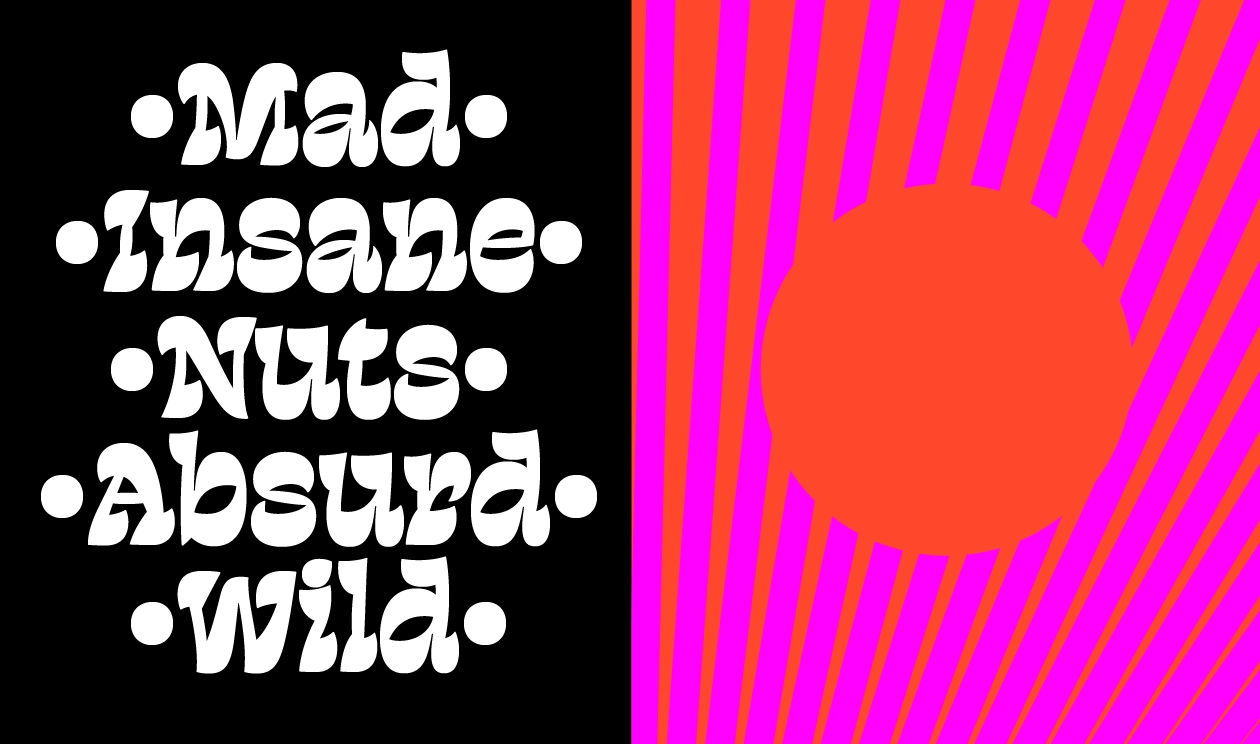
A soft and light wordmark for Khloud—a new snack brand by Khloé Kardashian shaped from our typeface CoFo Plusha.
The project
Turner Duckworth reached out about a wordmark for Khloé Kardashian’s new protein popcorn—and we were excited to see they’d started with CoFo Plusha.
There’s something really satisfying about tweaking one of our own typefaces to make it fit just right for a brand. Plusha already felt like the right call here: soft, friendly, and full of personality—exactly the kind of tone that works well in food.
As we got into the project, its rounded shapes started to feel even more fitting. They hinted at clouds: light and open, but not overly sweet. It struck a nice balance: playful without being childish, clean without feeling cold.
And then there’s the name itself, Khloud. It naturally carries that sense of lightness, lift, and softness. All those elements lined up beautifully, and the typeface helped bring that feeling to the front.
Why Plusha?
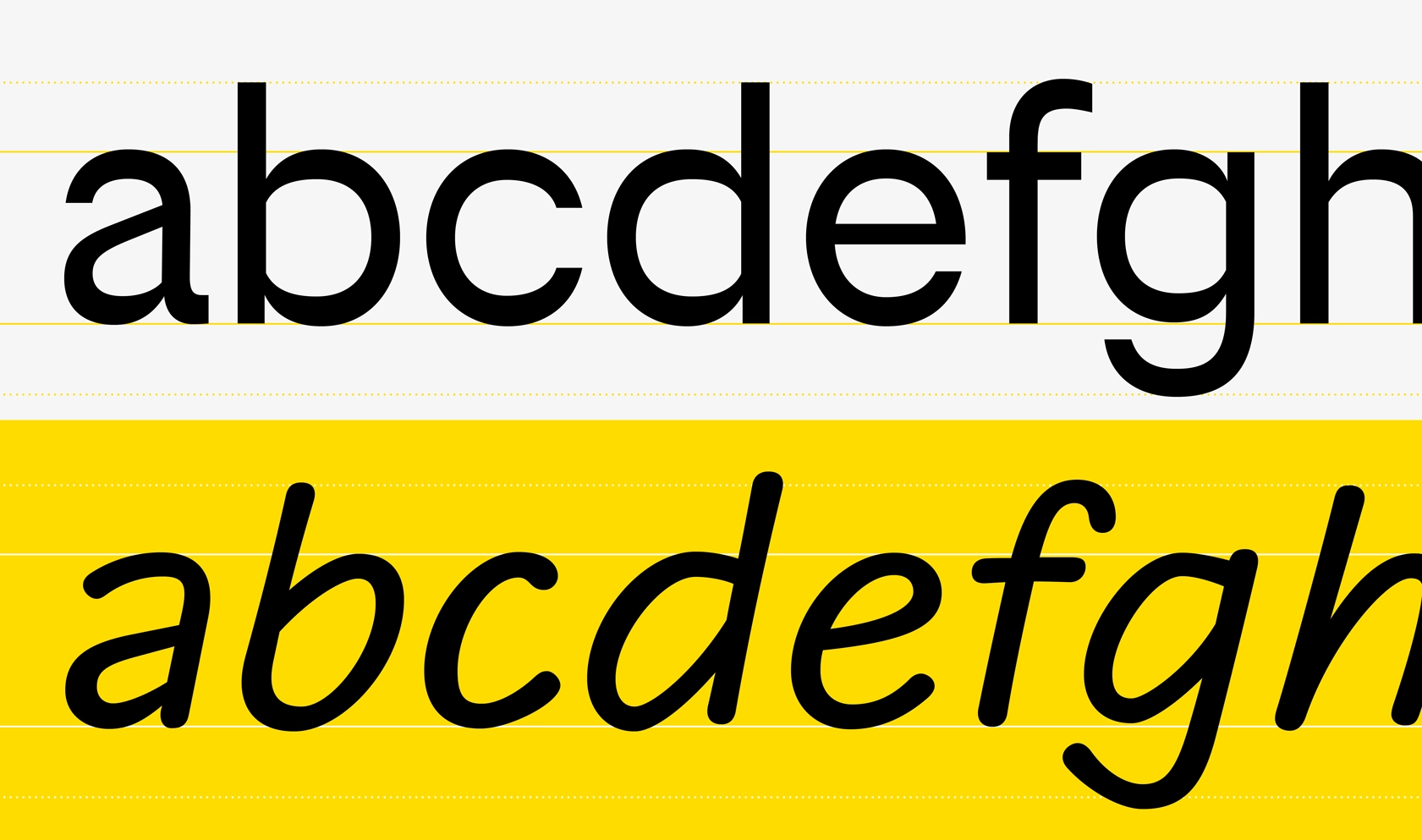
◦ Plusha’s rounded shapes feel like clouds—gentle, smooth, and airy, yet with a confident structure.
◦ Its tone hits the right note between being friendly and refined, without getting too playful or too serious.
◦ The name “Khloud” naturally suggests softness and lightness—qualities we kept in mind while designing Plusha.
Step 1: Initial refinements
The Turner Duckworth team had already started shaping the wordmark with a few early tweaks.
We picked it up from there and focused on clarity, rhythm, and visual balance:
◦ The k was redrawn to separate it more clearly from the h. The original forms felt too close in weight and shape.
◦ The l was flipped to mirror the structure of the d, adding flow.
◦ The “oud” section stayed just as it was—no changes needed there.
Our goal was to stay close to the tone of Plusha while making sure the design felt fully considered for Khloud.
Step 2: Final tuning
After the first round, the team asked for two last refinements:
◦ Add more space between the leg and arm of the k to make its shape clearer—a detail that had come up in the very first round of sketches.
◦ Adjust the bottom of the h, which had become a bit too light compared to the rest.
We made both updates—adding just enough weight to balance the composition, without losing the softness of the forms.
The result feels calm, open, and full of quiet detail—a wordmark that reflects both the product and the brand behind it.
Credits
Wordmark: Contrast Foundry
Liza Rasskazova, Maria Doreuli
Motion: Anna Volkova
Typeface: Hermes by Optimo
Packaging renderings & videos: Arts Facilities
Khloud & K5 Team
Kathleen Braine, Executive Marketing Director
Jenny Brown, Executive Creative Director
Summer Schneider, Art Director
Turner Duckworth Team
Jordan Poirier, Creative Director
Gabriel Ribes, Senior Designer
Alison Dyer, Senior Designer
Gerard Vasco, Account Director


