BLAH. In Conversation with Maria Doreuli: The Mission of Type Design
In his pursuit of the ultimate design truth, Sasha Zagorsky asked Maria Doreuli 13 serious questions. Life, art, and the creative mission. Dive in to find out what she had to say:
(1) How do you see your creative mission?
At this particular moment, I am dedicated to making quality typography accessible to more people. Which is increasingly challenging considering the rising expectations for speed. This mission may sound pretentious, but it’s a genuine pursuit.
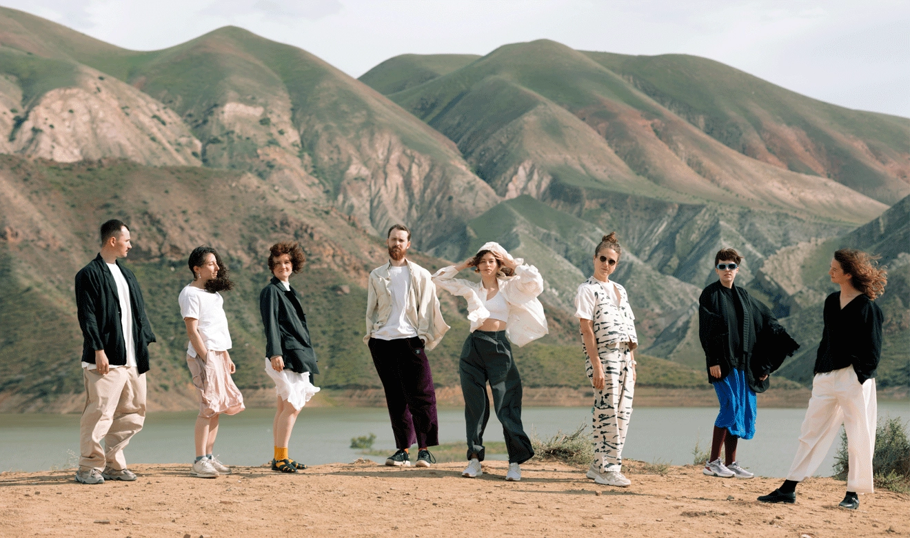
An important part of this mission is teaching and teamwork. These elements are crucial for getting more people into quality typography and typefaces while fostering a community of like-minded designers.
(2) What would you say is the primary intention of your work? What do you hope to achieve?
The primary intent of my work? That’s a tough question. Focusing on just one aim might seem either untruthful or arrogant. Am I seeking harmony within, aiming to slightly better the world, stimulate the typography industry, or transcend the established limits?
(3) What makes you unique as a professional?
I like to believe that my strength is in a combination of artistic and design skills, engineering, and management. This is somewhat rare in the type community, where roles are often distinctly divided into design or business. I try to balance the two, which helps me handle a wide range of projects and to do it well.
(4) What words would you use to describe your approach?
For my overall work approach, I’d say it’s lively and personalized—even if that sounds a bit typical—and always evolving. For typeface design specifically, I focus on being structured and multilingual.
(5) What are the key ingredients you rely on from project to project?
Each project relies on a solid workflow setup, teamwork, my gut instincts, and drawing on my experience to navigate challenges.
(6) Where do you draw inspiration from? What constitutes good work for you?
I don’t see inspiration as something that comes from outside. I believe inspiration stems from how I organize my day-to-day activities, balancing work with rest and play. This balance helps me stay energized and creative.
(7) Would you call your work art?
While not always artistic, it has its moments. Type design is a blend of precision and creative vision, similar to architecture. Whether architecture is art is also an interesting question to ponder.
(8) How do you create something unique?
I try to embrace new experiences more often than following well-trodden paths. However, even in repeating processes, I find opportunities to discover something new.
(9) Are you interested in developing your own voice and style?
I am leaning towards “yes.” There is definitely an interest in forming my own style, but more as a natural outcome of my work than a specific target. Style evolves as you engage deeply with your work and consistently tackle similar tasks. But I find taking unconventional approaches even more important. This creates challenges, which help keep things interesting.
(10) What’s on your mind right now? What are you focused on?
Right now, I’m pondering why I design typefaces and the goals I have, exploring development strategies for Contrast Foundry, and envisioning our future evolution.
(11) Do you create alone or do you need a team?
Focus is crucial in type design, so I generally create alone. However, having a team is essential for sharing knowledge and experience. Also, typefaces tend to develop much slower without a collaborative effort.
(12) If someone wants to understand what your work is about, which project would you show them and what would you say about it?
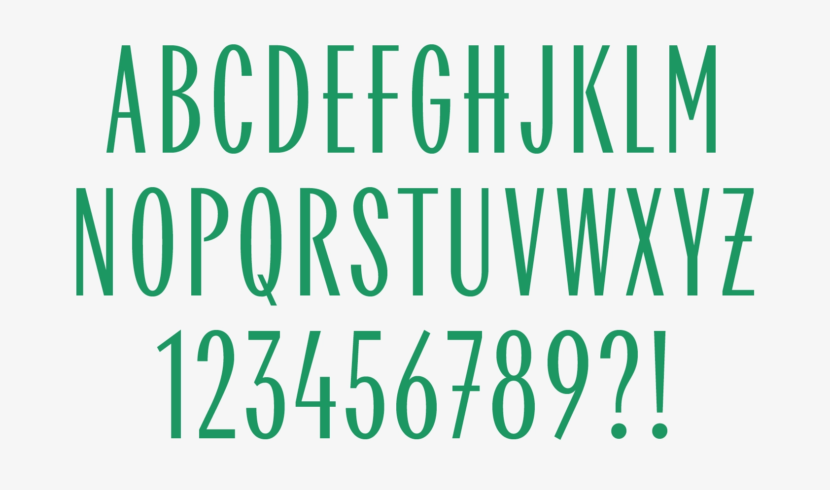
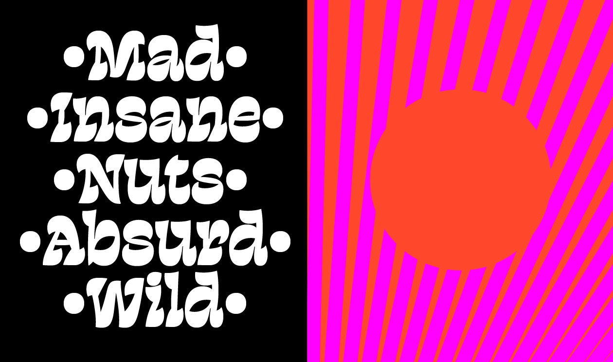
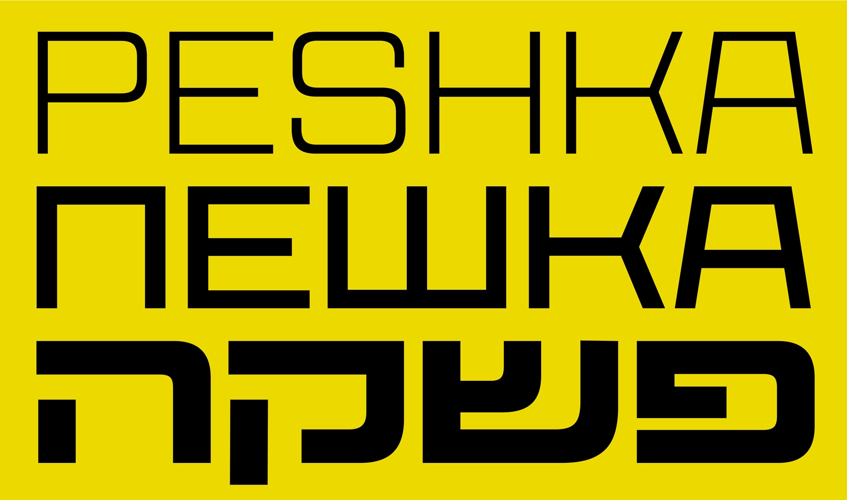
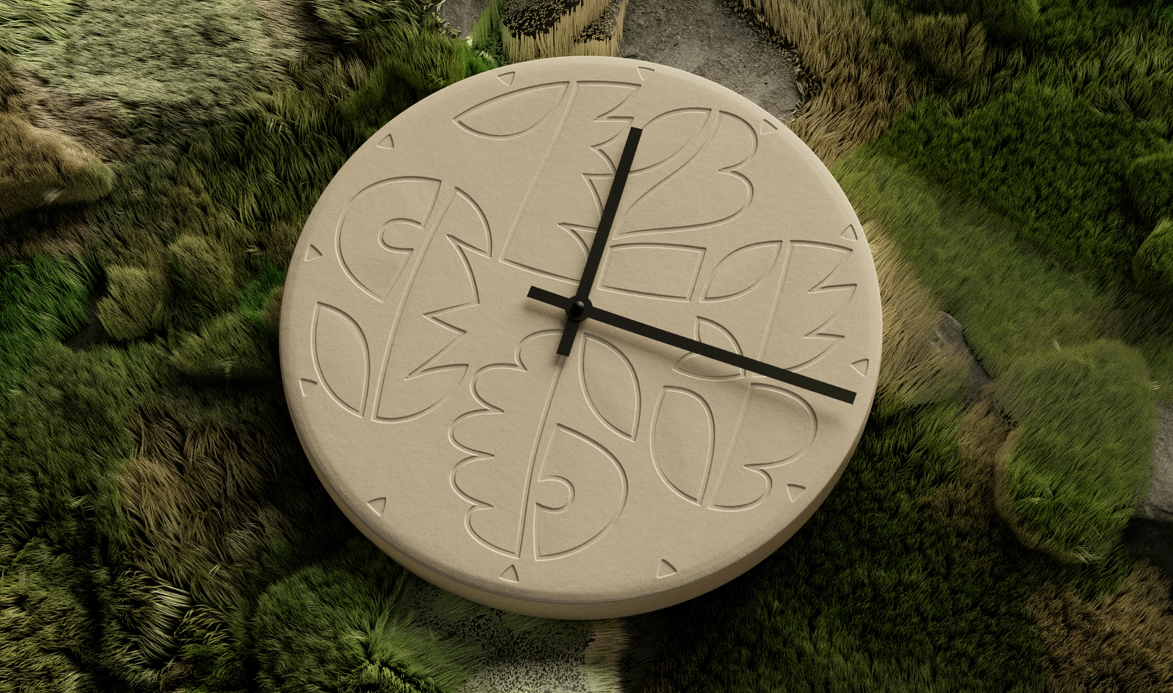
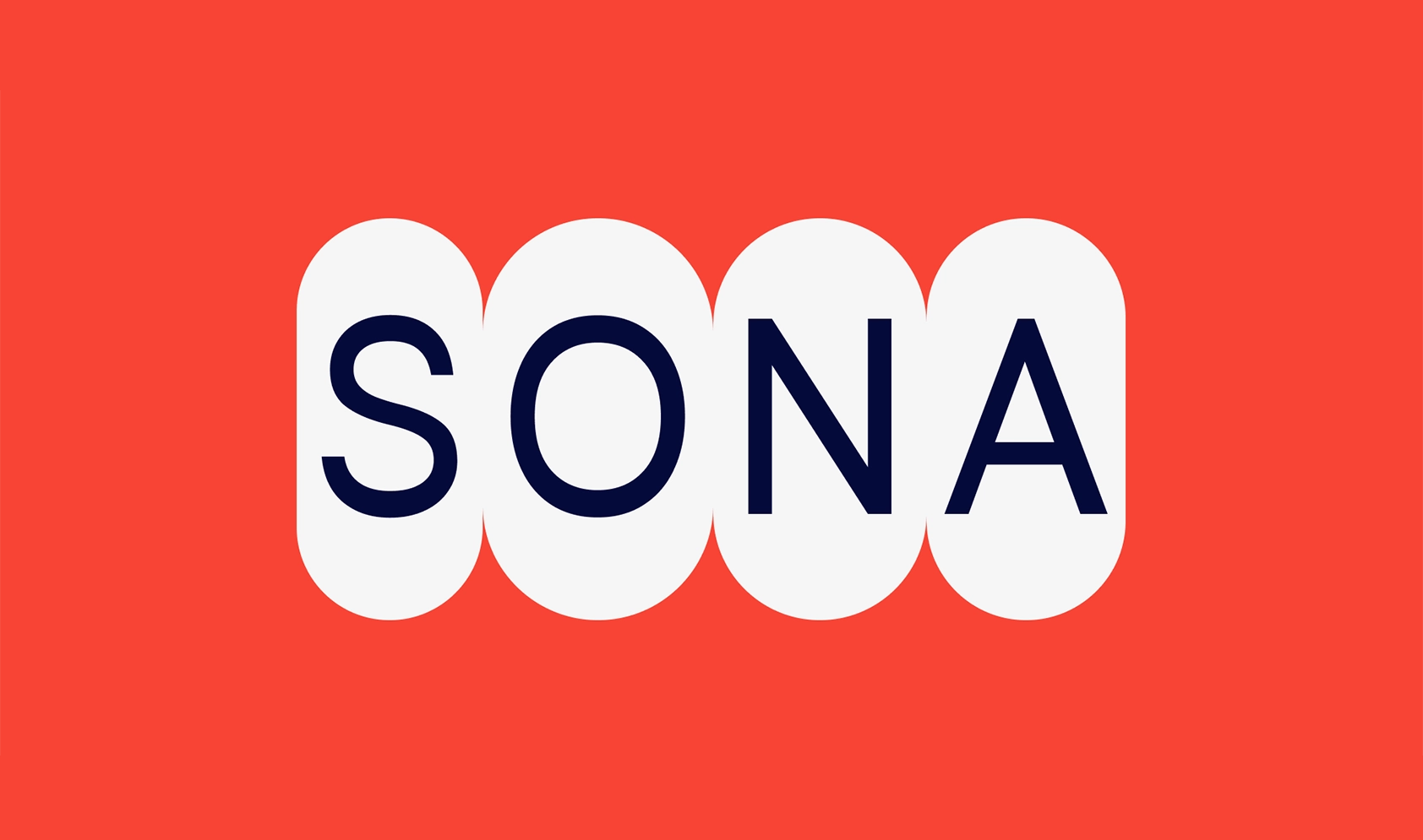
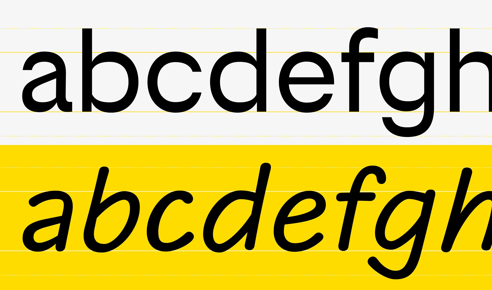
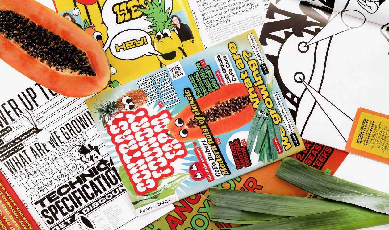
I would present William and CoFo Chimera as two contrasting projects. Their differences help clarify what type design involves and show the range of possibilities within the field.
(13) Do you have a specific breakthrough project in your portfolio that you could call your manifesto?
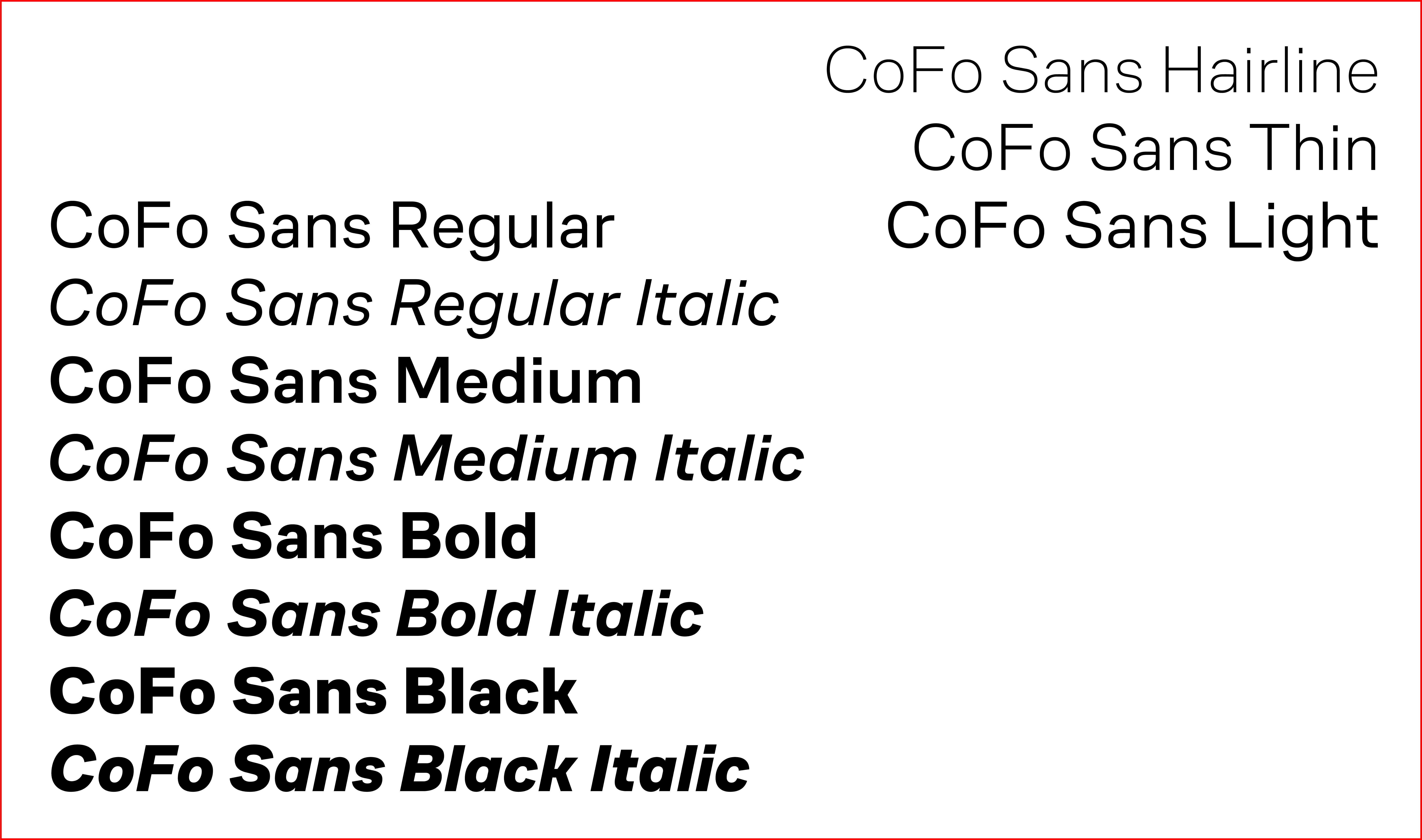
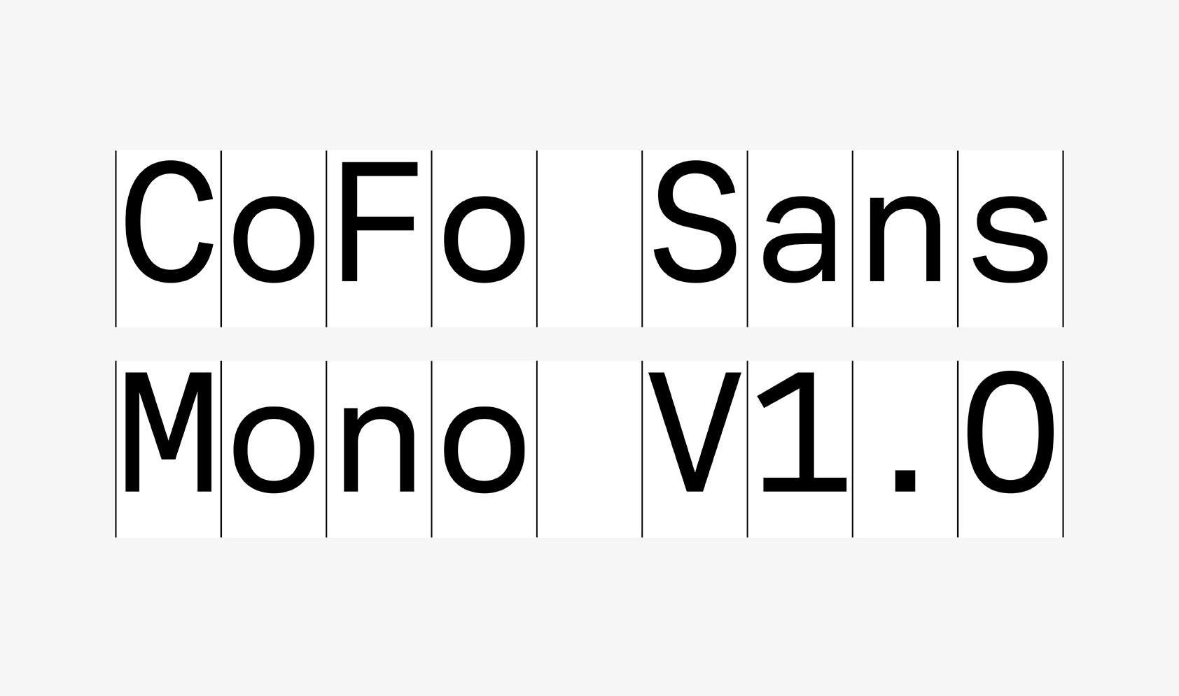
If I were to name a manifesto project, it would for sure be CoFo Chimera. I like to work with contrasts, and each next project that I am working on is like a contradiction to the previous one. William — CoFo Chimera — CoFo Sans — CoFo FlicFlac — CoFo Gothic—these typefaces are very different; in each of them I was setting up a very contrasting goal to the previous one. In a way, all of these as a timeline show different sides of my thinking and the evolution of what I am interested in.
Author: Sasha Zagorsky
Editor: Ekaterina Barannikova

