Kabeltouw: evolution of the modular system
Kabeltouw is a nautical unit of length equal to 185.2 meters (1/10 of a nautical mile) and a rope of this size. The unit was used because cable of that length was always a standard module.
THE STORY BEHIND THE TYPEFACE
Article by Egor Golovyrin
Date: August 30th, 2024
Kabeltouw was born, raised, and eventually evolved due to specific challenges. This influenced the entire workflow. When designing the typeface for a specific project, I didn’t plan the entire typeface family; instead, I chose the most striking and effective solutions, excluding anything that wouldn’t lead to a result in the shortest possible time. This approach differs from the “proper” process of type design, where the designer plans everything in advance: language support, type family, character set.
Stage 1: Basic modules set
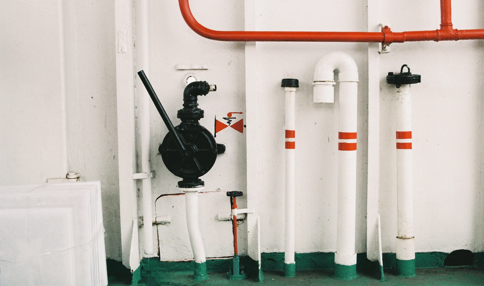
The first challenge was a commission for a large metal gate signboard. As always, I started to focus on the material. Painted steel reminded me of maritime and cargo container aesthetics, rich in various technical type graphics, including stencils. Now, stencil style itself is already a striking technique, but I wanted something that would naturally emerge from the letter shapes. Thus, modules were created, allowing for quick work and unexpected solutions. When assembling the letters, I left gaps between the modules that would become the stencil bridges. The text on the gates was short, and, following my own logic, I chose forms that would work the best not for the entire alphabet but only for this particular set.
Initially, the number of modules had to be uncomfortably minimal and their shape as simple as possible, aiding with any future decisions. To avoid creating modules without a foundation, I decided to rely on the main groups into which letters are traditionally divided by shape: rectangular E H L T Г Ш, triangular A V W Y У, and circular C O Q D S P B. Three basic modules emerged: a straight vertical one (also horizontal), an inclined one with a fixed angle of 17 degrees from the vertical, and a semicircular one, equal to half the height of the uppercase letters. The fixed slope prompted me to design A and V with a characteristic kink, and with the small semicircular module, I could create both horizontal ovals, as in B P R, and vertically elongated ones. This design choice defined the letter widths, which essentially set the style for the entire typeface.


Stage 2: Adaptation of basic modules
The limited number of modules gave the typeface a mechanical appearance and helped find unexpected, recognizable constructive solutions. On the other hand, I didn’t want the typeface to be toy-ish. This is why I took the first step towards complicating the modular system by adding two elements: one for transitioning from a diagonal to a curve, and one for the curve in the middle of the letter S.


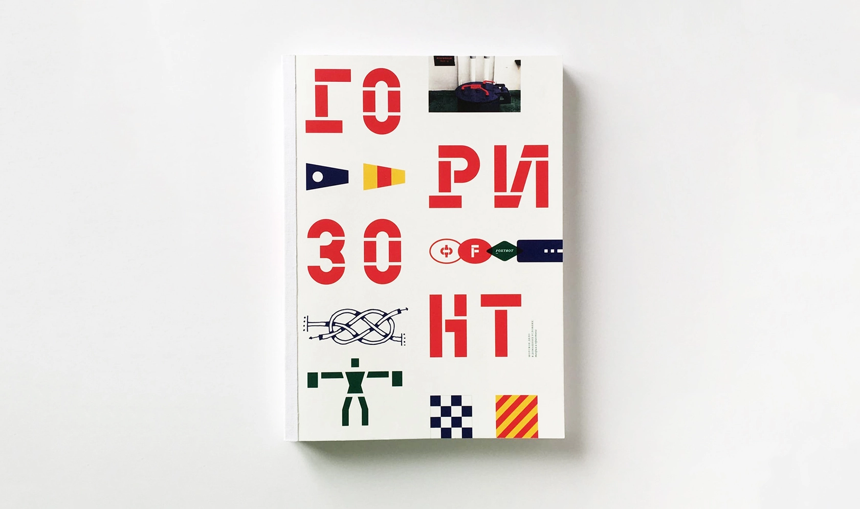
Kabeltouw made its way into the font editor when I was working on my diploma project at the Moscow Polytechnic University. I used it in a book titled “Horizon. Maritime Affairs at Home” about maritime terminology, knots, signal flags, and other sea topics. For the body copy, I immediately chose William Text Pro by Maria Doreuli, but I wanted to use especially vibrant display typography to support the colorful style and film photos. That’s when I remembered about my then-unnamed stencil typeface, which was already inspired by the same aesthetics: curved metal pipes, functional color highlighting, stencil inscriptions, and pictograms. Metal, paint, color—everything I needed!
In small sizes, the stencil bridges made too much visual noise, prompting me to add a second style—Solid.
That’s when the typeface got its name. I liked that “Kabeltouw” sounded both like a maritime term and a surname. Kabeltouw is a nautical unit of length equal to 185.2 meters (1/10 of a nautical mile) and a rope of this size. The unit was used because cable of that length was always a standard module.
Why do I refer to it with a name instead of a title? Applying human categories to a typeface helps in the long-term work on it. At CoFo, we sometimes jokingly ask each other about our personal type projects: “How is *** doing? How is he/she?” In the promo song for our typeface CoFo Sona, there’s even a line: “It’s got curves like a hot persona”!
Stage 3: Finding a compromise between modularity and optics
While working on the book, I realized that Kabeltouw was viable and could be released for sale once completed. At that time, the typeface only included Cyrillic, and in the book, Kabeltouw, although appearing in small sizes, played a very display-oriented visual role. As I was working on adding Latin, the designers from Apt Buildings approached our studio with an offer to develop a logo for their new project, The Building Store—an online store for standard architectural solutions. The logo references included Ikea, Caterpillar, and Lego. The client’s desire to convey ideas of reliability and constructiveness through the logo led us to use Kabeltouw for it.

We immediately settled on this direction, but the client was bothered by the constructions of N and G, as they seemed to stand out too much. This feedback helped me move away from modularity in a whole group of letters: G N M Z W И. However, the previous constructions remain in the current version as stylistic alternates. This step made the typeface more universal while maintaining its character, as I didn’t have to abandon the foundational idea.


Stage 4: New challenge: expanding the character set, new modules
A simple idea and such a limited number of modules both simplified and complicated the task—the forms that worked for the basic Latin, Cyrillic, and minimal punctuation became either very cumbersome or simply impossible when working with accents, superscripts & subscripts, and mathematical symbols.
There was a need to elaborate on the logic without losing the aesthetic and industrial yet lively character of the typeface. I decided to keep the three original modules but scaled them in accents, indices, and punctuation. For example, the brackets are made from segments of the same diameter as in the letters but with less thickness, and the indices and numbers in circles are made from smaller modules.


Stage 5: A flexible scaling system
Subconsciously, I tried to scale the modules in multiples of the basic values and began looking for repeating patterns in the numbers: “The sizes of the main stroke are 136×680 units, both divisible by eight. Why not try to align all the modules with a rectangular grid with an 8-unit step?” It turned out that such a grid provided the necessary flexibility in scaling without having to think by the ruler. All existing elements fit perfectly into the new system. Grid is a good way to bring a system to mechanical typefaces at some stage of work. Kabeltouw is not the only typeface with an industrial feel in the CoFo collection. Another industrial typeface grown into a superfamily is CoFo Peshka.


When it was time to re-space and kern, I realized that all the characters perfectly fit into groups. This meant that the work with the letter-spacing could also be made systematic—tying the distances to an 8-unit grid.

A random positive effect of such a systematic approach was that Kabeltouw, despite its display nature, works well on screens at small sizes since both white and black are based on a common grid, and even the roughness of auto-hinting appears systematic and isn’t annoying when reading.

Kabeltouw is not just a typeface but the result of a unique approach and original design, combining industrial aesthetics with functionality. Each letter and each module were created to convey a sense of reliability and innovation. This technological typeface is perfect for those who value bold and effective typography. Try Kabeltouw in action and let it tell its own story.
Author: Egor Golovyrin
Editor: Ekaterina Barannikova
Type designer: Egor Golovyrin