CoFo Farm Specimen—an all kinds of special magazine that defeats basic rules of the genre
Since the opening in 2014 we’ve always considered promoting «organic» type design to be part of our mission. We always think long-term and invest in sustainable type design without sacrificing the originality. We care about everything—the team and the climate in our studio, the software we use and the way we elaborate our ideas, the clients and building long-standing relationships with each of them. At the end of the day every little detail matters and affects both the process and the result—how the typeface will be used and how it will make people feel. That’s what we call organic design.
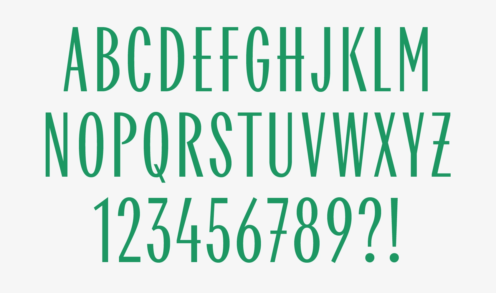
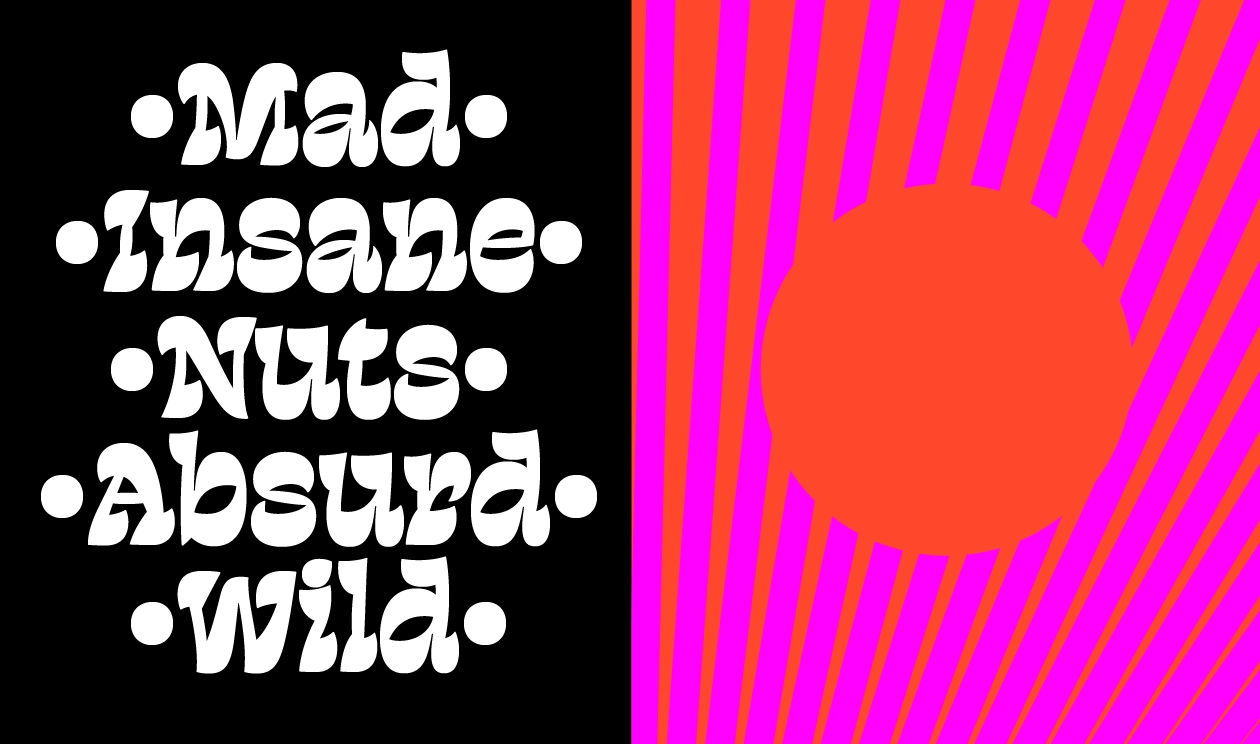
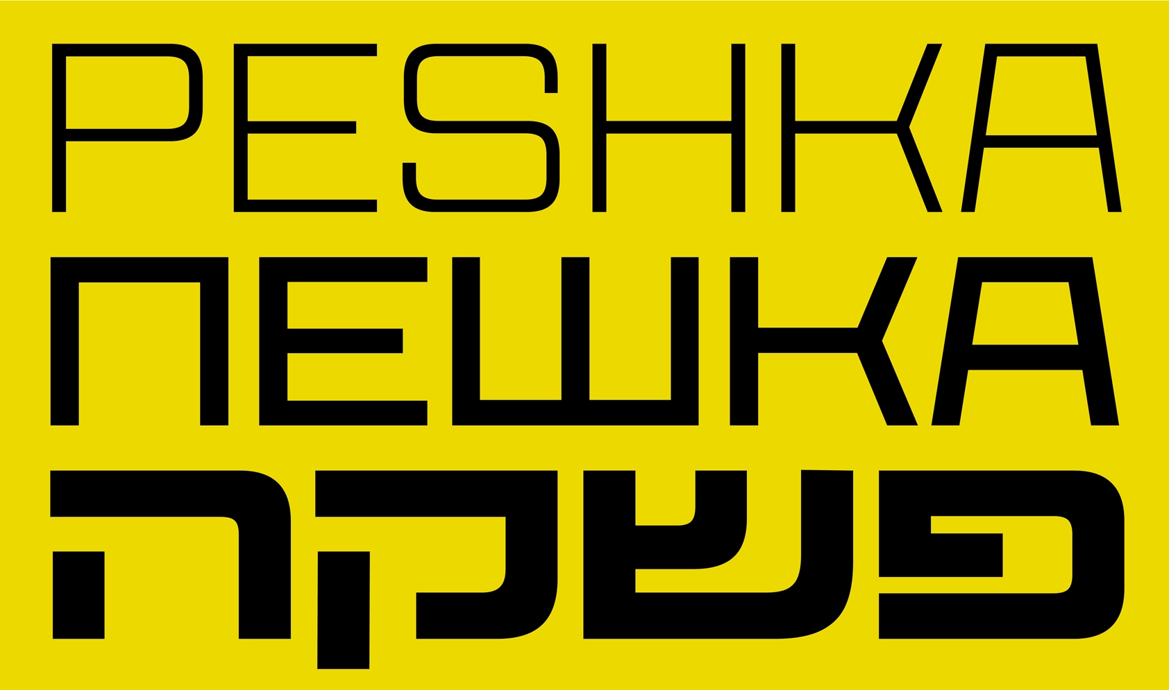
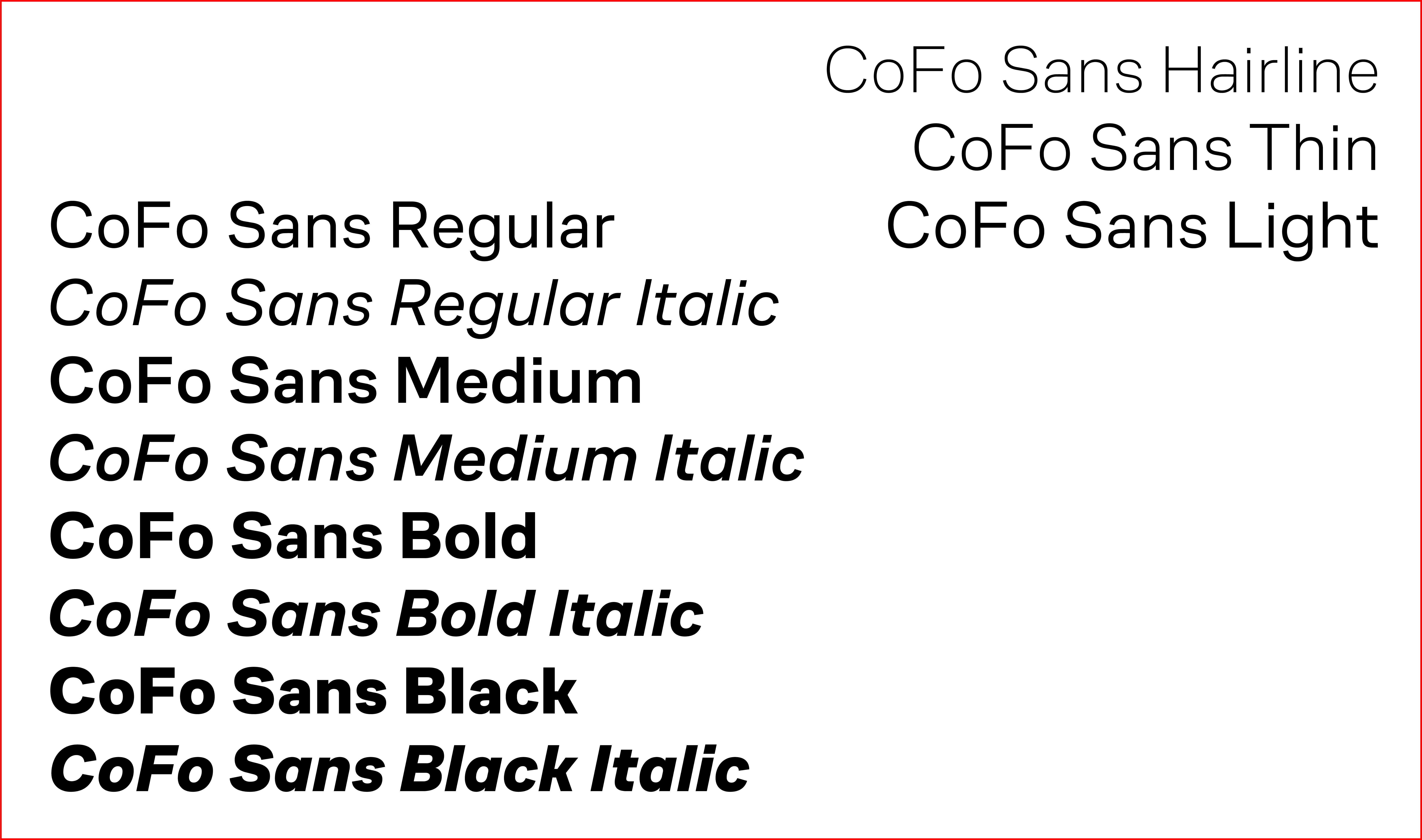
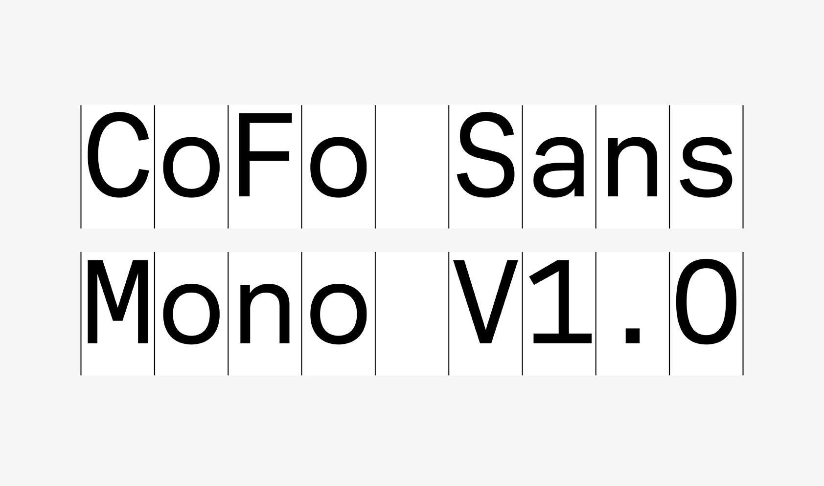
And in 2020 we decided to emphasize the organic nature of everything we create by conveying it metaphorically in the shape of a magazine—Contrast Foundry Farm Specimen. It doesn’t look like an ordinary specimen, nor should it be perceived as such. It was inspired by agricultural magazines and features all of our current typefaces disguised as a plant or a fruit: Robert is embodied by radish, CoFo Sans—by leek and Chimera—by papaya. A section is dedicated to each of them in the specimen, showing the fonts off in action. And not only the fonts, but all of the possible ways to combine them with each other.
The CoFo Farm Specimen is available in our store. Note that we left some of the pages uncoloured, and it’s no accident: we intentionally turned the spread from the specimen into coloring pages for you to have fun and color them on your own or with kids and family. You can also download this impromptu coloring book of ours separately in a PDF format and print or import it to your iPad.
Publisher: Contrast Foundry (CoFo)
Editors-in-Chief: Maria Doreuli, Nikita Sapozhkov
Editor: Susanna Agabayan
Photoshoot: Ksenia Yamutova


