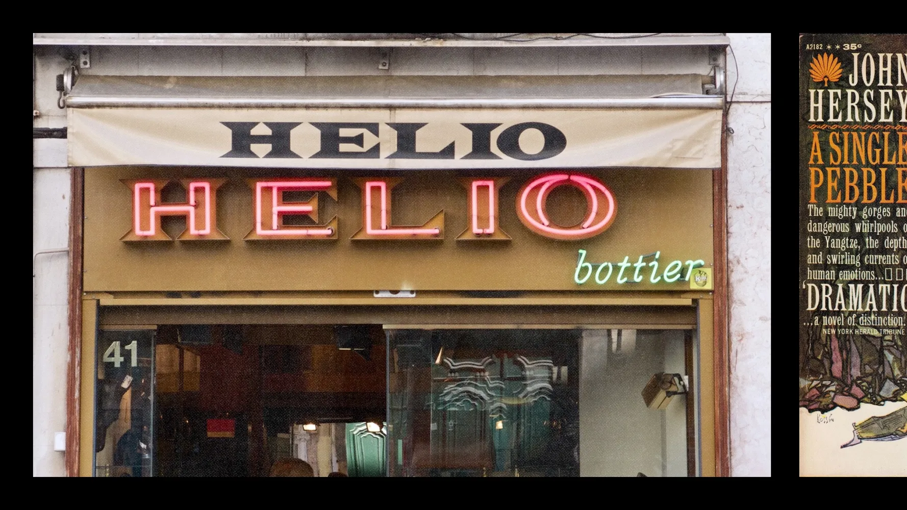
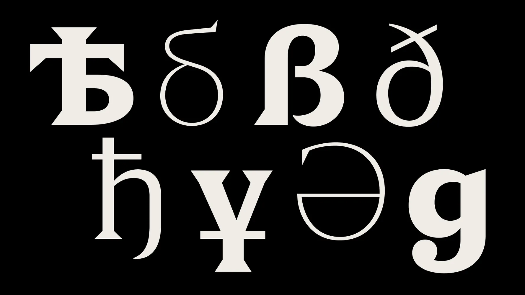
Holz blends triangular serifs with ball terminals in a contemporary interpretation of Victorian type
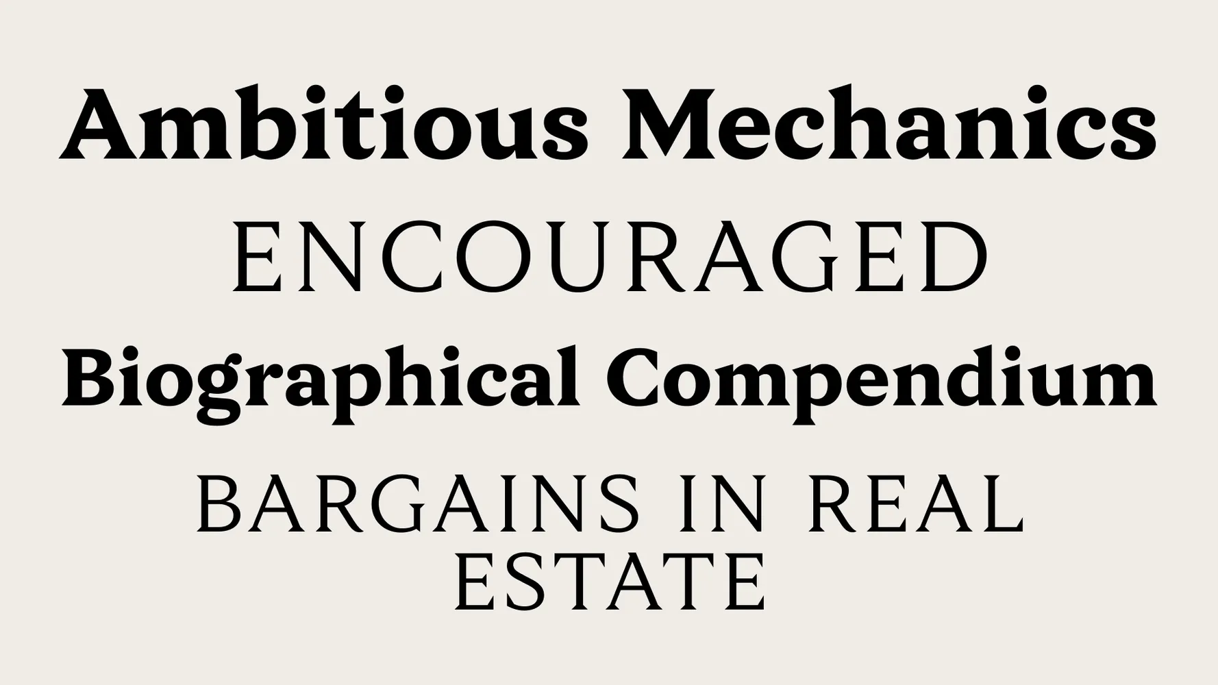
CoFo Holz is an expressive serif typeface with a confident, distinctive voice. Inspired by Victorian-era wood type heritage, CoFo Holz combines striking historical examples with modern type design, offering designers a versatile tool. The typeface blends sharpness and softness, uniting triangular serifs with rounded ball terminals. This interplay between simple geometric shapes gives a fresh feel to classic serif forms.
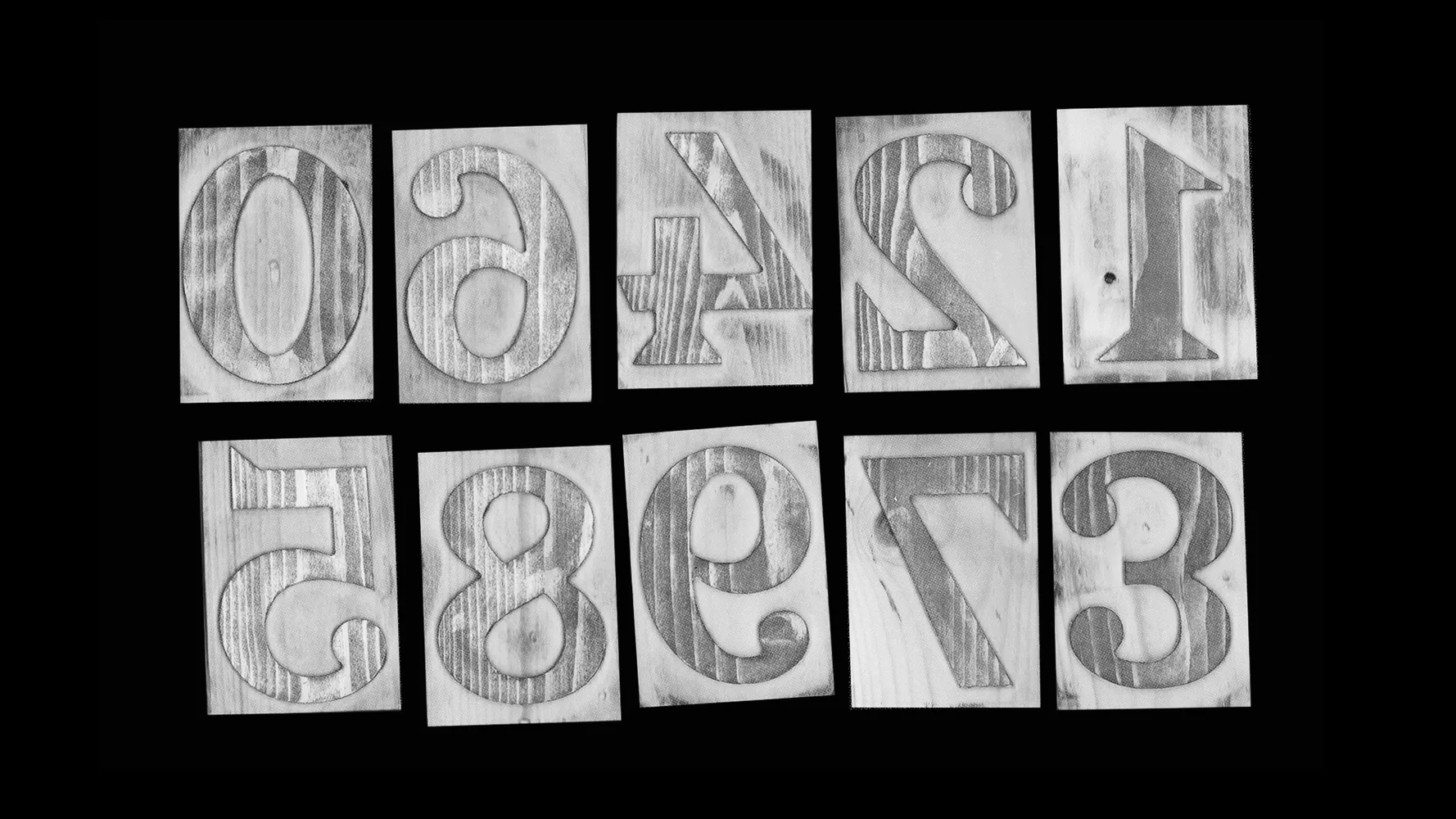
Reflecting the historical essence of letters carved from wooden blocks, the typeface is named Holz, meaning “wood” in German.
What makes Holz so special?
⦿ A modern serif font with historical roots. Holz combines the bold spirit of Victorian Latin typefaces with contemporary design clarity. The sharp serifs provide expressiveness, while rounded ball terminals bring elegance and softness.
⦿ Versatility: from display to text setting. Holz is ideal for striking headlines, posters, branding, and eye-catching display typography. Yet it remains highly readable in text-heavy applications.
⦿ Extended character set and variability. Holz supports Latin and Cyrillic scripts, including Kazakh language and specific alternates for Bulgarian and Serbian. Its variable font version allows precise weight adjustments.
⦿ Ready to shine. Holz is already in active use for exhibitions, posters, and within the fashion industry, celebrated for its distinct character and strong visual appeal.
The story behind the typeface
Article by Nikita Sapozhkov
Date: August 14th, 2025
The role of Latin typefaces in creating Holz
Latin typefaces significantly influenced Holz’s design. Particular attention was given to balancing the shape of the serifs, glyph proportions, and their interactions, ensuring Holz’s versatility. These Latin typefaces weren’t just a stylistic reference—they laid the structural foundation for Holz. Their influence shaped the serif sharpness, proportions, and clarity that define the typeface today.
From Latin typefaces, Holz inherited:
⦿ Sharp triangular serifs for structure and emphasis
⦿ Balanced, readable proportions for both display and text
⦿ Visual simplicity for expression
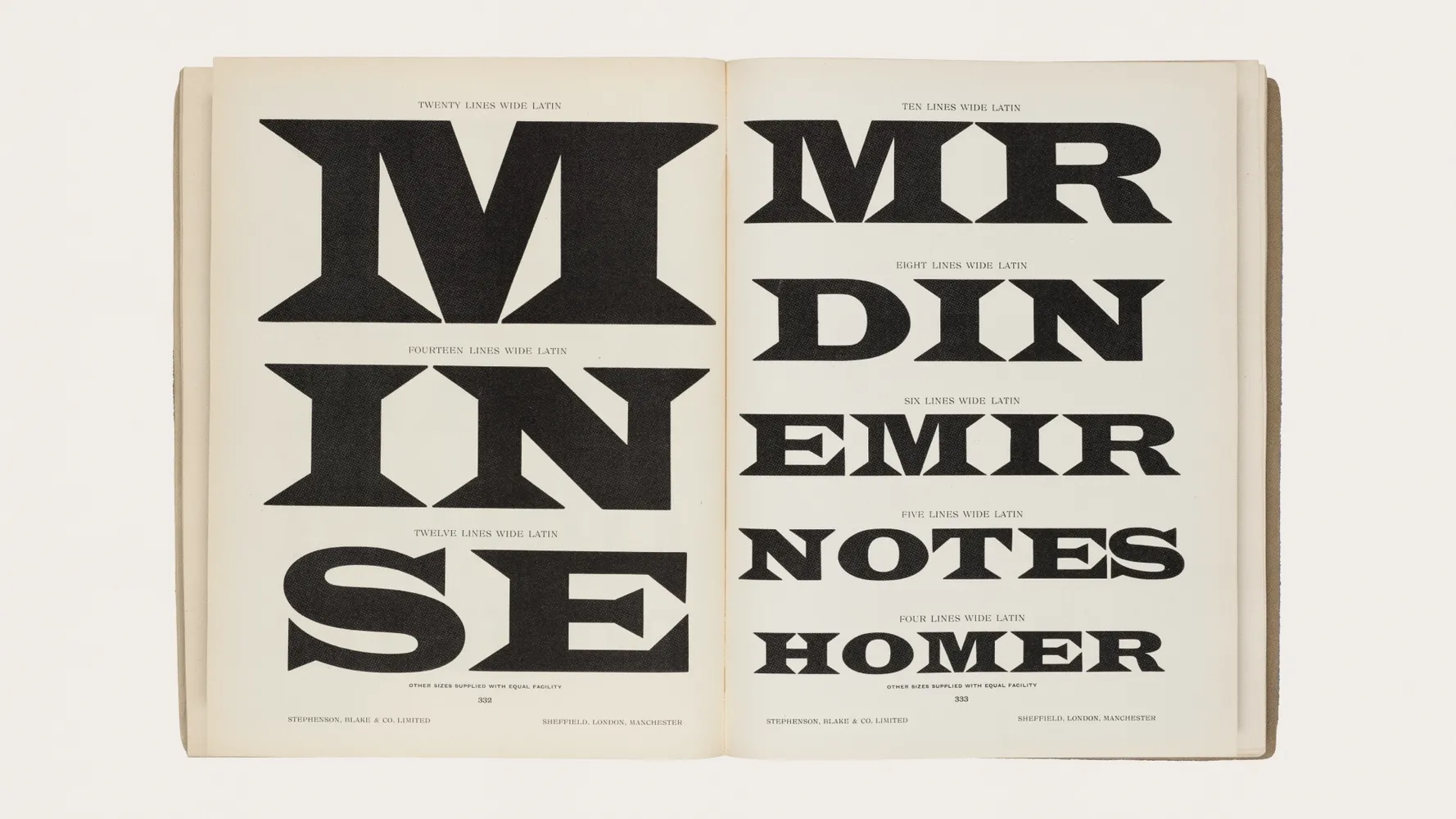
The History of Latin Typefaces
Latin-style typefaces first appeared in the 19th century, driven by new printing technologies that encouraged experimentation with letterforms and sizes. As wood type grew in popularity, more companies began specializing in it—among them, Hamilton Manufacturing Co. and Page & Co.
Contrary to European book typography, 19th-century American typography served street advertisements, circus posters, and storefront signage. This environment fostered bold, grotesque, and decorative typefaces. Among this diverse range and eclectic variety of forms, typefaces featuring pronounced triangular serifs stood out prominently, serving as foundational inspirations for Holz.
Characteristics of Latin Typefaces
— Triangular Serifs
One key feature of Latin typefaces is their triangular serifs. These serifs lend geometric precision and a strict appearance while maintaining visual clarity, making them ideal for signage, posters, and advertising that require readability from a distance.
— Proportions and Letterforms
Latin typefaces often featured varying proportions, with narrow or elongated letters that intelligently incorporated space into text composition or allowed flexibility in filling design layouts. This made them popular in newspaper and magazine typography.
— Graphic Power
Their forms were simple enough for mass production but expressive enough to command attention.
The Development of Holz
Origins
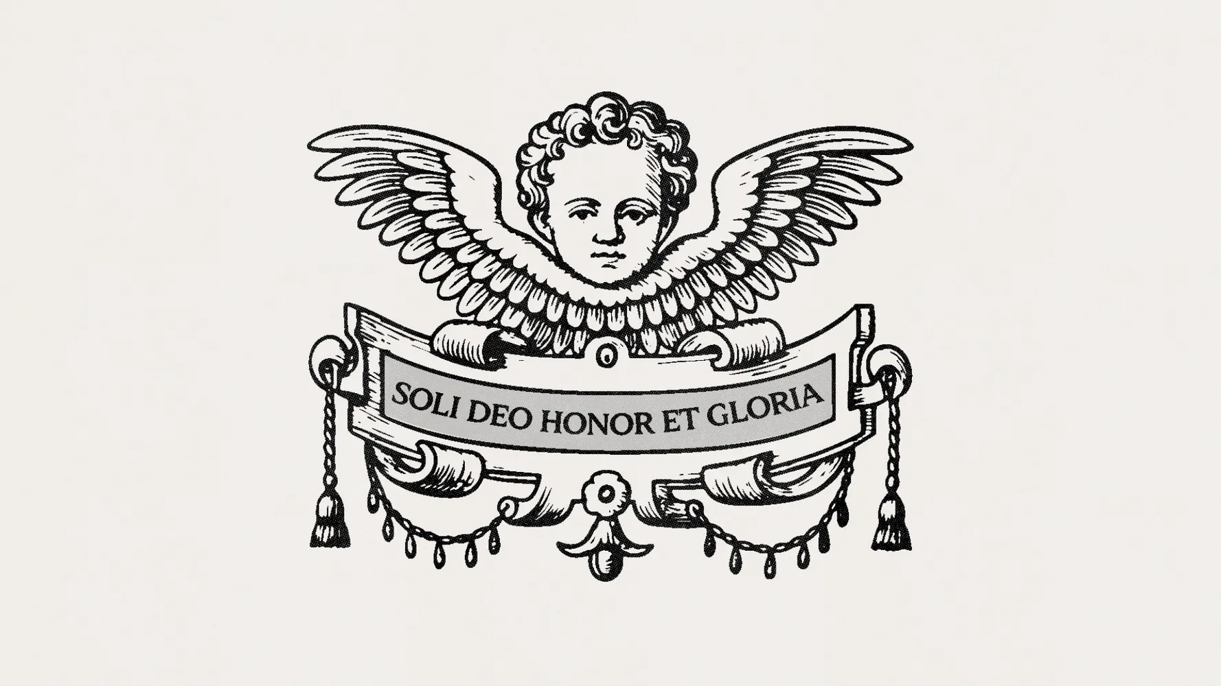
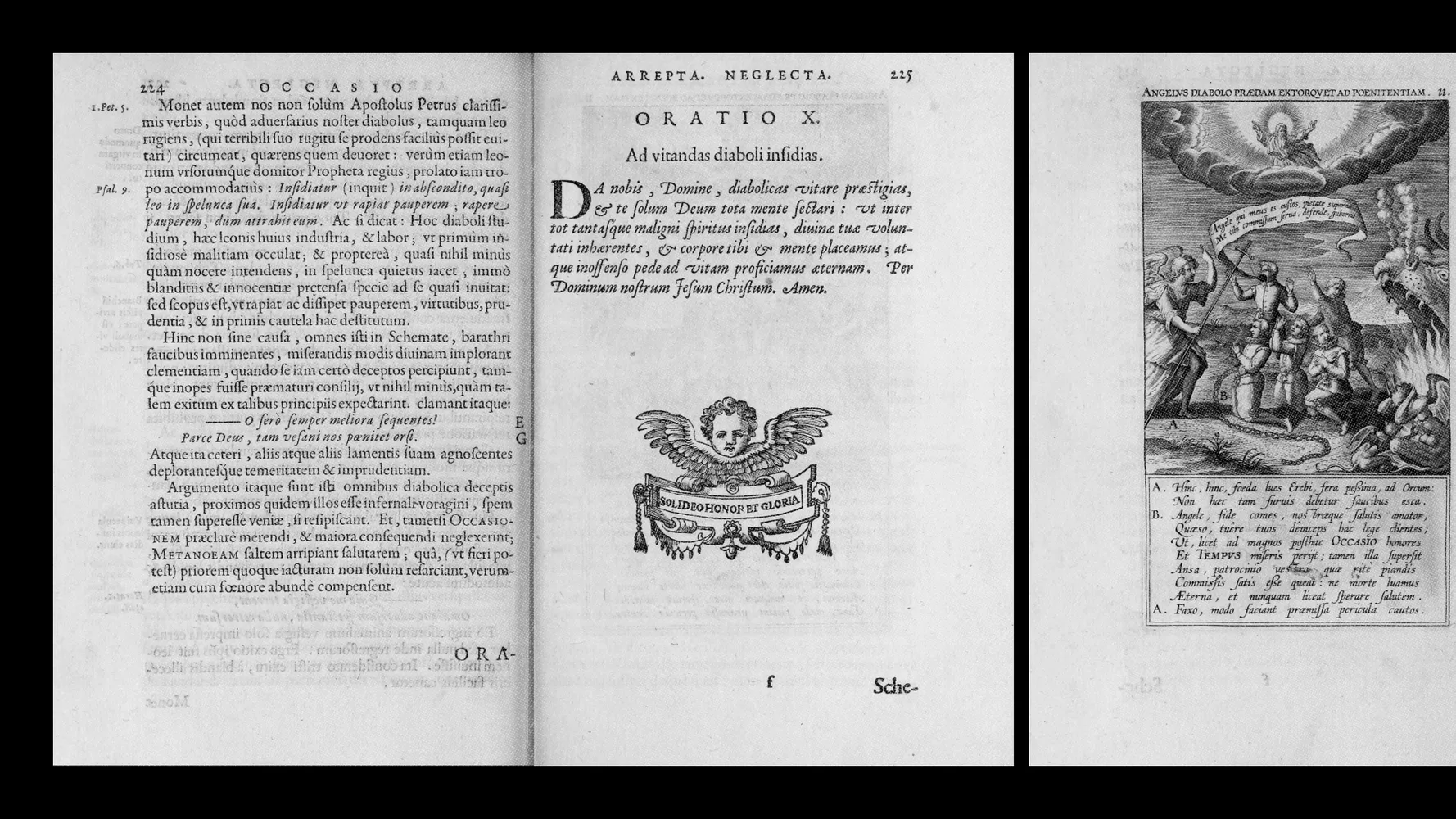
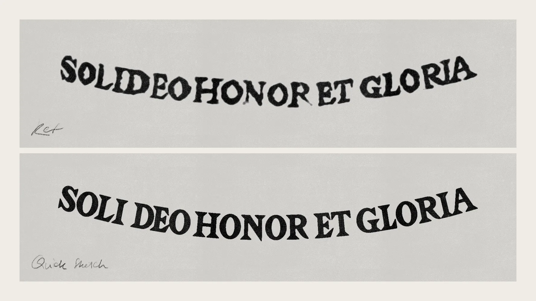
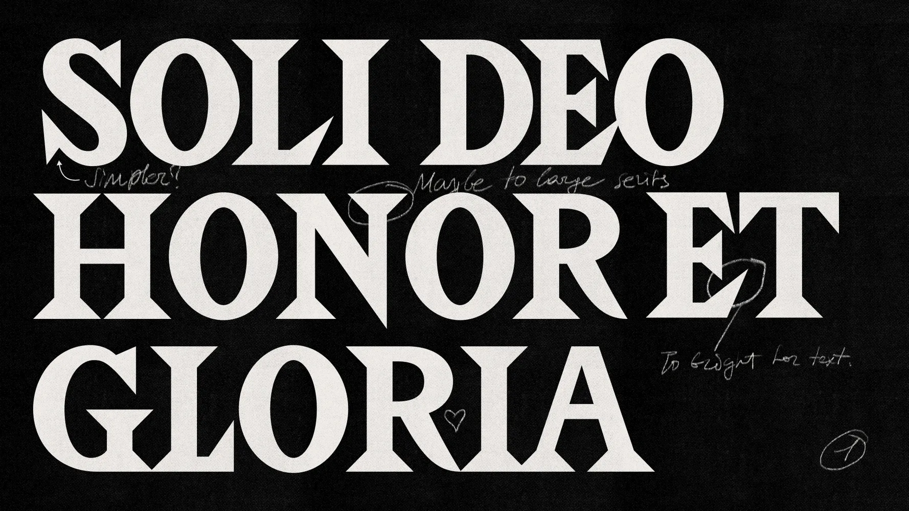
Holz began as a student project in 2015, inspired by a 17th-century engraving with expressive letters spelling “Soli Deo Honor et Gloria,” meaning “Honor and Glory to God Alone.”
As it turned out later, this engraving comes from the book Occasio Arrepta, Neglecta, Huius Commoda, Illius Incommoda, published in Antwerp in 1605 by the publisher Jan Moretus (Moretus, Ioannes). Its authors were Jan David and Théodore Galle. A copy of the book is preserved in the Plantin-Moretus Museum archives and can be explored in their online archive.
I was deeply inspired by this connection between letterforms spanning centuries, all executed in the same material—wood. Some resulted from the limitations of the technology of their time, while others emerged as techniques advanced. In a sense, one could say the third stage of their evolution is taking place now.
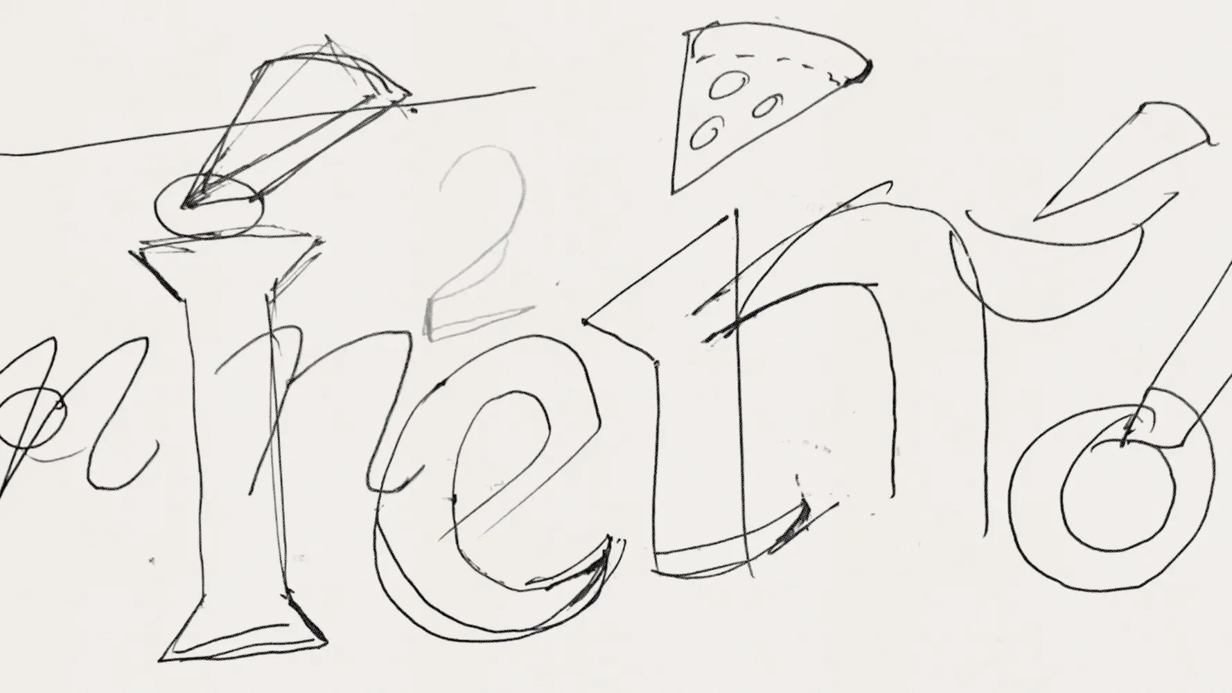
First sketches
At first glance, designing a typeface with triangular serifs seems simple enough—just take a vertical stroke and add triangles. However, in reality, such a straightforward approach rarely works in type design. A typeface is a complex system, and the pieces don’t always fit neatly like building blocks. Even Kabeltouw, one of our most modular typefaces, required compromises.
When designing Holz, I set myself an almost impossible goal—to create a typeface equally suited for both text and display typography, much like its historical predecessors.
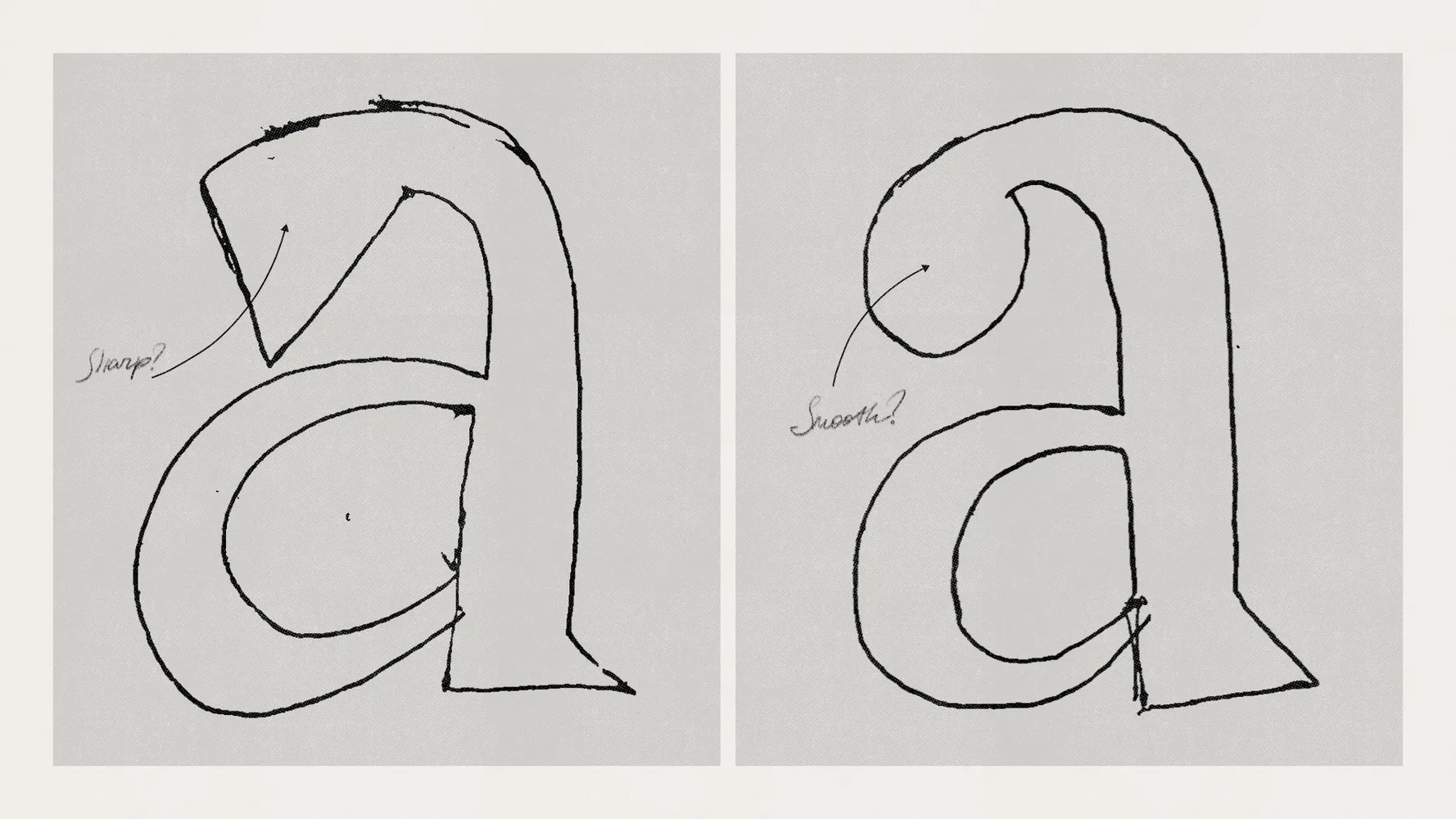
In the initial sketches, the serifs appeared excessively wild, making it difficult to imagine Holz as a suitable choice for body text. The forms felt jagged and overly dramatic—hardly suitable for body text. It took time to settle into the balance.
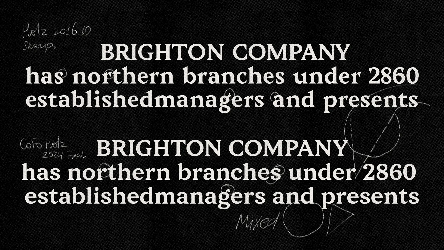
But over time, the aggressive nature of the serifs was tamed, and Holz gradually gained more geometric, rounded ball terminals, strategically placed where they felt natural and logical. This refinement softened the typeface, reducing excessive sharpness.
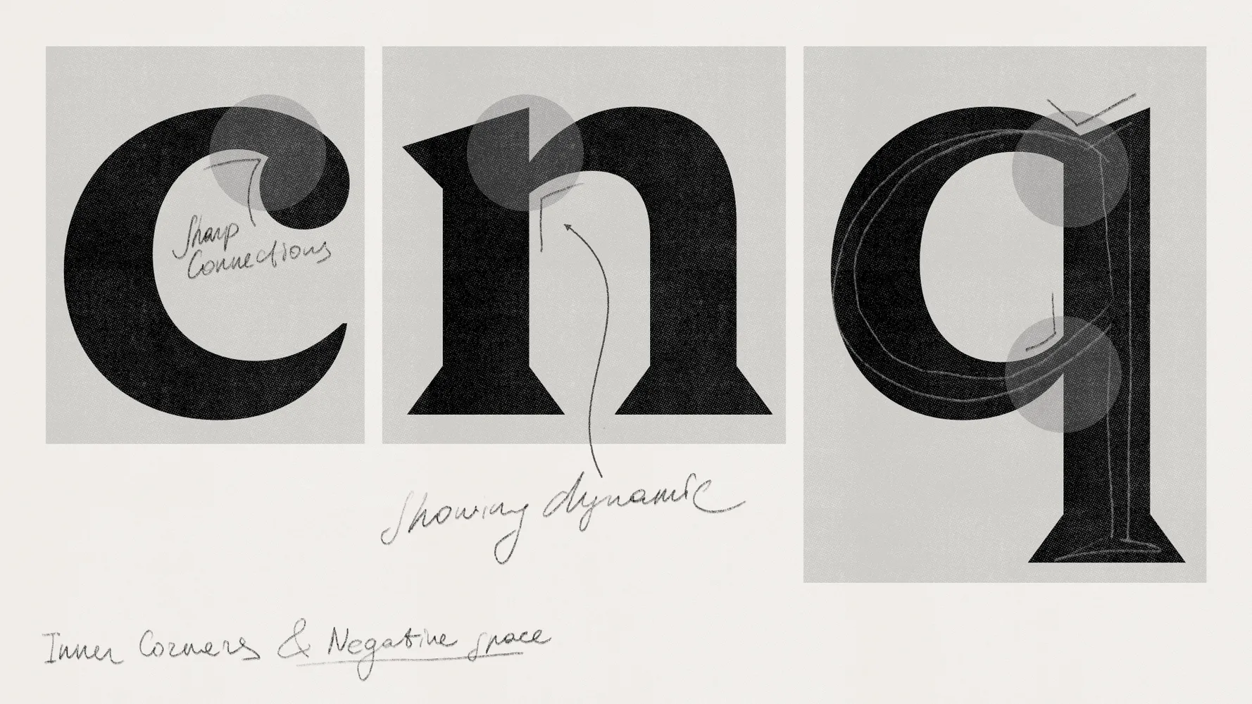
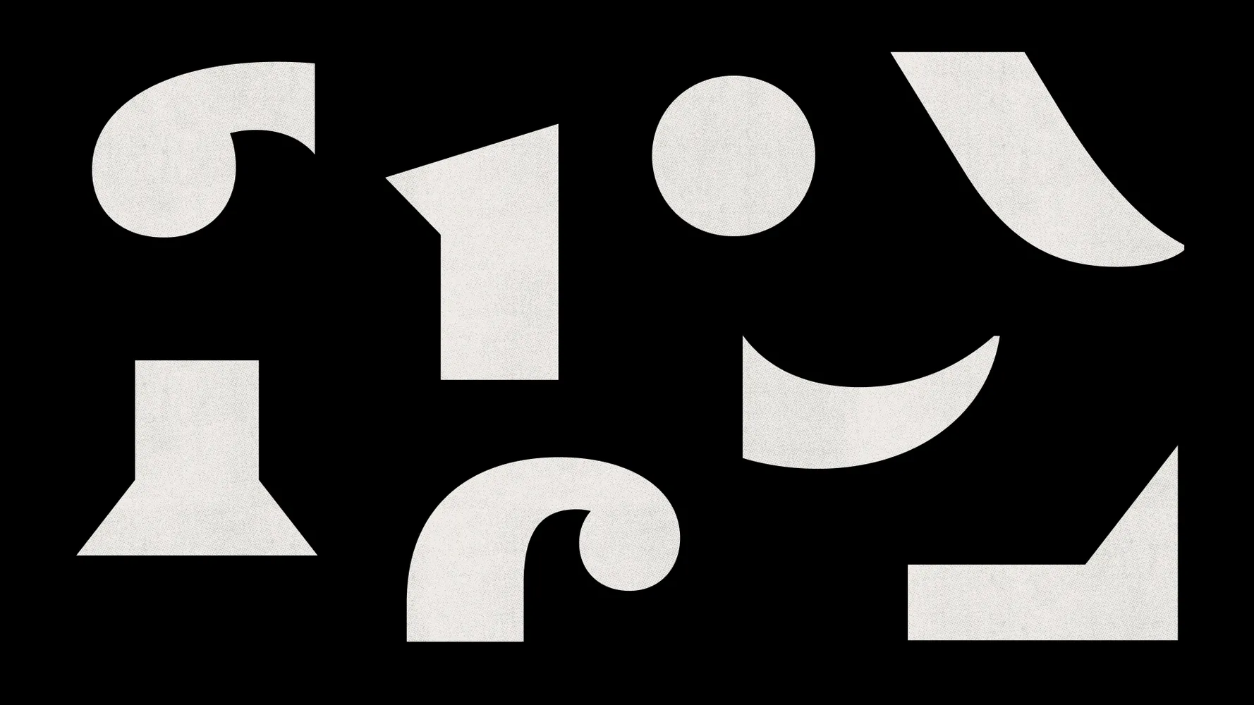
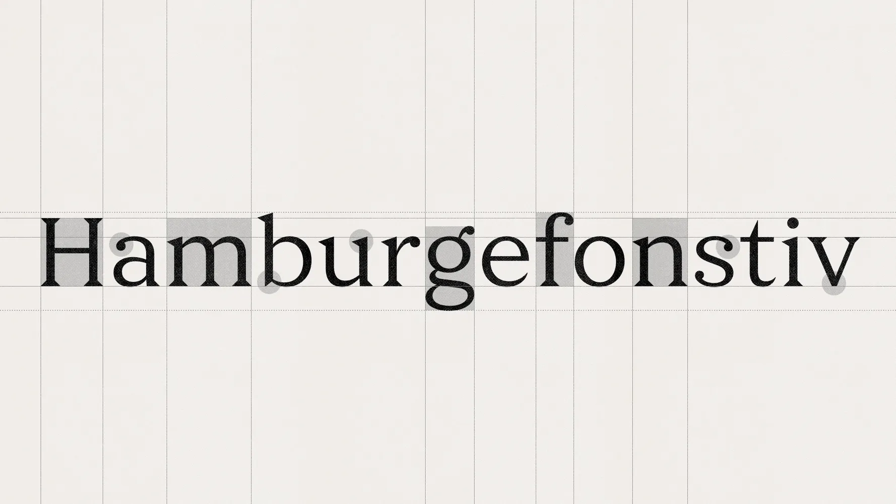
Form and counterform
When designing Holz, it was essential to consider not just the letters themselves but also the spaces inside and around them—known as form and counterform. These spaces define the typeface’s rhythm and enhance its character. In Holz, sharpness isn’t limited to serifs; it also comes from deliberately shaped internal spaces.
Personality vs. neutrality
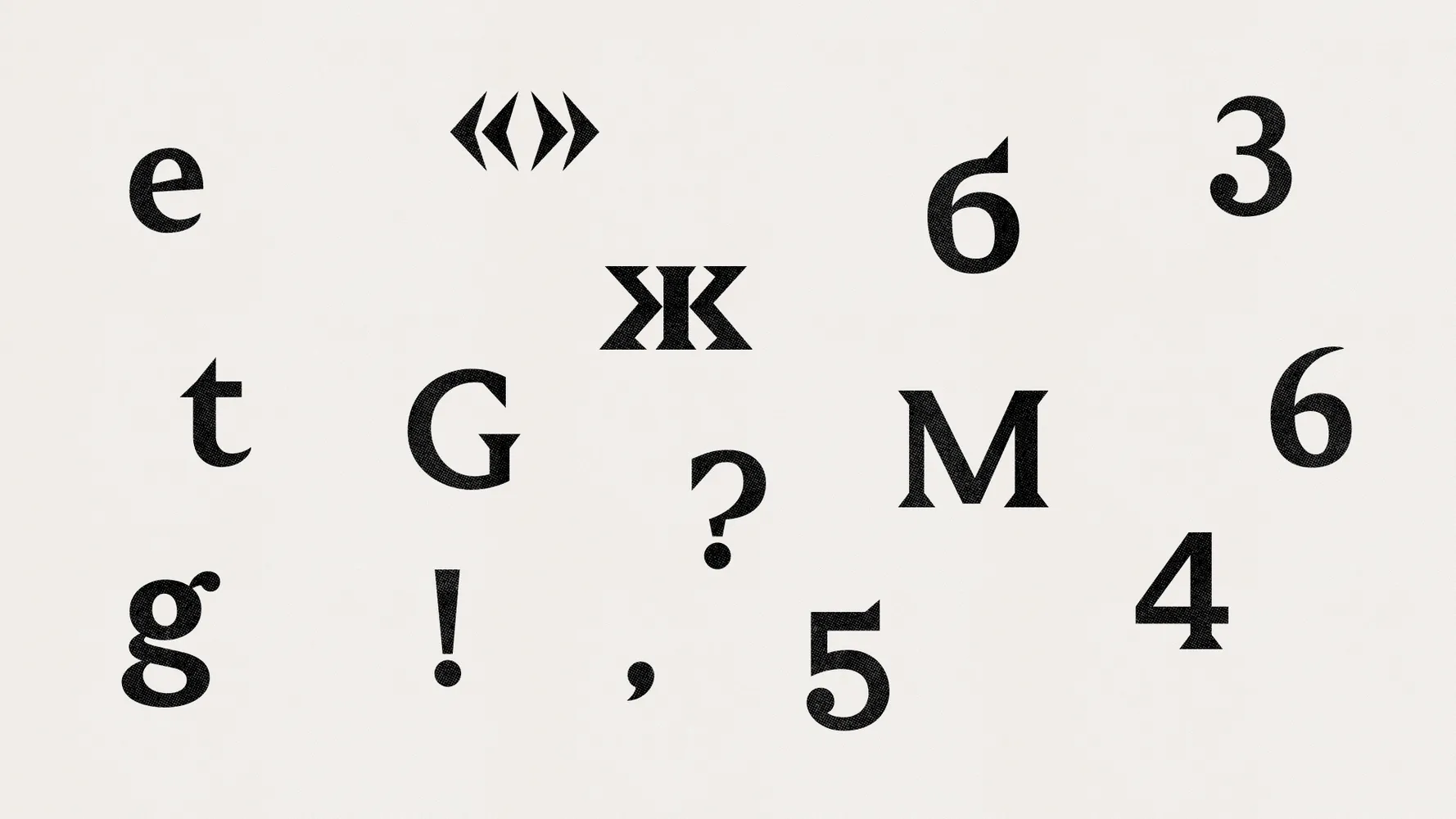
Throughout the design process, most glyphs underwent revisions: some became more expressive, others more neutral and systematic.
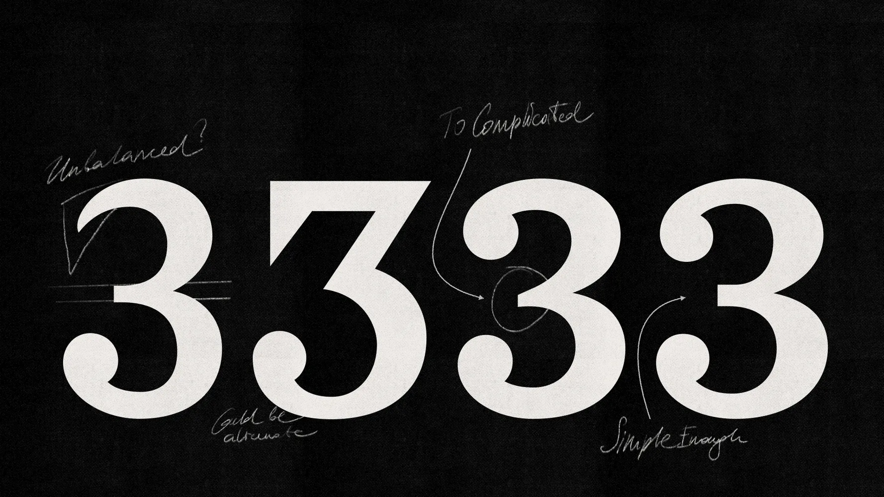
In particular, the horizontal strokes of letters like Э were softened, and the numeral 3 was redrawn multiple times to find the right balance of clarity and weight.
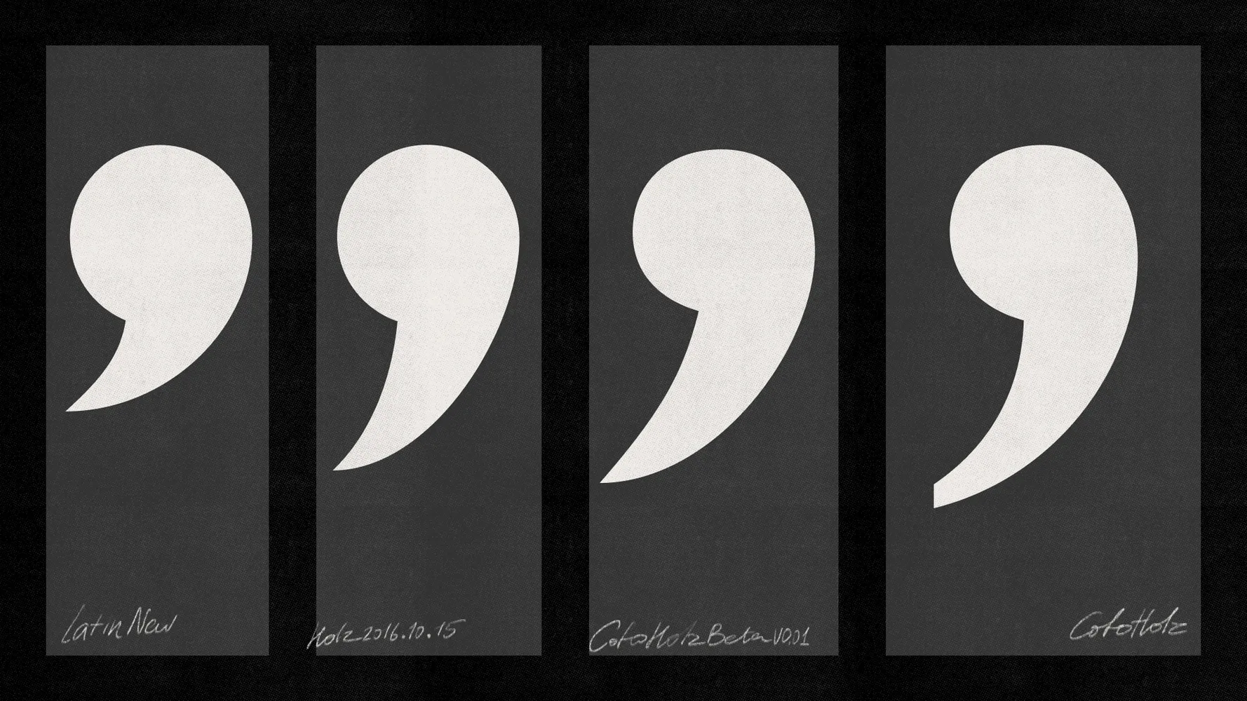
Punctuation also changed: quotation marks and commas were redrawn to sit better within text flow. The goal was to keep the typeface distinctive without overwhelming the surrounding content.
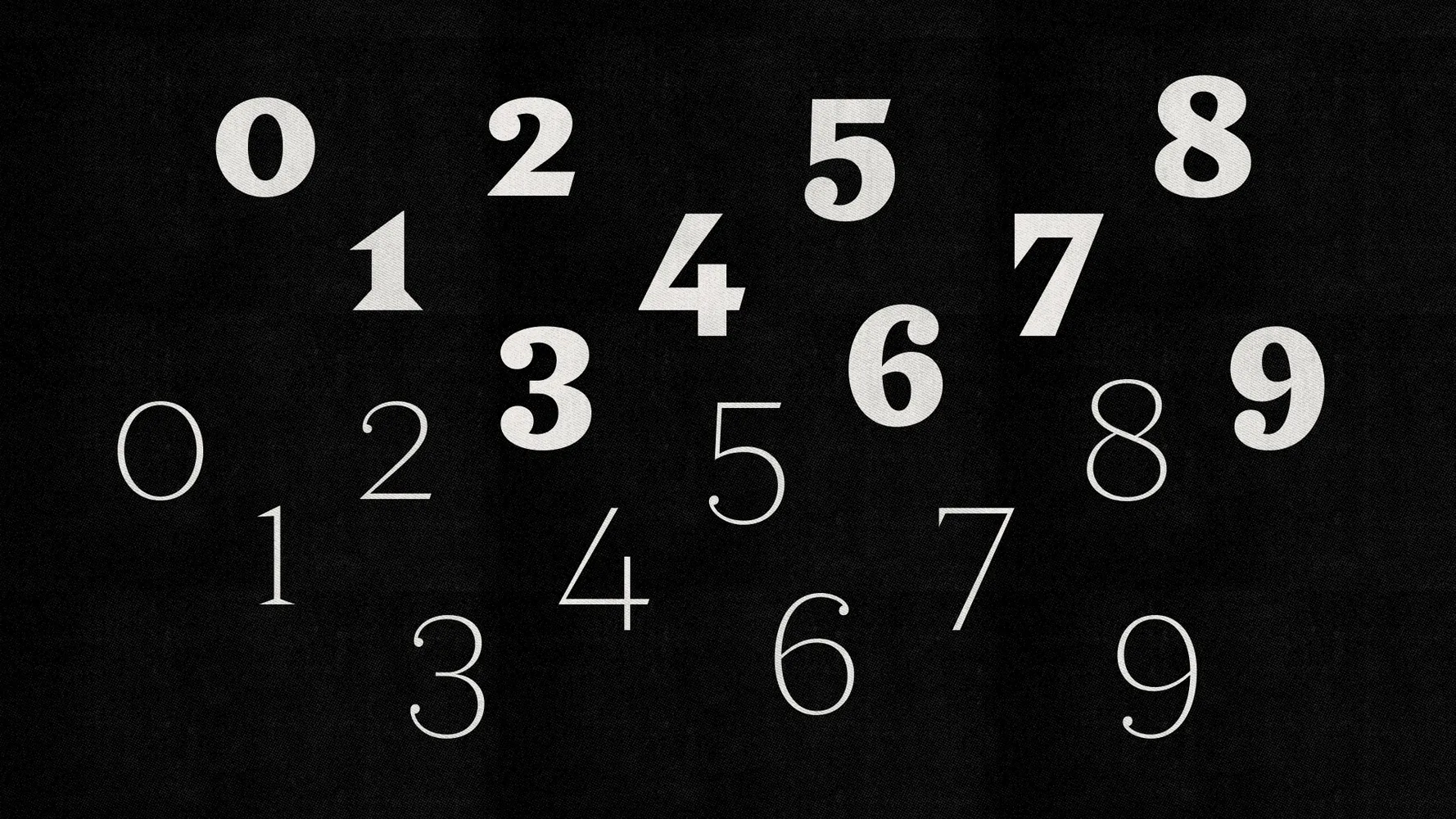
Numerals
Great attention was paid to numerals in Holz. In addition to the lining figures, I included a set of oldstyle numerals designed for use in text. Their ascenders and descenders help them sit quietly within long passages without disrupting the reader.
Holz comes with ten sets of figures, including lining, oldstyle, fractions, superiors, inferiors, and even Roman numerals.
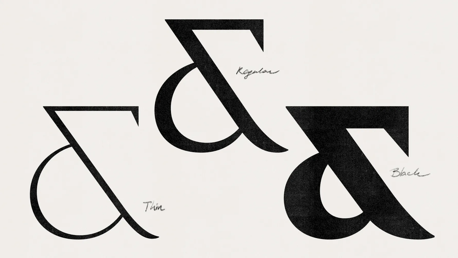
Ampersand
The ampersand (&) is possibly the only character that remained virtually unchanged throughout the design process. Its unconventional and distinctive form became a cherished feature that was deliberately preserved. Maybe in a future version it’ll get a calmer counterpart, but for now, it stands its ground.
Technical details
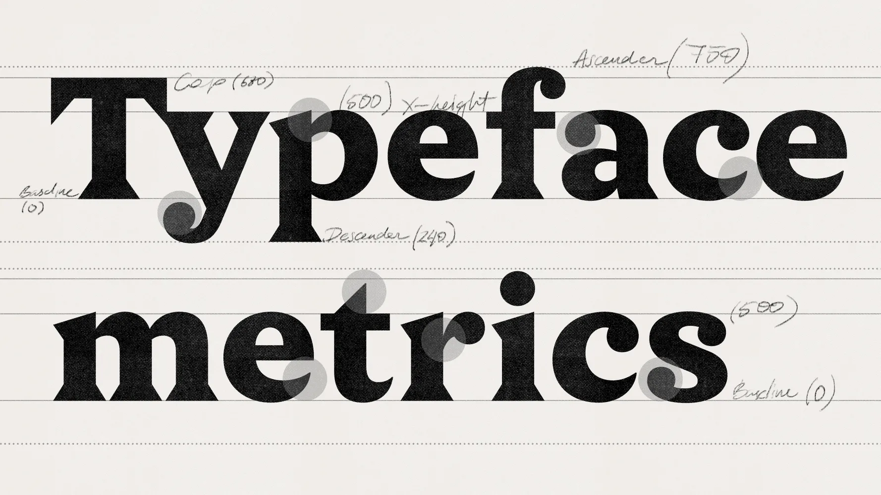
Font metrics, the ratio of lowercase to uppercase letters, and ascender and descender lengths are really important and can completely change how a typeface feels. I wanted to find proportions that make Holz work just as well in text as in headlines. Shorter ascenders and descenders help keep line spacing tight in headlines, while a taller x-height makes small text easy to read.
The importance of testing
Regular, real-world testing was essential. Beyond precise spacing and kerning (memorable from endless sheets printed in the studio when Lisa worked on her typeface Robert), practical tests in posters, book covers, and lengthy texts helped identify what worked—and what needed improvement.
It wasn’t just about kerning or spacing. We printed mockups, set headlines, designed layouts—tested Holz in logos, body text, posters, covers, and digital interfaces. That’s where the real insights emerged: how it moved, breathed, misbehaved, or held up under pressure.
Spoiler: there’s always something to tweak—even after release.
Holz style range
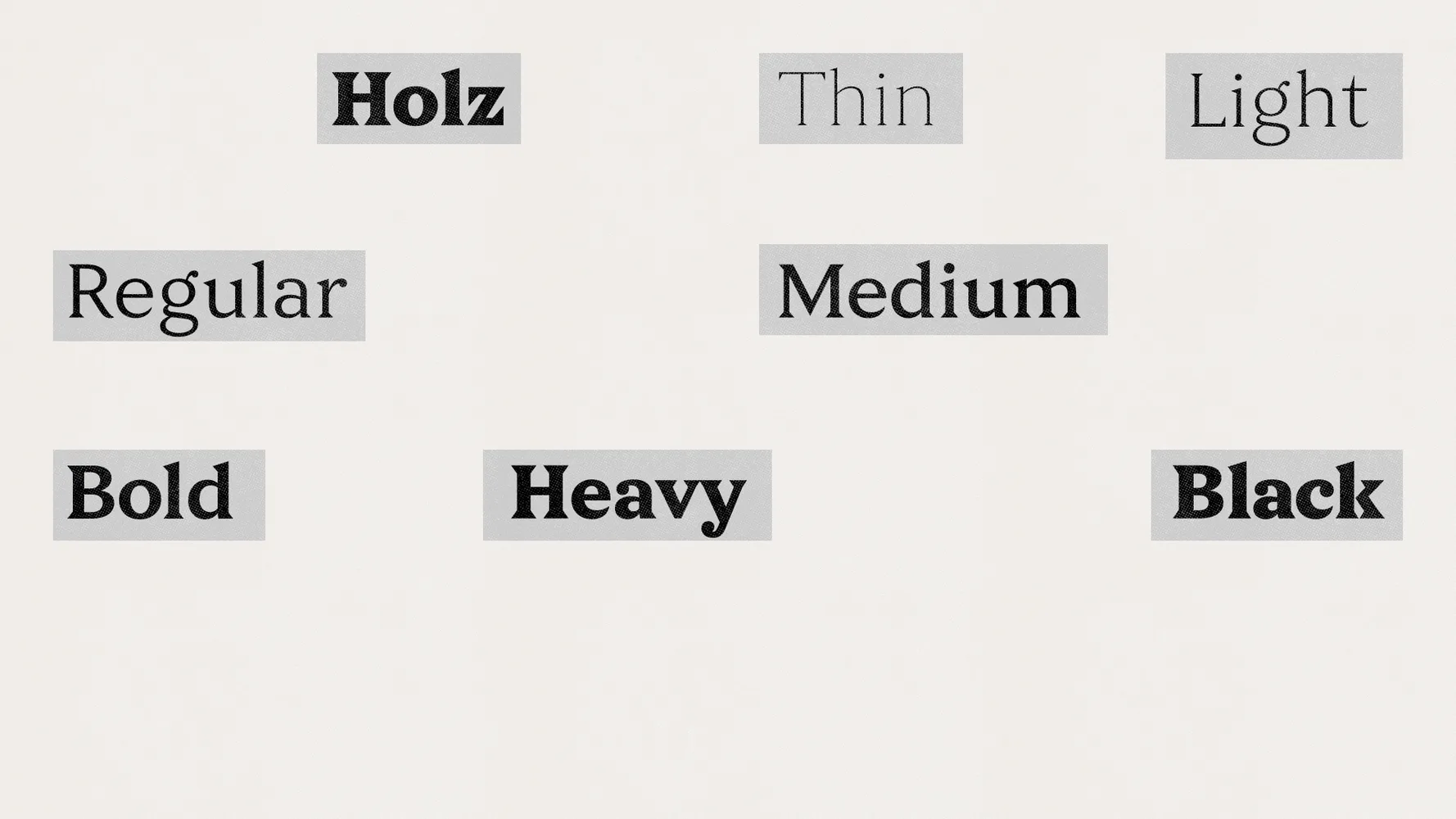
Holz is available in seven weights: Thin, Light, Regular, Medium, Bold, Heavy, and Black. This wide range makes it suitable for both display headlines and body text. Lighter weights deliver elegance and subtlety, heavy weights provide emphasis, and medium styles ensure comfortable reading.
Variable font
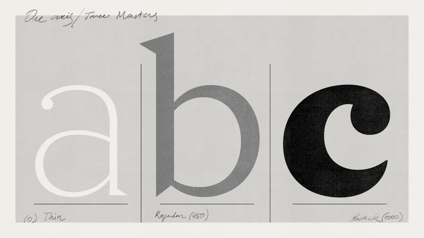
Like many of our typefaces, Holz comes not only in static font formats but also as a variable font, allowing subtle customizations of the weight. You might think two masters are enough for a typeface that covers weights from Thin to Black, but for a smoother transition, we added a third master in the middle to slightly correct the curves for better interpolation. It also helps fine-tune the contrast and gives us full control over the most essential Regular style, used for setting smaller text.
Extensive character set
Holz supports an extended Latin and Cyrillic alphabet, making it ideal for global branding. This includes major European languages (English, French, Spanish, German) and Cyrillic-based languages such as Russian, Belarusian, Ukrainian, Bulgarian, Serbian, Kazakh, and others from Central Asia, providing designers with extensive language versatility.
Best uses for Holz
Designed for versatile applications, CoFo Holz adapts to a variety of styles and contexts:
⦿ Branding: Logos and attention-grabbing headlines.
⦿ Book design: Effective for both body text and accent elements.
⦿ Digital media: Expressive for websites and animation.

Pairing Suggestions
Which fonts pair well with Holz? CoFo Holz works especially well with several sans serifs from our collection. They share similar metrics—height, proportions, and contrast—making them natural companions. Try pairing Holz with:
⦿ CoFo Weather
⦿ CoFo Gothic
⦿ CoFo Robert Sans
Their shared visual logic—modest contrast, clean proportions, and matching x-height—makes them an ideal foundation for mixed-type systems.
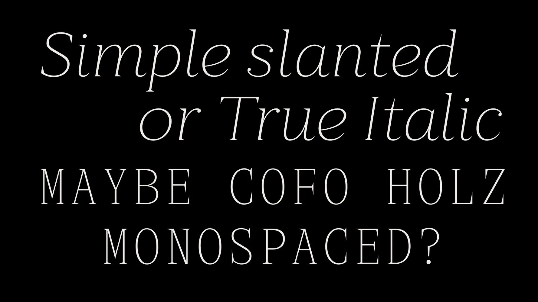
What’s Next for Holz
The development of Holz is still ongoing. Upcoming additions include:
⦿ Italics to expand the type family
⦿ A monospaced version
⦿ An expanded set of ligatures and advanced typographic features
These additions will allow Holz to stretch further—into editorial settings, brand identities, technical layouts, and expressive design experiments.
Latin-style typefaces served as the starting point for Holz, but the project evolved far beyond a straightforward revival. Holz is not a replica of a Victorian font—it’s a contemporary interpretation with a voice of its own. It carries tradition forward while staying relevant today.
Typographic References
If you are interested in Latin typefaces or just triangular serifs, here is a list of type specimens we recommend browsing through:
— Wood Type, Specimens of Nineteenth Century American Wood Type
— Collective Specimen Book, American Type Founders Co.
— Specimen of Printing Types, Borders, and Ornaments, Stephenson Blake & Co, 1895
— Wood Letter, Stephenson Blake & Co Ltd, 1936
— Monotype Jobbing
— Modèles de lettres pour peintre. Ducompex, 1885
— Photo Lettering’s One Line, Manual of Styles, 1971
Author: Nikita Sapozhkov
Editor: Ekaterina Barannikova
Type designer: Nikita Sapozhkov