From custom to open source: how Contrast Foundry helped shape TikTok Sans
It all started when TikTok reached out to Type Network to expand its custom font, TikTok Sans. After reviewing several partners, they selected Contrast Foundry to carry on the project. We stepped in to turn the design into an even more flexible typeface system. What began as a custom typeface with three axes, needed to do even more: it had to increase versatility to adapt to an even wider range of uses.
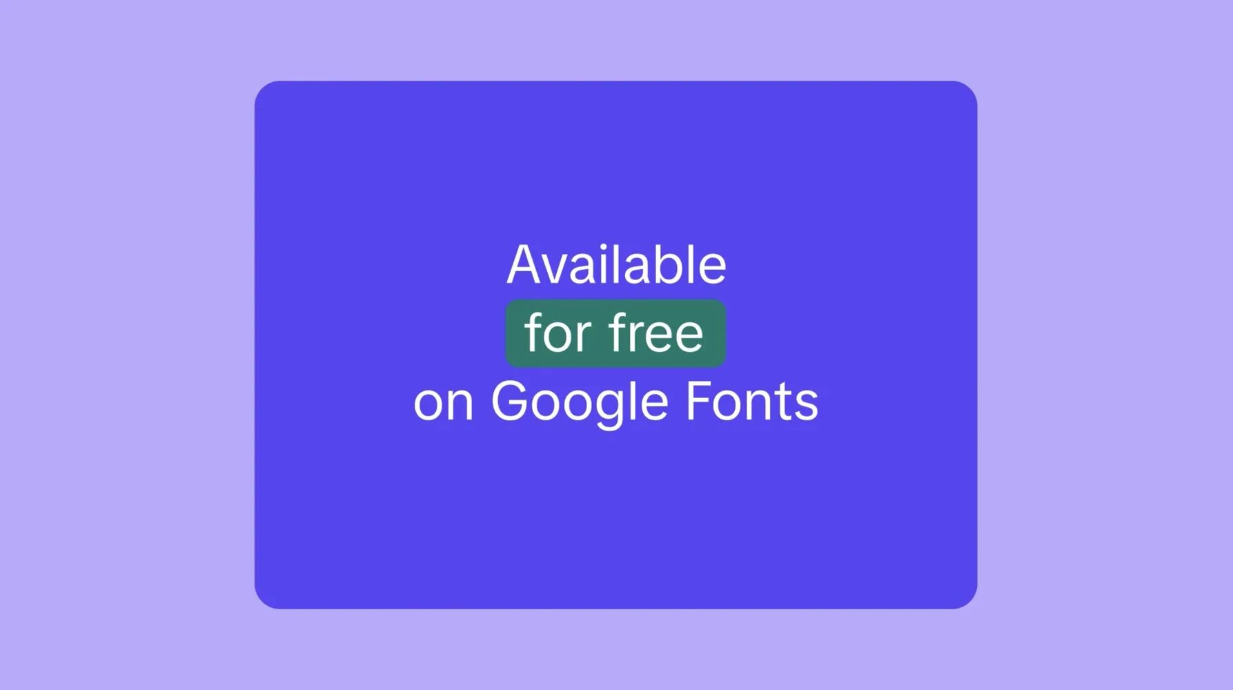
Over nine months, we worked closely with Type Network and TikTok’s design team to expand, and polish the type family. The updated TikTok Sans is now available on Google Fonts, open to everyone.
“Custom fonts aren’t made once and done. Especially when it comes to digital products. We were happy that TikTok chose us as partners for the next chapter of their TikTok Sans. It is even more exciting that the typeface is now available for everyone in the world to use”.
—Maria Doreuli, Contrast Foundry
From condensed to expanded — even more flexibility
The original design came from our colleagues at Grilli Type, and it included 8 font masters ranging from Light to Black and from Text to Display, all with matching italics. But the initial layout was not enough—TikTok needed a typeface that could adapt across UI, video, and everything in between. Content that their users create is so vibrant and dynamic—could the typeface express that same energy?
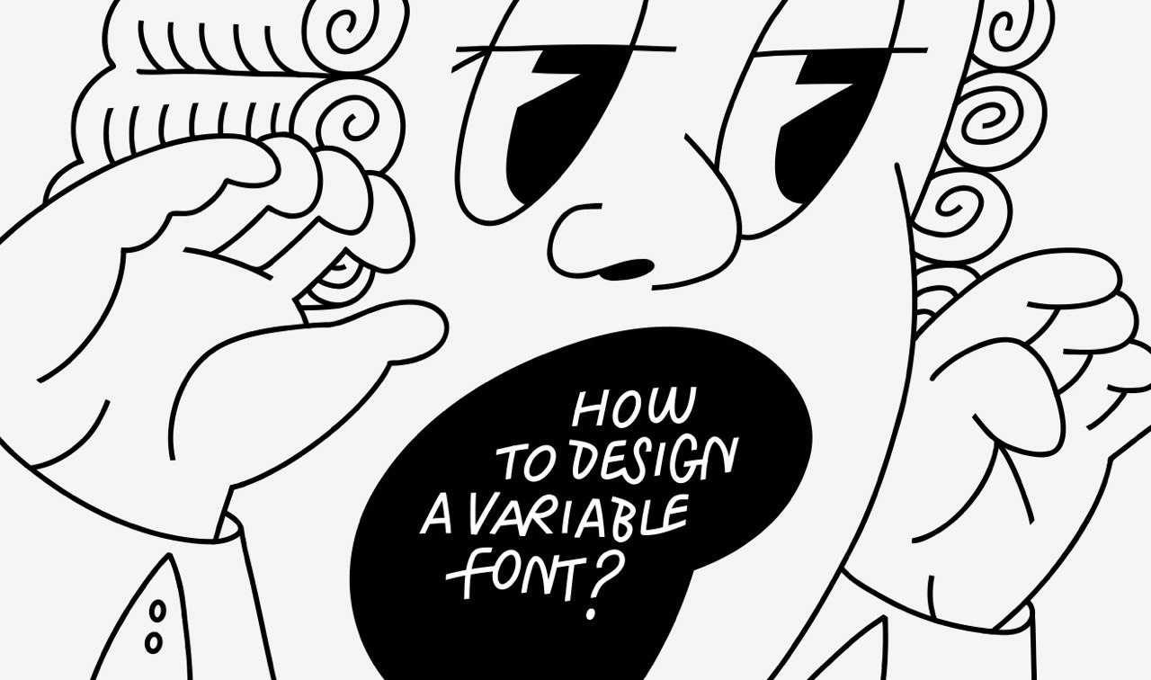
To kick off the project, our partners at Type Network created a testing playground to explore what the expansion of the typeface could be. One key area was the introduction of a new width axis for both the text and display families. You can read about all the different axes that may exist in a typeface in our article on variable fonts.
Traditionally, adding a width axis to a system with eight 8 masters would require drawing 16 new masters by hand—a huge undertaking. Instead, we worked with Type Network to identify which masters were most essential to draw by hand to improve the overall quality of the system and the rest were generated programmatically.
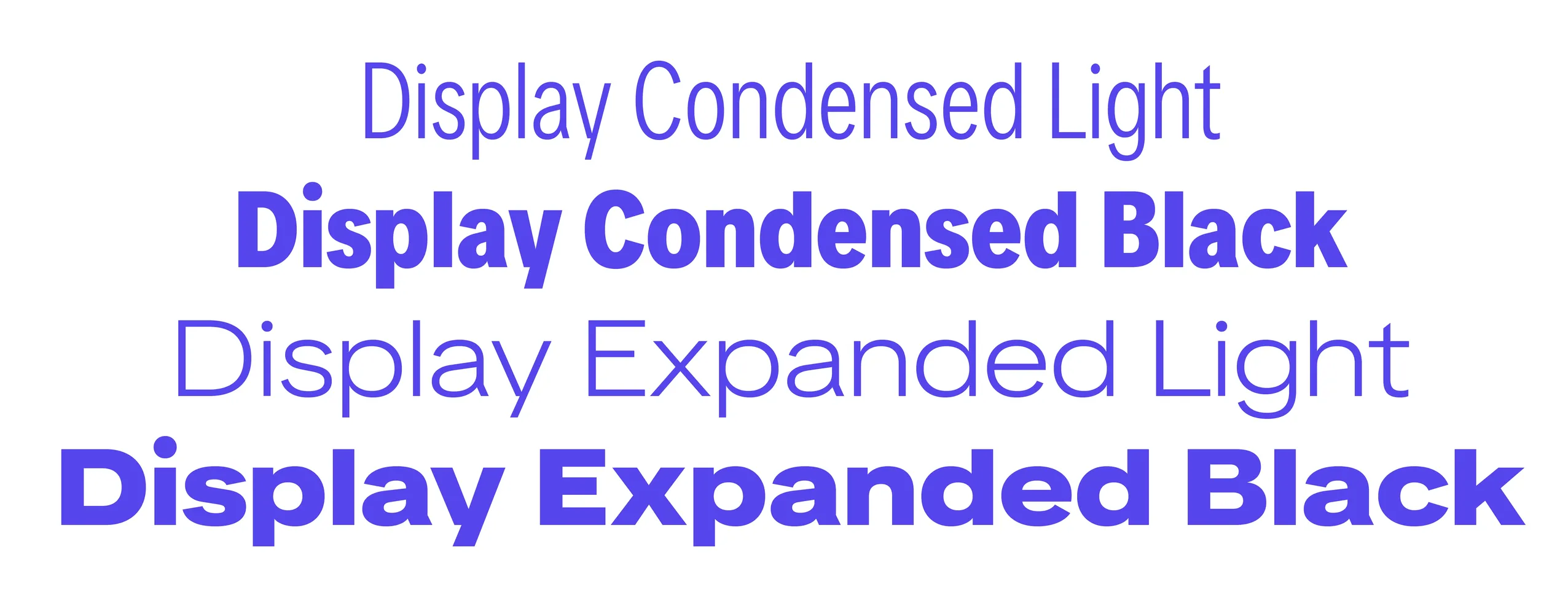
Rather than draw everything upfront, we took a gradual approach. One step at a time, we added one by one Display Condensed Light, Display Condensed Black, Display Expanded Light, and Display Expanded Black: each one expanding the system while preserving its original tone. Before committing to a new master, we tested it using a limited character set to see if it truly contributed to the system. This approach now only helped us to set priorities and save our time (and clients budget) drawing 16 new masters, but also helped us keep the file size down and focus on what was actually useful.
Tuning every script
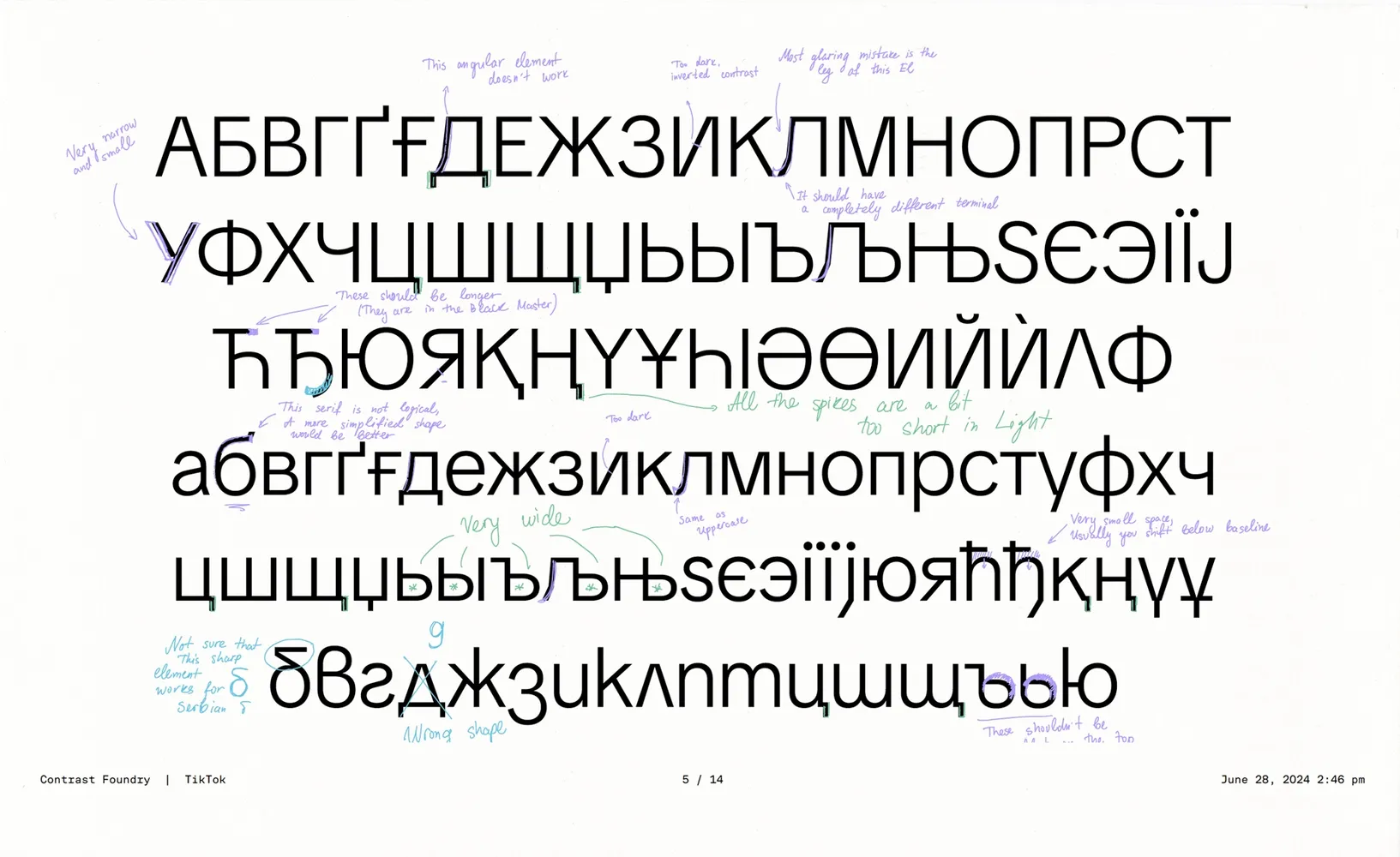
Using our expertise in multilingual type design, we were also asked to examine glyphs outside Latin. As a result, we fine-tuned Greek and Cyrillic to make them not only fit within the design but also be respectful to the script. Some letters, like the Лл, radically changed the construction, while other changes were often subtle. We adjusted proportions, spacing, and some of the design features as well, helping the scripts feel more connected and consistent.
“This project’s complexity meant we had many moving parts to tackle. We needed to ensure that compression and expansion of the letterforms retained the overall character of the original typeface, while also achieving consistency and balance across Latin, Cyrillic and Greek. We were only able to accomplish this through a systematic approach and strong teamwork”.
—Krista Radoeva
Clear on any screen
Since TikTok Sans appears across so many devices, the font needed to stay readable at all sizes. Type Network brought in Aaron Bell, a talented engineer who adjusted how the letters align to screen pixels so they stay sharp and readable on small or lower-resolution displays.
This behind-the-scenes step plays a big role in making sure the font works the way it should, no matter where it appears.
TikTok Sans goes public via Google Fonts
After all the updates, TikTok released the full font family to the public. TikTok Sans is now on Google Fonts, free to use and open to contributions.
For us at CoFo, this was a chance to work on something that started with clear design goals and ended up in the hands of people everywhere. We’re glad to see it used in new ways already and excited to see where it goes next.
CONTRAST FOUNDRY TEAM
Type designers: Krista Radoeva, Maria Doreuli
Editor: Ekaterina Barannikova
Motion: Anna Volkova
Sound: Tolya Doodko
TYPE NETWORK TEAM
Creative Director: Lucas Czarnecki
Technology Director: Guido Ferreyra
Hinting: Aaron Bell