Arthur Lebsack: Art and Cultural Heritage in the CoFo Glassier Typeface
We believe that projects intertwining art and cultural heritage deserve special attention. That’s why the CoFo team eagerly joined forces with Arthur Lebsack, known for his unique design approach and notable projects at the famous Gorky Central Park of Culture and Leisure, the “Tsvetnoy” department store, and Pizza Maestrello.

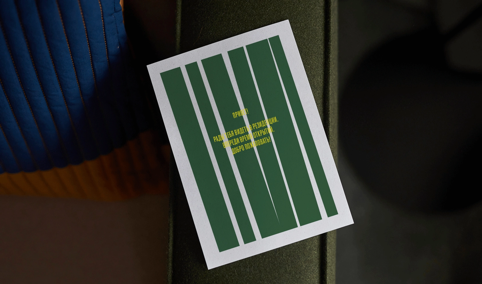
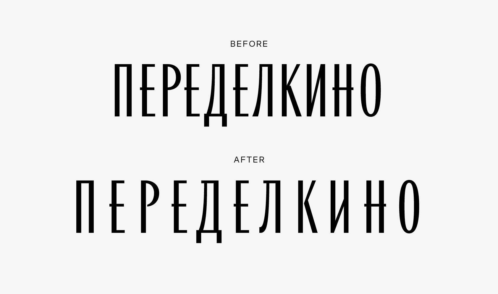
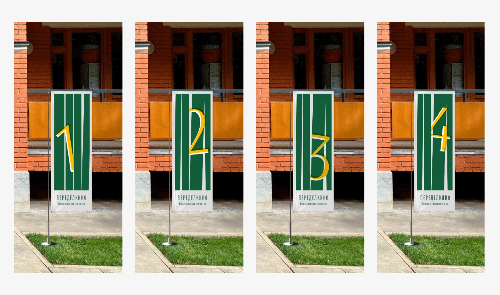
His project in Peredelkino is particularly noteworthy for its unique blend of visual beauty and deep cultural roots. The recently developed CoFo Glassier typeface, along with CoFo Kak, has become a key element of this initiative, aimed at revitalizing the cultural space of this legendary writers’ town.
[CoFo]: How do you usually approach typography when starting a new project? How often do you look to the past and use historical references?
[Arthur]: There’s no secret method; it typically unfolds like this: typography is a tool that shapes the style, and in each project, it becomes part of the system and the overall plan for creating communication. It is developed in such a way as to accurately convey the idea, character, and mood. For example, in the Peredelkino project, we referred to the 1960s because it was a special and significant time for Peredelkino, which we wanted to highlight through the graphic features of that era. I have had other projects where I drew on the distinctive features of typeface design from various periods, but I was very careful not to fall into mere stylization. I think that before Peredelkino, I hadn’t used typefaces in my projects that carried the bright and recognizable features of a specific era, as CoFo Glassier does.
[CoFo]: Tell us, how did you come to work on the visual style of Peredelkino? What was the challenge you faced?
[Arthur]: I was giving a lecture at a university, where I briefly talked about a typeface that I had started developing at the Type Design Workshop. I posted a few examples on social media, which Dasha Beglova, the director of Peredelkino, saw and prompted her to reach out to me. We met, talked, and soon began working on the style of Peredelkino. It was 2019, and everything was just reviving: the writers’ house, residences, the first events were starting, the flow of guests increased, and Peredelkino was in great need of an identity.
[CoFo]: Were there any specific materials (books, blogs, resources, works of specific designers) that you studied during the process?
[Arthur]: There is a library in Peredelkino, where I spent some time taking photos of book covers. I read a couple of books about that time. I studied the main events, understood how the country lived at that time, and what the main cultural events were. Of course, I studied the history of Peredelkino. I read biographies of poets who lived and worked there. Krichevsky’s book “Graphic Signs of the Thaw” is excellent on this topic.
[CoFo]: Where do you usually look for typefaces? And at what point do you start thinking about and trying to design something of your own (a typeface and/or logo)?
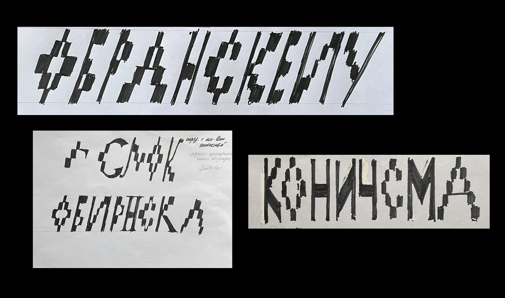
[Arthur]: When it comes to Cyrillic typefaces, I follow designers whose professionalism I trust and keep track of their new releases. When a project comes my way, I already have an idea of which typeface I might use. Logos in my projects are always unique; I don’t use retail typefaces for them. During the style development phase, I usually provide a type designer with a brief to draft several typographic options for the logo. When the brand typeface is one of the style-forming elements in the hypothesis, I engage a suitable type designer for the project. That’s exactly how we tackled the Peredelkino project.
[CoFo]: You have extensive experience working with type designers on various projects. What is the key to successful collaboration between a graphic and type designer?
[Arthur]: Indeed, in each project, I involve a type designer, coming to him/her with a ready brief and all the necessary details needed to start. The main thing is to start right, and then you can rely on the type designer’s experience, which will help develop the idea and complete everything I initially gave. The key to success is rigorous testing and adaptation of the typeface across various scenarios and the experience, professionalism, and responsibility of both parties.
[CoFo]: What personally indicates the success of a project to you? What makes you proud of a particular work?
[Arthur]: For me, a project’s success is measured by several criteria. First, the team’s satisfaction with the work done and satisfaction with the final result—especially important when it’s possible to realize all the conceived ideas. The second criterion is how well the final project matches the initial idea. It is not an easy feat, and it can be pretty disappointing. The third criterion would be whether you still consider the project noteworthy when looking at it after, say, a decade upon completion. Whether you are still proud of what you have created or feel like you’d rather forget about it.
Check out Arthur’s work on his Instagram.