Designing CoFo Robert Sans: an interview with Liza Rasskazova
CoFo Robert Sans is a new grotesque by Liza Rasskazova and one of the most carefully considered sans-serif releases in the CoFo library to date. Rooted in British type heritage, it expands the CoFo Robert family with a friendlier, more versatile sans-serif voice: warmer than a neo-grotesque. Built on the detail of CoFo Robert slab-serif, it introduces new stylistic alternates and excellent readability at small sizes.
[CoFo]: How did the idea for Robert Sans come about?
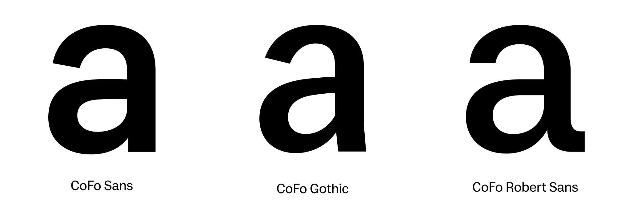
[Liza]: It started in a very practical way—with a book design project that I had been working on. I focus extensively on type setting and almost always use the CoFo type library. At some point, I realized that we didn’t have a friendly grotesque: CoFo Sans felt too techy, and CoFo Gothic was too display-oriented. I sketched a few letters, tested the idea, and it quickly became clear: we could design an approachable workhorse grotesque based on CoFo Robert—something that felt noticeably absent from our current typeface library superfamilies.
[CoFo]: What exactly connects the sans to CoFo Robert slab?
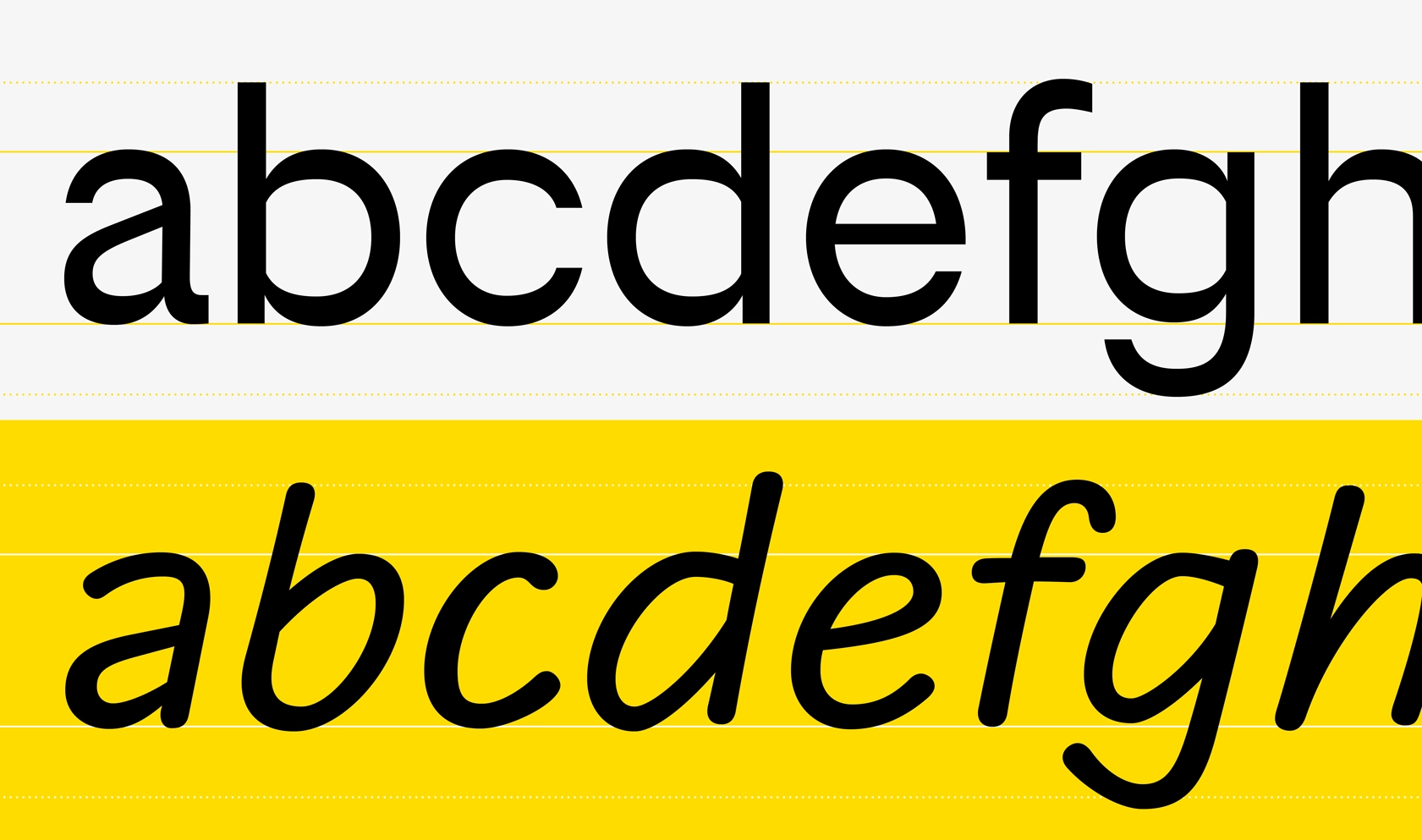
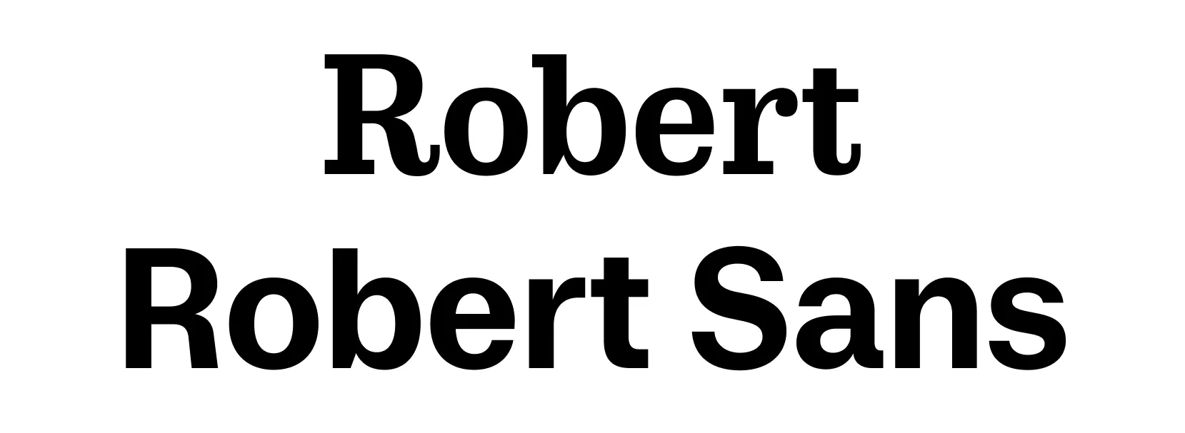
[Liza]: Robert Sans preserves the 19th-century DNA of its slab-serif sibling: proportions, closed counterforms, subtle stroke contrast, and the recognizable a with a tail. These characteristics add warmth—something many neo-grotesques lack.
[CoFo]: Which letters helped define the typeface character, and what are its stylistic features?
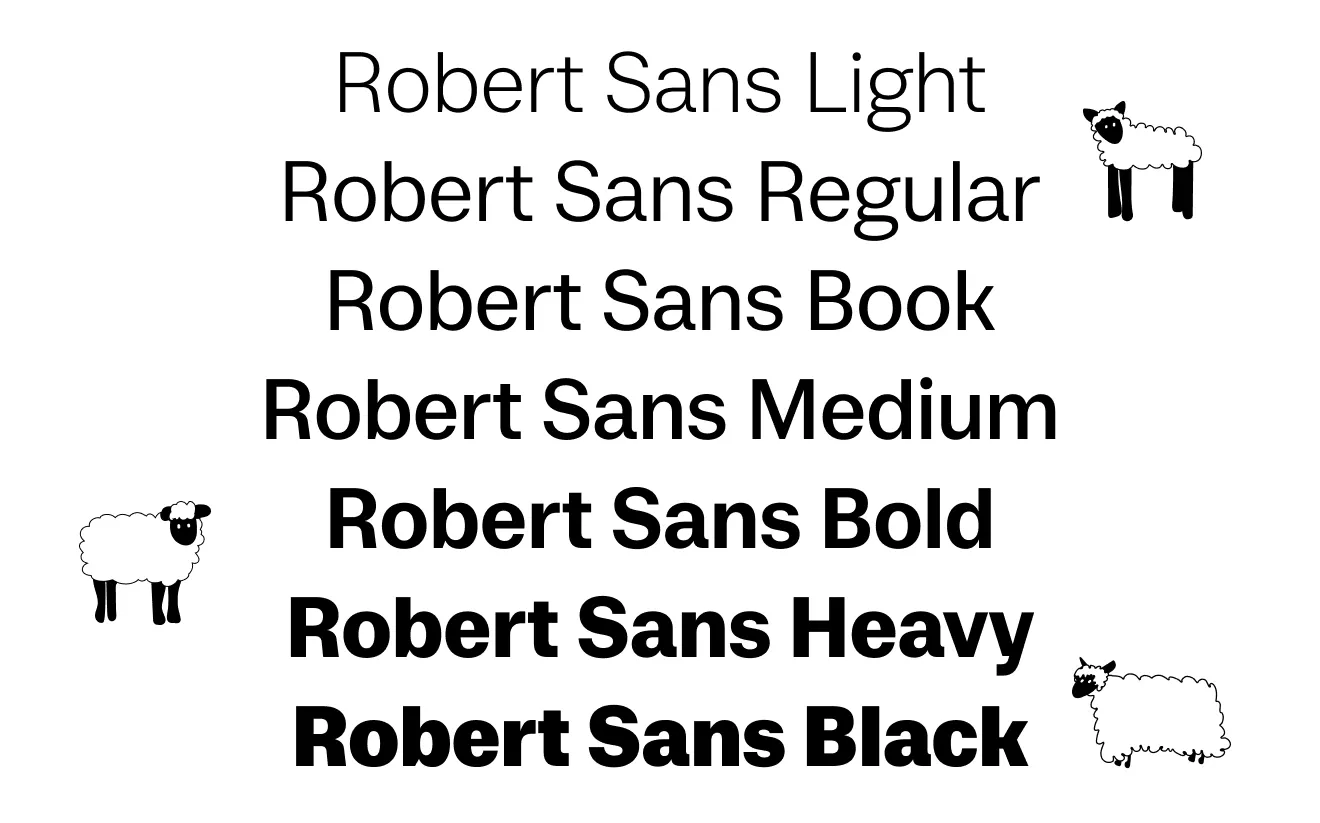
[Liza]: The defining glyph was a. We also spent a long time refining the forms of R and Я, ultimately creating two options: a straight version (used by default) and a “curly” alternate that references the original slab-serif.
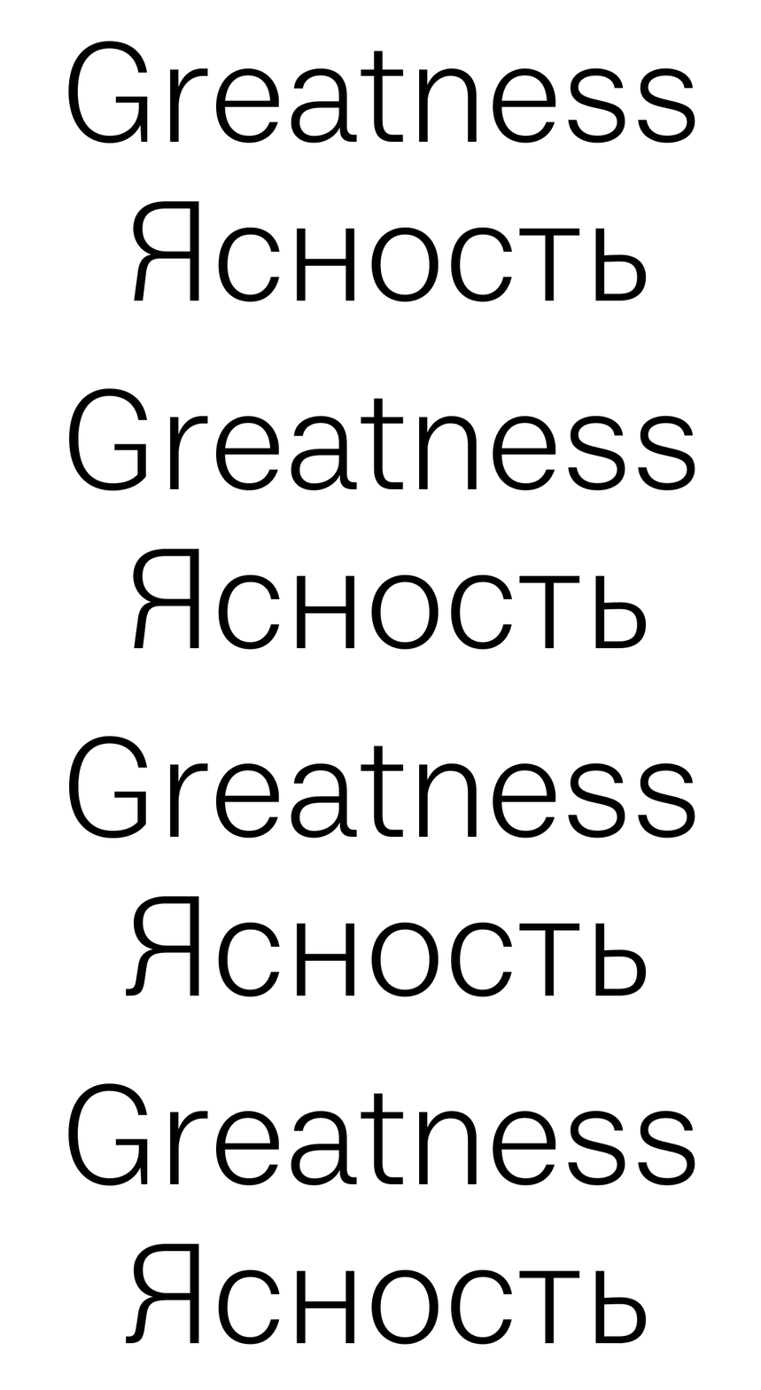
In the Latin alphabet, CoFo Robert Sans includes two versions of g: a double-story g (the traditional old-style form for grotesques) and a single-story g as a simplified alternative.

© Light Bean | Creative Direction: Maksim Arbuzov
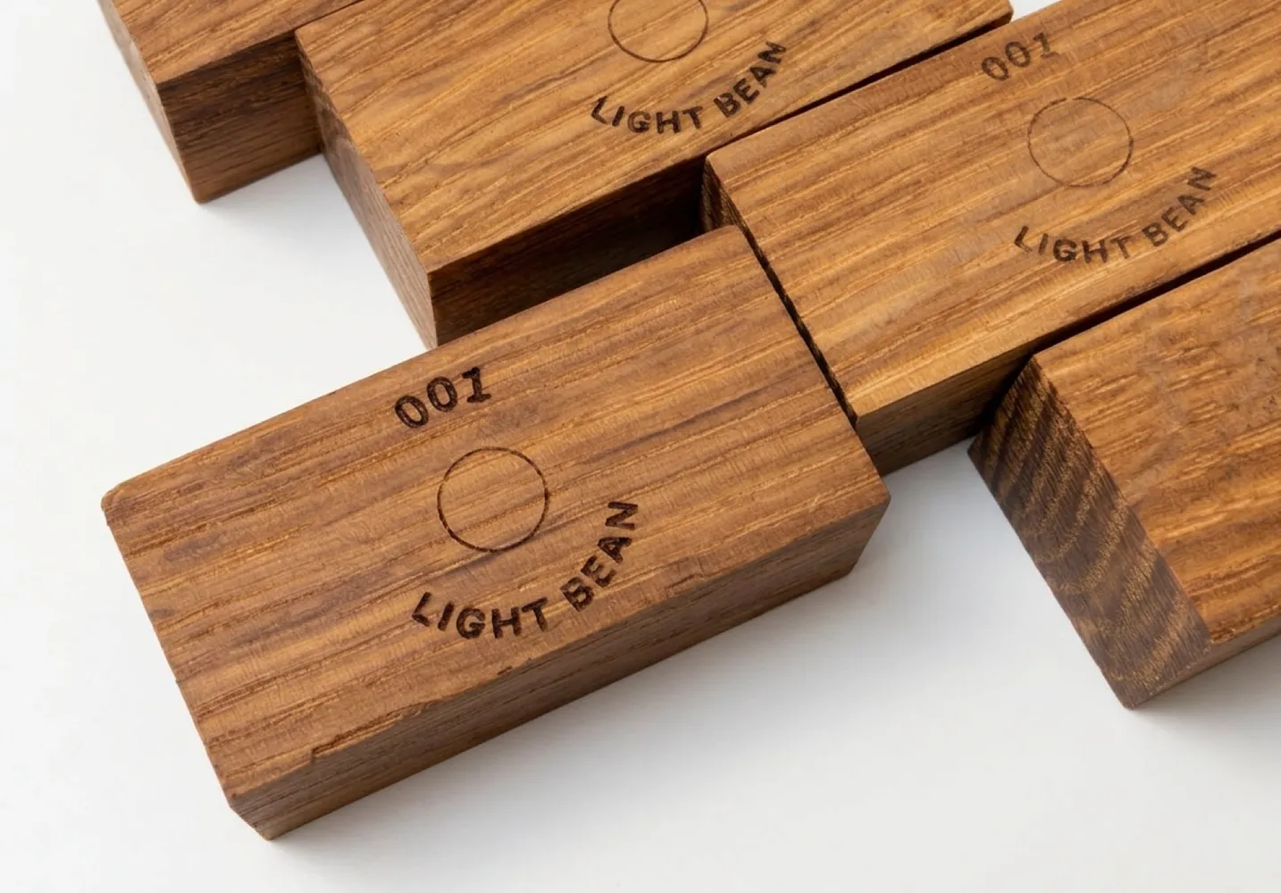
There’s also an alternate uppercase G with its own backstory: Robert Sans was used in an identity project for Light Bean, where the logo was laser-engraved on the lamp in a very small point size. At that scale, the spur on G disappeared, so we created a simplified version. It worked perfectly in that context and was added to the typeface as a stylistic alternative.
© Light Bean | Creative Direction: Maksim Arbuzov
All of these options let designers either highlight the connection to CoFo Robert or soften it, depending on context.
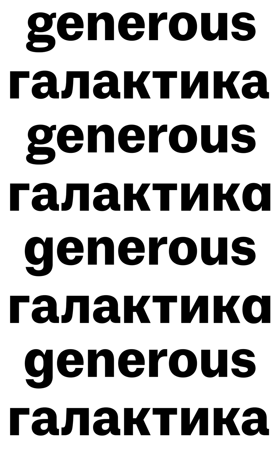
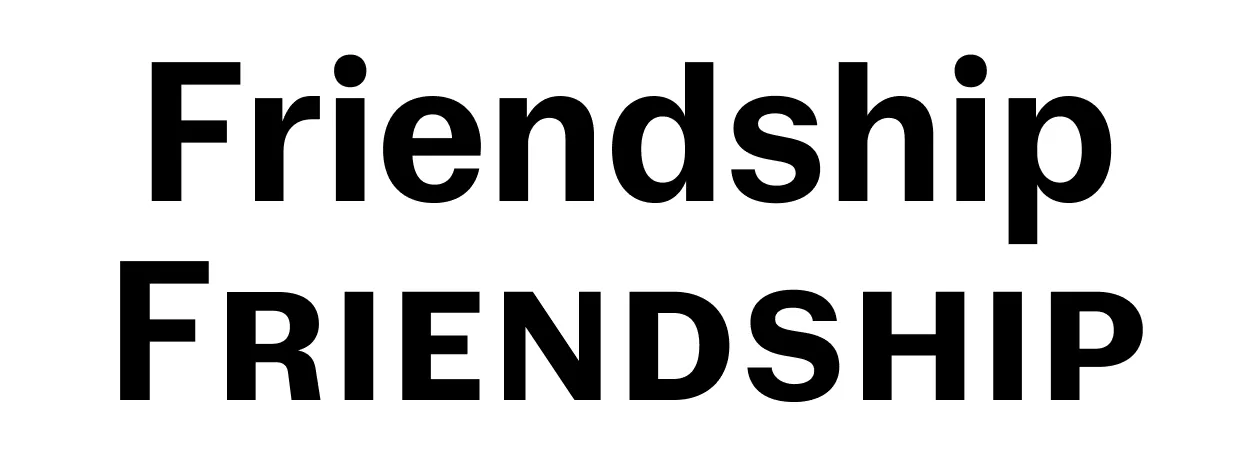
To strengthen that sense of typographic continuity, we also developed small caps—a nowadays rare feature in sans serifs. They proved useful in editorial design, especially in subheadings.
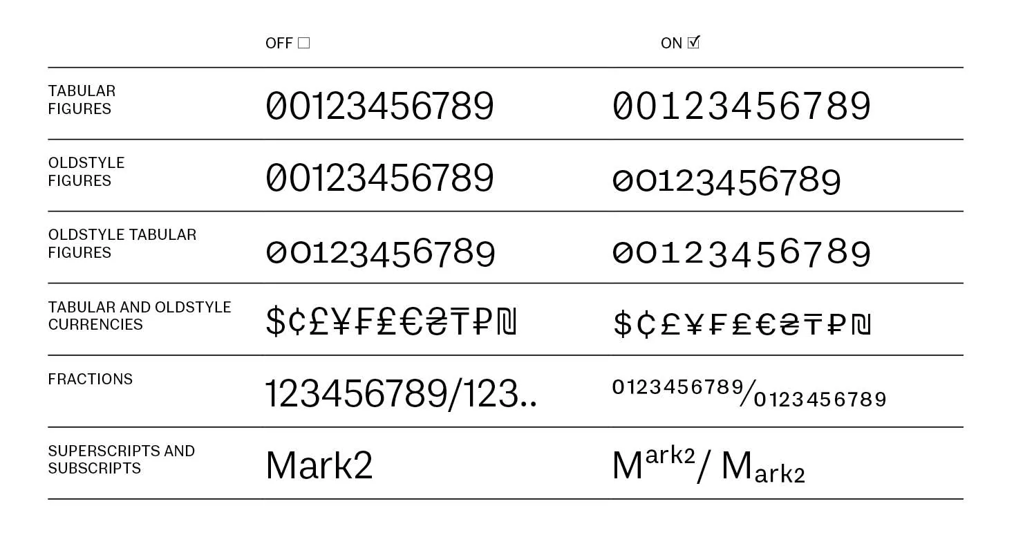
From Robert, Robert Sans inherited:
· Lining, old-style & small-cap figures
· Proportional and tabular numbers
· Currency symbols
· Superscripts and subscripts
· Fractions
[CoFo]: How did you determine the proportions of the typeface?
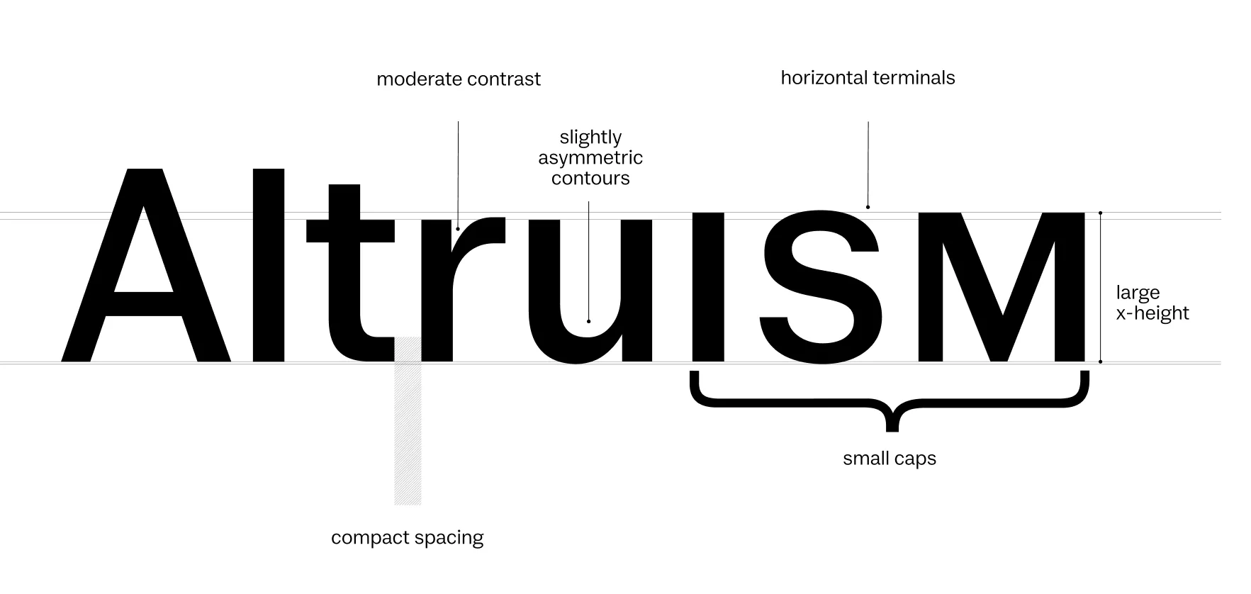
[Liza]: Our initial goal was to preserve the proportions of the slab, so we matched the lowercase-to-uppercase ratio across both typefaces. However, in practice, the sans appeared optically smaller. To address this issue, we raised the x-height in Robert Sans. That adjustment also meets the needs of interface designers who require high legibility at smaller point sizes.
[CoFo]: Where does Robert Sans work best?
[Liza]: It naturally pairs well with CoFo Robert—but that’s not the only use case. Robert Sans also works well as a standalone sans. Its friendly tone makes it a great fit for projects that need a bit more warmth from a sans serif, whether in book design, identity systems, or digital interfaces.
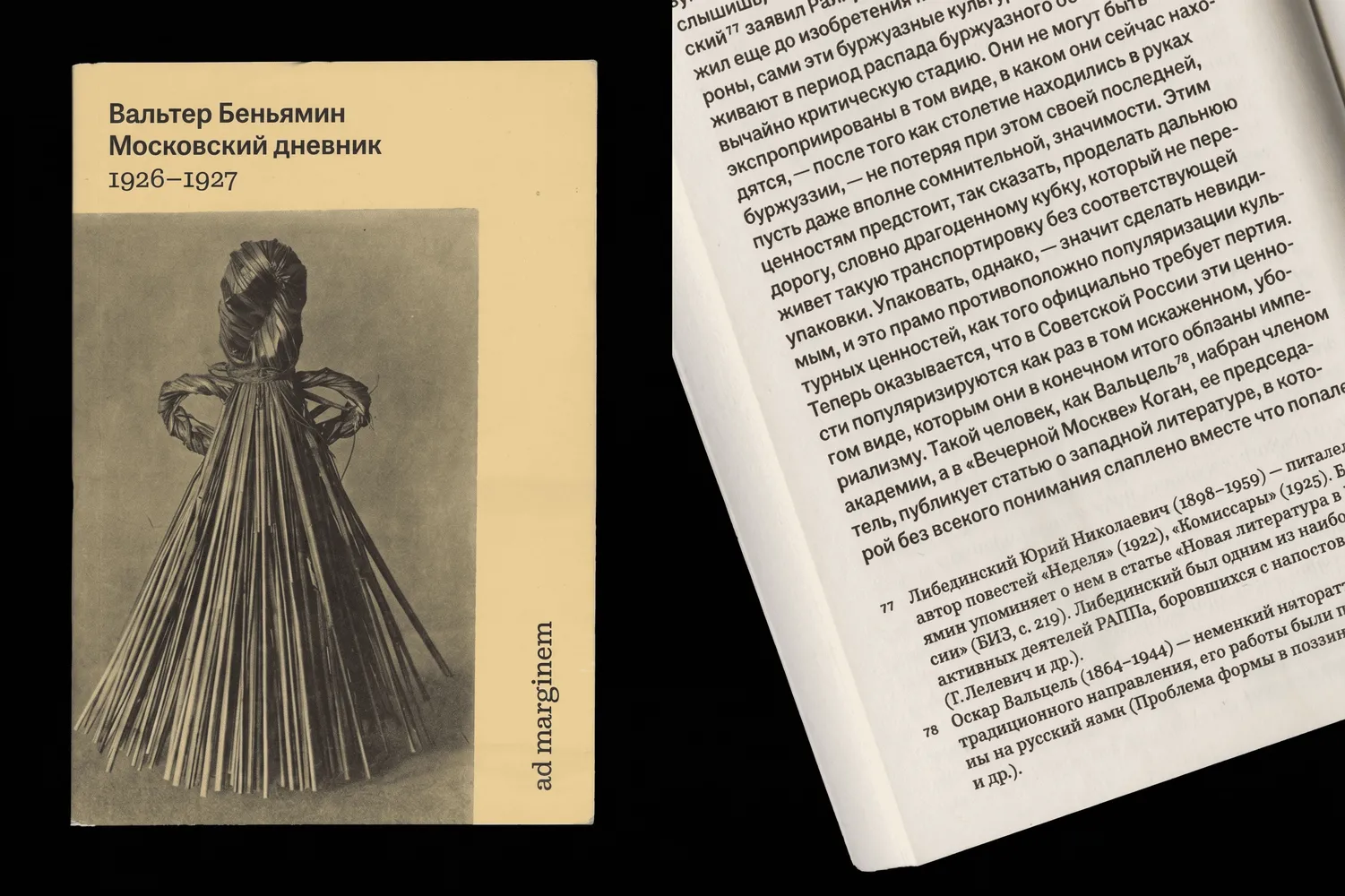
© Moscow Diary (1926-1927) by Walter Benjamin | Anna Ivanova and Evgeny Grigoryev
[CoFo]: Are there any plans to expand the Robert type family?
[Liza]: Right now, we’re focused on developing a monospaced version that continues the 19th-century lineage. Clarendons that influenced Robert also formed the basis for early typewriter fonts, so a monospaced version feels like a natural extension. We’re also considering condensed styles and italics for the sans.
Ready to try it out? CoFo Robert Sans is available for purchase and free trials. See the typeface in action on the СoFo Robert Sans page.
Interview & Graphics: Polina Baydin
Editor: Ekaterina Barannikova
Type designer: Liza Rasskazova