Chimera: An Impossible Typeface
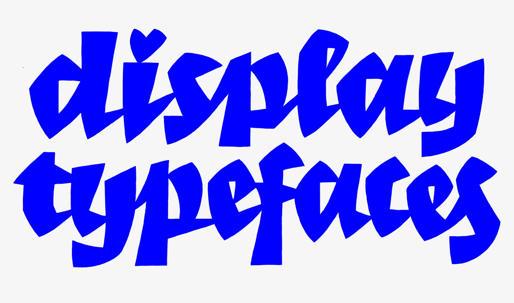
Chimera was born from a sketch and an experiment with the reversed broad-nib model. Maria Doreuli gave it life during her studies at the Royal Academy of Art in The Hague and it took another 5 years until it was finally released at CoFo.
Before you dive into the article, here are some fun facts about the typeface:
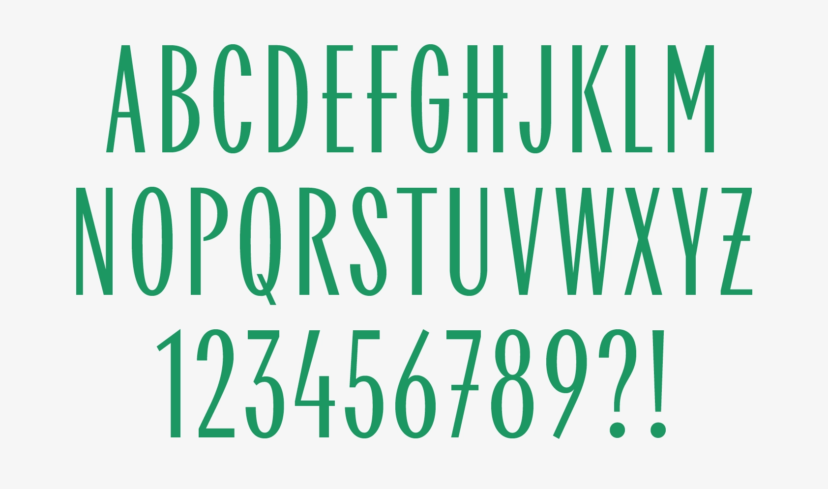
⦿ Chimera comes in five unique styles with two text ones, CoFo Chimera Regular and CoFo Chimera Regular Italic, and an unusually large x-height paired with slender proportions.
⦿ The typeface has received multiple industry awards, including the TDC Certificate of Excellence and Morisawa.
⦿ Chimera Black—is the quintessence of the style. Black weight is where the character shines the most. As the weight increases, the letter spacing narrows, and the contours of the letters evolve, simplify, until some serifs disappear completely.
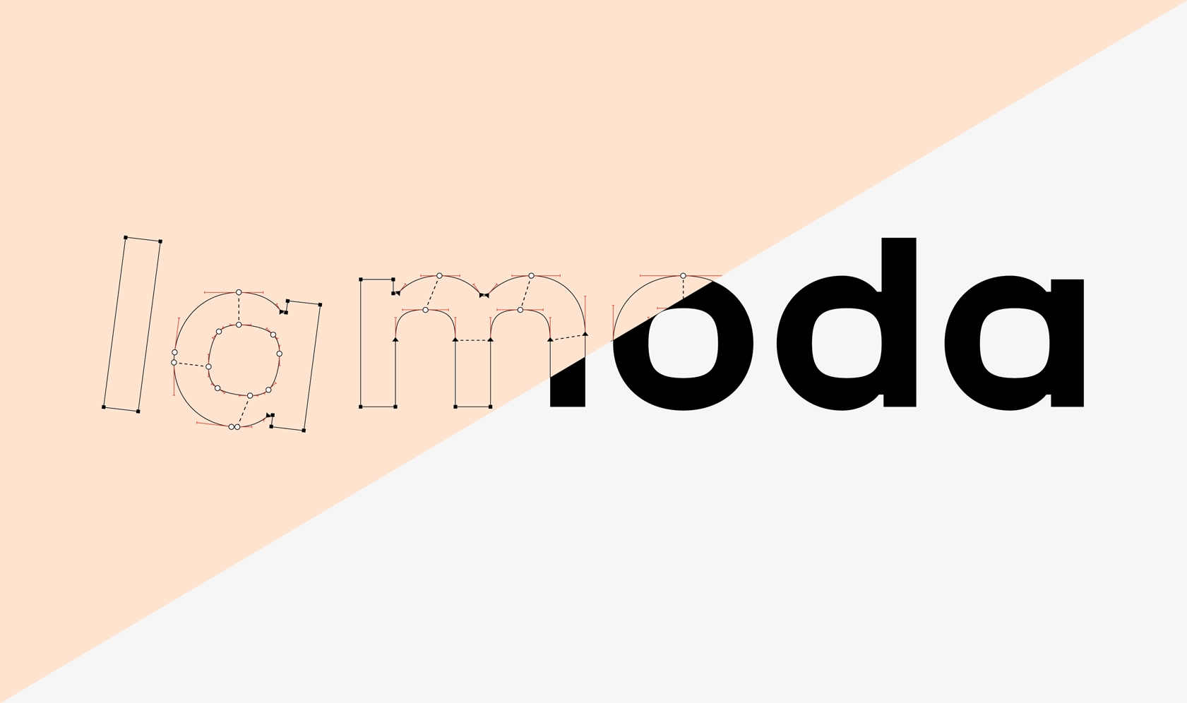
⦿ Chimera loves inktraps. This element is most noticeable in lowercase letters where two heavy strokes converge, with the aim of lessening the visual weight of black.
⦿ Chimera marked the turning point in Maria’s type design career and inspired CoFo to write a tribute to display fonts.
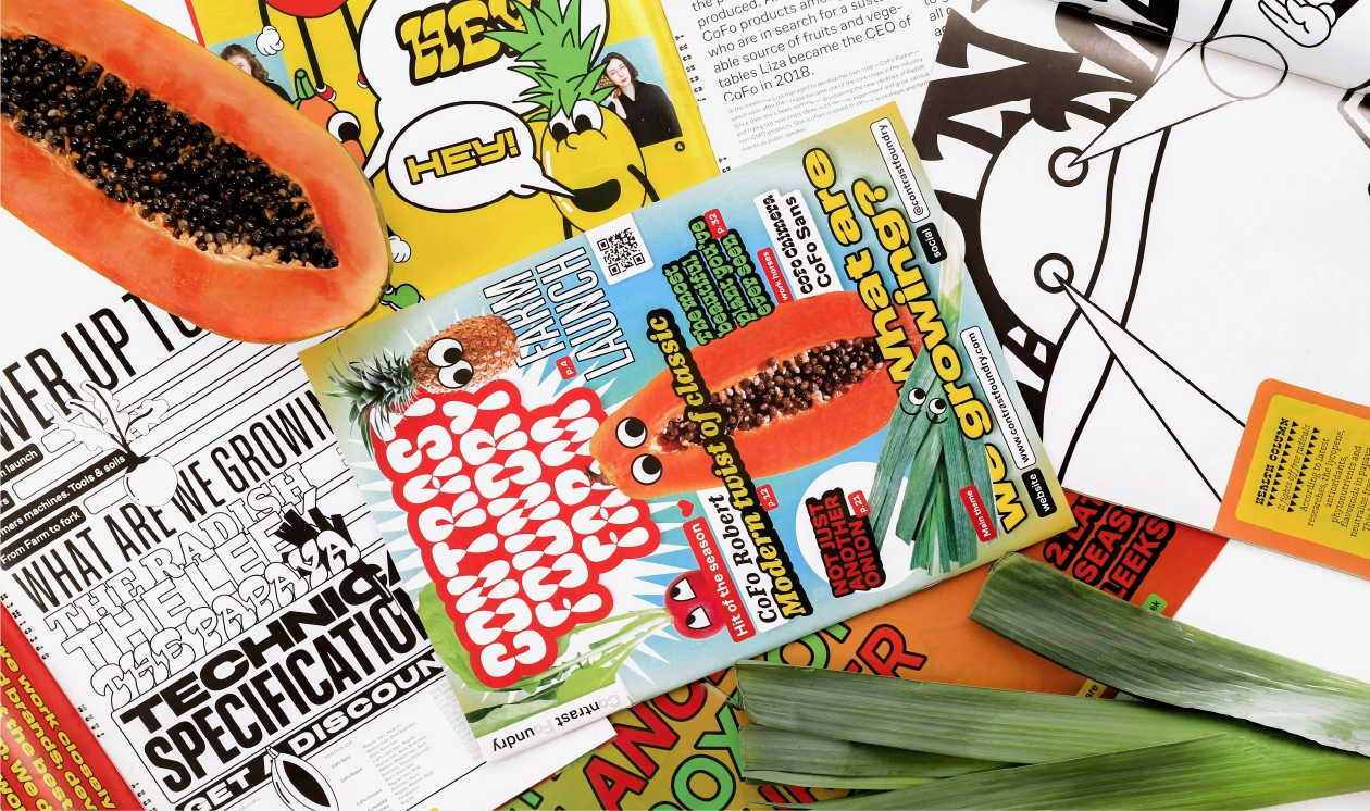
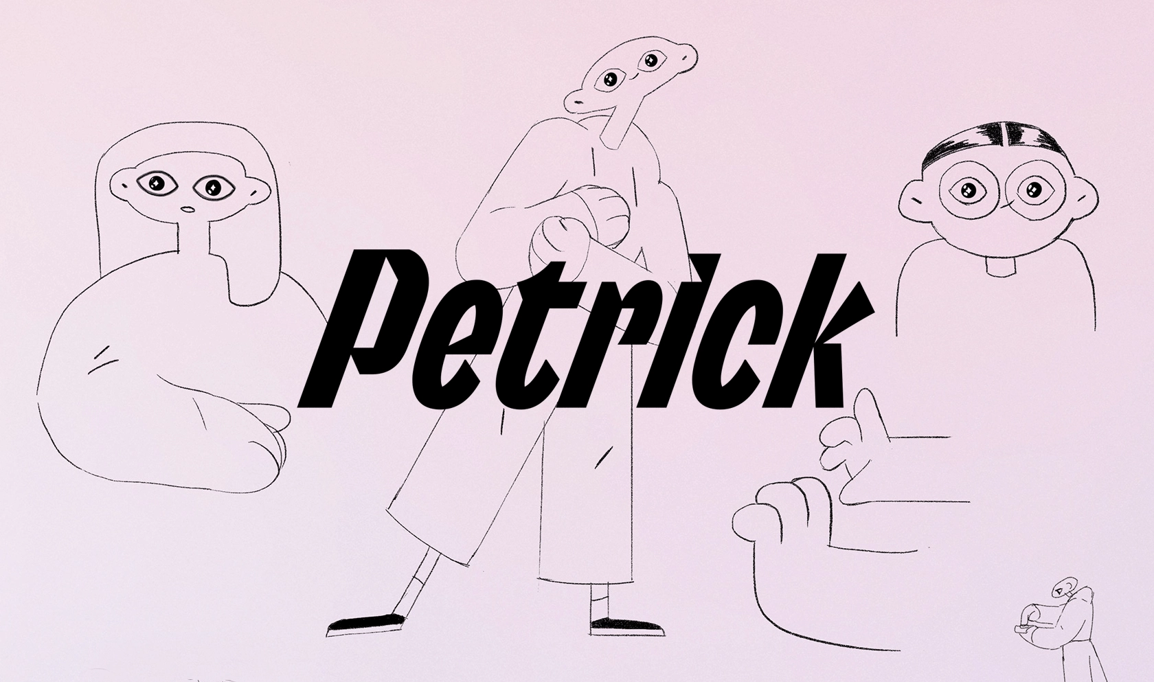
⦿ Chimera is a feminist typeface. Chimera is often used in feminism-related projects, such as Women Looking at Women Looking at Women (awarded the Best Dutch Book Design in 2022) and Design Struggles, designed by Lotte Lara Schröder.
THE STORY BEHIND THE TYPEFACE
Article by Maria Doreuli
Date: April 11st, 2024
Like all living creatures, CoFo Chimera started life as a simple idea during the Type and Media course in the Royal Academy of Arts. Through a painstaking process of sketching, digital drawing, printing, and constant revisions, it metamorphosed into a truly unique being.
Under the guidance of Erik van Blokland in his TypeCooker classes, I plunged into novel dimensions of sketching, using large-scale drawings and white-out to enhance precision and overcome fears of making mistakes. Drawing with a Pilot Sign Pen marker and tip-ex, I focused on shape and fine-tuned counter-shapes. One of these TypeCooker classes, in fact, became the starting point of my graduation project, encapsulating a spark of life akin to the birth of a unique beast.
Typecooker recipe
Width: Extra Condensed
Weight: Medium
Construction: Italic
Stroke endings: Wedge shaped serif
Ascender: Longer than normal
Descender: Shorter than normal
Contrast type: Between expansion and transitional
Contrast amount: Inverted contrast
Stems: Convex
Intended application: Smooth offset printing
Intended size: Most sizes
Special: Inktraps for inside corners (white)
When I had my first sketch ready, I took up the challenge of turning it into a full-fledged alphabet. It took a while to make shapes work digitally. You know how sketches have this special charm? Transferring the essence of Chimera and the enchanting feeling of the handcrafted words into a digital format was one of the toughest challenges to take on.
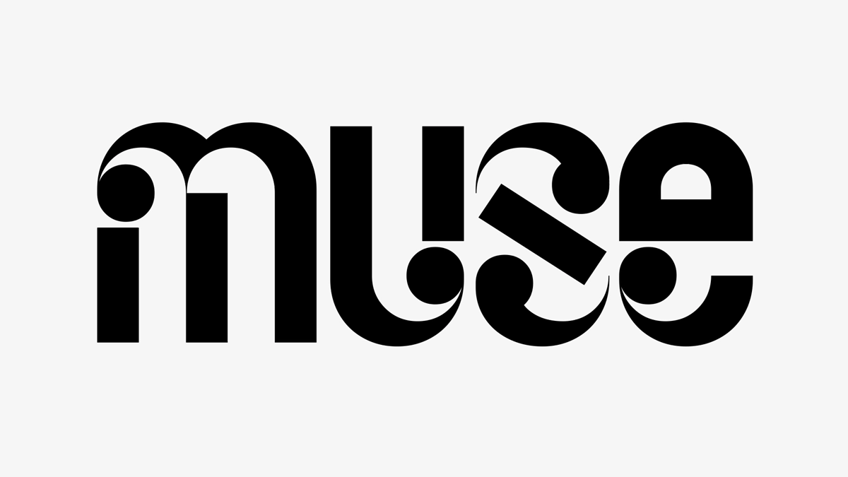
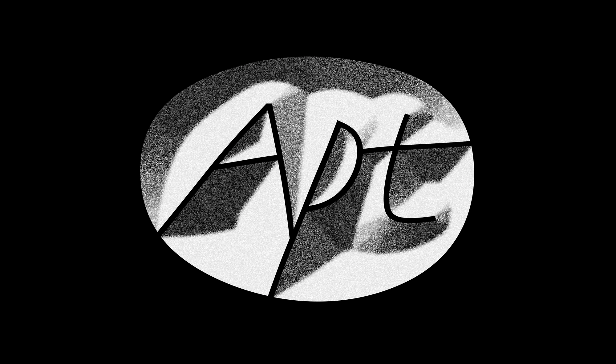
Note: Coming up with a sketch first can also be a great way to create a more unique lettering. And we keep using it in our studio work. One of the great examples is the logo we created for Apt.
Enthralled by the puzzle of impossible shapes, I found joy in the challenge they presented. My progress, although not perfect, was consistent. As decision time loomed in late January 2013, my mind was constantly engaged with this intriguing style. Ultimately, its appeal proved decisive, shaping my direction for the final project.
Chimera’s first steps
As I started my project, my enthusiasm was driven by shaping a unique condensed black italic. But my larger goal was to see how various styles could interplay with each other, and whether a harmonious typeface family that included both Romans and Italics could be achieved.
I knew my sketch-based approach would have its share of challenges. However, I also saw its value in promoting creative freedom, quickly exploring different ideas, keeping away from ordinary letterform designs, and pushing the boundaries of what the digital format could allow.
Working on this project differed starkly from developing a traditional text typeface. Rather than adhering to familiar forms and general views, I had the freedom and challenge of inventing nearly every shape without having close references to guide me.
My primary tools in this explorative journey were my black marker, a tipp-ex, and a block of paper. These tools allowed me to rapidly test a multitude of choices, sketch, balance forms, find optimal solutions, and switch between moments of creative chaos and calm. It was a relentless cycle of media migration—sketching, digitizing, printing, and starting over again.
Testing in context—the essentials
A critical part of the process was to experiment with different letter variations in a set to ensure they maintained the rhythm of the typeface. Asking myself, “Is this too peculiar?” or “Does this read as a letter?” became a part of my routine. Sometimes, I would spend days scrutinizing one specific letter only to realize that a previous version was superior or that the best solution was a balance between variations.
There were instances when a shape seemed nearly unrecognizable as a letter without context. Yet, I found room for flexibility, playing with contrast and making exceptions under specific circumstances. As long as a design aligned with my creative vision and maintained the rhythm of the typeface, it was deemed acceptable.
In the early stages of the project, I used a straightforward exercise: first writing a letter using a broad-nib pen to grasp how contrast normally develops, then sketching an inverted version beside it. This approach was particularly enlightening when applied to figures, which, to my surprise, appeared relatively standard. My guiding principle was to maintain weight predominantly at the top and bottom, with a slight diagonal rhythm. Certain distinctive proportions inspired me to incorporate fresh ideas, like a larger top oval on the 8 or diverse contrast options for the old-style 0 to clearly distinguish it from the lowercase o.
Adding a system
I noticed that my sketches needed standardization for consistency. I also acknowledged that the digitization process would demand rigorous attention. Rather than shying away from these challenges, I embraced them. My goal was to learn not only from technically straightforward tasks, but also from the more complex process of translating hand-drawn sketches into digital curves.
Note: Nowadays this sketching technique became part of the process in most projects we take on in the studio. For example the custom typeface we created for a ride-hailing company.
Looking for the shape of the serifs
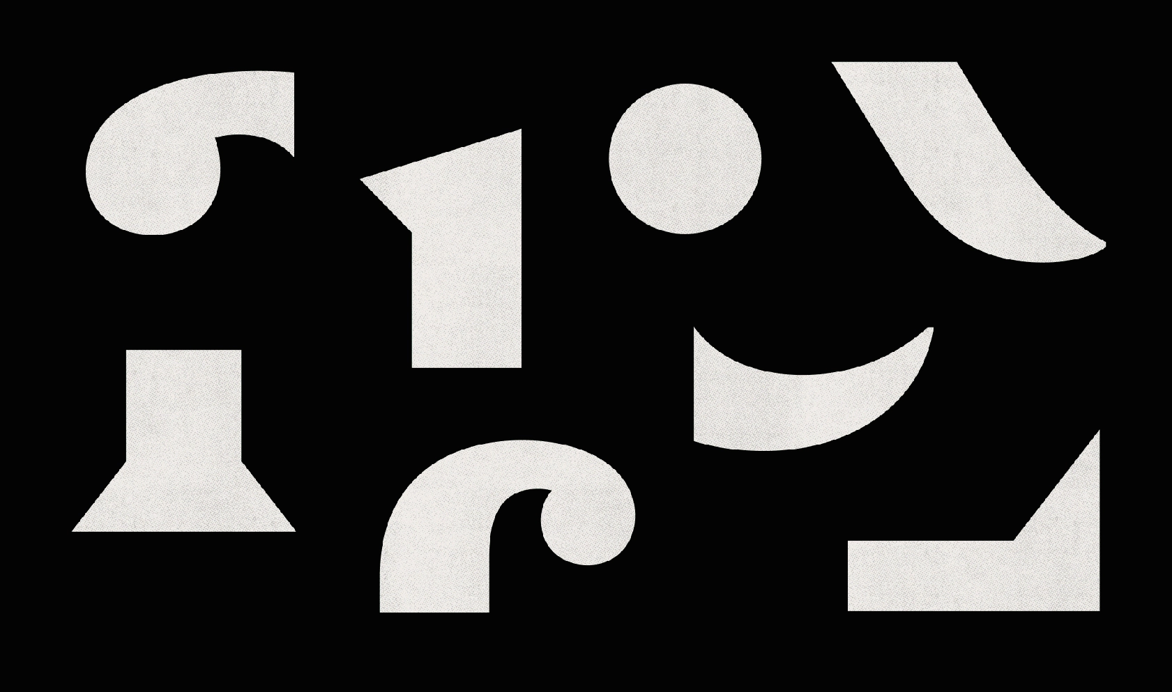
A critical pivot point came when I realized that maintaining the triangular serifs was a misstep. Though I had delayed this conclusion, I finally acknowledged that these needed to be altered. I set out to find a clear and simple solution that would resonate with my vision and be adaptable enough for various shapes. Selecting the a for its appealing shape, n as a fundamental letter, and i as a letter with a singular stem, I began an intense experimentation phase on paper.
My goal throughout the project was to find a clear, flexible solution that would fit my idea organically and be adaptable to a variety of shapes. I experimented relentlessly, always testing different ideas for the same shapes to discover the best fit. Maintaining a healthy level of skepticism and dissatisfaction allowed me to explore a wide array of possibilities and not simply settle for the most common or initially appealing construction.
The growth of text styles
The idea of the project initially aimed at display use, but I was always intrigued by the potential of creating a text companion. It would maintain the core concept but would be adapted to perform in smaller sizes. The transition from Display Light style to a more refined style involved subtle changes such as eliminating sharp details, defining ink traps, simplifying serifs, and adjusting stems for a perceived slant.
I simultaneously worked on sketching and actual development, expanding the character set, and exploring different styles. Each style, though based on the same concept, works independently, bringing its own unique look. Text styles can, however, serve as companions to any of the display ones.
The journey to the final result was both long and challenging. Despite deviating significantly from the original idea and navigating through the full development process, the final output retained its peculiar charm and character. My experience underscored the importance of sketching as a powerful tool, far from being a time waste or mere artist's exercise.
Language support
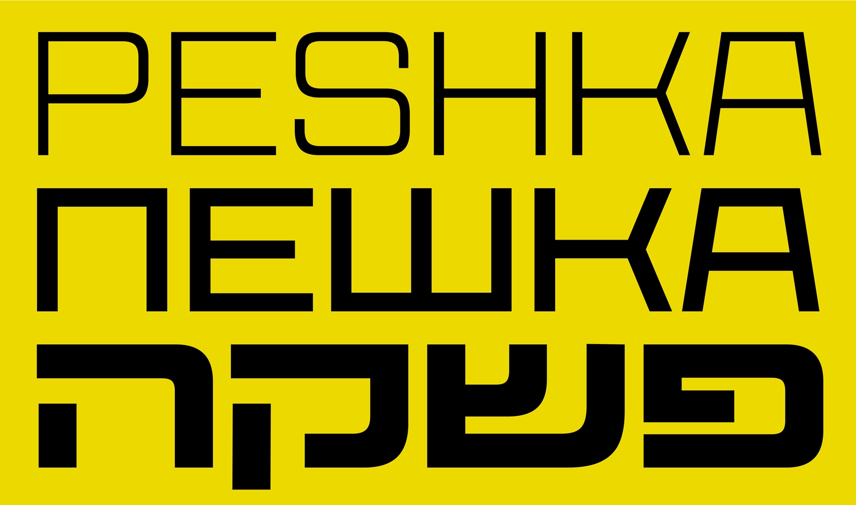
Chimera supports a variety of languages, including Central and Eastern European languages, Baltic, Turkish, and Extended Latin. It was expanded to support Cyrillic between 2013 and 2018 and even has a draft of Hebrew (thanks to Liron Lavi Turkenich and her Hebrew workshop at TypeCon 2014). Hebrew always felt like a natural extension of Chimera, and I hope it will happen soon, especially since we already expanded our CoFo Peshka with Hebrew. As well as Arabic.
Give Chimera a try
We invite you to experience Chimera for yourself, download a trial version, or purchase a license at the Contrast Foundry’s website. Stay updated on the latest designs and projects by following Contrast Foundry on Instagram. Chimera is a unique, emotional, and expressive font. Not the easiest to use, but definitely catching all the attention you can imagine.
Author: Maria Doreuli
Editor: Ekaterina Barannikova
Type designer: Maria Doreuli
Featured in-use
Check out Soulful Sessions visual identity by Tijsje Revalk.


