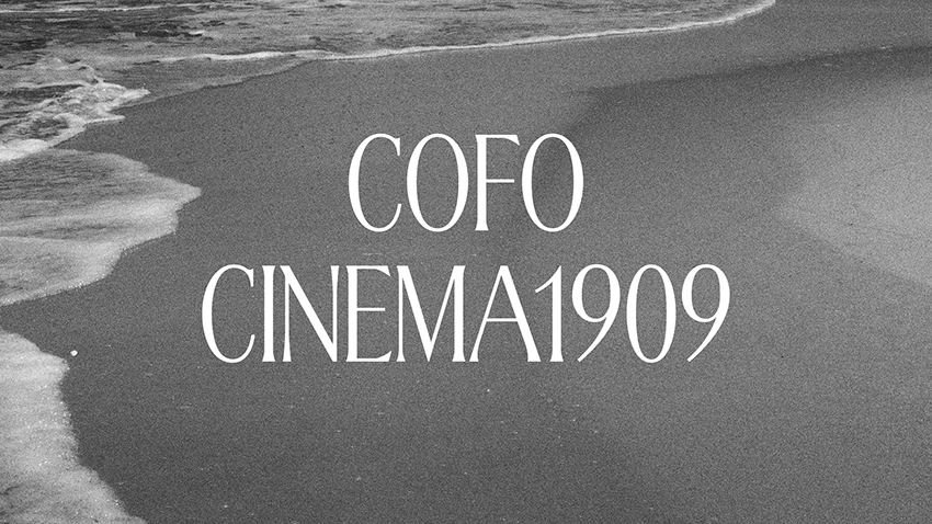
CoFo Cinema1909
Reduced character set
Purchase CoFo Cinema1909
Choose a bundle or individual styles and add a license based on how you’re planning to use the typeface—on desktop or web, in the app or social media, for a logo or a video.
Individual styles
CoFo Cinema1909 Regular
About CoFo Cinema1909
Cinema1909 cannot easily be classified. We could tell you that it is inspired by Art Nouveau, a historical period that enriched Latin typography with incredible freedom. But the truth is, it is also inspired by Cyrillic Art Deco, a peculiar style that never really had the chance to develop in the same way.
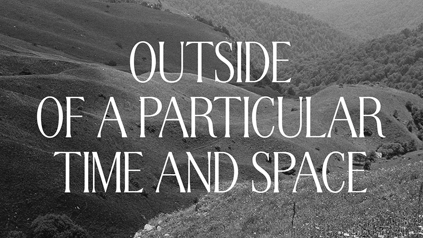
With Cinema1909 we created our own cinematic universe—one in which old-fashioned elegance exists in digital form, where traditional and contemporary forms work in unison. Yes, we did put a date in the name, but Cinema 1909 exists outside of a particular time and space. It is a visual experiment that questions the historical norms and your aesthetic sensitivity.
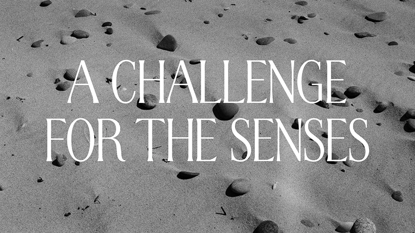
The typeface is caps only and is optimized for use in headlines. It is tightly spaced (and neatly kerned) to create a dense texture. All extending elements, (such as the Q tail, the Д Ц, the accented characters) are specifically designed to be compact, allowing for minimal line spacing.
The proportions are unusual—neither narrow or wide, but intentionally dynamic, which plays with the reader’s perception and contributes to the strong rhythm. This linear pattern is further emphasized by the compact serifs and terminals, and the carefully considered balance between thick and thin strokes. If there was a category of typefaces called “sophisticated”, that is where we would put Cinema1909.
Read the story behind CoFo Cinema1909.
Designer: Liza Rasskazova
Year of release: 2020
Version: 1.0
Styles: 1 style
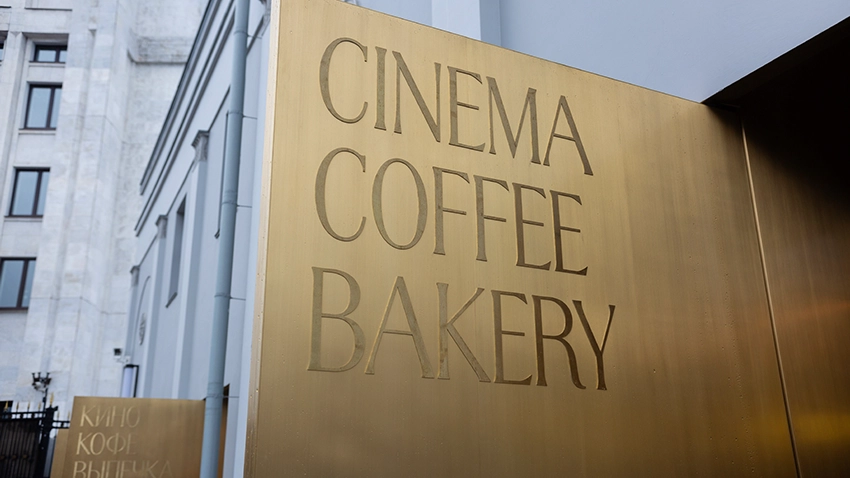
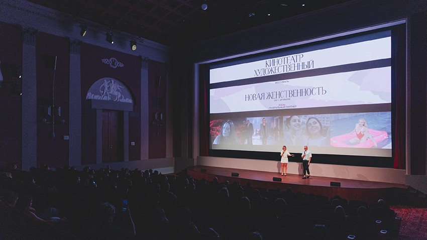
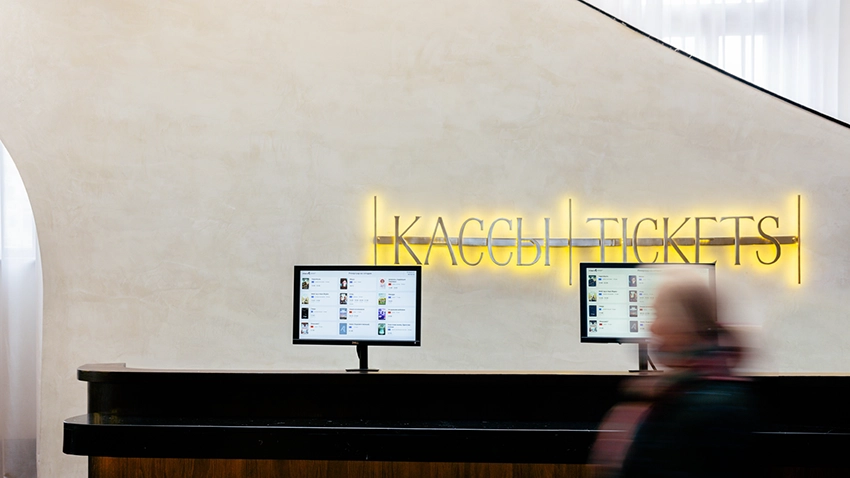
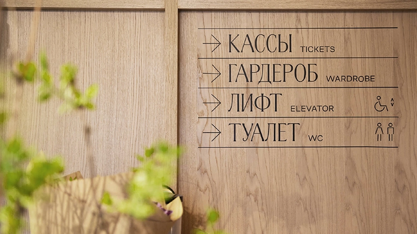
CoFo Cinema1909 in use