How to design a variable font: the internal structure of a variable font file
A variable font is a format that includes all the styles of a typeface in a single font file. It allows users to select not only predefined styles but also any intermediate instance between them.
Since its introduction at the ATypI conference in 2016, the variable font format has been adopted by major graphic design tools such as Adobe programs, Figma, and most web browsers. Today it’s an irreplaceable tool for many designers working digitally.
This article explores variable font (or VF) technology from a type designer’s perspective. We will explain the technical aspects of setting up the file, show the classical examples of variable fonts, and also share our favorite and most unique findings. You will get a list of practical tips for the variable font creative process. If you were curious about the technology or wanted to try creating your own variable font, this article is for you!
Key terms before we start
Before exploring how variable fonts function, it’s helpful to clarify a few foundational terms. The concepts below describe the core components and mechanisms that make variable type design possible.
Design space
Design space is the system of all the masters in a font family and their relative position.
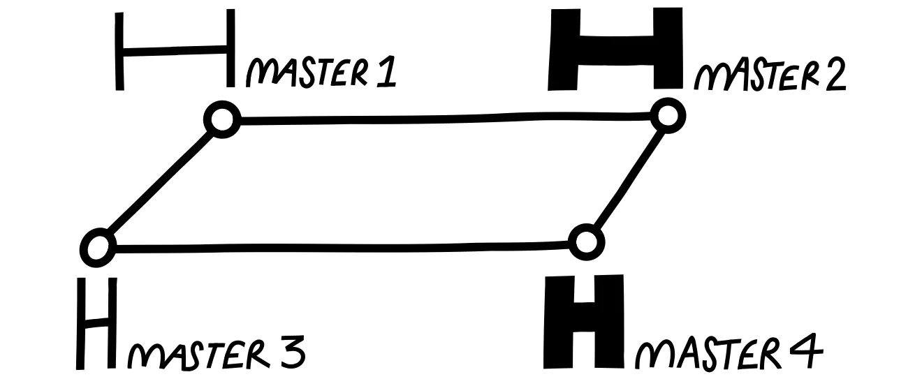
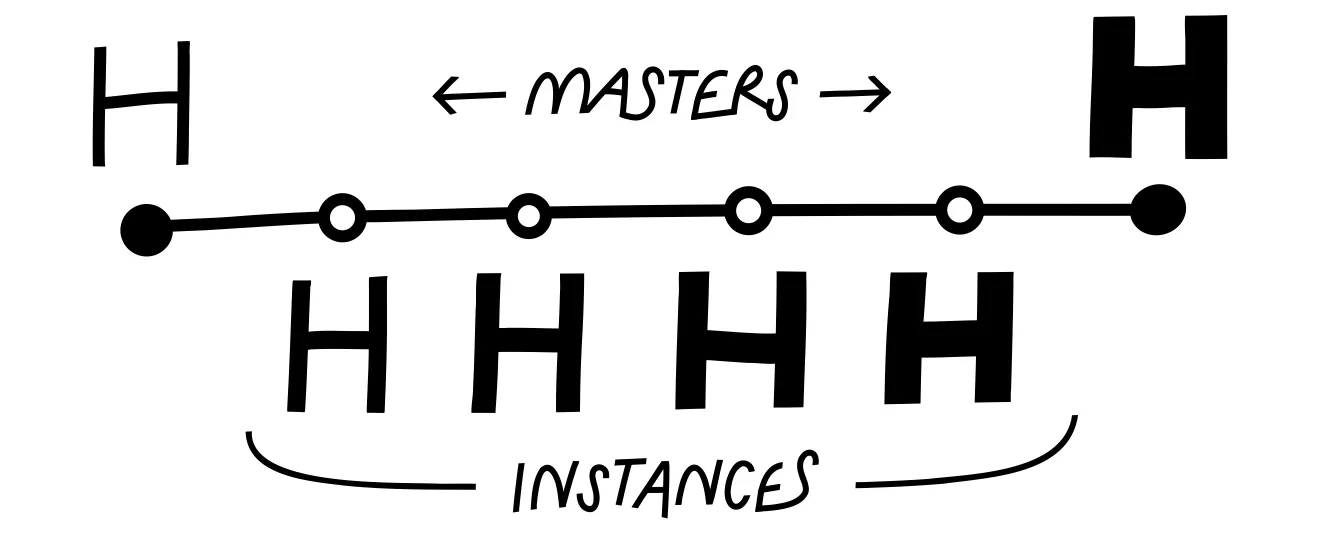
Font master
Master is a reference style in a variable typeface that is manually drawn by the designer. Masters are used to generate intermediate instances through interpolation. Usually, masters are positioned at the extreme points of a variable axis. Any VF should include at least two masters.
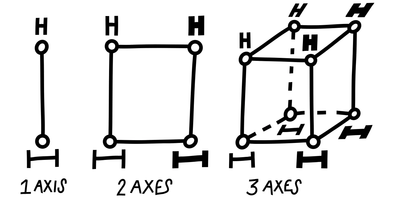
Typeface axes
An axis is an aspect of the design that changes between masters. The most common axes are the Weight and the Width, but there are many more possible interpolation axes.
Instance
Instance is a specific style generated within a variable font by interpolating between masters.
Interpolation
Interpolation is the mathematical process of calculating intermediate font shapes between masters in a variable font, creating smooth transitions along the axes.
How Variable Fonts Work
The VF format includes many different styles in one file and allows users to select any value along the axes. Here’s how it works:
1. Styles are organized in a design space
Inside the file, styles are organized along one or more axes in what’s called a design space. The design space is essentially a map with all the axes on it, where each axis represents a visual property such as weight, width, or slant.
2. Masters are placed along the axes
Designers draw a set of reference styles called masters, which are placed at the ends of each axis. Some fonts also include masters in the middle of the design space to improve control.
3. Axes define what changes
Each axis defines how the design changes, such as weight, width, or other characteristics. One variable font can include an almost unlimited number of axes.
4. Interpolation creates the rest
All intermediate instances are generated automatically through interpolation, giving users a wide range of styles within a single font file.
Classic Variable Font Axes
Let’s analyze the Variable font file using CoFo Peshka as an example.
CoFo Peshka is a multi-axis font. It includes the most common interpolation axes: weight, width, and slant.
• Weight interpolates from Hairline to Black
• Width ranges from 0 to 1000
• Slant spans from -24° to 24°
The font includes eight masters at the ends of these axes. These masters were carefully designed and tested to ensure smooth interpolation and consistent quality across all intermediate instances.
Creative Axes & Experiments
Axes such as weight, width and slant are common. But the great thing about variable font format is that it allows designers to create unique axes in their design.
There are a few examples of unexpected usage of VF technology that we split into the categories. Many of these typefaces also include more conventional interpolation axes, but here we focus specifically on showcasing and discussing the more unconventional solutions.
Stencil effects
CoFo Kabeltow by Egor Goloviryn is a modular typeface that plays with the interpolation between stencil and solid styles. The interpolation starts with the tiniest cuts, perfect for large sizes, and ends with significant cuts that create a robust stencil for smaller sizes.
Electric Blue by Font Spectrum interpolates between extremely bold and thin pixel forms, transitioning letters from separate, melting elements to fully conjoined shapes, creating a dynamic, retro-futuristic effect reminiscent of Space Age ’60s and Neon Glow ’80s design.
Exposure by Federico Parra Barrios lets you control the “ink intensity” of letters, interpolating from faint stencil prints through normal forms to very dark, almost smudged shapes. It creates a historical, textured look that mimics uneven ink on old printed text.
CoFo Kabeltouw • Electric Blue • Exposure
Shape exaggeration
LTR Very Bauble by Letterror interpolates from clean, pointed sans-serif shapes to sharper, Tuscan serif forms. Along this axis, added cuts, thorns, and a sprinkling of pips introduce increasing levels of grit and texture.
Sweet Lily by Céline Hurka interpolates between two styles, evolving from the small, freshwater lily buds of March to the fully bloomed, almost dissolving letter forms of September.
Seasummer by Céline Hurka interpolates on the emotional axis between calm, gentle handwriting and more intense, expressive shapes.
Whyte by Dinamo interpolates by enlarging historical ink traps from small technical elements to prominent decorative features, altering the shapes and overall character of the typeface.
LTR Very Bauble • Sweet Lily • Seasummer • Whyte
Movement & shift
Invert by Anna Khorash creates a smooth, dynamic interpolation from black to white forms, using separate small elements with individual motion paths for each letter. Although the intermediate instances are not practical for static use, they help create an illusion of movement.
Wind by Hansje van Halem interpolates its sweeping pixel-based elements along a full 360° rotation, creating smooth, circular motion within the letterforms that respond to wind direction.
Kablammo by Vector Type interpolates decorative elements in playful, unpredictable ways, creating dynamic, animated effects inspired by ’90s maximalism and cartoonish design.
Cheee by Ohno Type includes two playful axes, named Yeast and Gravity. The Gravity axis shifts the visual weight of the shapes from the top part to the bottom, and the Yeast explodes the shape in all directions.
WHOA by Vector Type plays with rotation, translation, and scaling the shapes. The outline contours keep all the intermediate layers visible, which creates the effect of a 3D space.
Invert • Wind • Kablammo • Cheee • WHOA
Patterns and outlines
Purple Haze by Font Spectrum interpolates from a readable regular weight to decorative extremes, producing overlapping effects as the pixels enlarge.
Gridlite by Rosetta Type interpolates modular letter elements and backgrounds along multiple axes—adjusting size, shape, and surrounding fields—allowing letters and negative space to transform smoothly while maintaining a consistent grid structure.
Silver Coil by Font Spectrum interpolates the shift of alternating black and white stripes. A one-step shift of the two stripes creates a looping effect. In a looping animation of this typeface, it produces the illusion of continuous movement along a three-dimensional form.
Gridlite • Purple Haze • Silver Coil
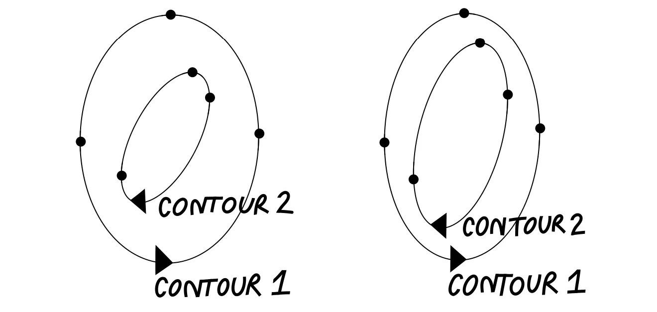
Interpolation can differ even when the masters look identical
Let’s have a closer look at the secrets of interpolation—the invisible mechanism that defines how points move between masters.
Consider the interpolation between a circle and a square. The process of interpolation can look different depending on the point placement on the contour. In both examples we will examine, the contour shape appears visually unchanged, but the positions of the points and handles can vary.
First example: uniform direction, visible fractures
In the first case, the points on both shapes move in the same direction during interpolation. As a result, the shape changes gradually, but the outline develops fractures along the contour: visible breaks or distortions that disrupt the smoothness.
Second example: structure designed for smooth transition
In the second case, both the circle and the square are built from eight points:
• On the square, the handles are zero-length, and two points overlap in each corner.
• On the circle, the points are evenly spaced, with long handles.
This kind of point structure creates a smoother interpolation and gives designers better control over the intermediate shapes.
Building Variable Fonts: Core Rules
1. Working with Outlines
To ensure smooth interpolation:
• Keep the same number and type of points.
• Maintain the same contour order and starting point. Consistency in point placement and contour structure across masters will save time and prevent interpolation issues.
• Use overlaps and open corners as needed.
First example: two masters on the width axis. The letter Z has a single point at each connection of the diagonal. Problem: during interpolation, the diagonal becomes too thick.
Second example: solution to the diagonal thickening issue during interpolation. Two points have been added at the connections of the diagonal to the horizontal stems. This construction is also called an open corner. Open corners allow controlling the thickness of the diagonal and keeping it normal throughout the interpolation process.
We do not recommend adding open corners everywhere, but keep in mind that additional points on the contour can help control tricky areas during interpolation. It is advisable to test them separately on a specific complex part of the contour before applying them to all masters.
2. Design Space Planning
• The design process starts from the definition of the design space: what axes will be included in the font file, and how extreme will they be?
• Plan systematically, using consistent character sets and letter constructions across all extreme masters.
• Start with a limited set of letters—choose examples with diagonals, rounded and square shapes, ascenders and descenders, plus complex elements like serifs, terminals, or drops.
3. Testing & Iteration
• Generate the VF file early and test the interpolation, instances, and design space. Animated interpolation makes weak spots easier to spot.
• Add intermediate masters only when necessary and closer to the final stages of working on the contours. In most cases, adjustments in the extreme masters are sufficient, while adding new masters significantly increases the amount of manual work.

Why do you need Variable Fonts
Variable fonts give designers precise control over weight, width, slant, and other axes in a single file, making typography flexible, responsive, and animation-ready. On the web, they reduce file size while allowing smooth transitions; in motion design, they turn text into dynamic, expressive elements.
While the concept of adjustable typeface isn’t new, variable fonts make the font variation settings accessible for the users. They shift part of the design control from type designers to graphic designers, enabling nuanced adjustments while relying on built-in masters as starting points.
Ultimately, variable fonts are a versatile tool for web typography, adaptive typography, branding, and animation, offering creative freedom and smooth, eye-catching effects with careful planning.
Tools and resources to explore
Dinamo Font Gauntlet: Online tool to test Variable font interpolation
Samsa: Online tool to inspect the variable font parameters and settings
Talk by Laurence Penney on ATD-3 conference at 2025: The Math Behind Variable Fonts
Author: Anna Khorash
Editor: Ekaterina Barannikova
Illustrations: Egor Golovyrin