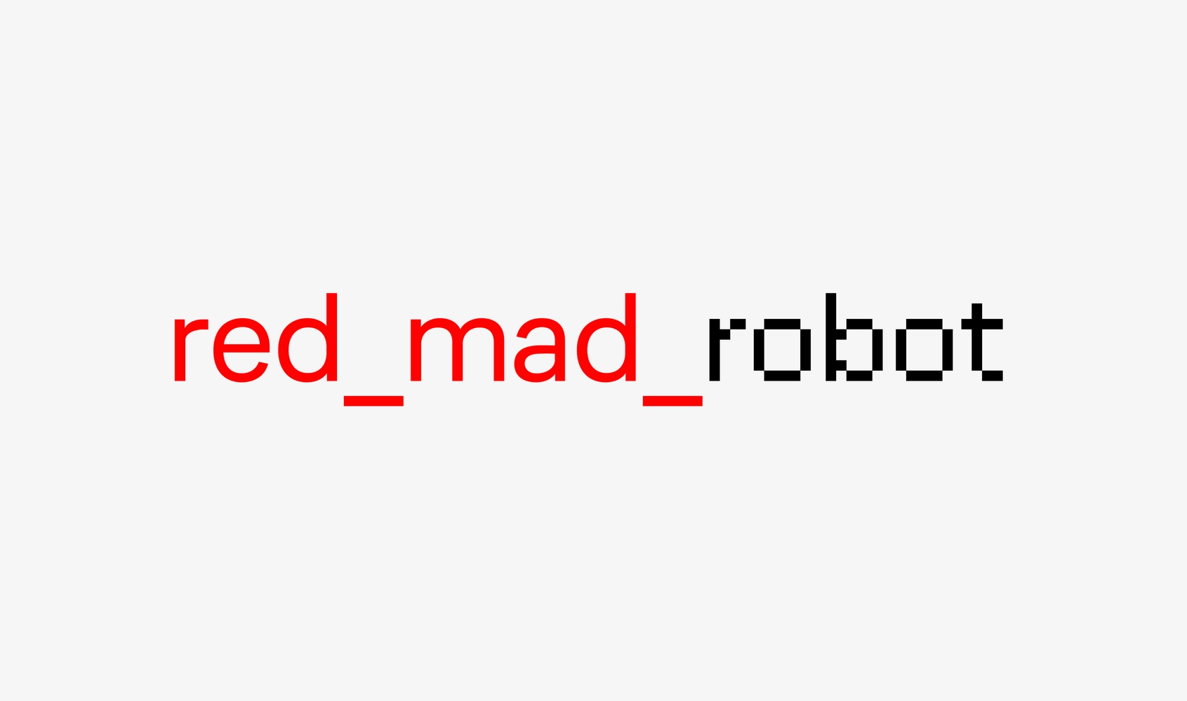
CoFo Redmadrobot—pixel typeface with a special appeal and a bright personality
In April 2020, we were contacted by Redmadrobot—a company with a focus on development of the digital services and products to improve the user experience and optimize business processes in various environments—from banks to factory floors. They were updating their visual style and logo, and commissioned Maksim Abruzov to create their new identity. Since Redmadrobot works with clients from different countries that speak various languages and use both Latin and Cyrillic, they need to be able to speak with everyone in the same graphic language. So initially Maksim was going to assign us to create Cyrillic of one of the existing pixel fonts. But we suggested doing otherwise and making our own pixel typeface based on CoFo Sans. This allowed us to solve two problems at once—to keep Cyrillic alphabet in mind right from the very start and to create the most complete typographic system.
The new CoFo Redmadrobot is based on the parameters of the original typeface—height, width and thickness of all its characters. By converting the font into bitmap format, we managed to get a rough idea of what the final result would be like. It’s important to note that the complexity of the pixel shape directly depends on the type size, so the smaller it is, the bigger the pixel needs to be. We made the pixel grid not too large, not too small for two reasons: firstly, so that the font can be used in the logo and in big size, and secondly, so that the form turns out as simple and clean as possible.
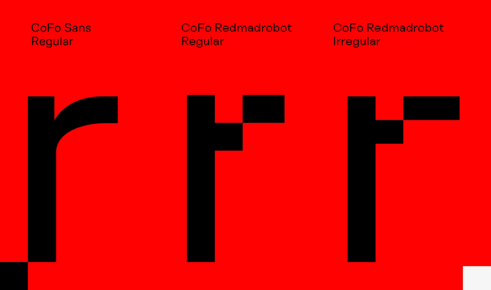
Two directions—two pixels
Initially, we suggested two types of pixels—regular and irregular one. We calculated their sizes based on the CoFo Sans parameters. As a result, the irregular pixel came out larger and ended up being more rectangular (hence its ‘irregularity’) with sides of 80 and 68 units respectively, and the regular one turned out smaller and more square with 40 units side.
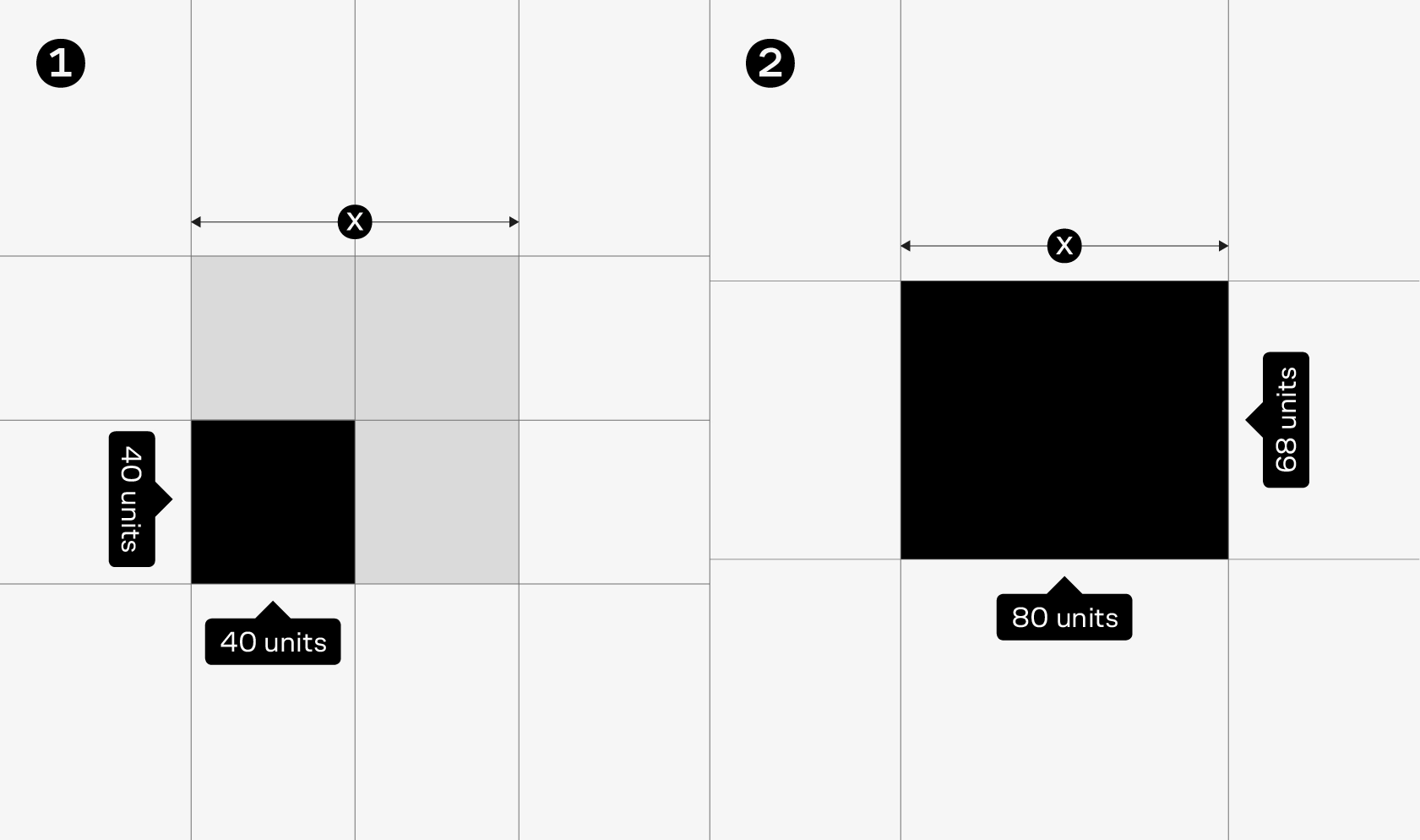
The large size and the ‘irregular’ shape of the first pixel were making it less flexible and gave less room to match the pixel characters with the original CoFo Sans.
The regular pixel had its own difficulties: in terms of font its mathematically correct shape was causing a few optical problems. For instance, the horizontal strokes seemed optically heavier than the stems. But we turned the situation in our favor and made it a thing. After all, such strokes made the font only more recognizable and gave it a special appeal. And the small size of the regular pixel together with the fact that the stem fit in two of them gave more opportunities to build complex forms.
In the end, we chose the regular pixel for further work. There were several reasons for such a decision: its idea is more coherent (pixels are usually square, and so is our pixel), it looks livelier, works better in display forms, and allows to add originality and distinctiveness to some letters and characters. And its design looks better in illustrations which are an important part of Redmadrobot’s new visual identity. So we decided to go with the special appeal in spite of optical challenges.
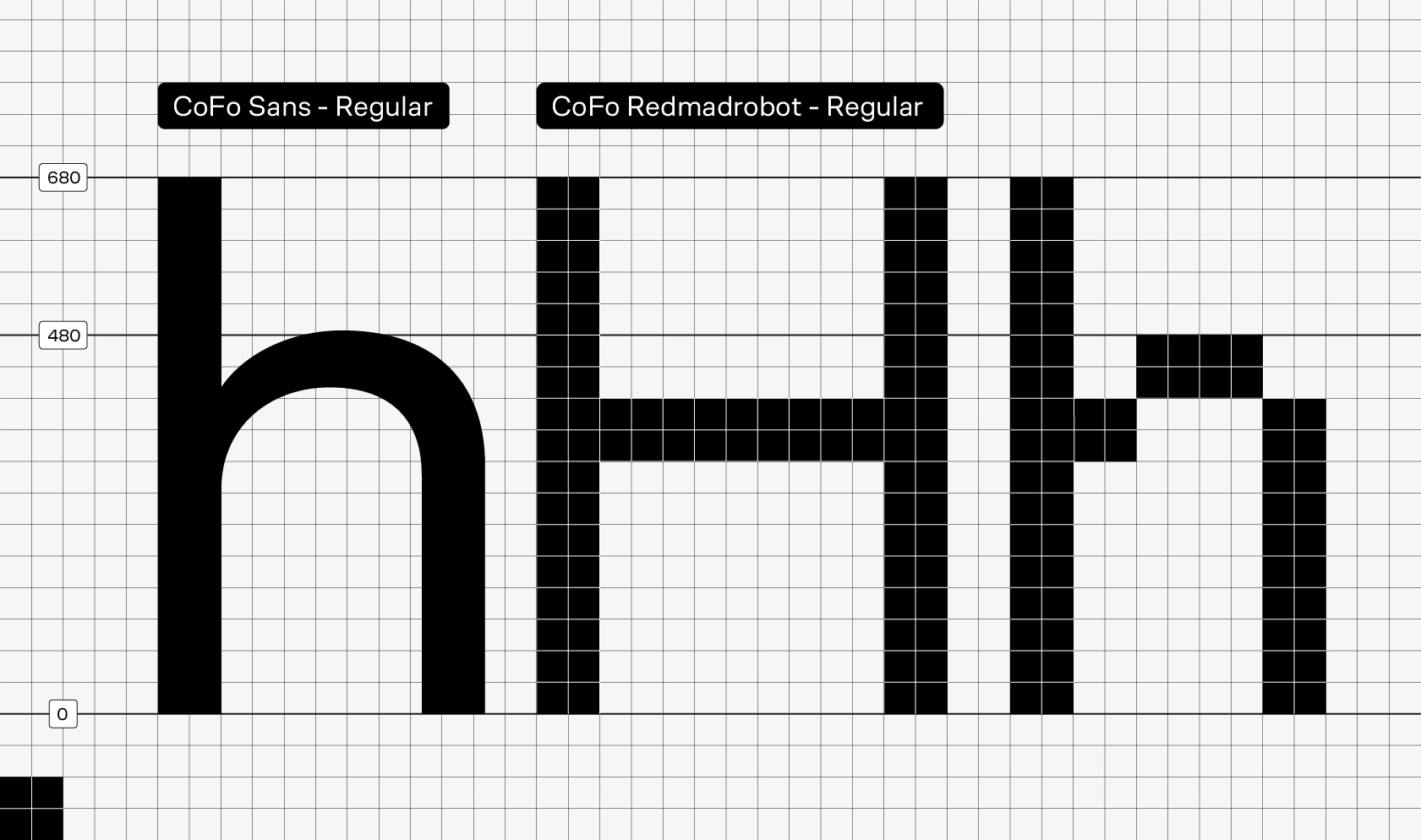
As is the case for the pixels, the sizes of the characters of the future pixel font were based on the original CoFo Sans parameters: 680 units for the height of the capital letters and extenders, 476 units—for the height of the lowercase characters, excluding the optical offsets, and 80 units—for the thickness. We also counted the number of pixels to fit in each of the heights.
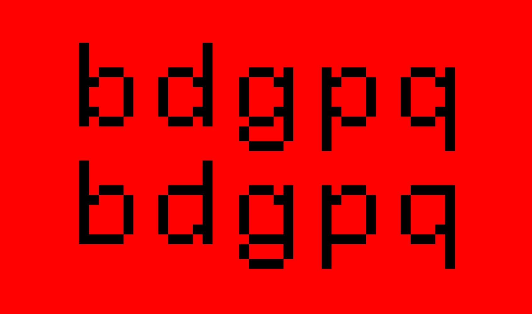
Alternative forms
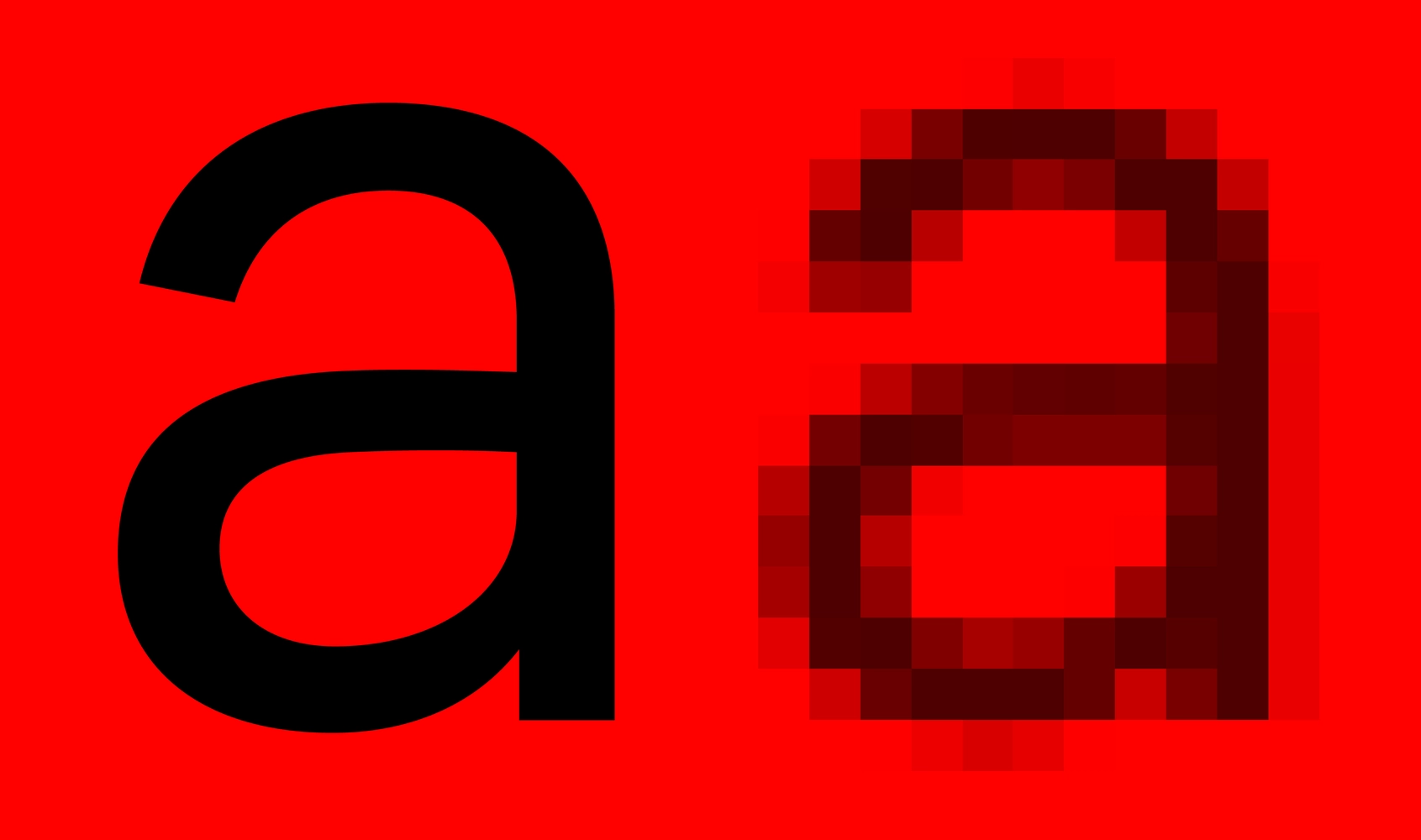
The typeface contains alternative forms for the letters b d g p q. The main set follows the design of CoFo Sans and works great in logos and large sizes, but in a smaller text these letters sag in the line due to the disproportionately small counter shapes inside the characters. To solve this problem, optically increase the size of the characters and equalize the density, we added an extra set of characters with a little more white inside the letters.
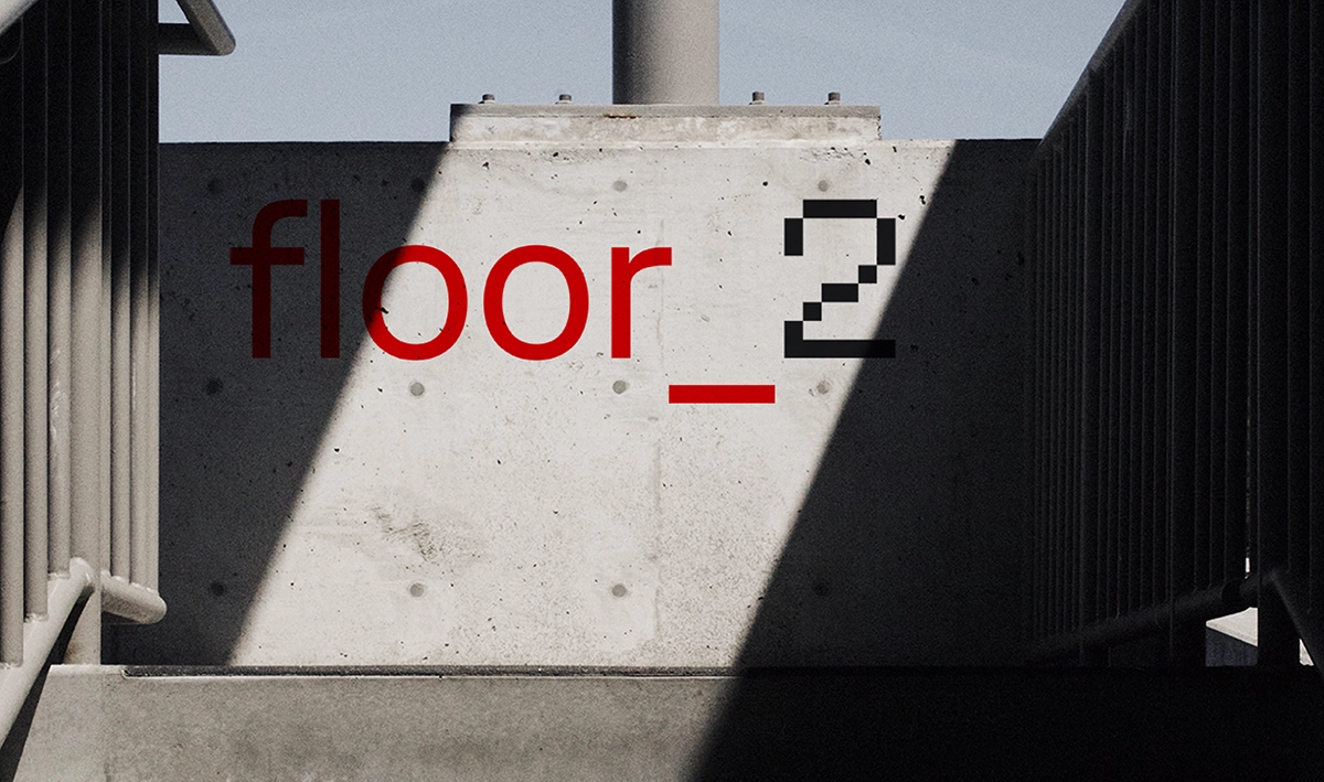
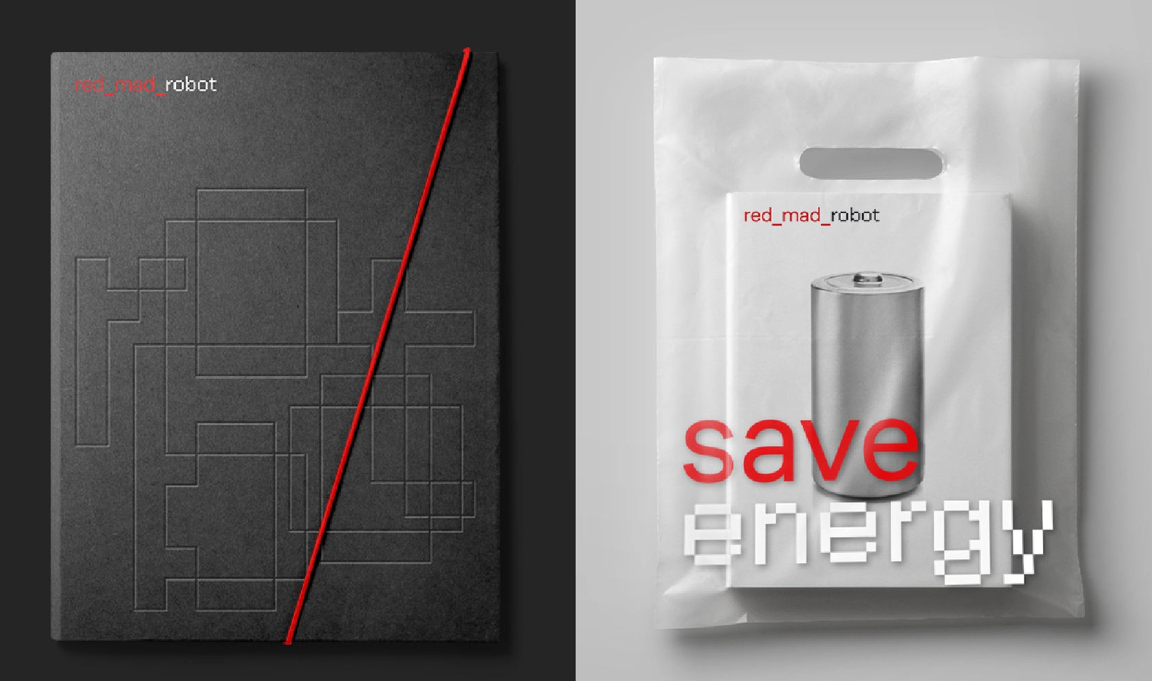
The resulting CoFo Redmadrobot is the CoFo Sans’s pixelated font brother. It’s main application is large display forms, logos and illustrations. It includes both Latin and Cyrillic, as well as a basic set of punctuation marks, math and currency symbols.

Designer: Nikita Sapozhkov
Supervised by Maria Doreuli
Mastering: Noe Blanco
Editor: Susanna Agabayan
Identity: Maxim Arbuzov
Creative director at Redmadrobot: Evgeny Bondarev


