
Petrick—an unconventional story of bald design with a twist and twinkle
Petrick is a studio focusing on character animation. First opened in 2016 they have been managing to combine skillfully different graphic styles in their work ever since. But in fact their greatest passion yet is drawing animation. For a while they had a simple logotype based on Futura, which was fine and enough for the time being, until it wasn’t anymore. Striving for some changes, for something unique and special, they came to us.

The initial studio’s logo was set in Cyrillic, and we had to create a Latin version of it. However, drawing the first sketches, we worked with both systems, since the characteristic forms of one can give a good hint to find interesting solutions in another.
The lettering is always about both concept and a rhythm formed by the letters it consists of, and we always make sure to figure out the inner interconnection of the characters first and only then to move on to the image itself. So we started off with constructions—upper and lower cases, small caps—and that’s where it immediately hit us: the capital letters in the original logo looked formal, sapless. We realized that the lowercase would allow to experiment more and this will bring liveliness to the logo. So that’s what we focused on.

Right from the beginning we wanted to make sure that the final logo would look good in social media. So not only did we focus on the full version but thought about how the first letter P will be used independently as studio’s profile picture.
For our very first presentation we elaborated three directions, all of which adopted some parts of the existing visual style of the studio.
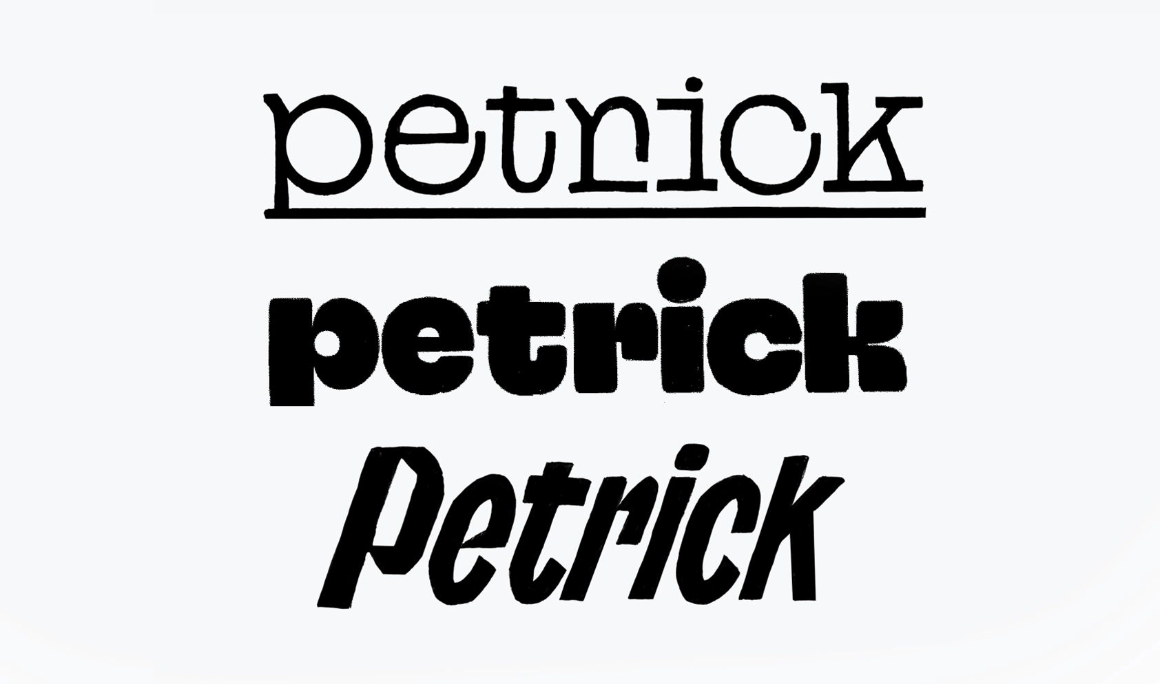
Our first idea was inspired by monospaced Menoe Grotesque (by Adam Katyi, Hungarumlaut), that the client was already using on the website. We thought it would sync perfectly with hand-drawn graphics of any kind, being quite serious due to the lack of contrast and at the same time recognizable thanks to the closed counters.

The second one extended the initial idea. We took a similar geometrical approach, but while making the letters significantly bolder we simplified the forms of the letters as much as we could. Studying the various forms, we still wanted to make it as warm and human as possible and not just draw another neutral sans serif. The resulting softness is what makes the inscription so recognizable and the density—distinguishable in any entourage.

For the third one we picked all of the brightest details—weight, slant, condensed proportions—and exaggerated them.

The sketch became compact and the letter constructions emphasized the dynamics. Lowercase characters allowed us to delve into details, play with round and sharp elements. In the lettering as a whole this created a bold play of the elements with each other and a variety of diagonal cuts even amplified that.
This last option ended up to be the one that showcased the animation studio’s nature in the best possible way. We were happy that the client shared our excitement and developed this idea further on.
Moving forward in the chosen direction, we specified the weight of the inscription, made it a little bolder. Traditional i didn’t seem to be enough, so we experimented with the layout, keeping in mind though that it wasn’t supposed to draw too much attention. In the end we turned the familiar dot into a triangle and connected it with the main stem. This way it supports the diagonal movement of the entire logotype.
Designer: Liza Rasskazova
Supervised by Maria Doreuli
Client: Petrick (Nadya Petrick, Misha Petrick)
Copywriter and editor: Susanna Agabayan


