CoFo Sans and CoFo Sans Mono for Alternativa Film
Ricardo d’Avila is an independent graphic designer from São Paulo, Brazil, based in Portland, OR, specializing in visual communication within the cultural field. He chose CoFo for his Alternativa Film Project, a nomadic series of initiatives aiming to boost the development of local film industries and communities.
About the Alternativa Film Project:
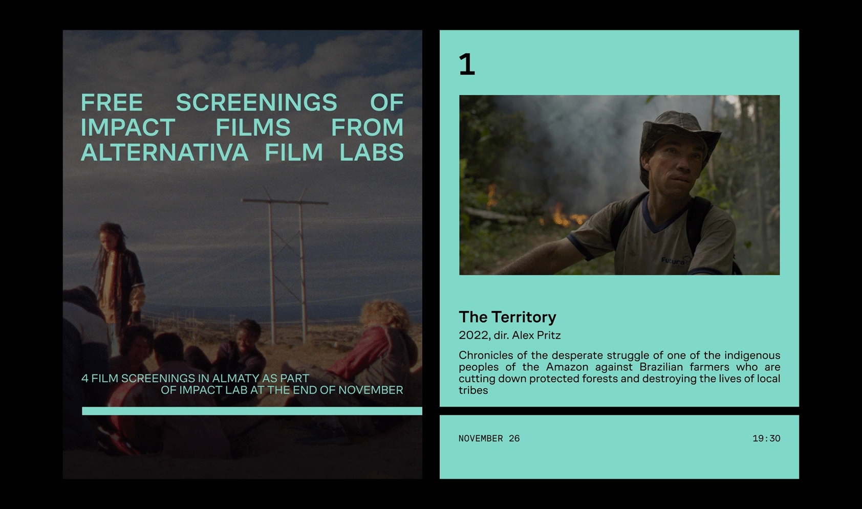
Alternativa Film Project is a nomadic series of initiatives created to support and promote filmmakers and discover new voices from developing film industries. The long-term project aims to change the status quo in the world of cinema and boost the development of local film industries and communities.
[CoFo]: Where do you typically search for typefaces when initiating a new project?
[Ricardo]: I have been putting together my own catalog of type foundries for years, currently trying to organize through categories and subcategories. When I start a project, I go through this catalog and start to experiment and test types, and ideas begin to appear during this process.
[C]: How did you come across CoFo Sans?
[R]: I can’t say for sure, but I think I first learned about CoFo through a really nice research article from It’s Nice That called Global Type. During the process of finding a typeface for this project and going through my catalog, CoFo Sans really attracted my attention and made it to the shortlist.
[C]: Were there any other typefaces you considered as alternatives? If so, which ones, and what led you to choose CoFo Sans?
[R]: I started searching for a clean and modern sans serif with a big variety of weights, and specifically a mono version. During the process, I ended up experimenting with some options, ones with more character, like Ritma by British Standard Type, ABC ROM by Dinamo (that I ended up using for the logo), Rauschen A and B by Out Of The Dark, and CoFo Sans.
[C]: Is there anything specific you were looking for in a typeface that CoFo Sans offered, or is there anything you wish it had provided?
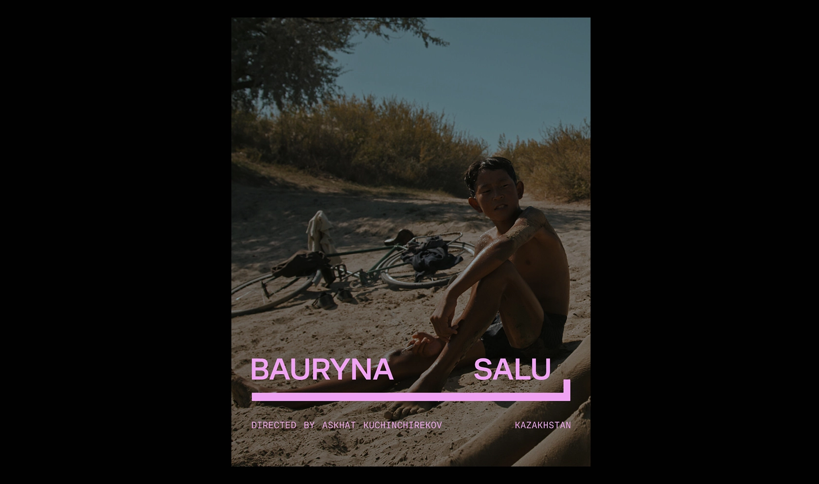
[R]: Alternativa is a global-scale project, so the variety of language support by CoFo Sans was key here. The project is primarily bilingual, English and Russian, but it will have additional languages since it is a nomadic platform.The first event of the project took place in Almaty, Kazakhstan, that required a Cyrilliic version of the typeface with some extra/special characters that represented specific Kazakh sounds, which CoFo Sans covered amazingly.
[C]: Thinking about creative usages of fonts and typography, which project comes to mind first?
[R]: I’m not entirely sure if I should pick one of my projects here or any design project. I will do both, just in case.
I have a long-term partnership with a documentary film festival called Beat, based out of Moscow. That was at the very beginning of my independent career as a graphic designer. The first 3 years we worked together, we did an all-type trilogy series of posters that somehow shaped my style and how typography became a central element of my work.
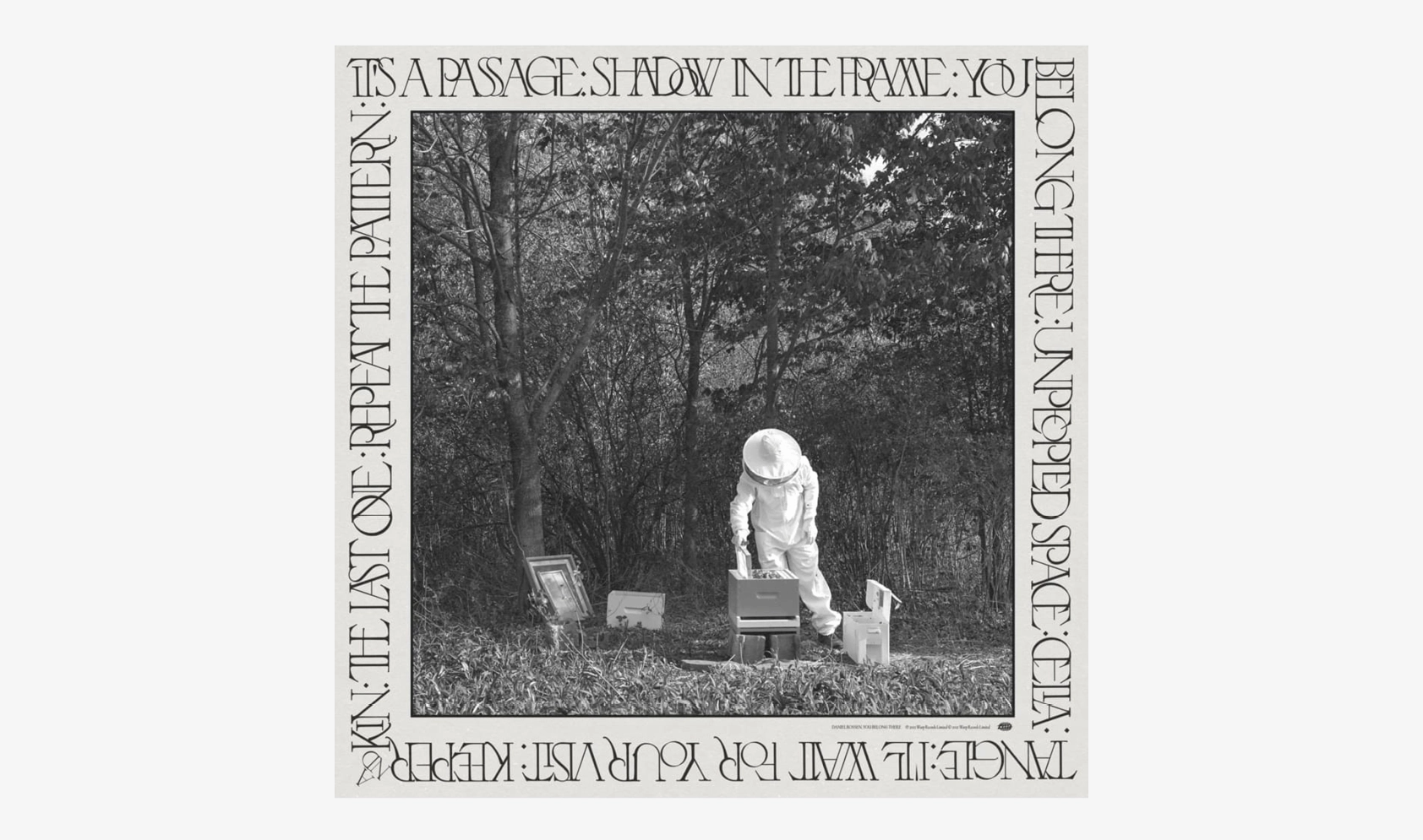
If I were to choose a project from outside my work, the first one that comes to my mind is the album cover of musician Daniel Rossen “You Belong There”, with a beautiful typeface created specifically for this by Justin Sloane.
[C]: Do you follow any design blogs, and is there one in particular that you would recommend?
[R]: I don’t actually follow a lot of design blogs, but I occasionally check It’s Nice That and AIGA Eye On Design, just to see what is happening out there and also to find new type foundries. I do follow designers, studios, and artists that I admire to not forget why I’m doing this in the first place.
Check out the full case study on Ricardo’s website ricardodavila.net.
Follow Ricardo on Instagram.


