We released three new styles of CoFo Sans
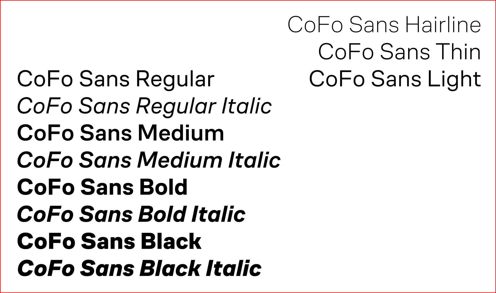
CoFo Sans Version 1.0 was first released in December 2018. Today we release three additional styles: Hairline, Thin and Light, which similarly to the rest of the family are all suited to be used in relatively small text sizes.
Light vs Regular
CoFo Sans has proven to be a great choice for digital products. For the past four years that it was out, we’ve seen it work in a variety of mobile applications and websites. With this in mind we designed CoFo Sans Light to work as an alternative style to Regular. Light style works great even in the relatively smaller sizes and serves well whenever a slightly crispier weight is needed.
With the additional weights CoFo Sans is slowly growing into a large typefamily that works equally well for print publications, branding, and digital projects where a more extensive and versatile typographical palette is required.
Check out CoFo Sans

CoFo Sans was originally designed by Maria Doreuli
Lighter styles were drawn by Egor Golovyrin and Liza Rasskazova
Engineering: Noe Blanco
Editor: Susanna Agabayan


