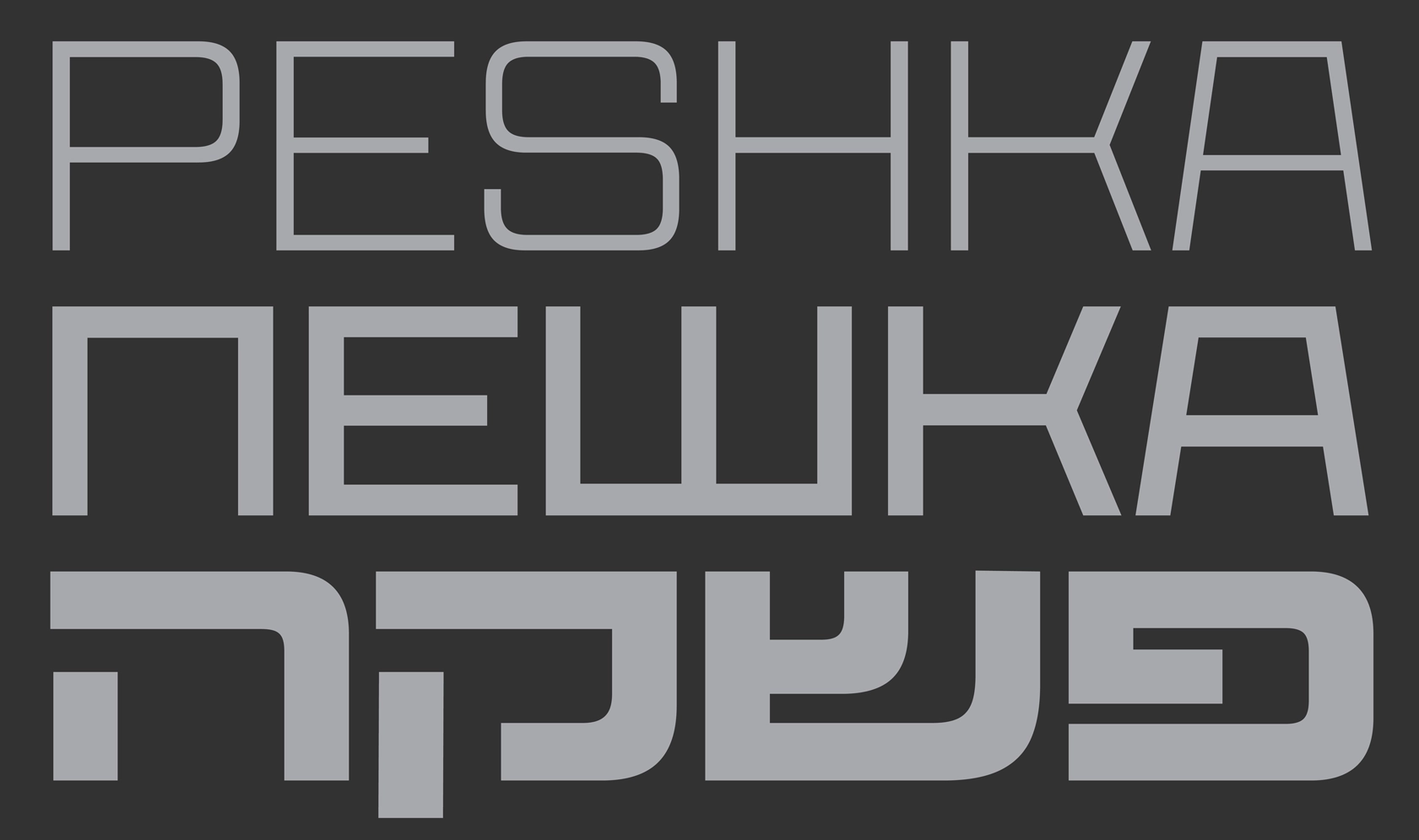
CoFo Peshka—From aerosledges to 144 style superfamily
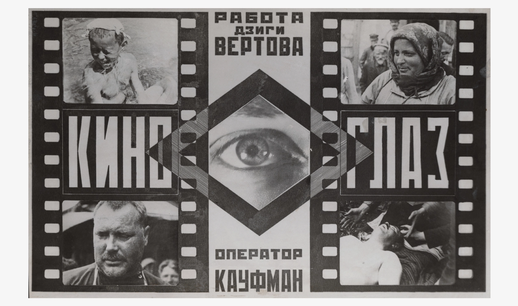
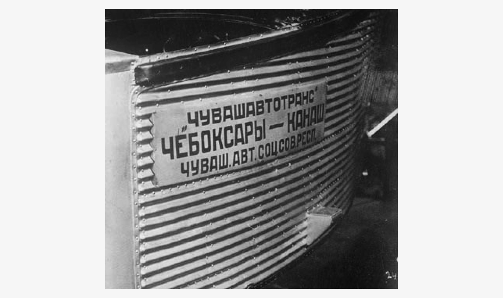
When CoFo Peshka first emerged, it only had one style. Its initial inspiration was drawn from the letters found on the 1920s aerosledges that were used to design a series of traveling exhibitions dedicated to aviation. The development of the typeface commenced in 2016 and spanned over the next seven years. Let’s delve into the reasons behind this extended timeline, the unique features of the typeface, the story of the Hebrew extension, and explain how the typeface grew from 1 to 144 styles during the process.
WHAT IS PESHKA?
Peshka features machine-inspired contours, which are characteristic of the industrial era lettering. Almost rectangular ovals, wide horizontals, and tight spacing add a unique personality, reminiscent of the constructivism period. Our aim was to intensify the feeling of rigidity and mechanical nature of the typeface by simplifying its forms.
In the process of designing Peshka, we kept gathering historical photos of inscriptions found on airplanes and aviation equipment, as well as propaganda and advertising posters from the 1920–1940s.
ABOUT THE PROCESS
The decision to turn Peshka into a variable font came from the aerosledges, where we could see wide and narrow lettering on different lines. This encouraged us to experiment with interpolation and led to a typeface family in a range of widths. We discovered that simple geometric construction provided the freedom to experiment with both the weight and width of the typeface.
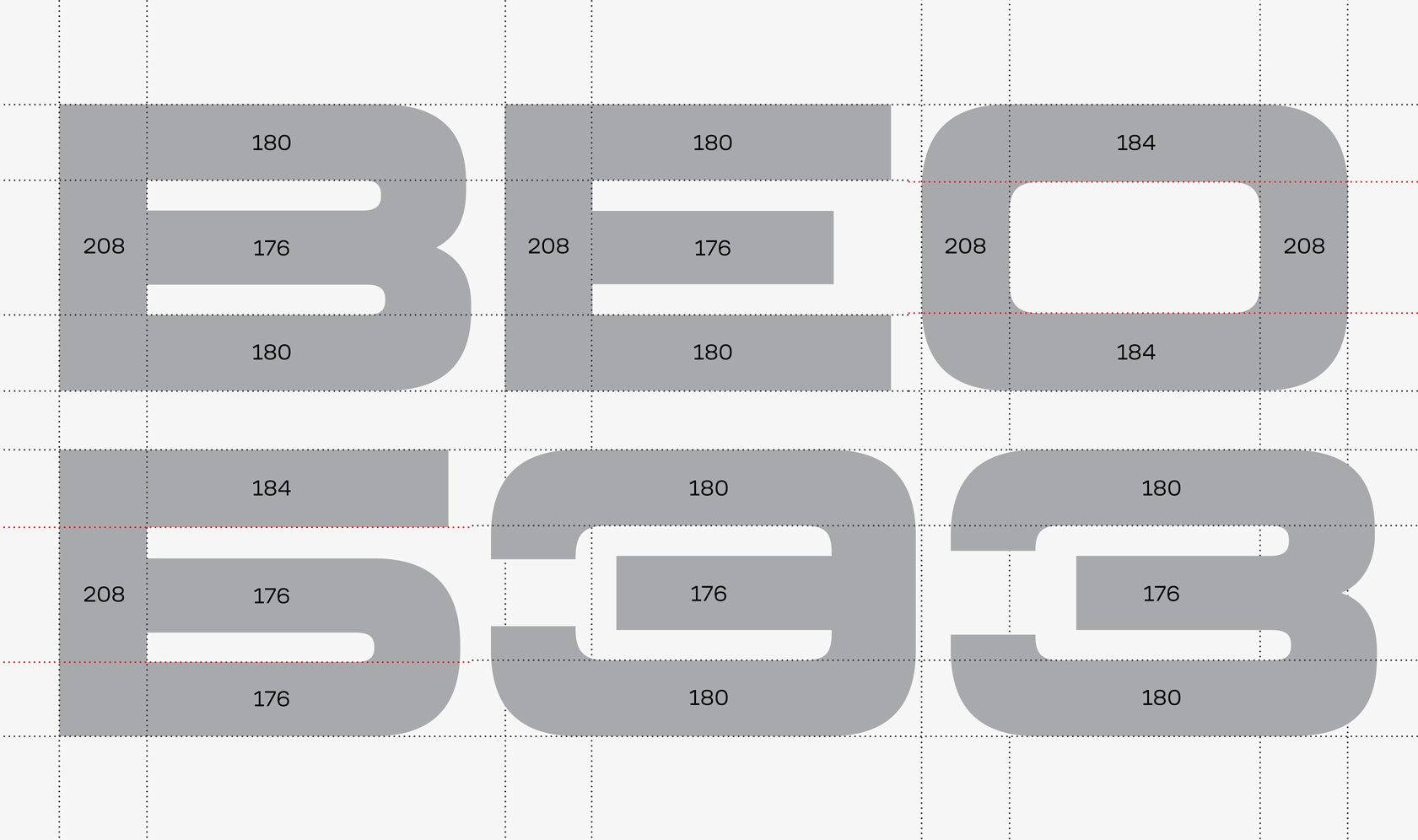
Throughout the drawing process, our goal was to achieve extremes on both ends: the maximum width and weight for the wide style and a significantly narrower thin style without compromising its monolinearity (uniform thickness). We looked at letters with three horizontals such as B S, and E in the Black Extended style as a guide to establish the maximum density for the rest of the characters in Peshka.
Check out another industrial and also stencil font from our collection—CoFo Kabeltouw.
WORKING ON THE WIDTH
The most captivating solutions surfaced as we sought letter constructions suitable for all master styles. To accomplish this, we experimented with diagonals. We faced numerous challenges: a specific form might excel and maintain historical accuracy in a narrow style, but it would become unreadable in a wide style, or vice versa.
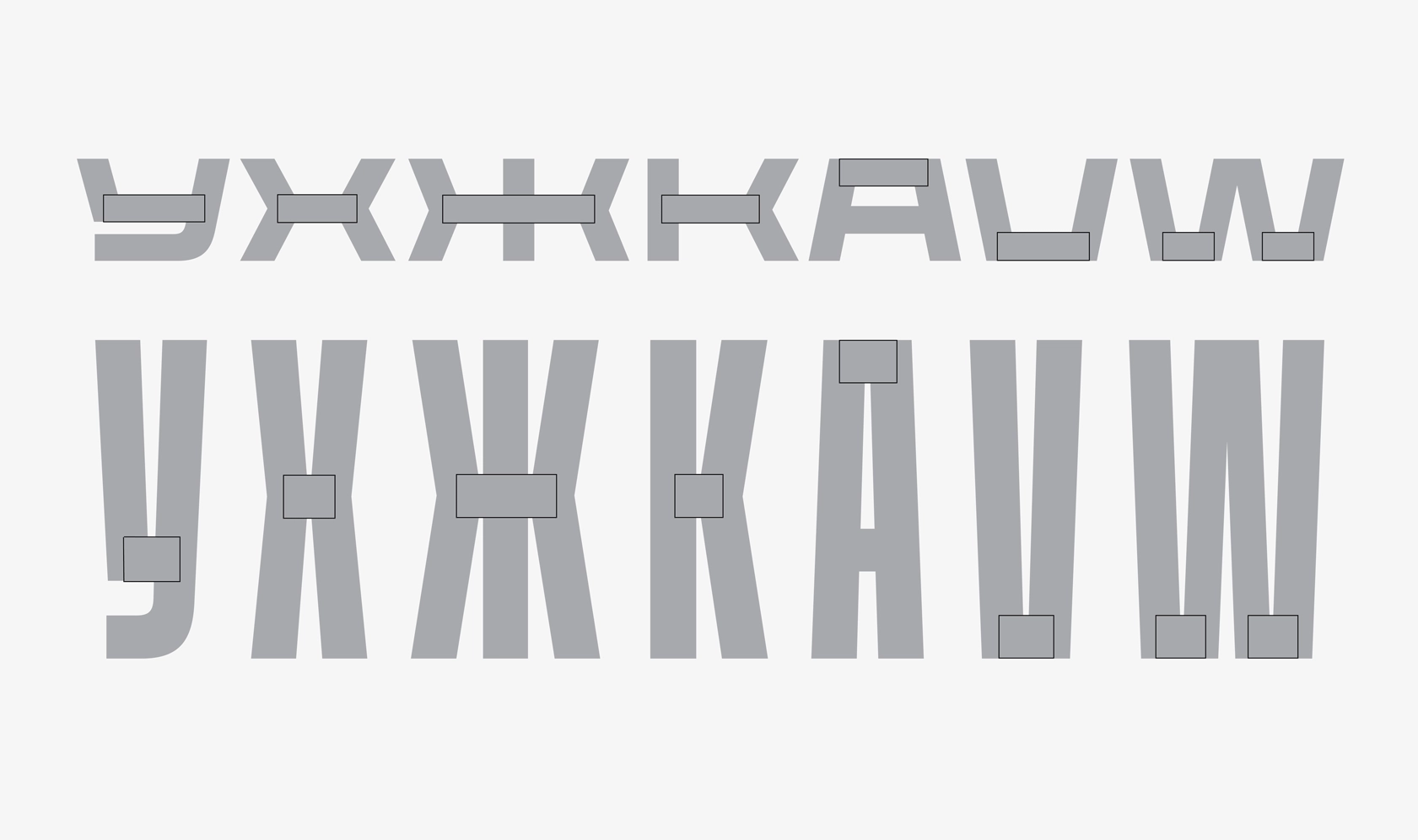
For example, the letter У serves as the basis for other characters with diagonals. In the narrow style, the connecting points of the diagonals created dark spots, while in the wide style, the diagonals exhibited excessively sharp endings. The solution involved adding a horizontal stroke. This not only allowed for the necessary negative space within the inner triangle across all styles but also contributed to the typeface’s expressiveness and emphasized its character. Moreover, we liked this construction so much that we decided to carry it from Cyrillic to Latin Y.
At the end we added a traditional form to the Latin as an alternative, but that is a different story ;)
The horizontal stroke proved to be the key for letters such as У Х Ж К А V and W. It enabled us to achieve the desired width for these letters in the wide style without tilting the diagonals too much. Furthermore, in the narrow style, it successfully prevented the excessive concentration of weight at the junctions of the strokes.
DUPLEX
Peshka is a duplex typeface, which means it allows you to change the weight without affecting the length of a line of text in a layout. The simple, squared shapes of Peshka motivated us to attempt this experiment, although it added further complexity to the project.
DUPLEXING & WIDE CHARACTERS
Preserving the duplex nature of the typeface was particularly challenging in wide styles, which led us to search for balance:
[1] We maintained similar proportions in the semi-ovals of Ь Ъ, and Ы, but made sure to adjust them to avoid a large gap in Ы between the semi-oval and the vertical stroke in the light style and an overly small gap in the bold style;
[2] We balanced out the characters like Ш and Щ. Usually, the inner negative space in these letters is identical; to ensure harmonious letter spacing, we narrowed Щ in the bold style and widened it in the light style.
WEIGHT IN EXTREME STYLES
Peshka allows for the creation of layouts with various character widths while maintaining consistent weight. Here is what we did to achieve that effect:
[1] For the bold styles, we increased the inner negative space and adjusted the stroke thickness to ensure the narrow style didn’t appear too heavy.
[2] For the light styles, we kept the stroke thickness consistent, taking into account that the typeface was designed for display usage, where the monolinearity of strokes is essential in both narrow and wide styles. Consequently, in long texts, the narrow style might appear slightly darker than the wide style, but they perfectly complement each other in headings.
INTERMEDIATE STYLES AND DIAGONALS
Given that the typeface varies along two axes, it was crucial to:
[1] Ensure comparable lengths of vertical and horizontal handles in complex letters like S. We aimed to create the right form of the vertical negative space within the letters in the narrowest and widest styles.
[2] Preserve proportions and stroke thickness during interpolation by incorporating overlaps where strokes connect. It was necessary to adjust the diagonals, which can become substantially bolder or lighter than the primary horizontal and vertical strokes during interpolation.
Note: We do not advise to add overlaps everywhere in your letterforms. They can make your work much harder. But there are cases where overlaps help interpolation and diagonal strokes are one of those cases, especially in a typeface with a range of widths and weights.
NUMBERS AND THEIR ENDINGS
Peshka is a static typeface with closed apertures, which is apparent in the vertical stroke endings of letters such as S Э, and З. Our goal was to make these characters as closed as possible while still accommodating the overall weight, in order to achieve a consistent color in the narrow styles. At first, the numbers 2 3 5 6 and 9 followed the same concept.
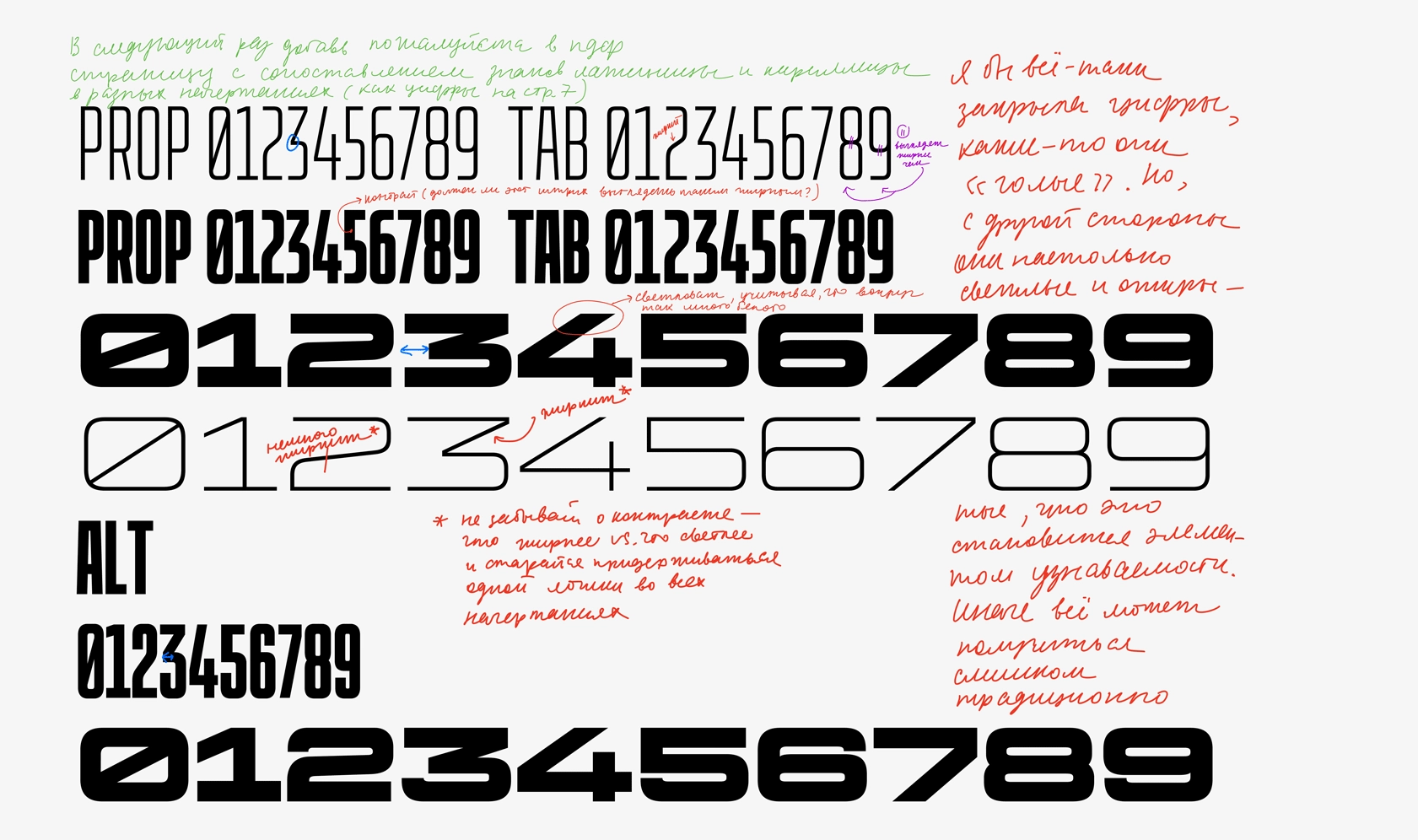
However, we realized that the “closed” construction of the numbers was too complex to be drawn across all styles. The diagonal in 3, the curved connections in 6 and 9, and the asymmetry between the top and bottom parts of 5 (in the bold wide style) left no room for vertical endings or required the numbers to be lighter compared to the other characters. Confronted with this issue, we decided to keep the numbers open (with vertical cuts).
In the wide style, this enabled us to preserve their boldness, consistent with the overall weight of the typeface. In the narrow style, we made them slightly bolder than the letters to offset the increased amount of negative space around them.
ACCENTS
Peshka is a display typeface featuring a set of compact diacritics. While working on the extended Latin characters, we decided to develop two sets of accents:
Traditional: matching the weight of the typeface (default set).
Experimental: considerably lighter but maintaining maximum compactness, can be accessed by turning on the stylistic set “Thin accents” (Type Details in Figma).
This approach allows for reduced line spacing, which is particularly beneficial when setting headlines.
MATH SYMBOLS AND FRACTIONS
Peshka’s blocky industrial nature forced us to pay special attention to some of the special symbols. In addition to the default fractions set, we decided to incorporate another alternative design of fractions:
We began designing fractions with the traditional diagonal middle stroke. However, we quickly realized that maintaining consistent character widths in wider styles would be challenging. In narrow styles, due to the diagonal, the fractions appeared overly wide and complex.
We found an alternative solution inspired by the gas price tags in the US. In a similar way, fractions can also be built with a horizontal bar. This type of fractions is helpful when space is limited and is often referred to as nut fractions. We decided to make both sets of fractions available in Peshka’s latest version.
We developed this further by adding superior and inferior numerals, along with related currency symbols, suitable for price tags. Initially, we tried to match them with the weight of the numerals but later significantly lightened them to achieve optical harmony with the main character set.
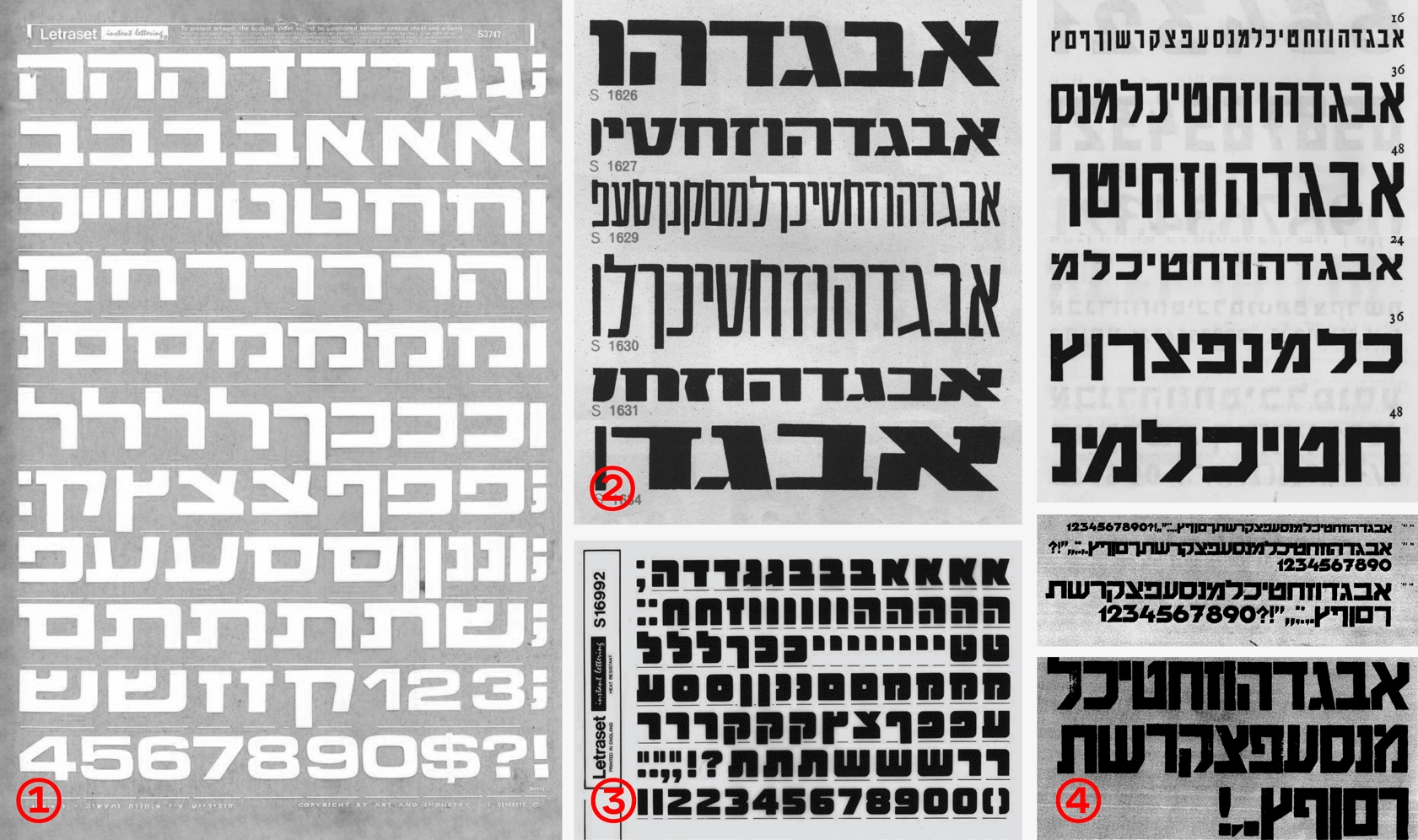
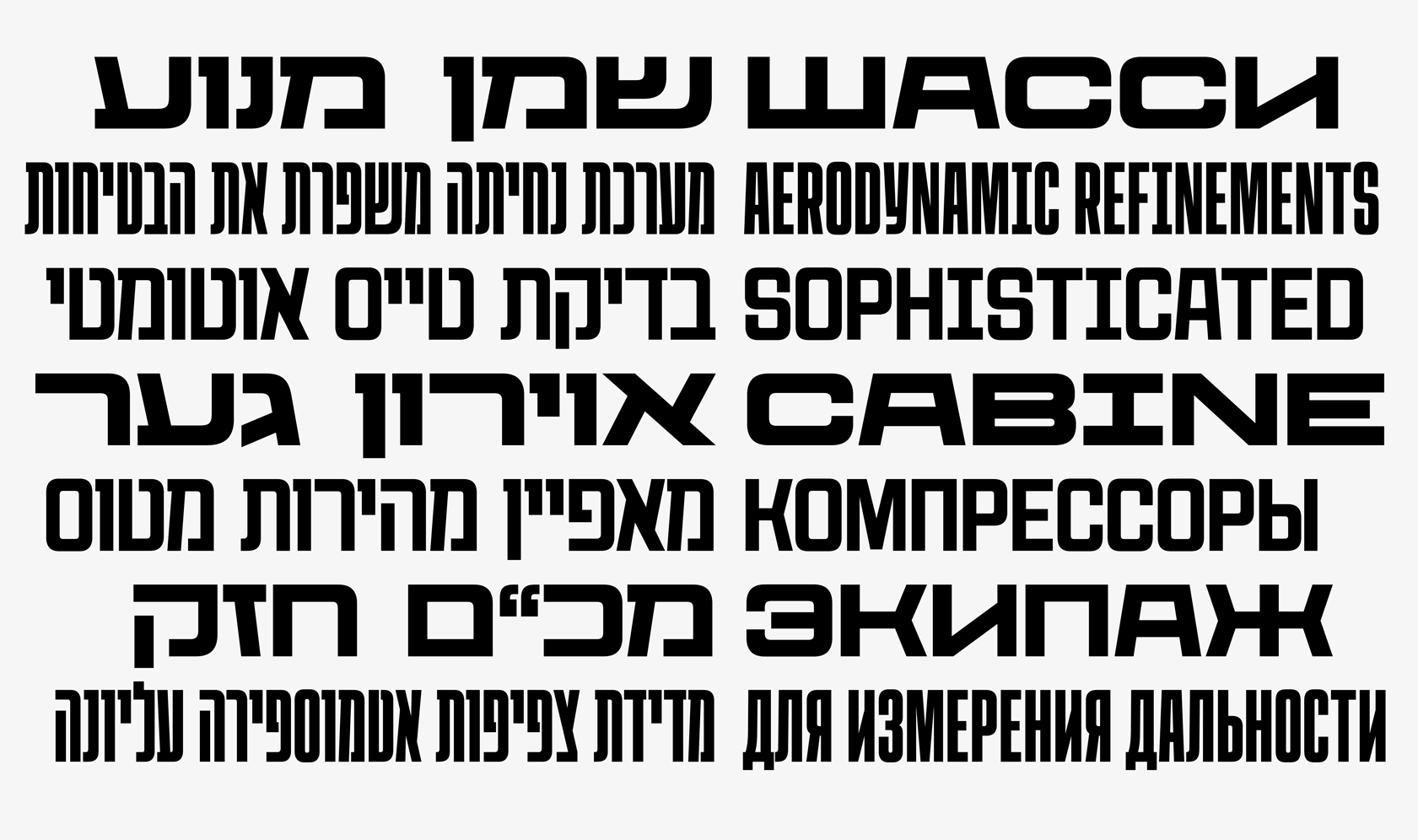
HEBREW EXTENSION
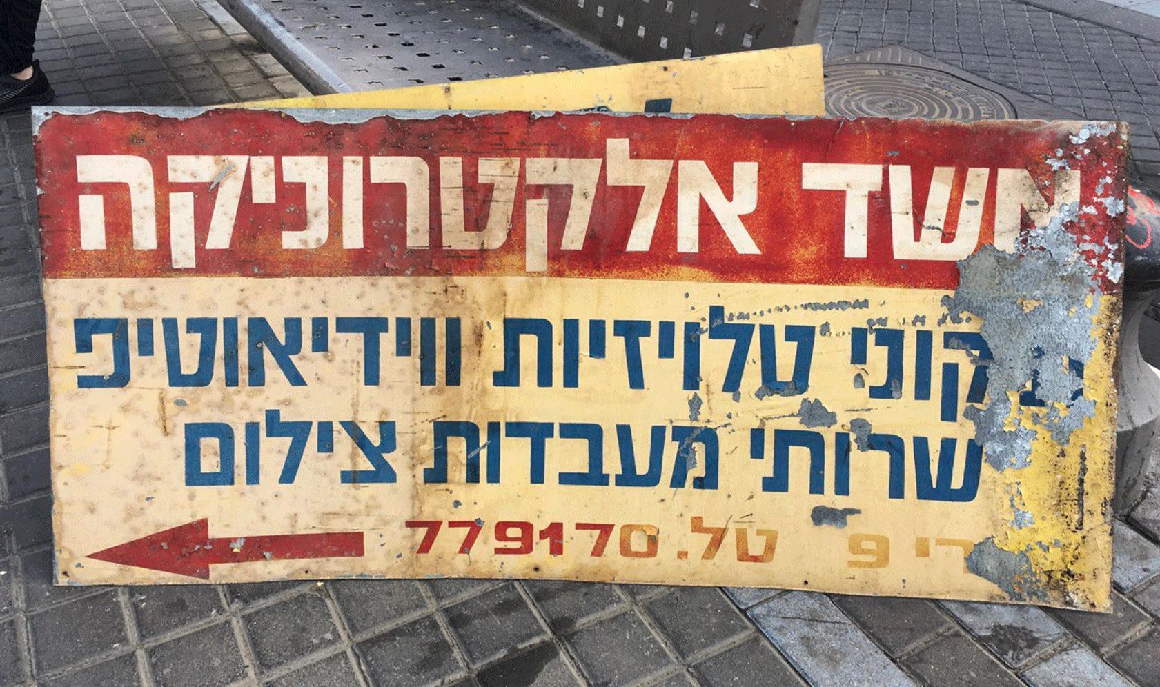
Anya Khorash, one of the typeface’s creators, moved to Israel in 2019, which inspired her to consider how well Peshka’s character aligned with square script proportions. As a result, Hebrew was added to Peshka. This project was Anya’s first serious typeface endeavor and provided an opportunity to explore the relationship between historical styles across different scripts. It turned out to be an engaging assignment balancing Latin, Cyrillic, and Hebrew.
SEARCHING FOR HEBREW REFERENCES
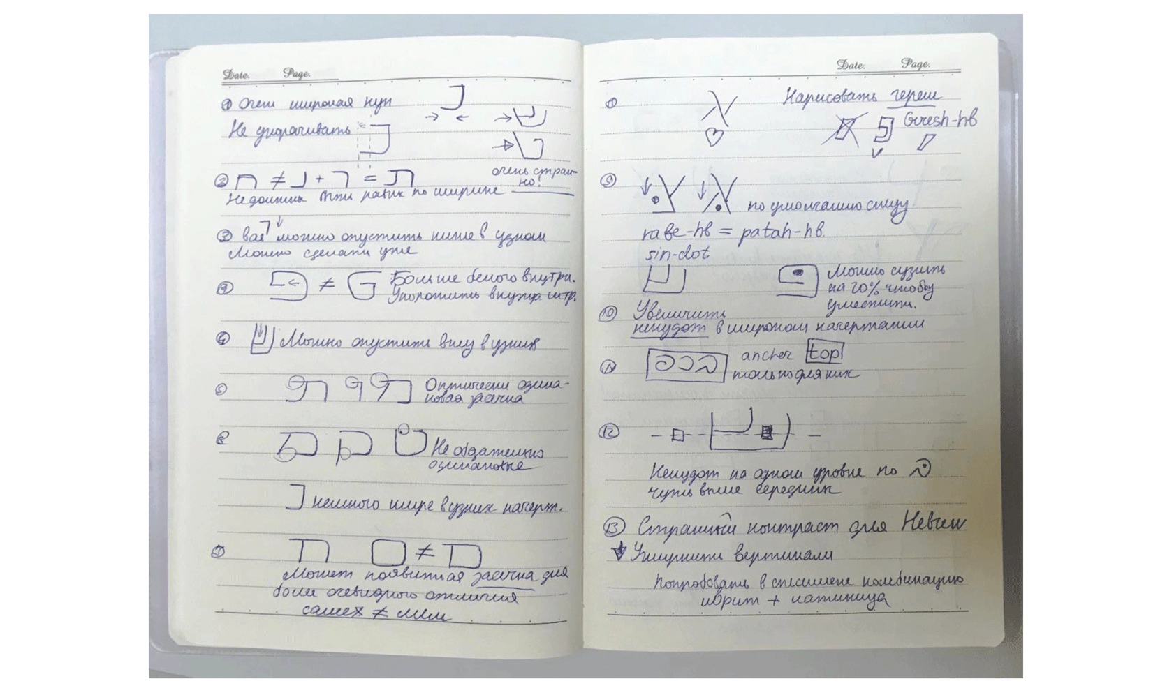
The process began by searching for references from the same historical period, the 1920s. We discovered several type samples with similar characteristics, but their creators had not intended to develop typefaces with multiple styles. Some letter constructions worked better in wider styles, while others were better suited for narrower ones. Our task was to integrate these elements into a cohesive system.
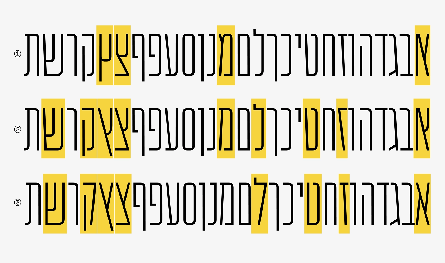
CONTRAST IN HEBREW
In classical serif Hebrew typefaces, an emphasis on horizontals is common. However, in sans serifs like Peshka, the contrast is usually more vertical, more similar to Latin. Additionally, with equal stroke thickness in Hebrew and Latin, the contrast in Hebrew is perceived differently. Long horizontal strokes and infrequent vertical strokes create a horizontal emphasis where Latin looks quite typical. Without optical compensation for thickness, Hebrew seems lighter. We attempted to adjust the thickness ratio to achieve a consistent feel across different languages but ultimately returned to the original ratio to ensure better compatibility with larger font sizes.
Note: It is common to hear the term “reversed contrast” when talking about scripts like Hebrew. We try to avoid it, because by using it we imply that there is a “default contrast” which is the one common for Latin script.
SEARCHING FOR HARMONY
Our goal was to preserve the harmony between Hebrew, Latin, and Cyrillic in terms of rhythm and the number of rounded, straight, and diagonal strokes. Hebrew offers flexibility in this area, as many characters can have either straight or diagonal construction. However, it wasn’t always clear which constructions would be harmonious within the chosen style’s context. At this stage, we consulted with Yanek Iontef and Daniel Grumer from Fontef, who guided us in maintaining historical context.
SLANTED / BACKSLANTED
This font is designed to be variable, allowing users to select their desired slant, ranging from 25° to −25°. Our aim was to maximize expressiveness for the extreme styles without compromising the intermediate ones. Working on Hebrew, which is written from right to left, inspired us to include a backslant, developed by Krista Radoeva. Since the upright style was already completed, the extreme styles are interpolated from upright to slanted and from upright to backslanted.
SYSTEM OF STYLES
During the development process, Peshka’s number of axes increased to three—weight, width and slant, with the total number of intermediate styles reaching 144. We needed to organize the styles so that they would be easier for the user to choose from. The decision was made to divide the font family into eight separate subfamilies based on width, ranging from 0 to 1000:
CoFo Peshka 0
CoFo Peshka 75
CoFo Peshka 160
CoFo Peshka 260
CoFo Peshka 380
CoFo Peshka 550
CoFo Peshka 750
CoFo Peshka 1000
Each subfamily contains 18 styles. After installation, each width subfamily is displayed as a separate font, with all styles easily accessible through a drop-down menu.
P.S. We decided this for you, but any user experience input is very much welcome. Is this useful? Let us know!
If you got this far reading this article—you are our hero ♥︎

Author: Anna Khorash, Maria Doreuli
Editor: Ekaterina Barannikova
Motion: Dima Kozlyaev
Type designer: Maria Doreuli
Team: Anna Khorash, Krista Radoeva
Hebrew: Anna Khorash
Hebrew consultant: Yanek Iontef, Fontef
Mastering: Tasya Petelina


