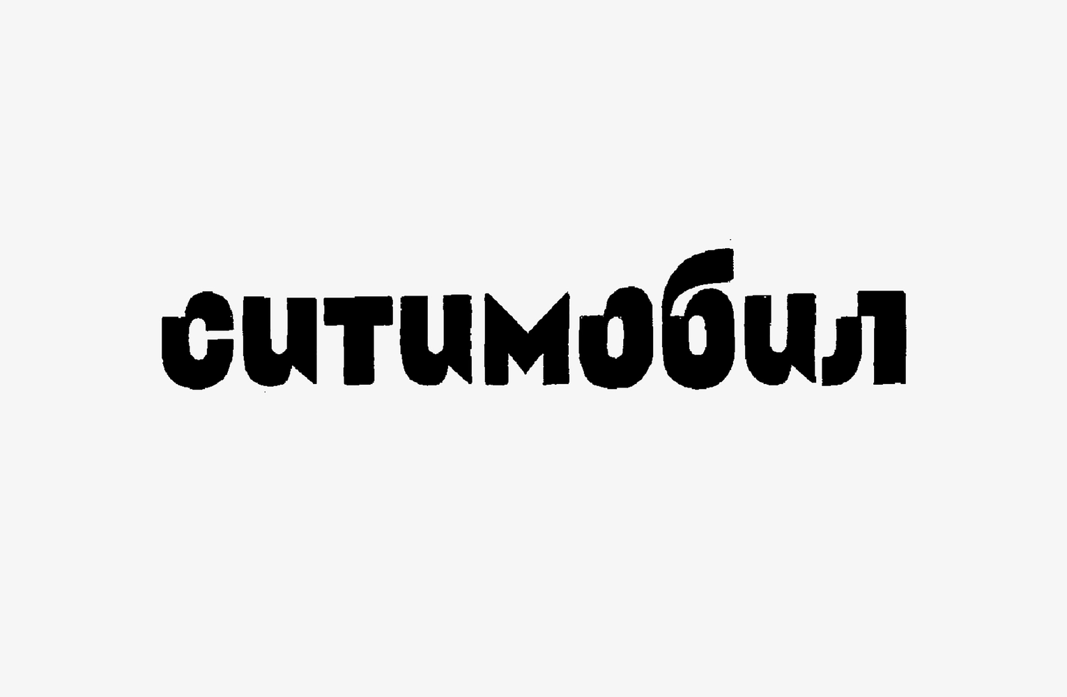
Typeface as a metaphor of the city rides: ride-hailing company Citymobil’s new typographic voice
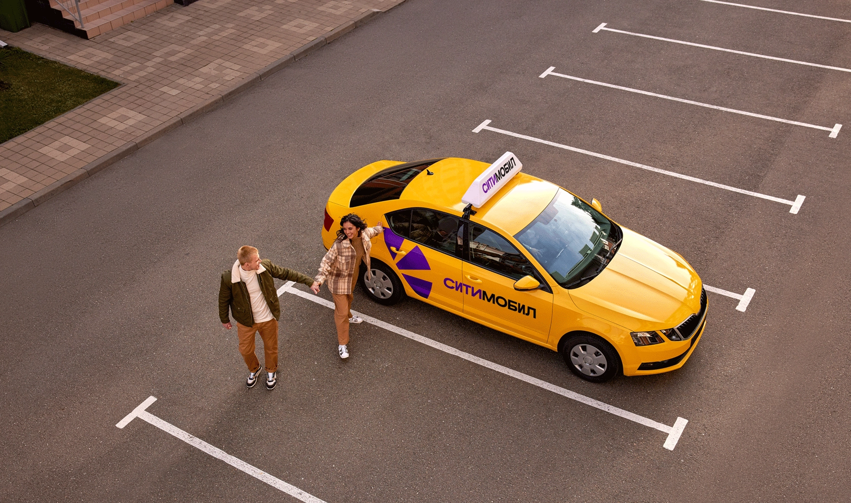
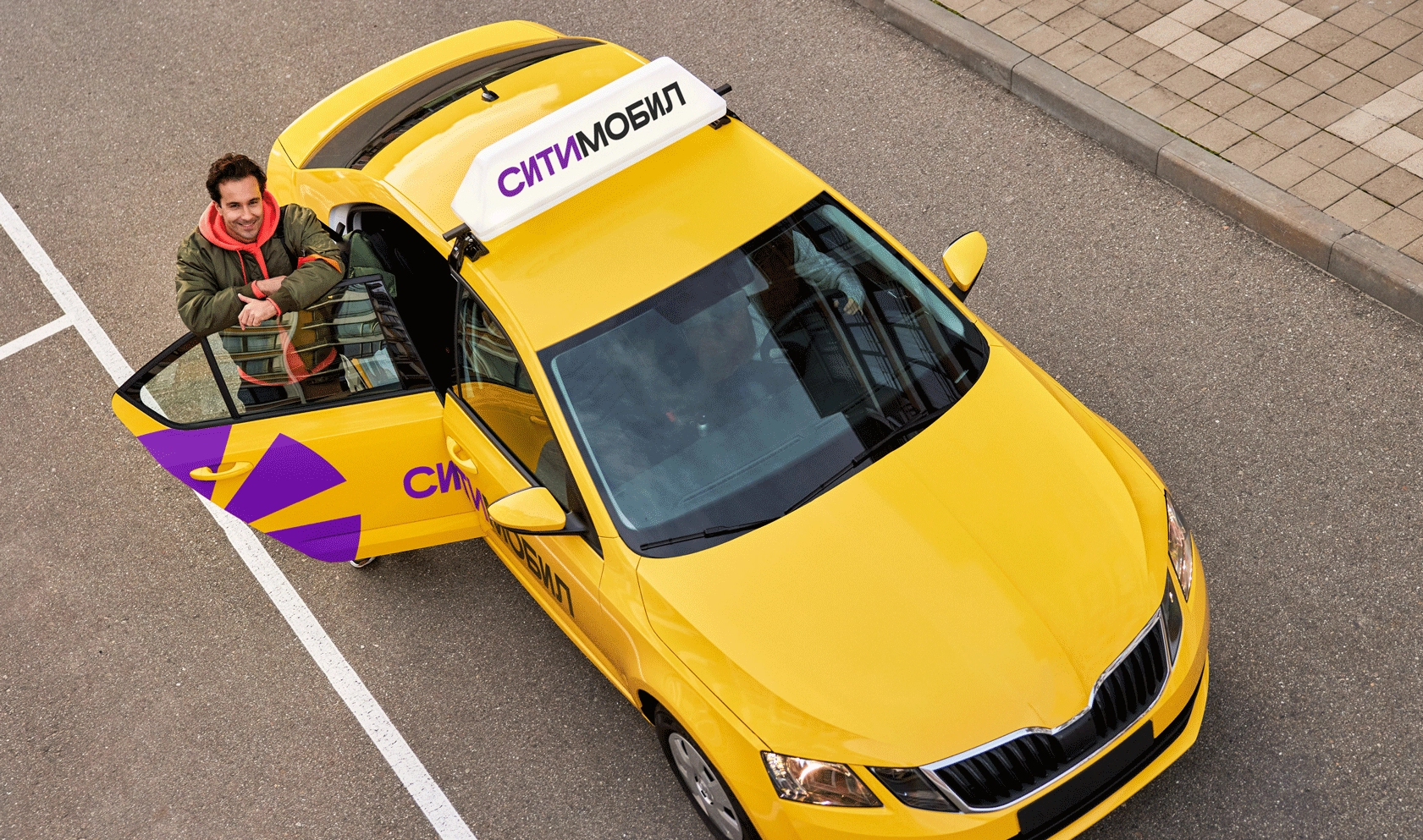
At the beginning of 2021, Citymobil launched a large-scale rebranding. From the second largest taxi aggregator in Russia, the company has transformed into a system of urban mobility services with car sharing, delivery and scooter renting, in addition to the service for ordering a taxi. This shift in concept led to a redesign of the identity and prompted the brand to seek its own typographic voice as well. The first part was carried out by the London-based agency Saffron Brand Consultants, and for the second task Citymobil turned to us.
PROCESS
From the very beginning, it was about creating a flexible system of wordmarks and a bespoke typeface for use in the updated brand communication. Citymobil came to us with a ready-made concept of corporate identity—a color scheme, a key visual in the form of a spark, volumetric vector graphics, onomatopoeic words like “whoosh”, “yeehaw” and “beep-beep”, which were to be used in the media—and a detailed brief for the development of the typeface.
We were to create the Citymobil and Citydrive logos and the typeface in three styles: Display, Title and Text. Even though Citymobil is a huge company with a complex ecosystem they didn’t want to be neutral or serious. So we had to find a balance and create the most vivid and expressive image, while not missing the mark with tone of voice. And we were happy to roll up our sleeves and start looking for a solution.
Search for the right direction
The Citymobil typography approach is communication-led, and they wanted their typeface to be the main vehicle for translating the boldness of their tone of voice that could be summed up in two words—a cool friend. This approach sets the company apart from its more serious and neutral competitors. It helped us determine the general direction of work. Users of Citymobil services should be left with a feeling of personal communication, and not of contact with a heartless machine. At this stage, in the course of a dialogue with a client, we formulated a set of key concepts that we wanted to reflect in logos and the typeface: mobility, modern urbanism, smooth movement, softness, dynamics, technicality, liveliness, and easy audacity.
Despite the fact that the brief was extremely accurate in terms of the scope of work and visual directions, we still had room to experiment with the letterforms. Therefore, at the first stage, we decided to develop three directions, each of which emphasized one of the characteristics of the style or correlated with the existing design solutions.
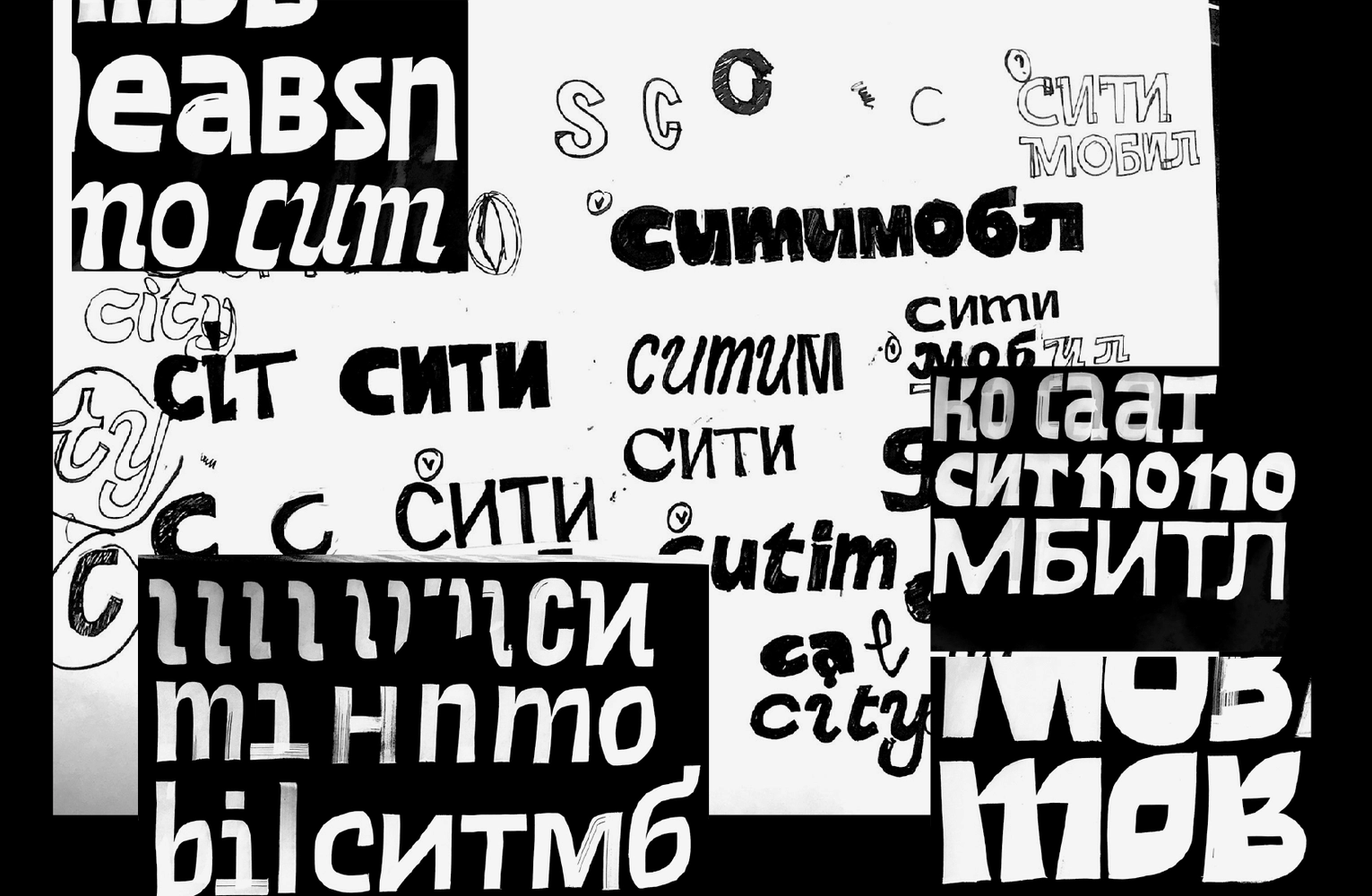
When we start working on a typeface, we always visualize the idea on a limited set of characters. And we turn the first sketches into a system and develop them in a typeface only at the next stage. This time we tested our ideas on the words Citydrive and Citymobil in Cyrillic and Latin. This allowed us to concentrate on finding the rhythms and character of the letters.
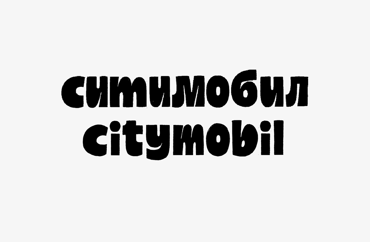
First direction: friendliness and energy. Reading the brief, we drew attention to how much importance was given to friendliness and humanity in describing the new concept. It seemed unusual given the context—city, speed and cars. So we decided to emphasize this conditional “softness” by opting for heavy weight of the letters, roundness and “inflated” forms, and discarding the rigid geometry. The lowercase characters in the logo allowed us to use italic constructions, and we fitted the Citymobil’s trade-marked spark in the narrow inner counters of the letters.
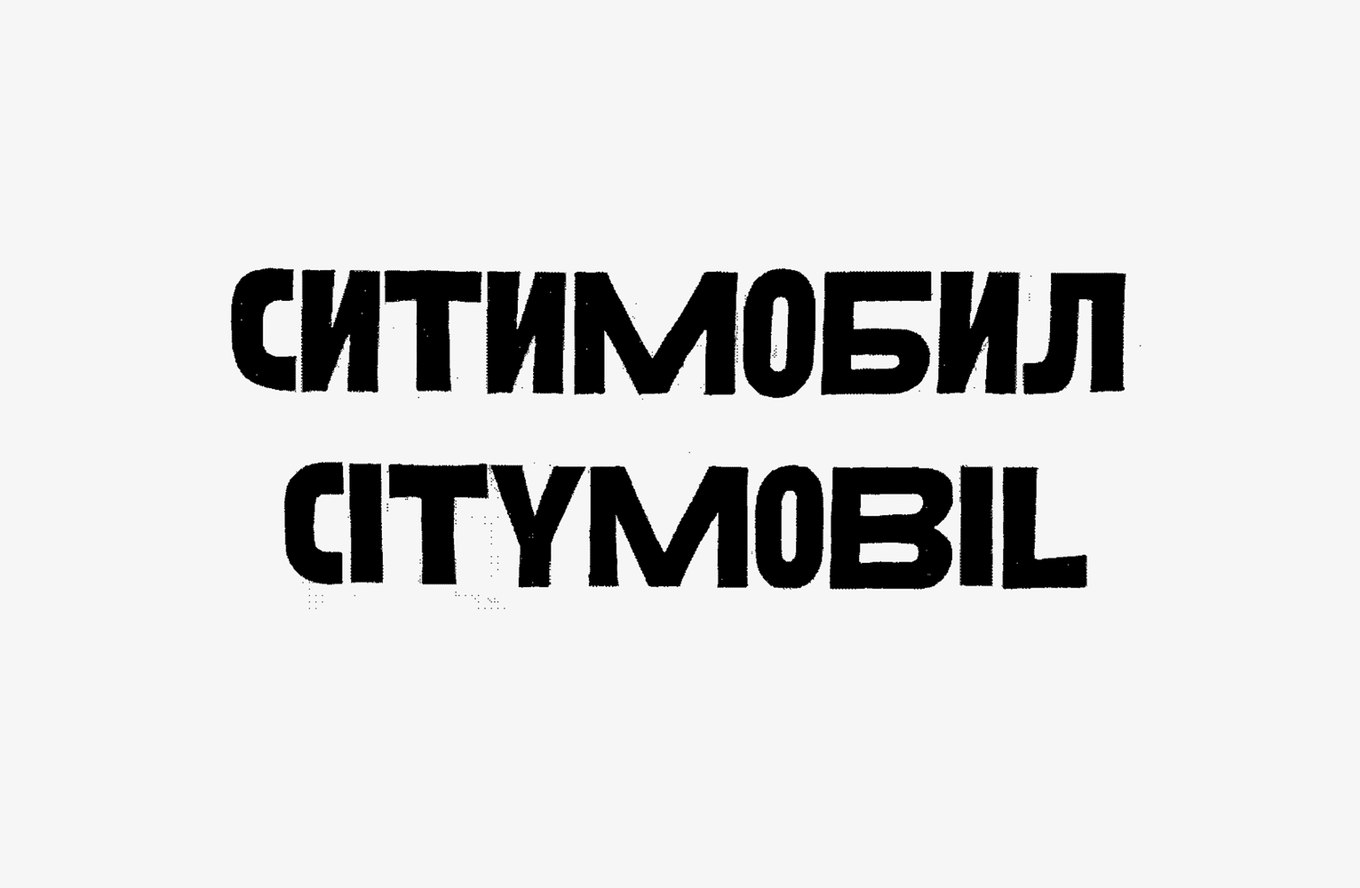
Second direction: urbanity and geometry. This approach was based on the ideas of urbanity, technicality and smoothness of movement. We were inspired by the shapes of city road junctions, their precisely calculated radii, smooth curves and intersections. All that remained was to convey all of this in the design of the typeface. We decided that it should be a pretty heavy sans serif.
Its most characteristic features are the uneven proportions, owed to the shape of the ovals and flattened ovals, which resemble not only the junctions, but also the shape of the stadium. We immediately decided to type logos in this direction only in capital letters in order to emphasize the lines, to make the rhythm visually cleaner.
Third direction: audacity and relevance. It was interesting for us to try and do something bold, but appropriate within the style of such a large company as Citymobil. Hence the unexpected “cutouts” in the letters, sharp corners, simplified and decorative forms. They were leaving the impression of dynamism and audacity.
WORK IN THE CHOSEN DIRECTION
The client liked the last two directions, but it was the second one, based on the ideas of urbanity, technicality and smoothness of movement, that fell exactly into the desired image and at the same time remained flexible enough to become a part of the new identity.
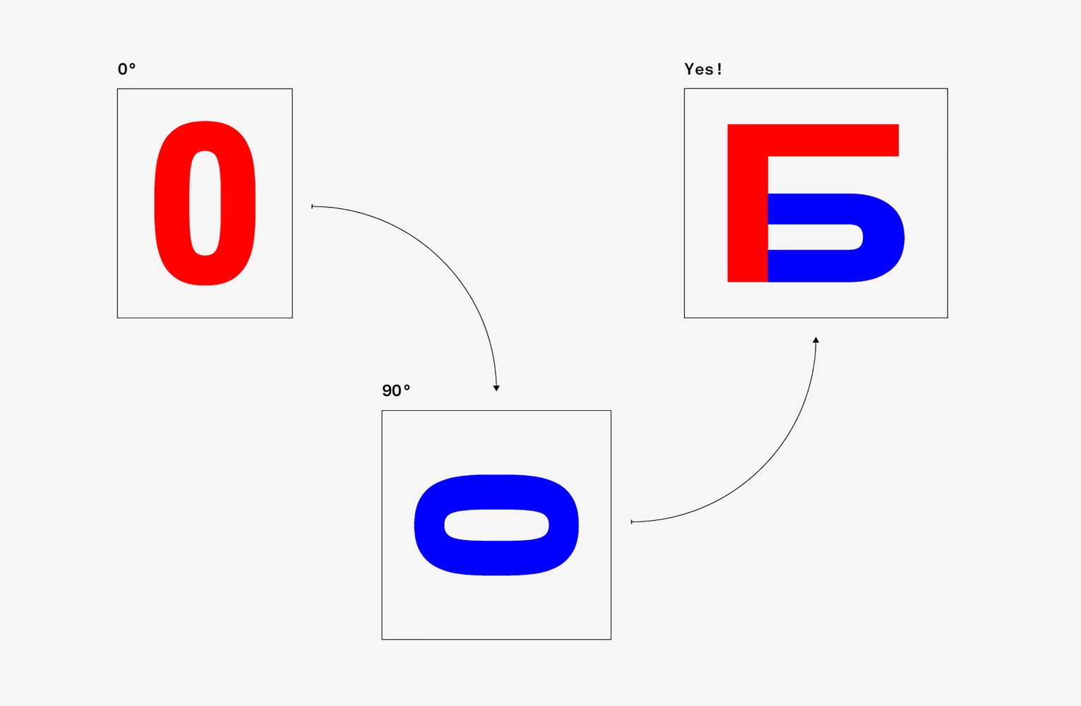
Shape of ovals
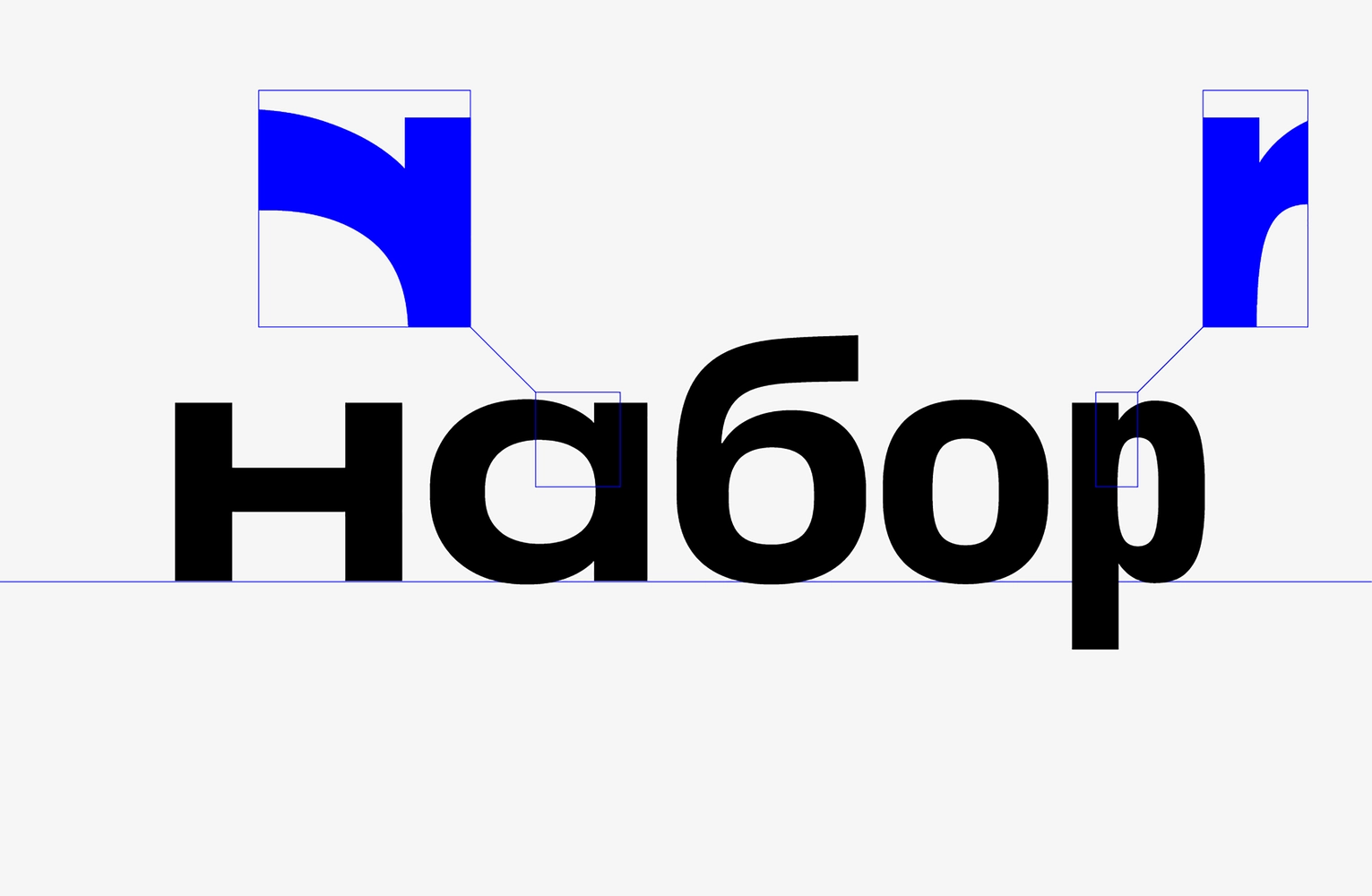
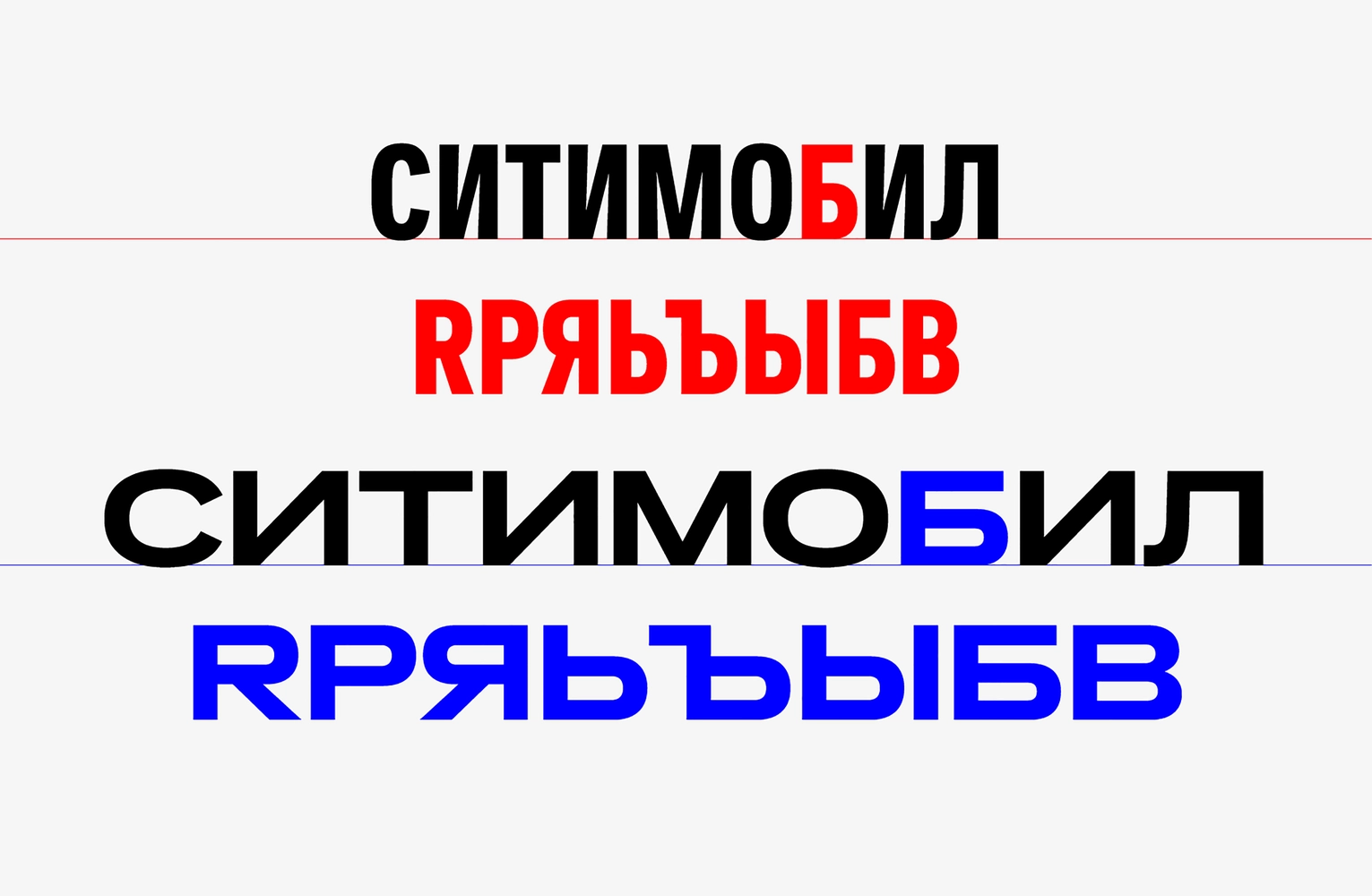
We played a lot with the countershapes of the ovals. First of all, we got a lively rhythm in the wordmarks thanks to the letters of different widths. Second of all, we matched a few more unexpected contours—the narrow O with the flat counterform of the Б which resulted in a remarkable shape of the Б. Moreover, we liked how the counterform between its bowl and the crossbar rhymed with counterforms in T in the word СИТИ.
Variability
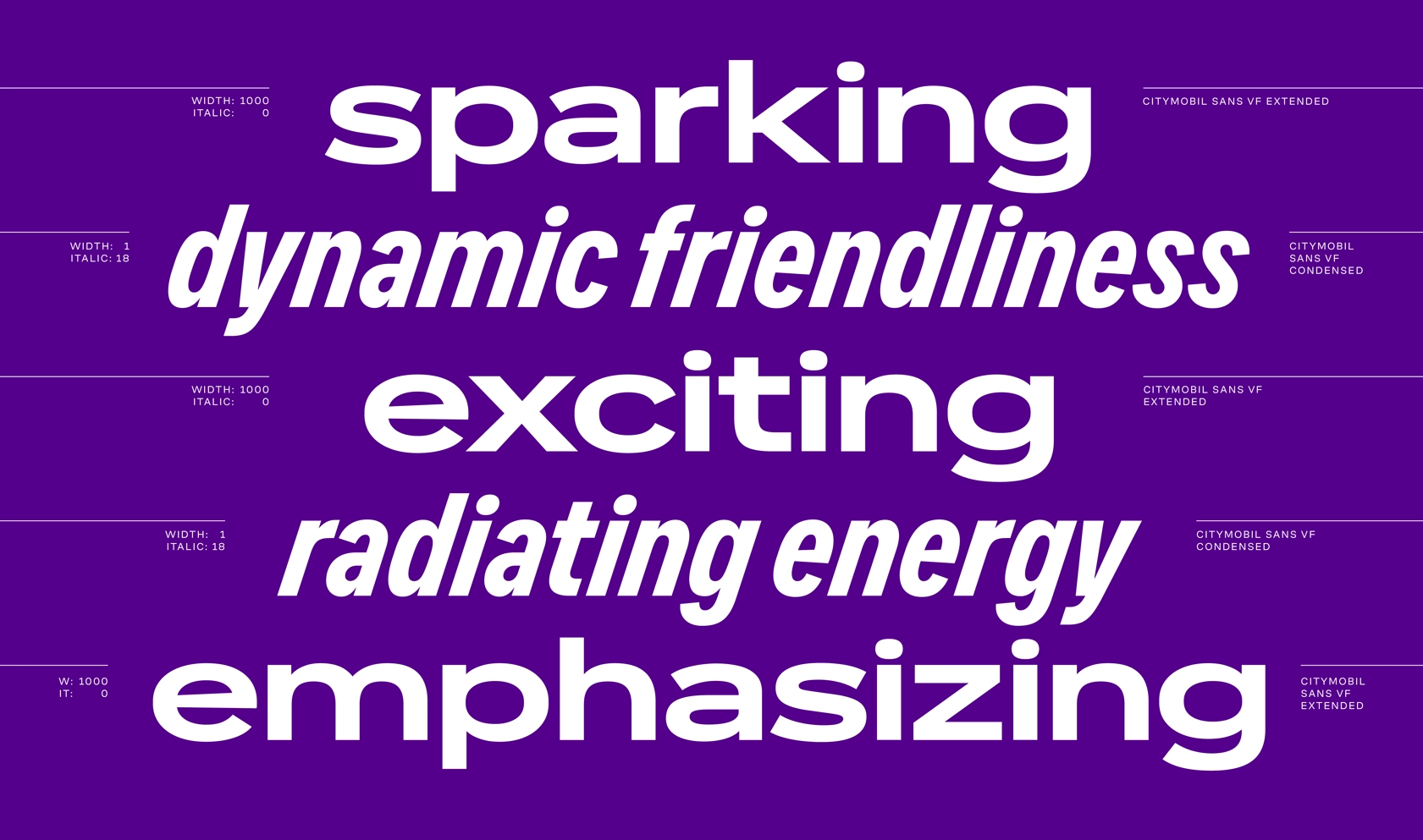
The different widths of characters in the chosen direction prompted us to produce the typeface as a variable font. The typeface was going to exist not only in physical media, but also on screens and would not always be accompanied by graphics and animation, so it was interesting to try to imitate movement, acceleration, braking and different speeds in the typeface itself. After all, Citymobil is all about mobility.
The flattened ovals from the early sketches became the basis for the proportions of the condensed master. As to the proportions of the wide we wanted to make it really wide, but at the same time we did not want to lose the readability. Plus, the interpolation also imposes its limitations—the greater the difference in proportions between the extremes is, the more difficult it is to get the desired result in the middle. As a result, we settled on the proportions of the wide letter B, which rhymed with the narrow O.
We decided to test how the system would work: building on the logo and using the letters from it, we created a set of condensed and wide characters. The alternation of only narrow and wide characters in the line was giving a feeling of jumps and abrupt movement in traffic. But when we tried to gradually change the widths of the letters, it created the illusion of a “smooth ride”. And when we added another axis of variation—the slant—the effect of movement with acceleration and braking became even more pronounced. For maximum expressiveness of tilted styles, we made the angle large enough—18 degrees.
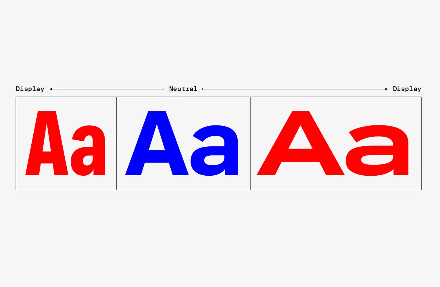
So variability has acquired an independent artistic meaning within the framework of our task. But for all that to really work, there were many more decisions to be made. For the sake of variability, we had to abandon the 3rd style from the original brief and design two slanted masters instead. The extremes on the width axis were supposed to become display styles, and those in the middle—more neutral.
Dynamic geometry
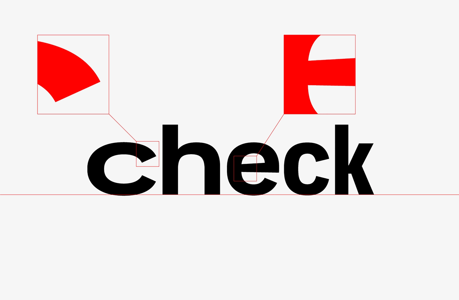
Another important characteristic of the typeface that put us through quite a lot of trouble were the apertures. It all started with pure geometry and the most open shape of С with vertical terminals. But this design was causing problems in the wider style due to the huge white inside and excessively brutal.
We tried to close the characters completely, but this again led to a too cold of an impression of the letters. Then we decided to find something in between—we opened the ovals and made the terminals oblique.
Thus, we have outlined a concept—combining geometry with dynamics. The technicality was conditioned by aspiration for geometry in the ovals, soft transition between arcs and stems (p b q, etc.) and the lowest possible contrast. And humanistic features and dynamics were conditioned by contrasting elements (for example, contraction in the middle of an e), asymmetric connection in к ж k and slightly opened aperture of ovals with diagonal cuts.
System of logos
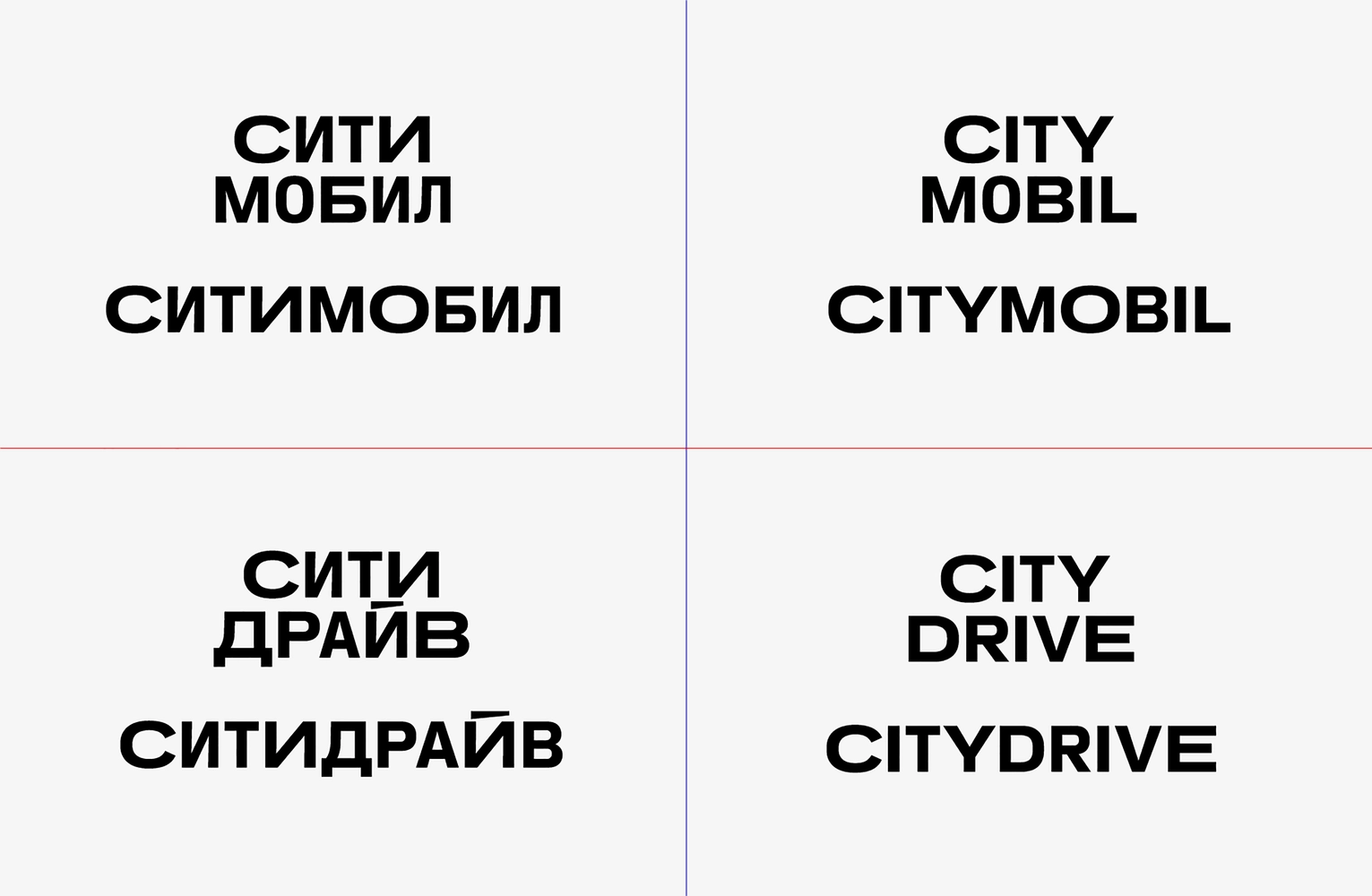
Having settled on the basic design features, we returned to the wordmarks. The name of each sub-brand of the Citymobil’s ecosystem is built from two parts, one of which remains unchanged at all times—the word “Сити”, and the second one changes: Citymobil, Citydrive, Cityscooter and so on. In addition, each logo must exist in two versions—in one and two lines. Taking into account our idea with the proportional spacing, we had to choose a certain constant, and our choice fell on the word “Сити”. Its form doesn’t change from title to title, neither in design nor in proportions. But the widths of the letters of the second part are adjusted individually for the composition in one and two lines.
Thanks to the variability, we tried different rhythms and fine-tuned the proportions of the letters—some were made wider, some narrower. We kept the original idea of alternating wide and narrow letters, but made this alternation much smoother, and in the end, managed to play out a small story about a comfortable ride with a start, stops at traffic lights and long drives along the avenues inside each logo. Thus, Citymobil Sans has become a metaphor for a smooth ride through a city.
SPECIFIC FEATURES OF CHARACTER SHAPES
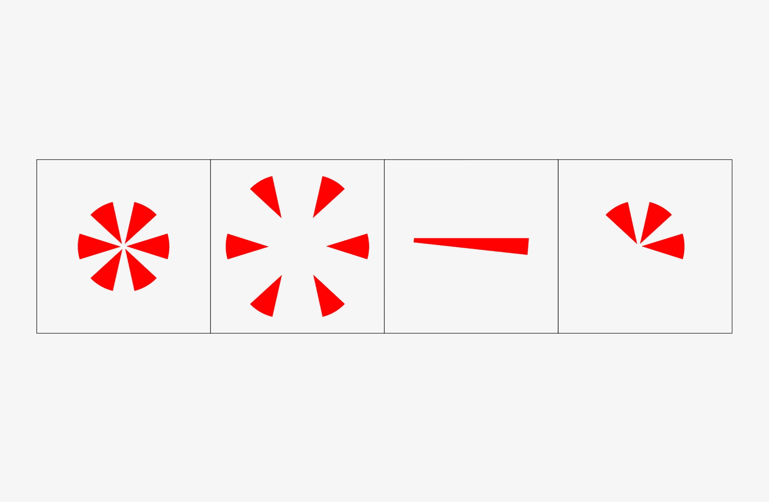
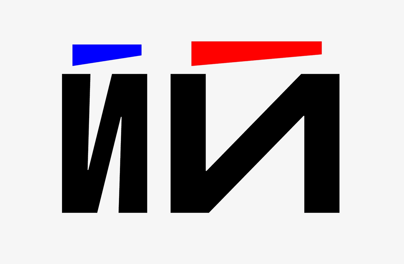
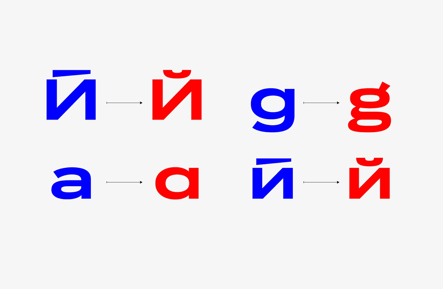
Spark in the Cyrillic Й
The main services of the ecosystem are Citymobil taxi and Citydrive carsharing. While drawing the logo of the second, we had to deal with the fact that the initially conceived tight interline spacing was simply impossible due to the breve in the Cyrillic Й. Then we remembered about the brand’s key visual—spark—and decided to use it instead of the usual breve. Not only did this help us to tighten up the interline spacing for all logos, but also emphasize the brand’s corporate graphics in the typeface.
Spark in other characters and the form of Kk
In addition to the noticeable breve above the Cyrillic Й in the logo, we have delicately included the shape of the Citymobil’s signature spark in other characters. For example, in horizontal stroke of the lowercase е and triangular counters in Ии Кк Жж.
The form of Кк needed our separate attention, we weren’t satisfied with any of the traditional shapes. Curved diagonals would have looked too complicated. The more geometric construction with a pointy junction of the diagonals also didn’t work, because of the wide range of widths. The crossbar construction solved the problems of the geometric construction, but looked too default, rigid, and simple.
In the end, we found a solution: we attached the arm to the stem at an acute angle, and compensated for the slope of the leg with a crossbar. The shape has become asymmetrical and distinctive.
DEVELOPMENT OF THE TYPE FAMILY
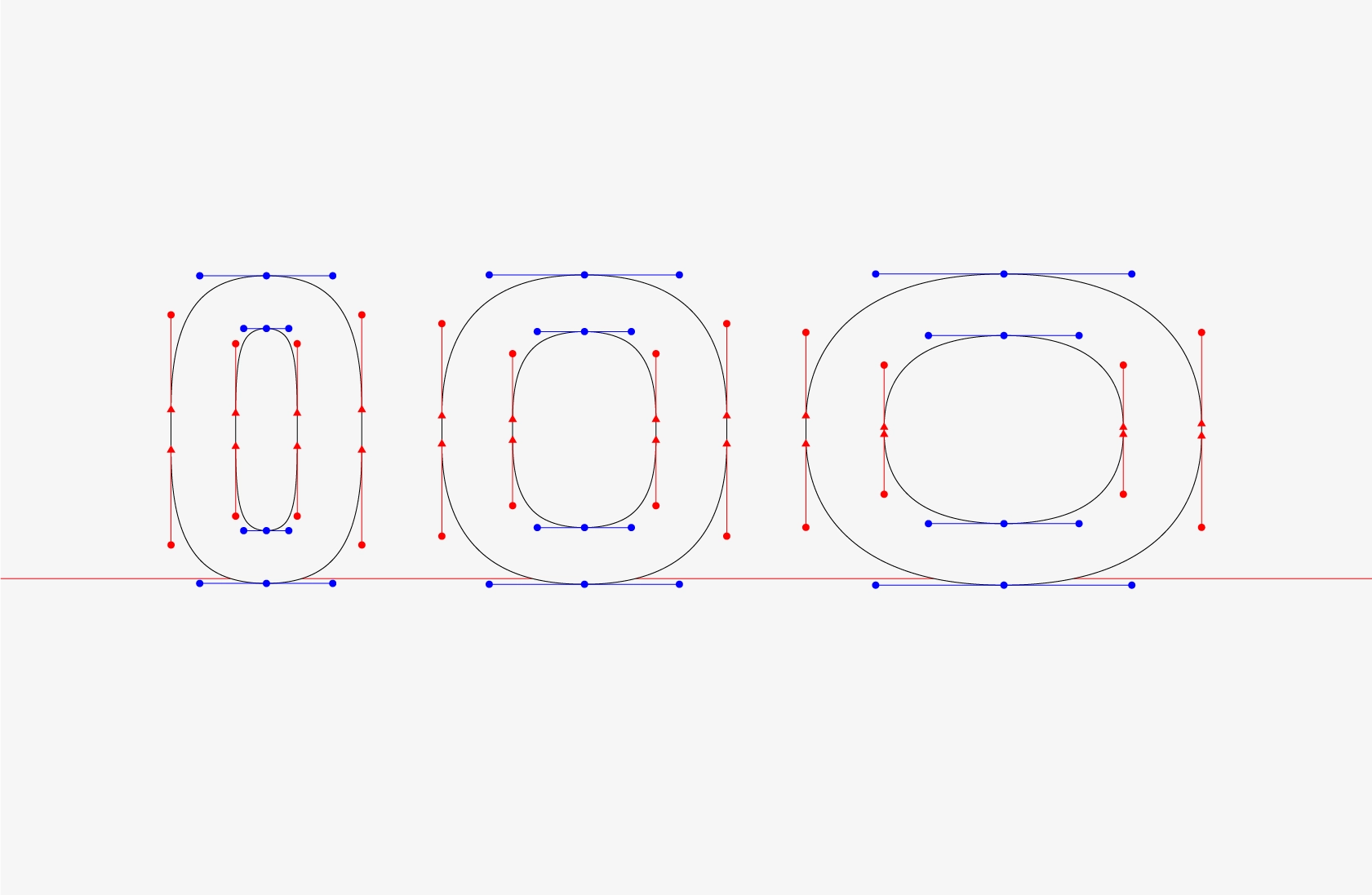
Transferring the logic and plastics of the logos to the typeface was a difficult task, because the intermediate styles had to preserve the character of the typeface, preset by the extremes. We had no problems with straight characters, but we had to work hard on the round ones, especially the ones with open oblique terminals.
The narrow style has the already familiar flattened ovals with straight vertical segments, and in the wide one the ovals were stretched horizontally. It was fundamentally important for us to preserve the conciseness of round characters in a narrow master, because it served as an excellent rhyme for wide letters with horizontal narrow bowls, for example, Б В Р R Я. First we drew both styles independently and looked, what happens when we interpolate them. All round characters in the intermediate styles looked very squarish. To solve this problem, we had to carefully adjust the extreme points and the handles—cut straight segments in the narrow style as much as possible and balance the length of the handles between the masters.
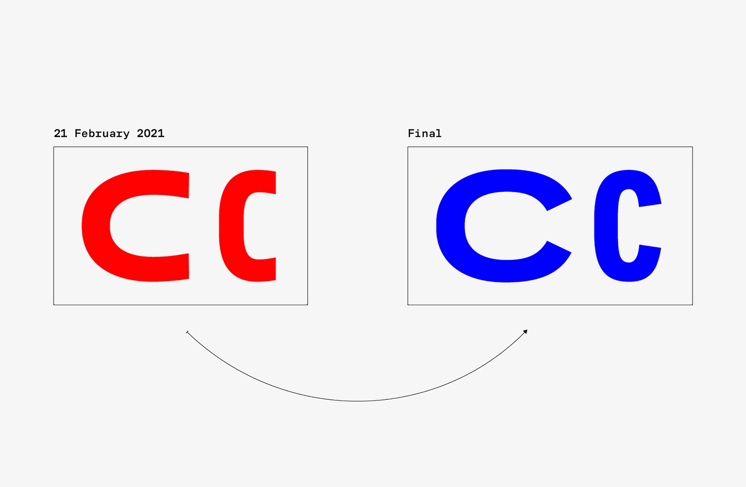
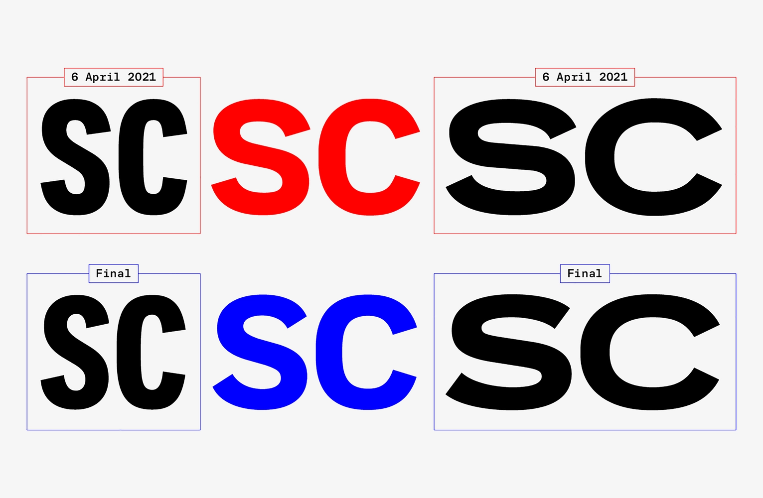
Characters with open contours Сс Ss Ээ Зз turned out to be even more complicated. Initially, we were going to choose a single angle for terminals in both masters, but this way wide characters looked very closed. Then we decided to open the letters in the wide master, and have them with more vertical tilts of the cuts. This led to a new difficulty—when interpolating, the terminals had to open from 12 to 54 degrees, that is, radically change their shape, and in the intermediate styles they became very narrow, with noticeable stresses on the arcs. We managed to solve this problem after several weeks of fine-tuning the lengths and angles of the handles and extending the strokes towards the ends. As a result, such a significant change did not affect the character of the type, but only added even more dynamics to it.
The shape of individual characters and stylistic alternatives
We wanted to emphasize humanistic features in the font, so we drew double-storey а and g. After discussing it with the client, we included the double-storey а in the main set of the alphabet. The single-storey shape had a nice simple appeal, but at the same time it was a little more rigid than necessary, and we left it as a stylistic alternative.
CITYMOBIL SANS—BRIGHT AND DYNAMIC TYPEFACE WITH CHARACTER
In the course of work, we adjusted the initial brief to the chosen idea. Since from a visual point of view Citymobil communicates with the user mainly through large headlines and short sentences, and long materials are very rare, we discarded the development of a text style, suggesting to choose one of the existing retail text fonts instead, and combining the Display and Title styles into a single communication typeface with a bright character and with a wide range of possibilities.
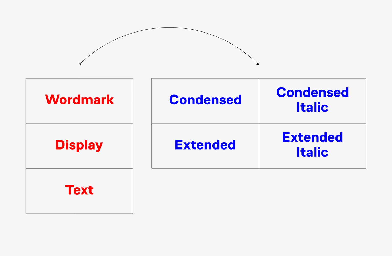
Citymobil Sans has two variable axes—width and slant. For the convenience of working with the typeface, we added key points on the axes and got five steps in width: Condensed, Narrow, Normal, Wide, Extended. The extreme styles on this axis are intended to be used as a Display style, that is, in large and small sizes, while those close to Normal can be used as a Title style—in longer titles and short sentences.
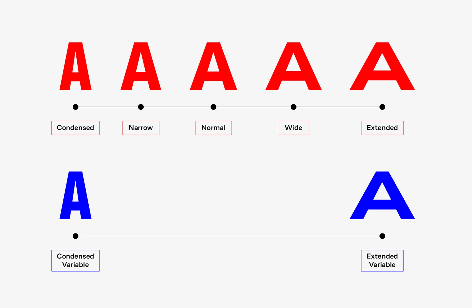
Thanks to the variable font technology, the typography of the brand can be very diverse. Available in styles ranging from super narrow to wide, it helps to create a dynamic typography. Due to the expansion of letters, you can arrange accents properly in words—emphasize vowels or enhance the feeling of a word. And the combination of the slant with the expansion of the letters allows to typographically create a sense of movement.
SUCCESSFUL IMAGE AS THE RESULT OF JOINT WORK WITH THE CLIENT
Searching for the right image is always an important part of all our projects, whatever the premises. In this case, Citymobil came to us with a ready-made identity, and it had its perks: we knew right from the start in what context the typeface would live, and didn’t have to imagine it ourselves from scratch. The development brief was very detailed, and yet we managed to make a remarkable project, which became technically innovative for us on top of everything else—we created a variable font for a client for the first time. Moreover, the variability in this case became a really suitable solution for the dynamic brand that Citymobil is, and not just a beautiful feature.
Thanks to the client’s openness to our wildest ideas, Citymobil Sans has turned out to be dynamic and distinctive. It’s not designed for long texts, because its too heavy and the spacing is too tight. But dynamics and large scales are definitely its specialty.
Creative director: Maria Doreuli
Designers: Egor Golovyrin, Nikita Sapozhkov
Mastering and hinting: Noe Blanco
Special adviser: Liza Rasskazova
Motion: Nikita Sapozhkov, Dima Kozlyaev
Editor: Susanna Agabayan
Citymobil
Marketing Director: Elena Dobrokhotova
Head of Brand & Creative: Nikita Shipov
Head of Product Design: Alexander Vsekhvalnov
Head of Mobile Platforms Design: Artur Kasimov
Art Director: Tatiana Khrustaleva
Saffron Consultants
CCO: Gabor Schreier
Creative director: Drew Vann Coughlan
Designer: Alex Poryadina
Programme Director: Anna Tyurina