On their own side: strangely humane typefaces for beeline
Beeline’s first large-scale rebranding happened in 2005. It was at that time that the London agency Wolff Olins came up with the well-known yellow and black striped identity using Officina Serif, and British designer Miles Newlyn drew the wordmark.
By 2021, the company has come to form a new request for major visual changes. A very unusual, and a rather contradictory one—they wanted to become both “vital” and “digital”. Humanity and liveliness were supposed to go hand in hand with the aspiration for mechanicalness and precision. These last ones, loved and praised lately by such IT giants as Apple and Google have shaped the trend of inexpressive typography—blanding (the term derives from words bland and branding). The phenomenon has not spared even the fashion industry that is traditionally very prone to brightness: famous brands have moved on from personality to neutrality, updating their logos to a simplified design based on neutral sans serifs.
Thanks to the unusual request, the process of work turned out to be truly exciting and reckless. We had to draw a bespoke typeface in four weights and another more unusual one for use in special advertising campaigns.
EVOLUTION OR REVOLUTION
We didn’t want to rush into things and change everything drastically straight away. The initial idea was to create a typeface that would organically evolve from the existing one and be based on the Officina Serif that made the previous corporate identity so recognizable. So first, we thought about making a serif or a slab serif. But after discussing that with the client, we realized that we won’t be able to skip “the sans serif period”. Because it’s the only way to emphasize the radical change in positioning, and the transformation of the company into a technological one. So we started searching for the right character of the sans serif.
DIGITALITY & VITALITY
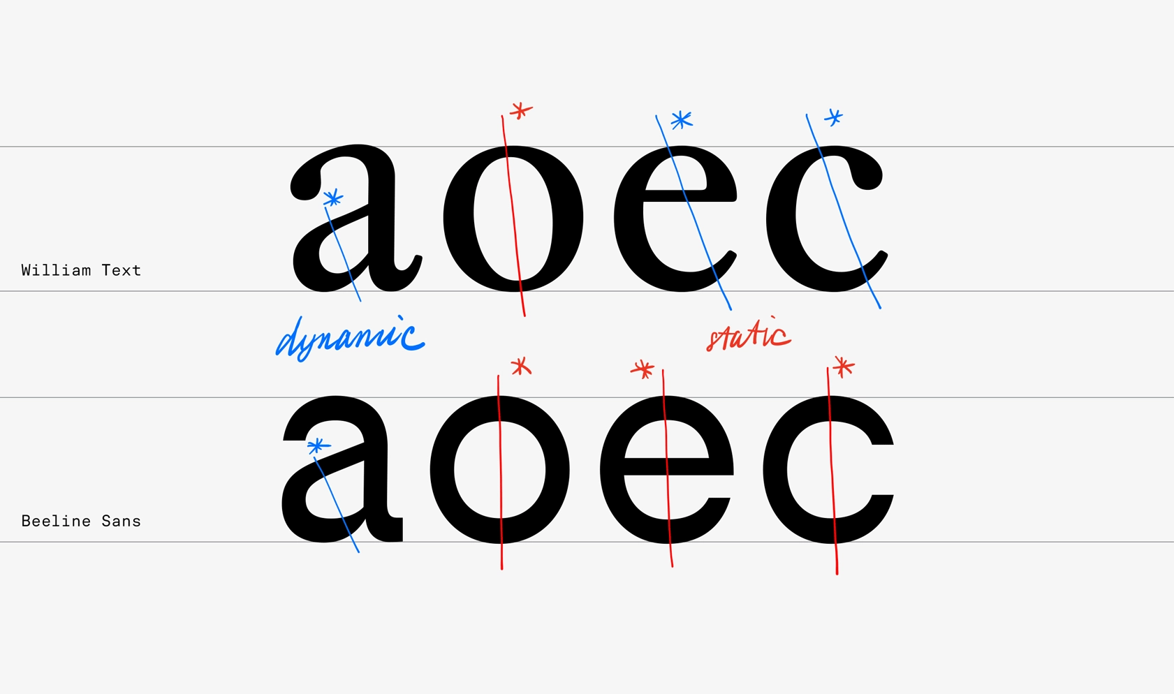
From the very first sketches, we were thinking about how to convey the key parameters from the original request—“digitality” and “vitality”. And we came to combine statics and dynamics in the typeface, a reference to neutral sans serif dominating the digital world and the elements inherent in humanistic, dynamic fonts. That’s how we developed two directions.
WORK IN THE CHOSEN DIRECTION
Undeterred by the extravagance of the concept with the reversed contrast, the client decided to go with the first direction with reversed contrast.
We tried out two hypotheses: to make a systemic slightly reversed contrast in all of the characters, or to thicken the horizontals, while keeping the diagonals within the parameters of the usual contrast. And we came to the conclusion that the second option works better.
PROPORTIONS AND DIFFERENT WIDTHS
Beeline Sans’s characters vary in width: round letters aspire to the shape of a circle, while rectangular letters have narrower proportions. In fact, this serif nature integrated into the sans serif is one of the characteristic features of Beeline Sans, which results in the extra “liveliness”.
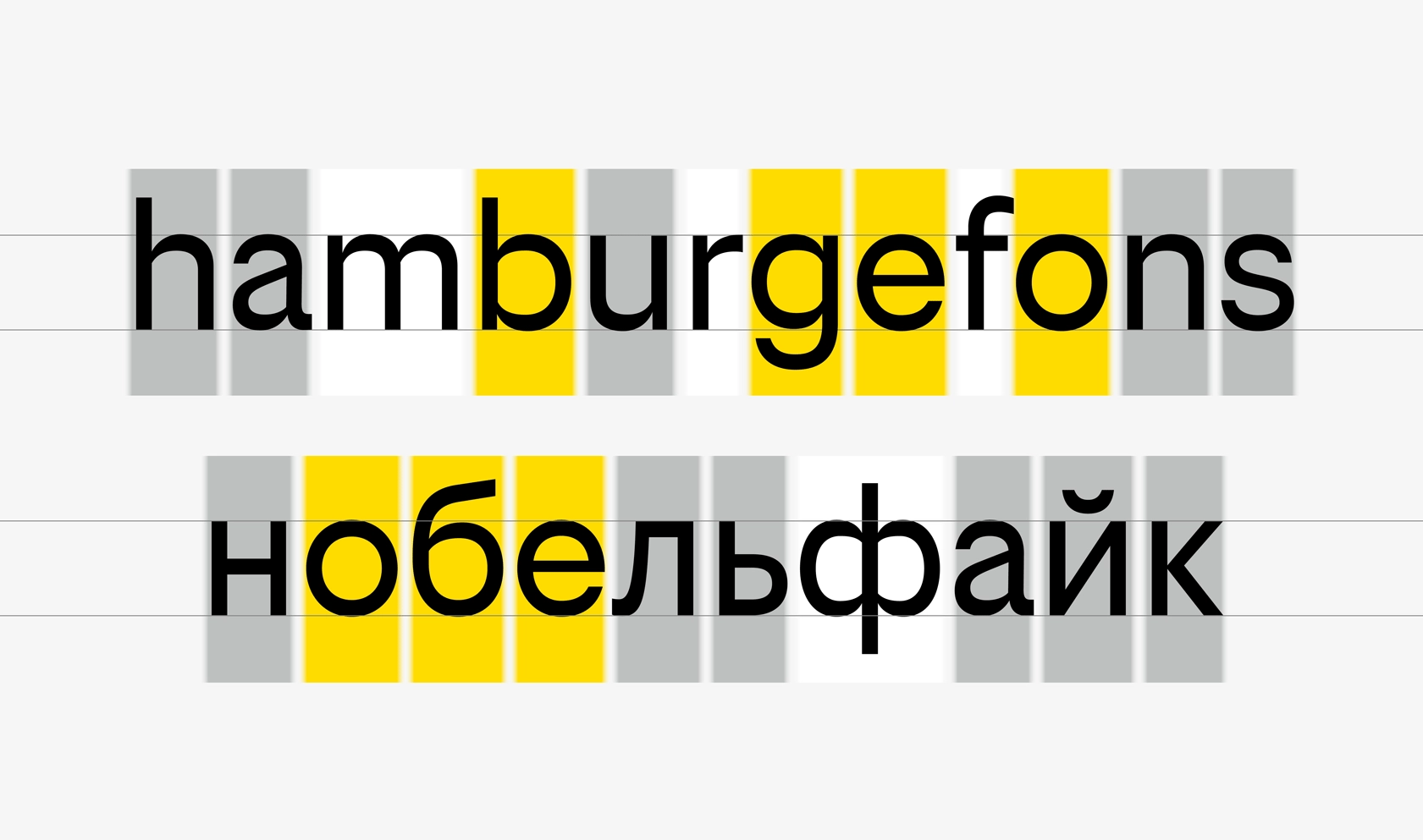
SYSTEMIC NON-SYSTEMIC CONTRAST
Beeline Sans is built on the combination of static and dynamic features. In the process of work, we created our own system, our very own list of rules and exceptions.
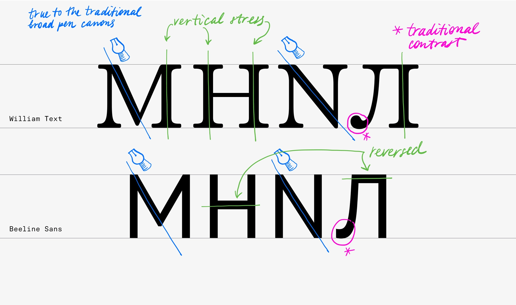
And the idea of doing that isn’t inherently new per se. For instance, we’re very much used to transitional serif typefaces, where, for example, o is nearly symmetrical, while the letters e c have a confident angle of the stress (typical of humanistic fonts).
We don’t even realize that in most fonts the letter z is also a kind of exception to the rule. If you follow the logic of the movement of the pen, you can’t get a thick stem in the middle of Zz. And in Roman Capitals, which is the basis of all modern uppercase letters, the brush rotates when writing, and it is due to this that we get thin left vertical stems in M N. Thus, even in our traditional design of serif typefaces, a little non-systemicity is for the benefit of the general rhythm and is the norm.
BOLD STYLES
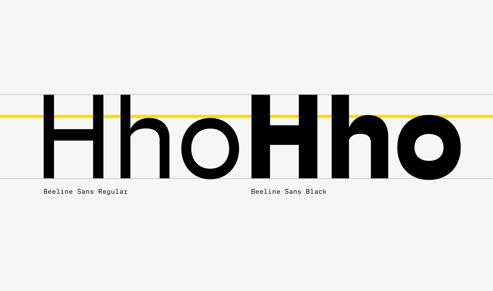
The new identity was supposed to be light and bright, and the Regular was supposed to be the main style used in the typography. But our task was to develop the typeface in the range of weights from Regular to Black, and it is in bold styles that, as a rule, the character of the typeface is manifested the most. So we designed Regular and Black together, and not separately.
LOWERCASE HEIGHT
There are some subtleties in typefaces that almost always go unnoticed. So, for example, in various typefaces the x-height of the lowercase characters in Bold is often made slightly higher than in Regular. The reason for that is the optical effect—there’s less white space inside the Bold weight, therefore, in most cases, in small size Bold starts to look too small. In typefaces with an emphasis on horizontal lines, this effect gets enhanced even more—there’s even less white, and it’s even more “flattened”. That’s why the bold weight of Beeline Sans turned out to be noticeably larger than the Regular.
CONTRAST IN THE MIDDLE STROKES.
“RINGING” OR “FRICKERING” ELEMENTS
Working in a wide range of weights, we needed to make strong optical adjustments in bold in characters with three horizontals, which are especially abundant in Cyrillic. Usually we try to make these compensations invisible, but this time, we went the other way around and emphasized it—we made the middle stroke deliberately thin. This in turn maintained subtle articulations at the junctions of arches and stems.
BRAND NAME SET IN BEELINE SANS
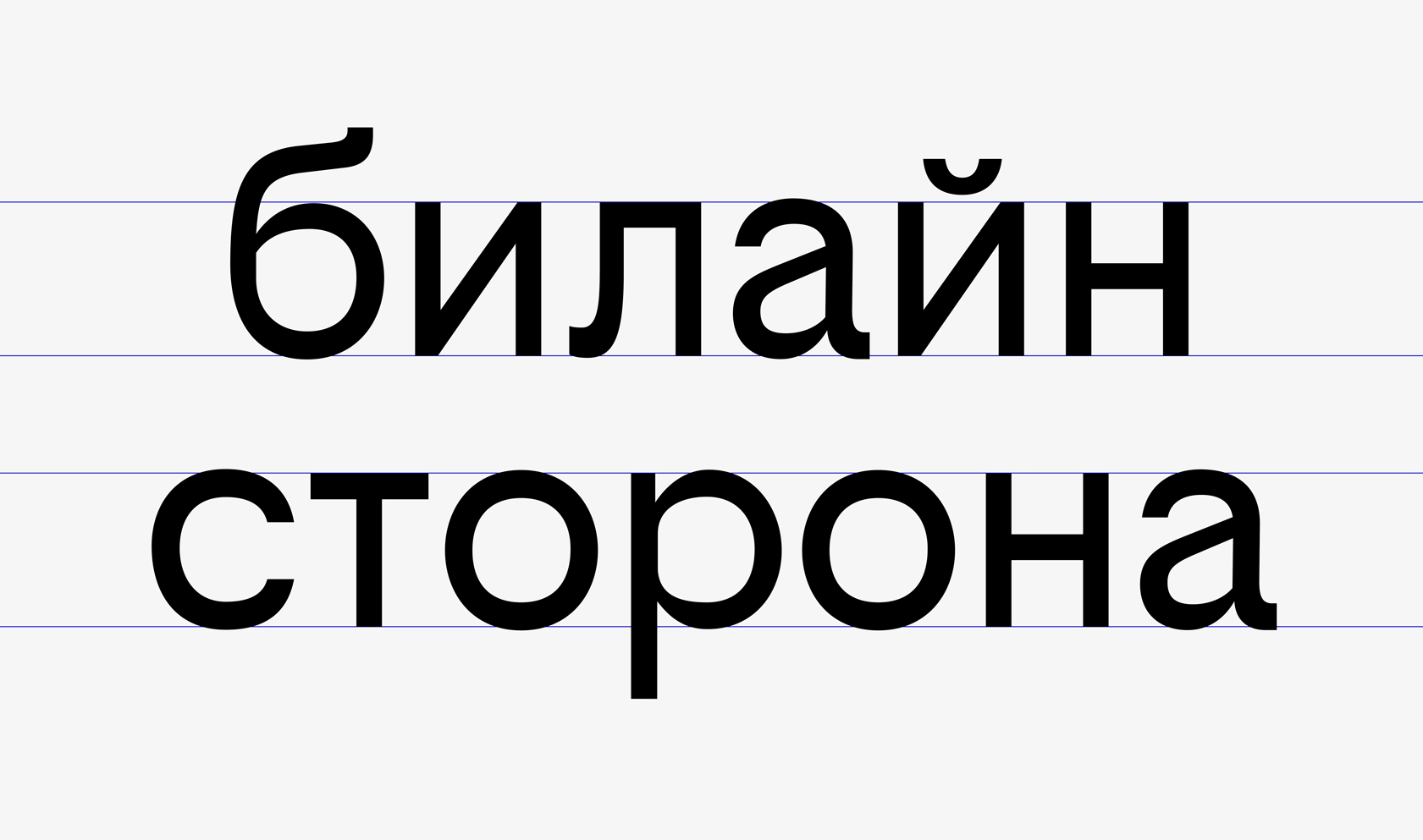
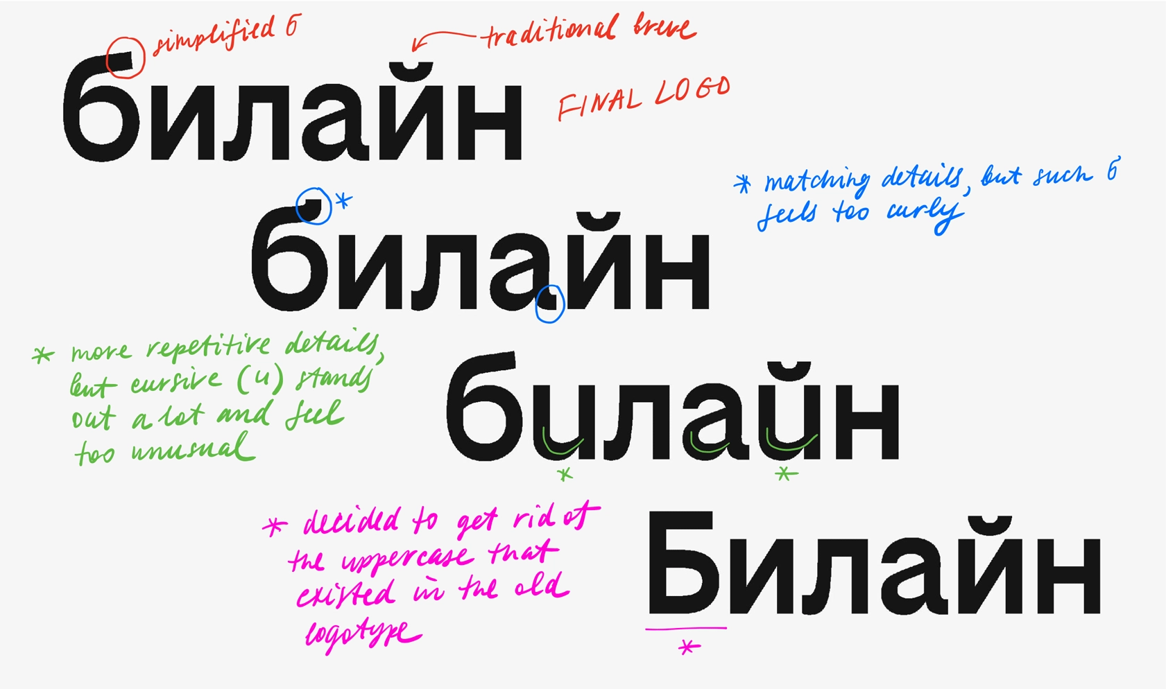
Our original brief specified that the typeface and the logo needed to have the same core so that the brand name set in the typeface would look organic. From the very first presentations, we would type the name of the company in Beeline Sans and try different constructions of б to find the right image. And although the more elaborate б was close to our heart, it looked too “decorative” against the rest of the letters. Therefore, we decided to go with a more simple construction.
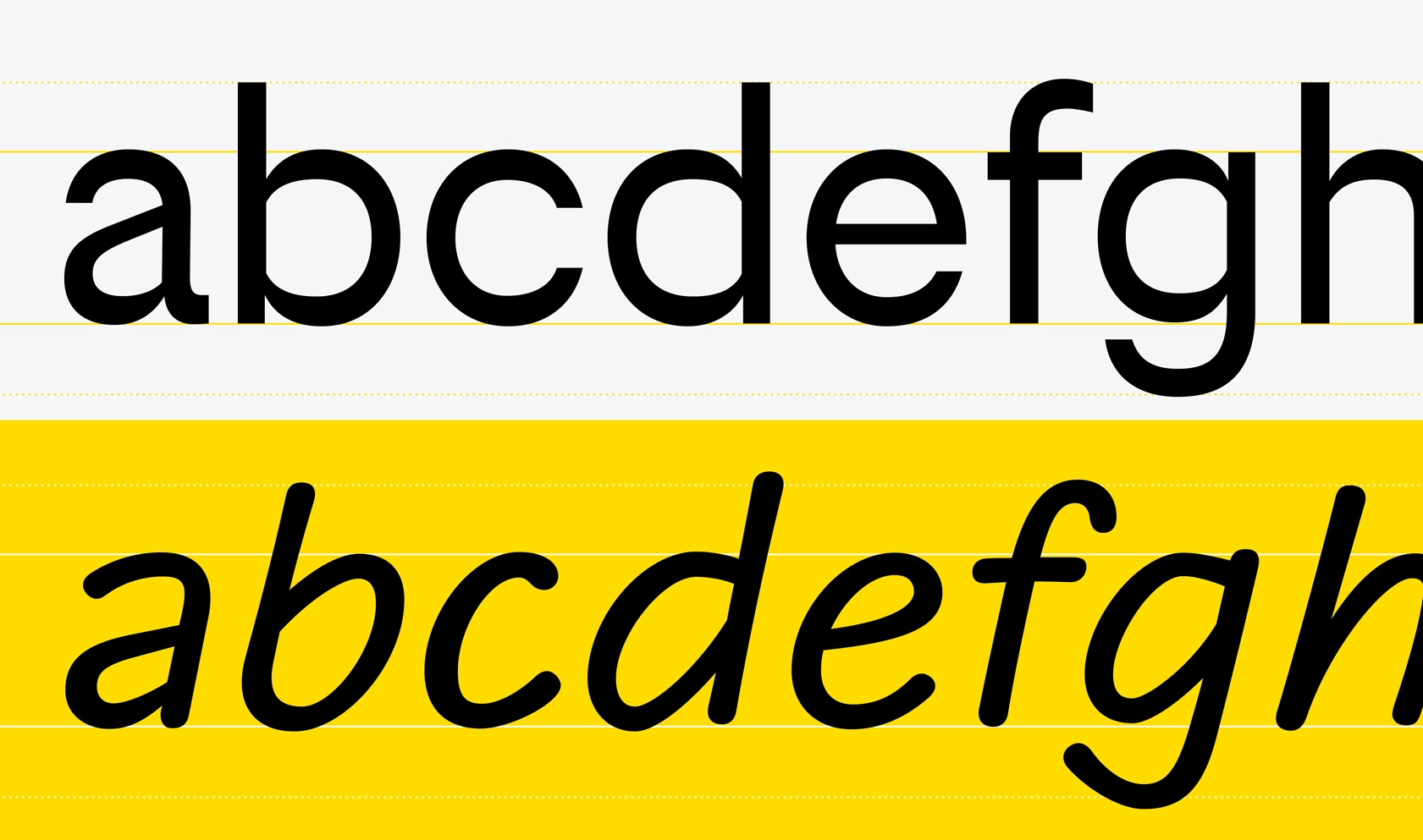
BEELINE HAND—SPECIAL STYLE
We also had several approaches to the fifth style. The first, the most neutral, was to create a serif style pair.
The second, inspired by the company’s new slogan “on your side”, was to create a variable typeface with a sans-serif skeleton, which would be superimposed with different serif variants. This serif game could work dynamically in videos and animations in digital and web: users could even be able to customize the typeface for themselves. But due to the fact that the typeface didn’t work so brightly on static media, we didn’t go with this idea in the end.
In the third approach we decided to create an unusual typeface pair from sans serif and handwriting style. The idea was born out of the observation that many big brands have come to use handwritten typefaces or lettering in an effort to move away from cleanness and “machinery” and become softer, more humane. It was this concept that turned out to be the closest to beeline.
DECORATIVENESS OR UTILITY
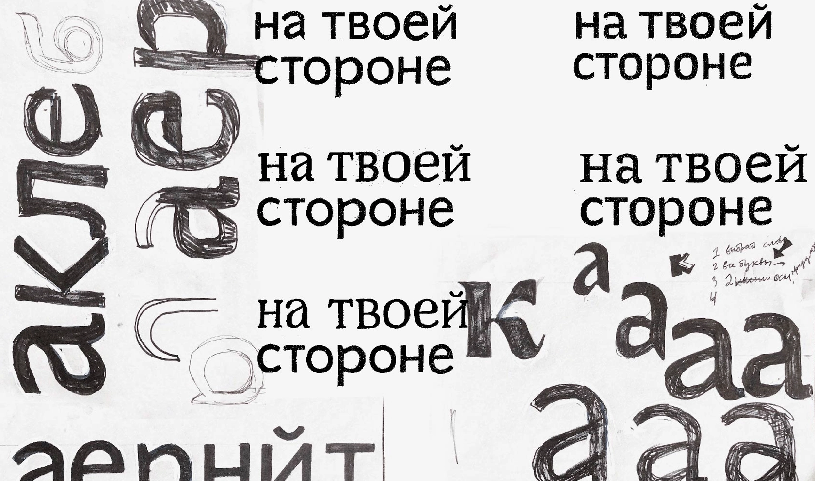
The development of the handwritten concept was not that easy. We needed to find a balance and make sure that this style wouldn’t turn out to be too childish and decorative. To do this, we went towards a more formal writing, in which the letters are written individually, instead of a “connected script”, in which on the contrary, the words are written in a single movement of the hand.
We started by drawing all the letters with a single stroke. This allowed us not to waste time on details, but to focus on finding the right rhythm. In the next step, we chose the optimal thickness of stroke.
Having added thickness, we got a very mechanical result. So we added a little bit of unevenness to the lines, creating a sense of lively writing. The endings of the strokes seem to spread out a little, in the same way when you’re writing something on paper and then slow down. We also made the joints of the strokes thinner to avoid these places getting too dark and introduced some more contrast/optics to the monolinear strokes, thus making already thin by tradition elements even more thin.
The next difficulty consisted in the fact that we needed to create the effect of a lively handwriting without overcomplicating the workflow. Normally in order to achieve such an effect, you need to make a number of alternatives for each letter. This way, the characters in the word don’t get repeated, and it makes it seem as if the sign was produced not by a machine, but by hand. But such an approach would increase the time frame of the implementation, so we had to go the other way about it.
In Beeline Hand, the letters have a slightly different tilt, and don’t stand exactly on the baseline, but rather are jumping on it a little bit. We also avoided having anything too parallel, especially in characters with multiple vertical strokes.
We did not build all the accented letters as components, but tried to make them a little different whenever it was possible. This was especially important in Cyrillic ё and й because ий and её is a very common combination in Cyrillic.
Another specific feature of Beeline Hand is that the ovals in the characters are slightly asymmetrical and may have small angularity inside.
A TRULY UNIQUE BRAND VOICE AND A PROFESSIONAL VICTORY
At the very beginning of the work on the project, we had a very open brief, and we did not have specific references. On one hand, it scared us, but on the other, it was a great success. This left us with the opportunity to offer our own concept, an idea that could not lie on the surface.
In the process of combining geometry and dynamics in the typeface, we gradually came to a slight reverse contrast—this became the basis of the character of the Beeline Sans typeface. We are very pleased that from the very beginning to the end we had a complete understanding with the client and we managed to create not just another sans serif, which is formally drawn from scratch and therefore gets called exclusive, but a truly unique voice of the brand.
As pioneers (ha-ha) in the reversed contrast trend our professional victory is that Beeline possibly became the first major corporation in the world to get a typeface with reverse contrast. Not such a big deal you might say, but to us it is a matter of contributing to making the corporate typeface design world a more versatile field. Therefore we think that it is a big deal.
Creative director: Maria Doreuli
Designer: Liza Rasskazova
Team: Anna Khorash, Egor Golovyrin
Engineering and hinting: Noe Blanco
Motion: Dima Kozlyaev
Copywriter and editor: Susanna Agabayan
Branding
Contrapunto
Beeline
Brand and Marketing Communications Director: Julia Galina
Head of Development Department for Brand Management and Advertising Campaigns: Sergey Sverzhinsky


