Carved in stone: offbeat volume wordmark for Apt Buildings
Development is a very specific area, especially when it comes to the luxury segment. Clients from this industry usually have a very clear and trend-driven idea of what kind of logo they would like to get as a result, they come armed with references of expensive brands like Burberry, Chanel and others.
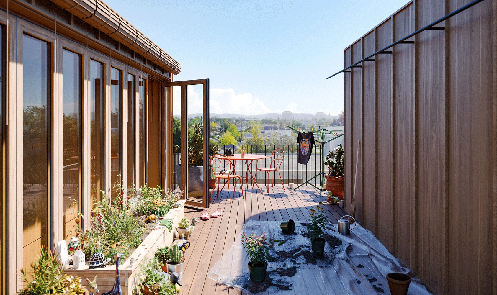
But not in this case. Petr and Fed Novikov, ex-Strelka and Airbnb, the founders of Apt Buildings, have a completely unconventional approach to life and to their business. They have fresh ideas and their own view of real estate. They pay a lot of attention to how people feel there where they live, imagining that they should be able to live in their houses infinitely. It’s important for them to create a home that wouldn’t be just a “box” that isolates one from the outside world. On the contrary, it’s a place that is organically integrated into the landscape, where there’s a lot of light, green, many open spaces, materials that age beautifully, unusual approaches to volume. In such housing, you inevitably feel united with the space around you, the outside world and yourself.
“Apt is not blank or neutral, but gently integrated. (...) It avoids aesthetics of now—minimalist, Instagram-friendly, millennial pink—as does it resist nostalgia or specific visions of the future. Instead, it considers the context of the city and how it might become both a product and a mystery of that environment. (…) Apt provides a quality canvas that invites its residents to define home on their own terms.”—the founders are writing in their brand principles.
Even for luxury, they came up with their own name—“subconscious luxury”—and definition, giving this word a new, more ringing meaning. “It is felt in the unexpected weight of a door, or the unusual texture of a handrail. It’s experienced in the firmness of the flooring or stability of the stairwells. Most of all, it’s the immaterial things. The quality of silence. The peace of mind. The way the light crawls across the wall between 4 and 6 PM every day, or fills an entire room every morning. The simultaneous sense of freedom and security. It is luxury that lasts. Not in the sense that it withstands time, but in that it haunts our dreams”. Isn’t this a hymn to conscious living and the philosophy of slow life?
This is where their interesting request to us came from. Apt didn’t want a clean, sleek, boring design, they were eager to have some kind of “their own”, truly unique face. We fell in love with this project from the very first meeting. And we were especially grateful that Apt entrusted us with the task of finding an idea virtually from scratch. We weren’t limited by any references or a clear understanding of the graphics of what they wanted. On the other hand, their brand principles immediately sparked font associations that we were interested in developing further.
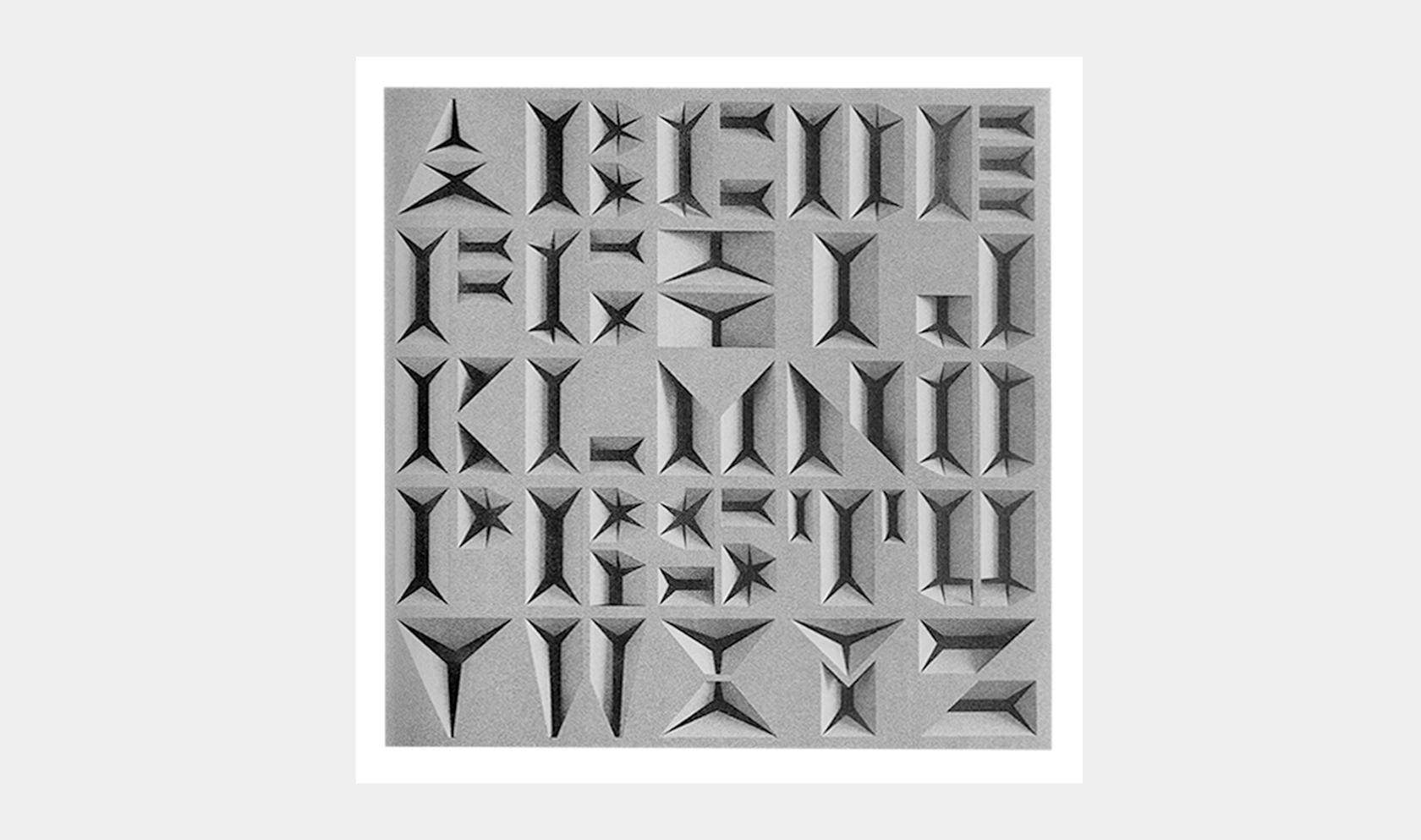
A DIGITAL LOGO INSPIRED BY NON-DIGITAL AESTHETIC
We had to consider twisting the ideas of volume and three-dimensionality, working with material, noble aging, which are so important for the guys. And it was a very unusual task, because in most cases everyone’s inclined towards something flat. As a result, we were inspired by stone carving, volumetric letters, and thought about light and shade effects, how all this can be combined in a logo and which of these ideas would work best, taking into account the combination of characters.
Since we were working with the client for the first time, it was important for us to test the waters first. So at the very beginning we developed several approaches—we went for very experimental things, like, for example, illegible signature, antique stamps, stones and three-dimensional letters, as if cast in metal, as well as for more calm and traditional forms.
FIRST ROUND, THREE DIRECTIONS
When we got this project the first thing that we immediately thought of was Calypso, the typeface designed by Roger Excoffon. It’s probably one of the most interesting examples of three-dimensional looking letters produced as metal type. We also thought of stone carving as something that definitely integrates architecture and type design. So we also decided to look at how the actual volume can be seen in the letterforms and try exploring engraved style.
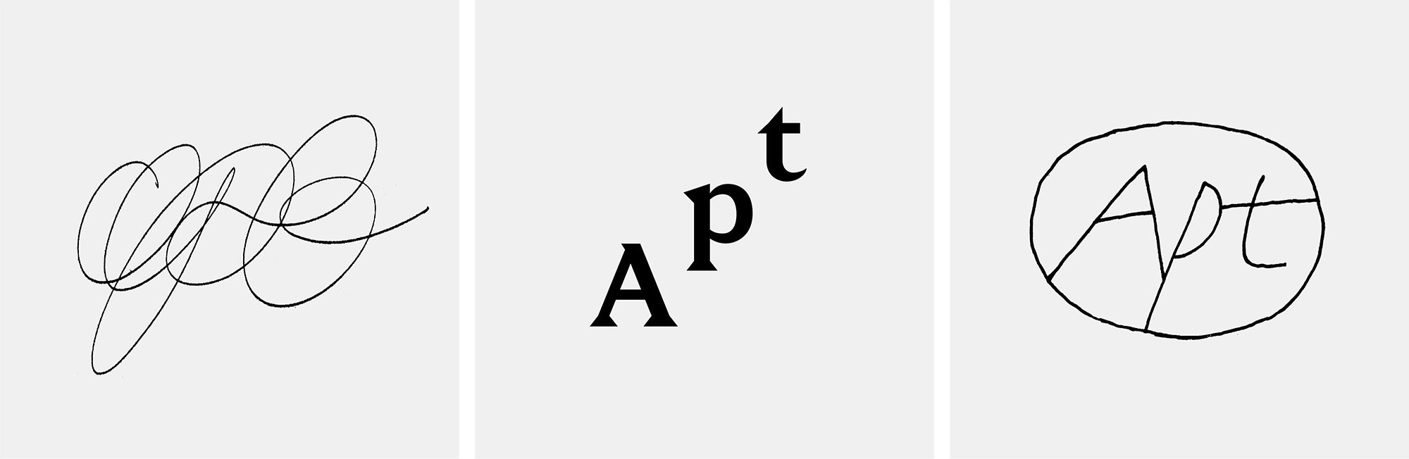
First direction. In the beginning we explored a few ideas around drawing with a single monolinear stroke. Due to the simplicity of the stroke all the three ideas below could also have a second level of exploration in terms of volume—shading, textures, and embossing in the actual material later on.
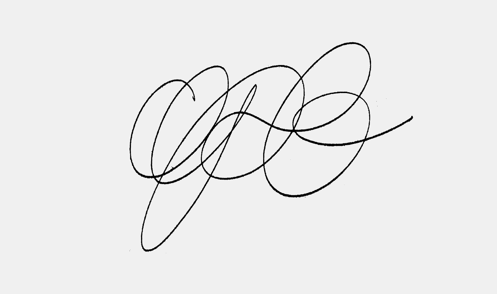
① Signature. This turned out to be quite an experimental approach. We liked it as a drawing, as a shape, but obviously its problem was that it was largely illegible. By showing it to the client we wanted to see their reaction, how far we could push them to go.
② Ellipse. We liked this sketch right away. The overall shape looks simple, yet remarkable. It is legible and easy to reproduce. The drawing leaves room for further experiments with the material.
③ Stone. Still monolinear, but the forms of the letters get more wild. Too wild and playful? Maybe, but we wanted to see what kind of impression it would make on our client.
Second direction. Contrasted to the stroke approach we decided to try a sans serif logo—also monolinear, but in a different way. Here the idea was that the simplified drawing may allow us to experiment more with different kinds of shading. One of the sides of the logo can go deeper in the material reflecting one of the architectural references the client showed us.
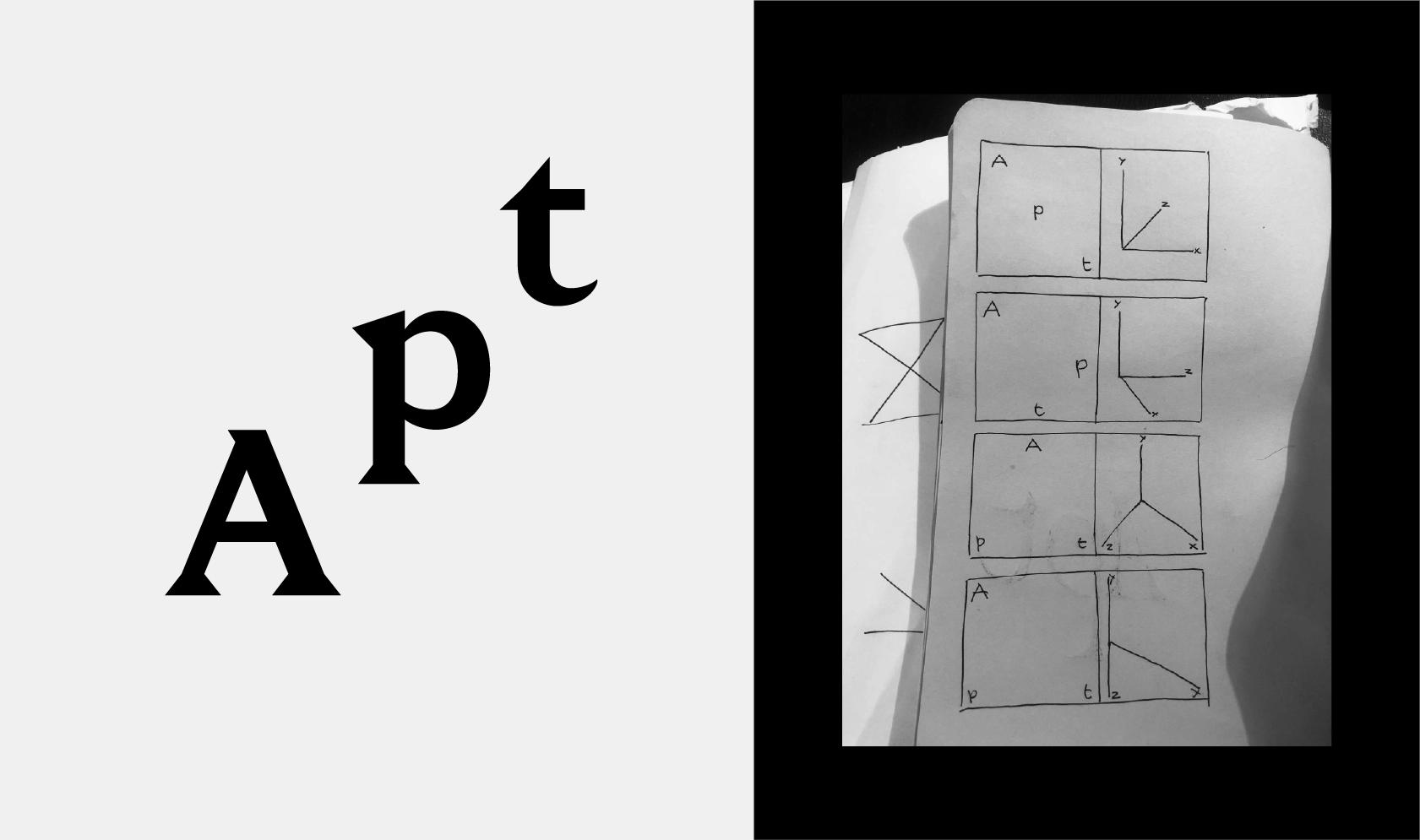
Third direction. Our last approach was rather on the whole identity than on the logo itself. We called it dimensions. We thought that the whole identity of the brand can be based on the idea of space and x and y coordinates. Therefore we decided to choose a typeface for this direction, but tried creating a feeling of space (3D) by playing with it in typography.
ROUND TWO, THREE FINAL IDEAS
After the first round the client chose signature, dimensions and ellipse for further exploration.
With the signature the question was—can we make it readable or not? Unfortunately, trying to make it more readable messed up with the overall shape that we really liked. So we decided not to pursue this idea further.
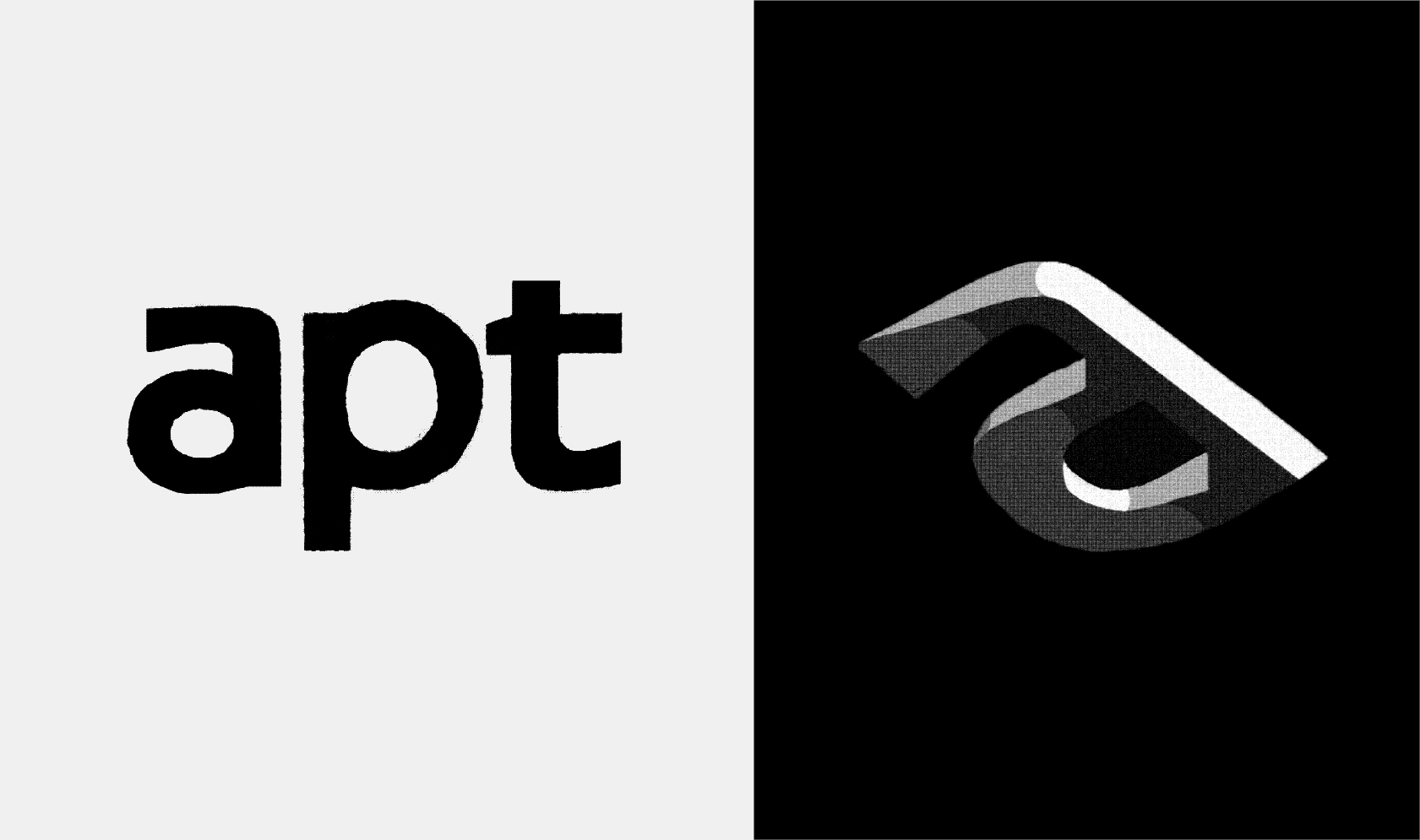
We tried the second idea—dimensions—in different typefaces, and chose Nikita’s Holz typeface in the end. But even though it was a safer option, we decided to go with the third approach in the end—ellipse. It was bold and luxurious, and both the client and us liked this concept the most.
WORKING WITH THE CHOSEN IDEA
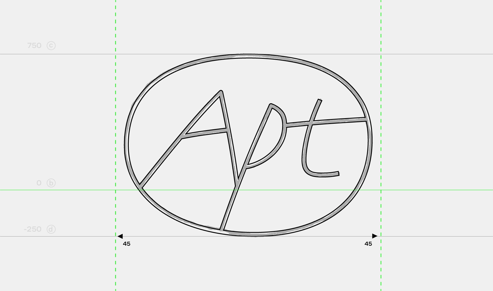
There were a few things to consider before finalizing the idea. First, how thick should the line be? We quickly digitized the sketch with a single line, added a thickness to the stroke to try different weights. We chose the weight that will work in both large and small sizes. This weight became our reference for future development.
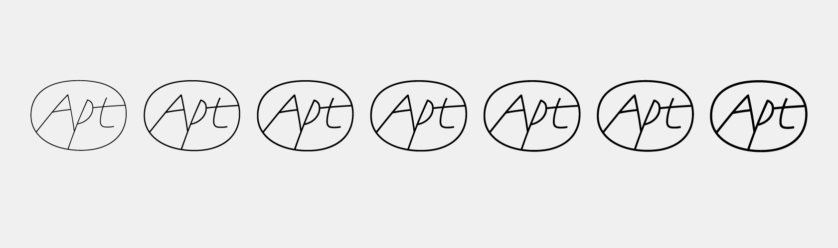
We weren’t happy with how the single stroke digitization turned out. When comparing it to the initial sketch it was definitely lacking some personality, roughness. And even though the wordmark was supposed to work primarily on computer screens, we still wanted it to be human, not too digital.
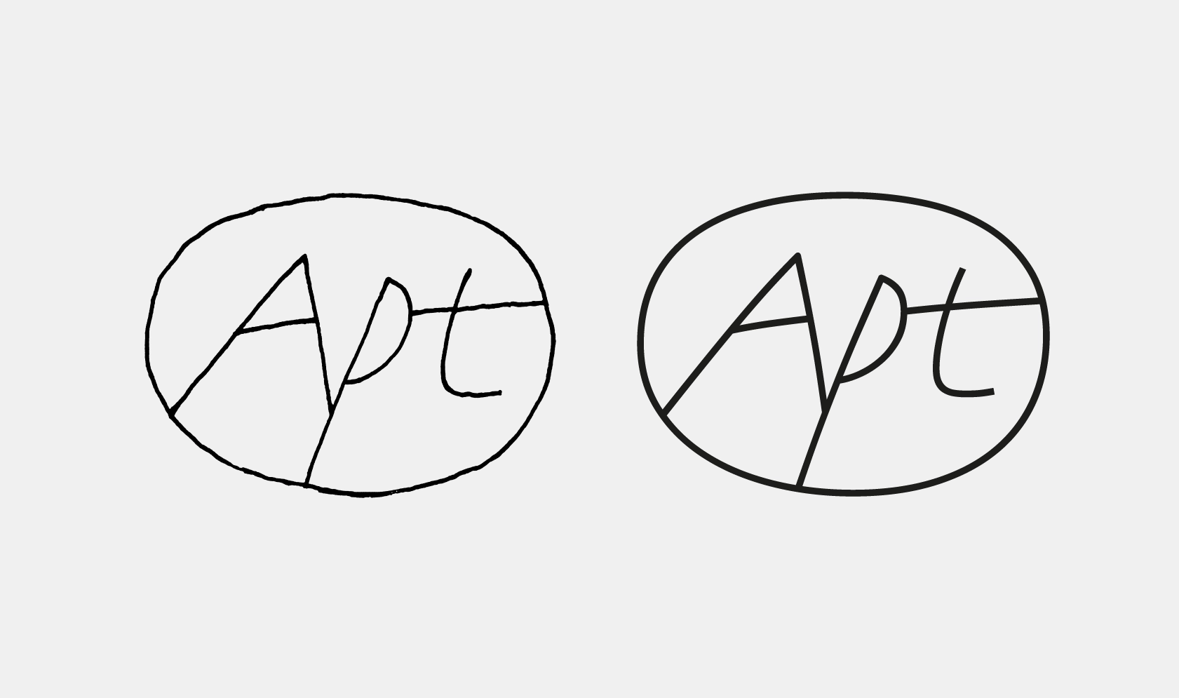
Based on the chosen thickness we digitized the sketch once again, keeping all the subtle irregularities as best we could. We wanted the digital drawing to be a little quirky, a little irregular, not too smooth. Subtle modulation of the thickness of the stroke helped with that as well as the additional “unnecessary” points on the curves.
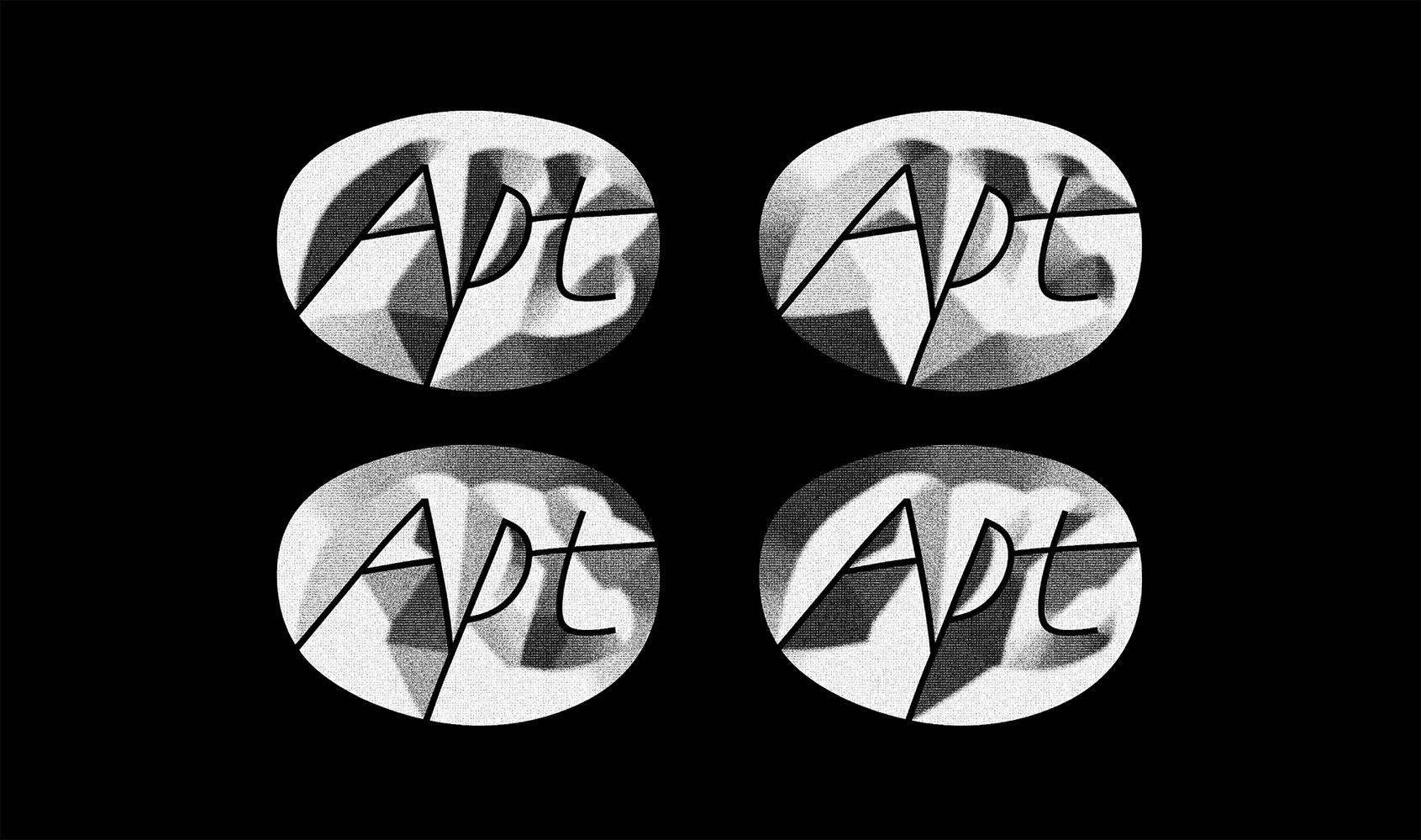
And finally we also experimented with adding shading to the logo. First by just applying the effects and shading from different angles and textures. We discovered that depending on the lightning we could have both embossed and debossed versions and we loved them both!
THE RESULTING LOGO AS THE ESSENCE OF THE DIALOG WITH THE CLIENT AND THE PROCESS ITSELF
As with many of our projects the success of the end result is the reflection of the process, the result of the dialog with the client. It’s not only the initial brief that plays a role, but also the actual letters the wordmark is composed of—at some point they just come together and show you the best ways to play with them and then you immediately can tell—that is it! In this particular case we like how different fields intersected and helped us. Architecture and space that we had as a brief forced us to explore letters in a three-dimensional space, using our knowledge of stone carving and drawing skills and working with unusual digitizations.
As a result, the wordmark looks quite simple and clean, especially in small size. But if you look at it on a larger scale you can see the detailing and the human touch. And then there’s a WOW effect when you actually see the simple drawing under the light with all the shades and angles. We look forward to seeing the wordmark carved in stone in one of Apt buildings one day.
Creative director: Maria Doreuli
Designers: Egor Golovyrin, Nikita Sapozhkov
CGI: Danilo Kuchum
Sound: Konstantin Kutsyn
Editor: Susanna Agabayan
Client: Petr Novikov, Fed Novikov
Brand strategy: Keaton Ventura